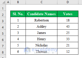
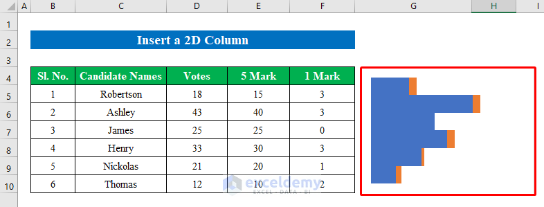
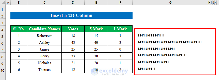
The sample dataset showcases Candidate Names and their collected Votes.
Represent the collected votes in a tally graph.
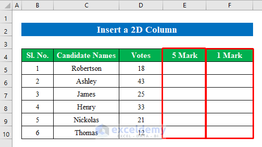
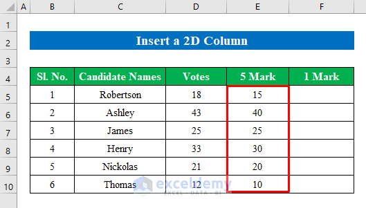
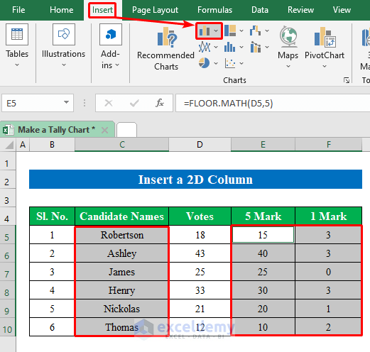
Method 1 – Inserting a 2D Column to Create a Tally Chart
Step 1:
- Insert 2 new columns. One for 5 marks and the other for 1 mark.
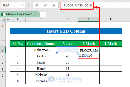
- Choose a cell to enter the formula. Here,E5.
=FLOOR.MATH(D5,5)The FLOOR.MATH function rounds a number down to a specific multiple given in the string.
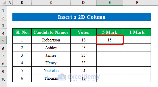
- Press Enter button to get the output.
- Drag down the Fill Handle to see the result in the rest of the cells.
Values are multiple integers of 5.
Calculate the remaining values with the MOD function.
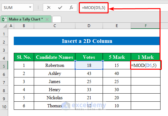
Step 2:
- Choose a cell to enter the formula. Here, F5.
=MOD(D5,5)The MOD function returns the remaining numeric values after division.
- Press Enter.
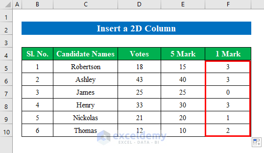
- Drag down the Fill Handle to see the result in the rest of the cells.
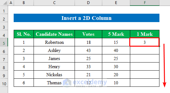
The remaining values are displayed.
Step 3:
- Select the data in Names list, 5 mark, and 1 mark: (C5:C10), (E5:E10), and (F5:F10) holding Ctrl.
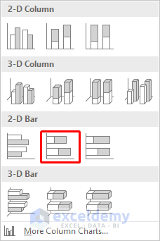
- Go to “Column or Bar Chart” in “Insert”.
- Select a 2-D Bar chart.
- The 2D bar chart is created.
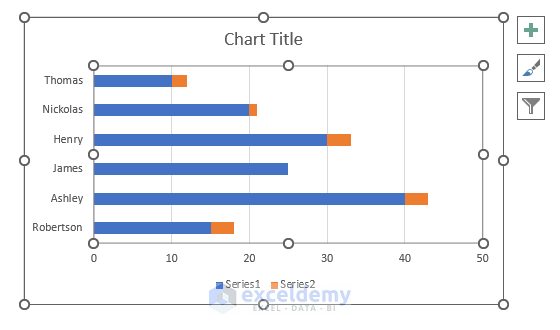
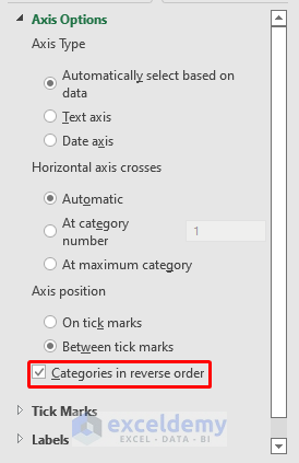
Step 4:
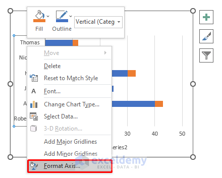
- Right-click the name list in the Y axis.
- Choose “Format Axis”.
- Click “Categories in reverse order” to rearrange the name list.
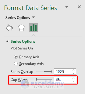
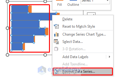
- Right-click to select the chart.
- Choose “Format Data Series”.
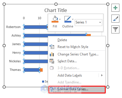
- Decrease the “Gap Width” to “0%”.
- Remove all lines and names.
This is the output.
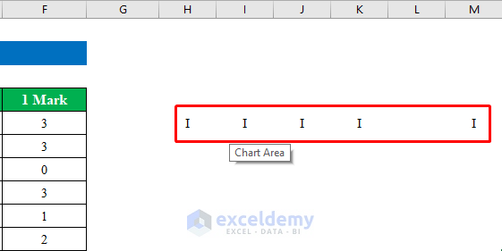
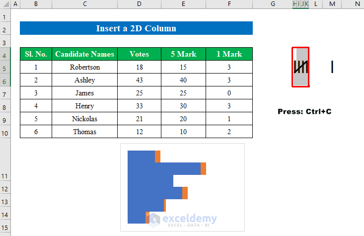
Step 5:
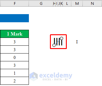
- Enter “I” in side-by-side rows in different columns.
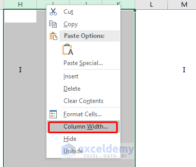
- Select the columns and right-click.
- Click “Column Width”.
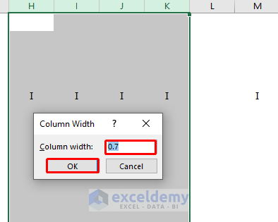
- Change the column width to “0.7”.
- Click OK.
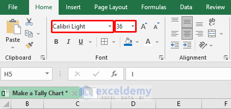
- Change the font format and size:
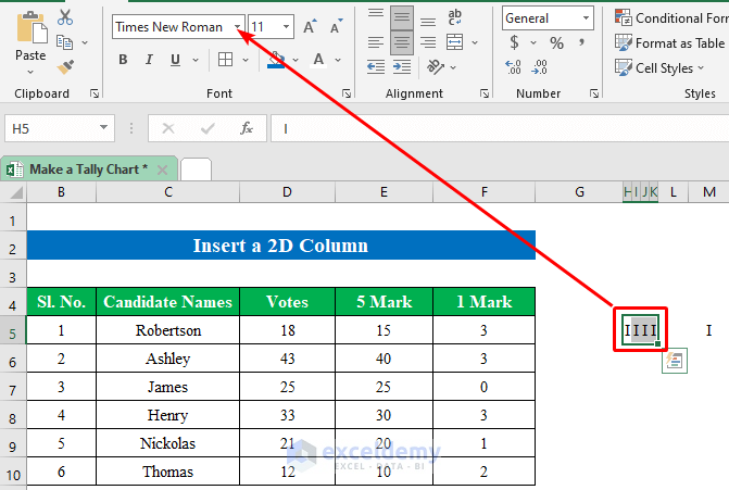
- Change the font to “Calibri Light” and size to “36”.
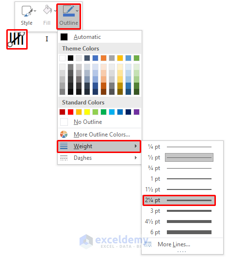
- Go to the “Insert” tab and choose a line in “Shapes”.
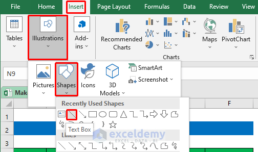
- Draw the line diagonally striking through the previous 4 lines.
- Edit the weight of the diagonal line.
The tally lines are prepared.

Combine the tally lines with the chart to create the tally chart.
Step 6:
- Select the tally lines and press Ctrl+C to copy.
- Click the blue data chart and right-click.
- Choose “Format Data Series”.
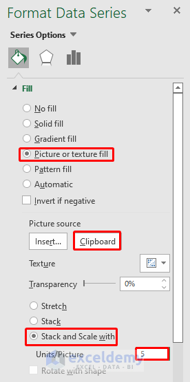
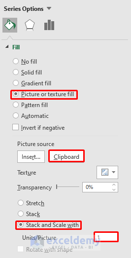
- Go to Fill > Picture or texture fill > Clipboard > Stack and Scale with.
- In “Units/Picture”, enter 5.
- Select the single tally line and press Ctrl+C to copy.
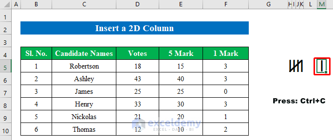
- Select the yellow part in the chart and right-click.
- Select “Format Data Series”.
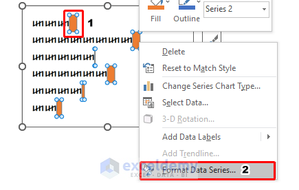
- Go to Fill > Picture or texture fill > Clipboard > Stack and Scale with.
- In “Units/Picture”, enter 1.
This is the output.
Read More: How to Tally Votes in Excel
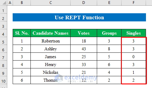
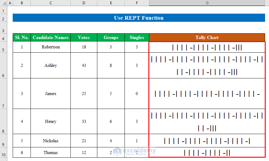
Method 2 – Using the REPT Function to Create a Tally Chart
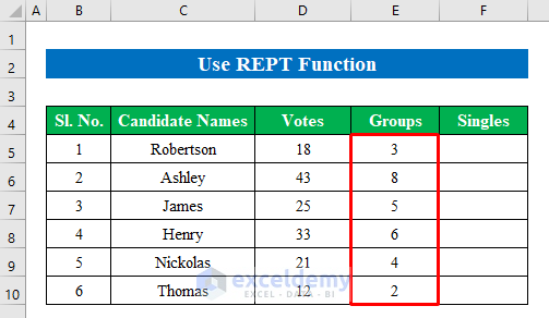
Step 1:
- Choose a cell to enter the formula. Here, E5.
=FLOOR.MATH(D5,5)/5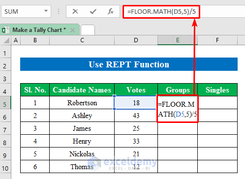
- Press Enter.
- Drag down the Fill Handle to see the result in the rest of the cells.
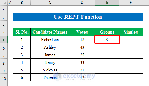
- This is the output.
- To calculate the remaining values in a new column, select F5.
- Enter the formula:
=MOD(D5,5)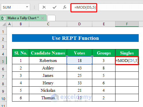
- Press Enter and drag down the Fill Handle to see the result in the rest of the cells.
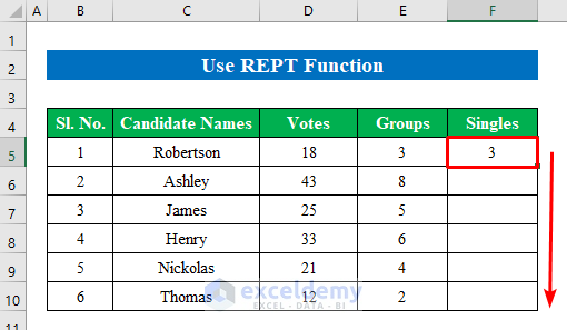
The dataset is ready to represent the tally chart.
Step 2:
- In two different cells, enter the 5 tally lines and 1 tally line.
- Edit font and shape.
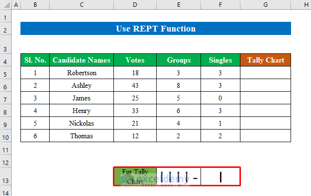
- Choose a cell to display the tally chart. Here, G5.
- Enter the formula:
=REPT($E$13,E5)&REPT($F$13,F5)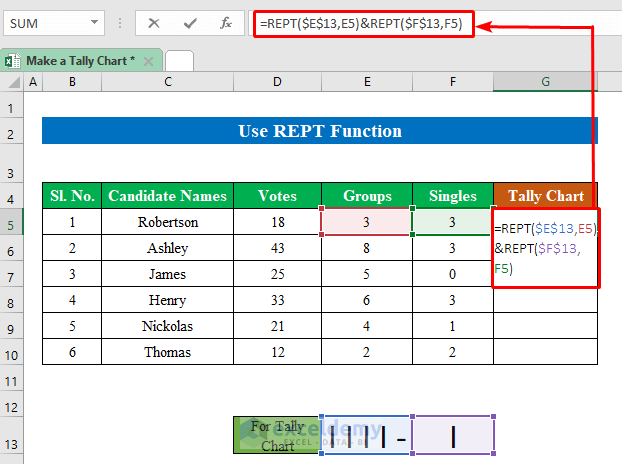
- Press Enter
- Drag down the Fill Handle to see the result in the rest of the cells.
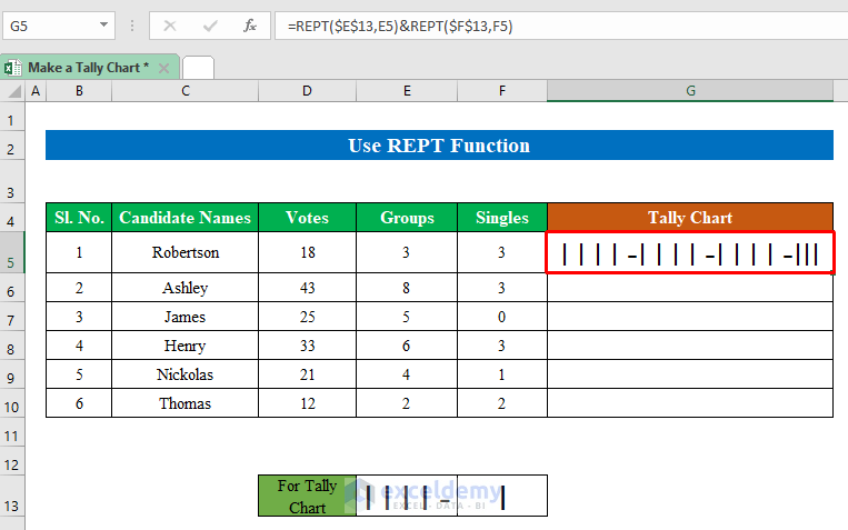
The final tally chart is ready representing the votes of the candidates.
Read More: How to Tally a Column in Excel
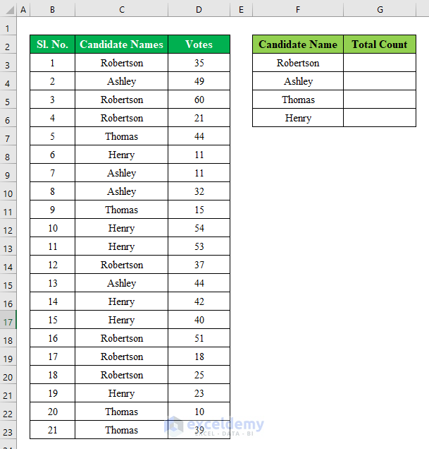
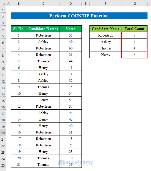
Method 3 – Using the COUNTIF Function to Create a Tally Chart
The dataset showcases Candidate Names and their calculated Votes.
Find the duplicates and create a tally chart.
Steps:
- Select G5 and enter the formula.
=COUNTIF($C$5:$C$25,F5)
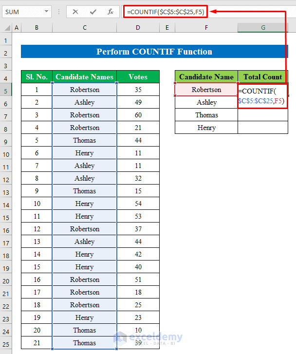
- Press Enter.
- Drag down the Fill Handle to see the result in the rest of the cells.
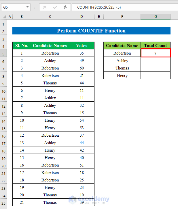
The duplicated values are displayed.
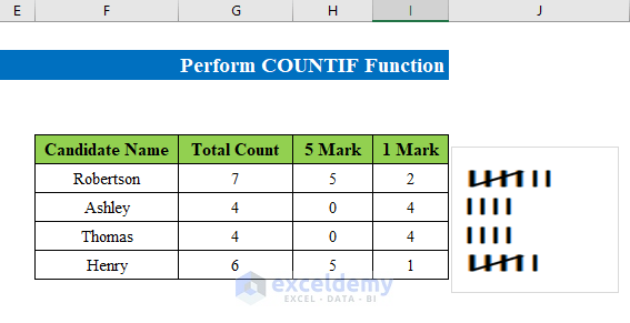
- Follow the steps described in the previous methods to create the tally chart.
Read More: How to Make a Tally Sheet in Excel
Things to Remember
- You can also create a tally chart using the FREQUENCY function.
Download Practice Workbook
Download the practice workbook.
Related Articles
- How to Create a Tally Button in Excel
- How to Tally Words in Excel
- How to Export Tally Data in Excel
- How to Make Tally Marks in Excel
<< Go Back to Tally in Excel | Excel for Statistics | Learn Excel
Get FREE Advanced Excel Exercises with Solutions!
