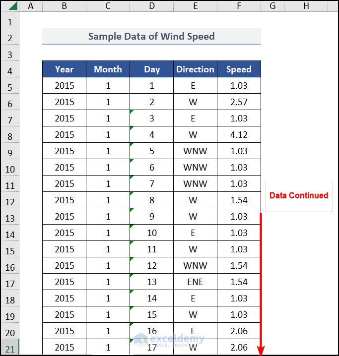
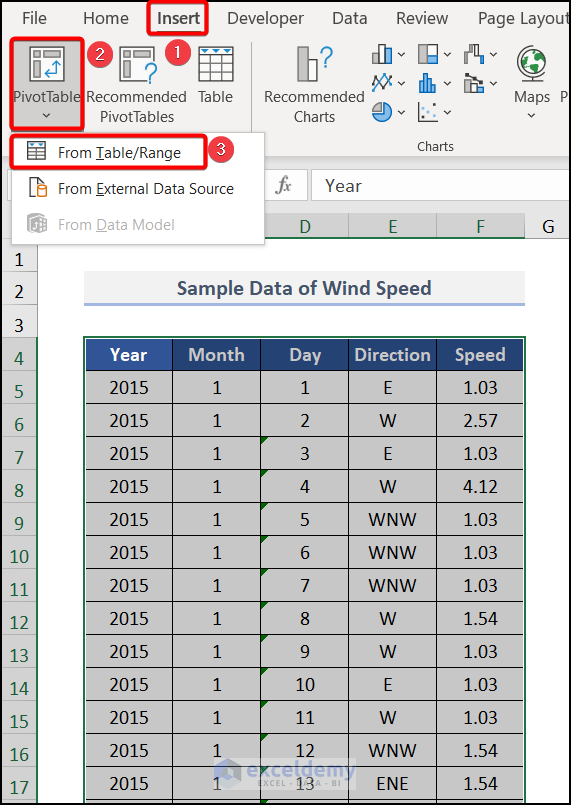
There are two possible ways to make a wind rose in Excel. But first, we must insert the wind speed and cardinal directions in a specific location. Here, we have taken a dataset of Wind Speed with their Direction for a specific time.
We used the Microsoft 365 version. You may use any other version at your convenience.
Method 1 – Using Recommended Charts Command
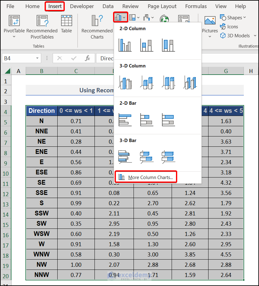
- After creating the dataset, select the entire range of the data, then navigate to the Insert tab >> choose Insert Column or Bar Chart>> pick More Column Charts.
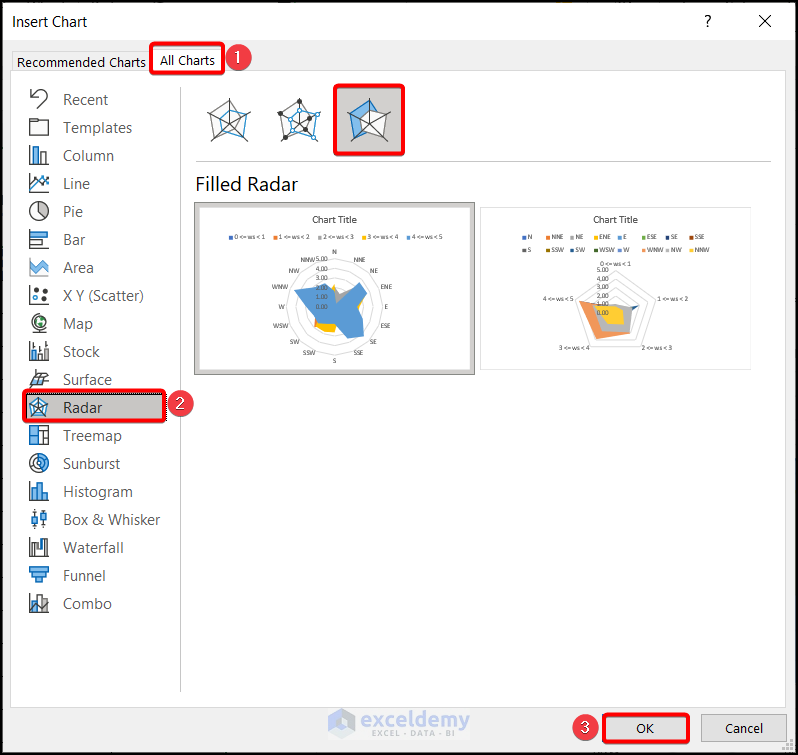
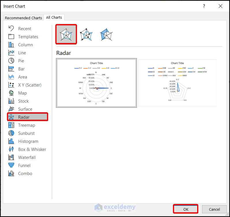
- The Insert Chart window appears. Choose Radar from the All Charts tab >> Pick Filled Radar and hit OK.
Note: You can bring the Insert Chart dialog box from any other More Charts option from the Charts group of the Home tab.
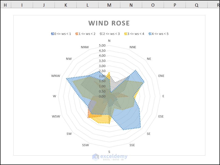
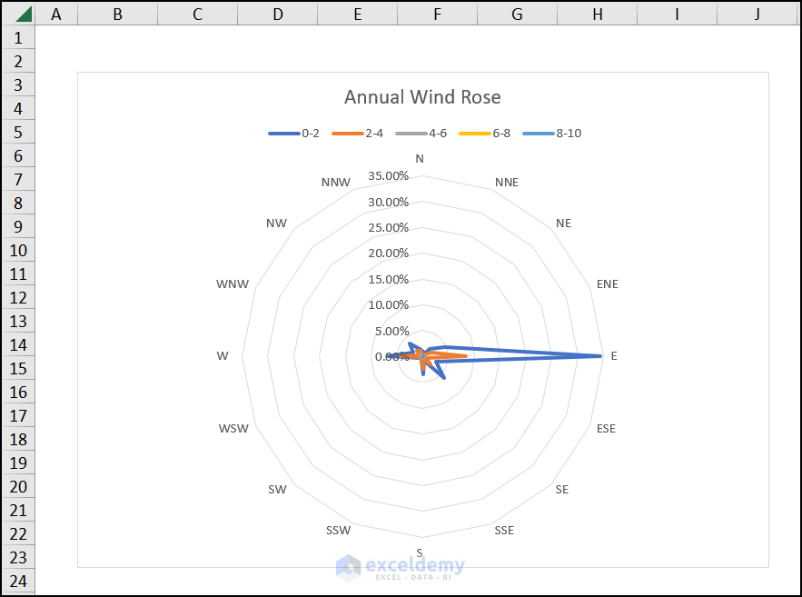
A wind rose will be created, as you can see in the image, and you can customize the chart according to your preferences.
Method 2 – Inserting PivotTable to Make a Wind Rose
Steps:
- Select the entire dataset. As it is a large dataset, we select the entire dataset with the CTRL + A key.
- Hover over the Insert tab >> choose the PivotTable >> From Table/Range.
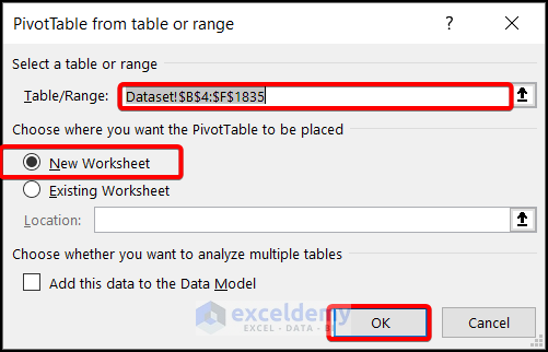
- A PivotTable from table or range window appears. Check the New Worksheet in Choose where you want the PivotTable to be placed. Hit OK.
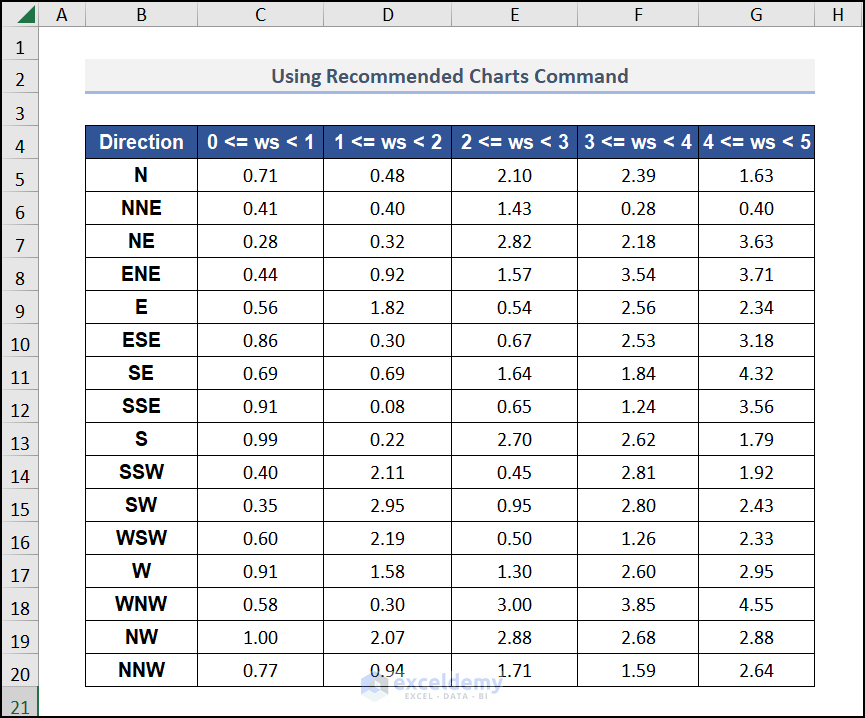
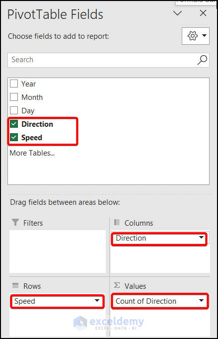
- In the PivotTable Fields sidebar, put the Direction in the Columns and in the ∑Values. Also, drag the Speed in the Rows section.
- Convert the Row Labels to Groups. So, right-click on any data of the Row Labels and pick Group from the Context Menu.
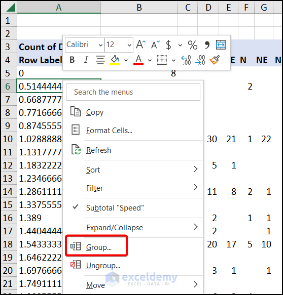
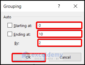
- The Grouping window appears. Uncheck the Starting at and the Ending at boxes. Put the Starting at the value of 0 and Ending at the value of 10 and insert the By to 2.
- Hit OK.
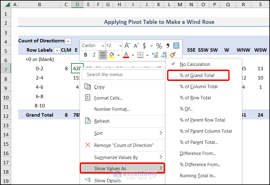
- Right-click on the Speed data and pick Show Values As >> % of Grand Total from the Context Menu.
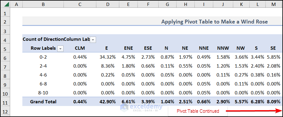
PivotTable has been created. Copy the values of the table to create a new dataset.
After pasting the new dataset, created with the PivotTable, select the entire range except for the Grand Total row and navigate to the Insert tab >> choose Insert Column or Bar Chart >> pick More Column Charts.

- The Insert Chart window appears. Pick Radar from the All Charts tab.
- Hit OK.
A wind rose with the corresponding data has been created, as shown in the image below. You can customize it through the Chart Design as your preference.
Download Practice Workbook
Download the following practice workbook. It will help you to realize the topic more clearly.
Related Articles
- What Is Radar Chart in Excel
- How to Make a Radar Chart in Excel
- How to Include Standard Deviation in Excel Radar Chart
- How to Create Excel Radar Chart with Different Scales
- How to Create Excel Radar Chart Max Value
- How to Create Radar Chart and Fill Area in Excel
- Color Rings on Radar Chart in Excel
- How to Create Radar Chart with Radial Lines in Excel
- How to Create Pie Radar Chart in Excel
- How to Create a Circular Radar Chart in Excel
- How to Create Polar Area Chart in Excel
<< Go Back To Excel Radar Chart | Excel Charts | Learn Excel
Get FREE Advanced Excel Exercises with Solutions!

