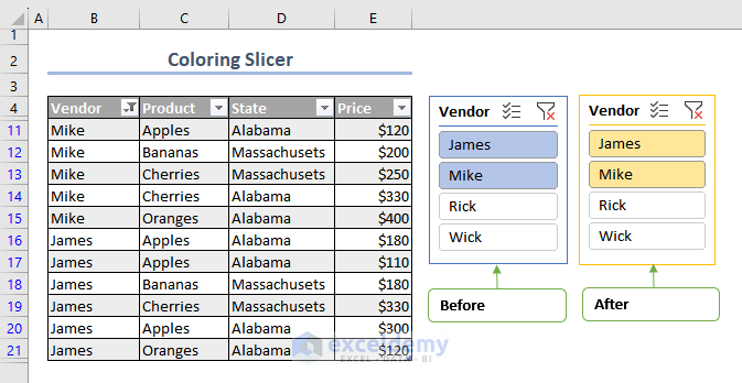
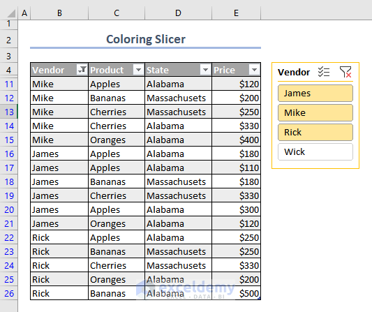
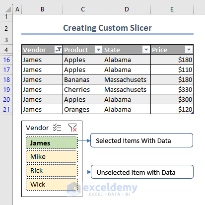
In the Pivot Table, a Slicer named Vendor was added. Its color was changed.
What Is a Slicer in Excel
A slicer is a graphical filtering interface in Microsoft Excel that enables users to filter data in a PivotTable, PivotChart, or Table.
How to Insert a Slicer in a Pivot Table
- Select a cell in the Pivot Table.
- In Insert, click Slicer
- In the Insert Slicers Dialog Box, select Vendor, and Product.
- Click OK.
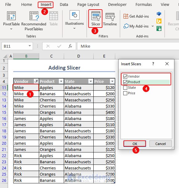
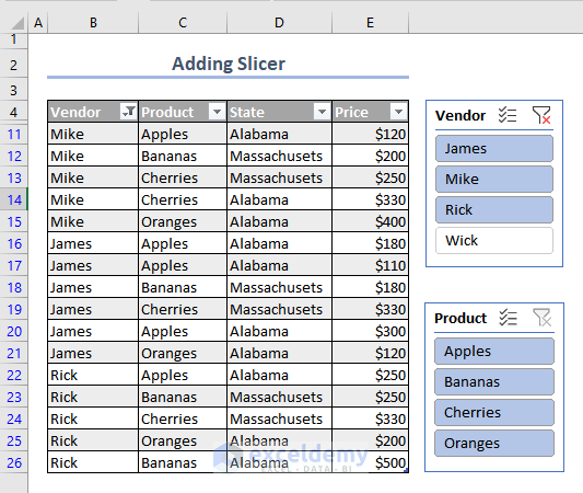
- Two Slicers named Vendor and Product will be displayed.
To Change Slicer Color in Excel
Step 1 – Use the Built-in Slicer Formats in Excel
- Select the Vendor Slicer.
- Click More Option as shown below.
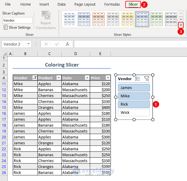
- Select a color.
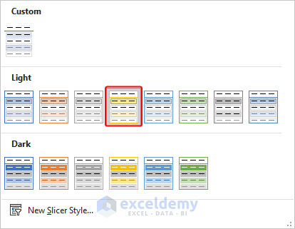
- This is the output.
Read More: How to Format Slicer in Excel
Step 2 – Create a Custom Slicer Style in Excel
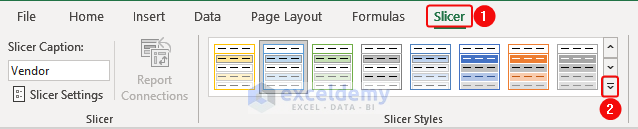
- Select Slicer.
- Click More as shown below.
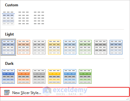
- Click New Style Slicer.
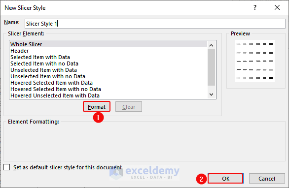
In the Dialog Box:
- Name the style of the new Slicer.
- Click Format.
Notes
- The “with data” slicer displays values with data in the selected criteria.
- The “with no data” slicer displays values that do not have data (if data was removed after inserting the Slicer) in the selected criteria.
In Format Slicer:
- Change the Font, Border, and Fill.
Here: Whole Slicer, Select Item with Data, and Unselect Items with Data.
Frequently Asked Questions
- What is an interactive dashboard?
An interactive dashboard is a visual representation of data that allows users to interact with and manipulate the displayed data.
- What’s the difference between a slicer and a pivot table?
| Feature | Slicers | Pivot Table Filters |
|---|---|---|
| Type of tool | Visual interface | Dropdown menu |
| Functionality | Filters data based on selection | Filters data based on selection |
| Appearance | Visual representation of filters | Text representation of filters |
| Ease of use | Intuitive and user-friendly | Requires knowledge of pivot tables |
- Can you make a slicer without having a pivot table?
Yes:
- Select the range of cells to create the slicer.
- Go to the “Insert“.
- Click “Slicer” in “Filters”.
- In the “Insert Slicers” dialog box, select the field you want to filter.
- Click “OK“.
Download Practice Workbook
Download the practice workbook.
Related Articles
- How to Resize a Slicer in Excel
- Connect Slicer to Multiple Pivot Tables from Different Data Source
- How to Insert Slicer without Pivot Table in Excel
- Excel Slicer for Multiple Pivot Tables (Connection and Usage)
- [Fixed] Report Connections Slicer Not Showing All Pivot Tables

