
Image by Editor
If you are familiar with Microsoft Excel and use it for data analysis, creating reports, or managing dashboards, then Power BI is your next superpower. As an Excel user, you already have a strong foundation for working with data. Power BI allows you to import, clean, transform, and visualize data interactively.
This tutorial provides a step-by-step guide to help Excel users get started with Power BI.
What is Power BI?
Power BI is Microsoft’s business analytics platform that extends Excel’s capabilities with the following options.
- It can handle larger datasets (billions of rows vs. Excel’s ~1M row limit).
- Creates interactive dashboards with cross-filtering.
- Connects to multiple data sources simultaneously.
- Automates data refreshes.
- Cloud dashboards & live sharing.
- Enterprise-grade sharing and collaboration.
Sample Dataset:
In this tutorial, we’ll work with a sales dataset in an Excel file named SalesData.xlsx that contains four sheets:
- Sales: Transaction records with dates, customer IDs, product IDs, quantities, prices, and revenue.
- Products: Product details including categories and costs.
- Customers: Customer information with regions.
- Regions: Geographic sales regions with country and city information.
This structure represents a common business scenario where related data is stored in separate tables.
Familiar Concepts for Excel Users
| Excel Feature | Power BI Equivalent |
| Sheets | Tables |
| PivotTables | Visualizations |
| Charts | Visuals |
| Formulas | DAX Measures |
| Power Query | Power Query Editor |
| Power Pivot | Data Model |
Step 1: Installing Power BI Desktop
- Download Power BI Desktop from Microsoft’s website.
- Install the application following the standard prompts.
- Launch Power BI Desktop.
You’ll immediately notice a familiar ribbon interface similar to Excel, making the initial transition more comfortable.
Step 2: Importing Excel Data
Let’s import our sales dataset.
- Go to the Home tab >> from Data >> select Excel Workbook.
- Browse the location of SalesData.xlsx >> click Open.

- In the Navigator dialog, you’ll see all sheets and tables.
- Select all four sheets: Sales, Products, Customers, and Regions.
- Click Load or Transform.

Note: Power BI will load your data and automatically detect relationships between tables based on matching column names (CustomerID, ProductID, RegionID). This automatic relationship detection is a significant advantage over Excel, where you would need to use VLOOKUP or INDEX/MATCH functions to relate data.
Step 3: Clean and Transform Data using Power Query
Now let’s fix some issues.
- Click Transform Data to enter Power Query Editor.
- Actions to perform:
- Ensure the Date column is in Date format.
- Check that Quantity and Unit Price are numeric.
- Remove null rows, fix spelling errors if any, and rename columns for clarity.
- Click Close & Apply to save changes.

- Data is loaded into the Power BI editor.

Step 4: Exploring the Data Model
One of Power BI’s most powerful features is its data modeling capabilities.
- Click the Model view in the left navigation bar.
- You’ll see your four tables with relationship lines connecting them:
- Sales[CustomerID] connects to Customers[CustomerID].
- Sales[ProductID] connects to Products[ProductID].
- Customers[RegionID] connects to Regions[RegionID].

If any relationship is missing, you can create it by dragging a column from one table to the corresponding column in another table.
Step 5: Creating Visualization
Let’s explore the Power BI visualization feature.
Sales by Product Category:
- Click on Report view in the left navigation bar.
- Select the Column chart from the Visualizations pane.
- From the Fields pane, drag:
- Products[Category] to the X-axis field.
- Sales[Revenue] to the Y-axis field.
Power BI automatically aggregates the revenue by category and creates a column chart.

Notice how you didn’t need to create a pivot table like you would in Excel; Power BI handles the aggregation automatically.
Analyzing Sales Trends Over Time:
Now, let’s create a time series analysis.
- Click on a blank area of the canvas.
- Select the Line chart from the Visualization pane.
- Drag Sales[Date] to the X-axis field.
- Drag Sales[Revenue] to the Y-axis field.
Power BI creates a time-series chart showing revenue over time. Unlike Excel, Power BI automatically creates a date hierarchy, allowing you to drill down from months to days with a single click.

Test Chart:
- Click the drill-down icon in the top-right corner of your visualization.
- Click on any point in the line to drill down to the next level of detail.
Customer Analysis by Region:
Let’s analyze customer distribution by region. If you are using Map visualization for the first time, you will need to enable Map and filled map visuals from the Options.

- Go to the File tab >> select Options and settings >> select Options >> select Global >> select Security >> check Use Map and Filled Map visuals.
- Click OK.

- Select Map visualization.
- Drag Regions[Country] to the Location field.
- Drag Regions[Country] to the Legend field.
- Drag Sales[Revenue] to the Bubble size field.

Power BI automatically creates a map showing sales by country, with bubble sizes representing revenue. This geographic visualization would require multiple steps in Excel but is straightforward in Power BI.
Step 6: Adding Interactive Filters (Slicers)
One of Power BI’s strengths over Excel is the ease of creating interactive filters.
- Click a blank area of the canvas.
- Select the Slicer visualization.
- Drag Products[Category] to the Field section.
- The slicer appears as a list of categories (Beauty, Home & Kitchen, Toys, etc.).

- Add another slicer for Regions[Country].
- Drag Regions[Country] to the Field section.

Now try clicking different categories in the slicer. Notice how all visualizations update simultaneously! This cross-filtering capability is available in Excel with slicers, but Power BI makes it much easier and more powerful.
Step 7: Creating Calculated Measures with DAX
DAX (Data Analysis Expressions) is Power BI’s formula language, similar to Excel formulas but more powerful. Let’s create some measures.
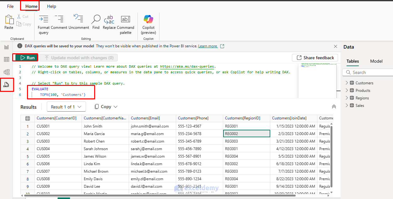
- Select DAX in the left navigation bar.
- Insert the DAX formula >> click Run.
- It will automatically generate the results based on the DAX formula.
- Select Table view from the left navigation pane.
- Select New Measure from Calculations.
- Or, right-click on the Sales table in the Fields pane >> select New measure.

- Create a profit measure:
Profit = SUM(Sales[Revenue]) - SUM(Sales[Cost])

- Create a profit margin percentage.
- Select Percentage % from the Formatting.
Profit Margin % = DIVIDE(SUM(Sales[Revenue]) - SUM(Sales[Cost]), SUM(Sales[Revenue]), 0)

Add these measures to your report:
- Add Profit, Profit Margin % measure to the card.
- Return to the Report view.
- Select Card visualization (looks like a big “123”).
- Drag Profit to the Data field.
- Drag Profit Margin % to the Data field.

These calculations are similar to what you might do in Excel, but they automatically respect all filters applied to your visualizations.
Step 8: Building a Dashboard
Now that we have several visualizations, let’s arrange them into a cohesive dashboard.
- Resize and arrange your visuals on the canvas.
- Go to the Home tab >> from Insert >> select Text box.
- Place the Card visual showing Profit and Profit Margin % at the top.
- Ensure your slicers are positioned prominently for easy filtering.
Now the dashboard will show a comprehensive view of sales performance across products, categories, time, and regions, all interconnected and interactive.

- You can use slicers to check the interactivity.

Step 9: Publishing and Sharing Power BI Service
Publishing:
Once your report is ready:
- Save your Power BI file (it saves as a .pbix file).
- Click File >> select Publish >> select To Power BI.
- Or, go to the Home tab >> select Publish.

- Sign in with your Microsoft account.
- Select or create a workspace to publish to.
- Done! Your report is now on the web.
- Once published, you can share it with colleagues who can interact with your dashboard without changing the underlying data model.
Sharing:
- Share with colleagues.
- Set up refresh schedules.
- Embed it into Microsoft Teams or SharePoint.
View on Mobile:
- Download the Power BI Mobile app and sign in to view your reports on the go.
- It’s automatically responsive.
Step 10: Setting Up Data Refresh
If your data will be updated regularly:
- In Power BI Service (online), find your published report.
- Click Schedule Refresh.
- Configure daily or weekly refresh times.
- When your Excel source file is updated, Power BI will automatically refresh the dashboard.
Tips for Excel Users Transitioning to Power BI
- Leverage your Excel knowledge: Your understanding of tables, relationships, and aggregations transfers directly to Power BI.
- Think in relationships, not lookups: Focus on building a proper data model instead of writing lookup formulas.
- Start simple: Begin with basic visualizations before diving into complex DAX formulas.
- Use Power BI’s built-in intelligence: Take advantage of features like quick measures, AI insights, and auto-detection.
- Remember the data model: The relationships between tables are what make Power BI powerful.
Conclusion
Power BI is a powerful upgrade for Excel users who want to move from static spreadsheets to interactive dashboards. Once you understand the Power Query, DAX, and Visual layer model, your reports will become dynamic, scalable, and shareable across your organization. Start with the basics we’ve covered here, then gradually explore more advanced features as you become comfortable with the Power BI environment. Your Excel expertise provides an excellent foundation, Power BI expands what you can do with your data analysis skills.
Get FREE Advanced Excel Exercises with Solutions!

Assalam-O-Alaiqum,
It is very informative and knowledgeable tutorial. I learnt Power BI two years ago, but organizations rarely use it.
Please keep sending me such tutorials on data analysis. I did a complete course of data analysis two years back.
Hello Mohammad Afzal,
Walaikum-assalam. Thank you for your kind feedback! We’re glad you found the tutorial helpful. It’s great to know you learnt Power BI, surely adds value to how you engage with these tutorials.
You’re right that Power BI adoption varies across organizations, but it’s encouraging to see interest like yours continuing strong.
We regularly publish tutorials under our Power BI Basics, feel free to explore and stay updated with the latest content.
Regards
ExcelDemy