
Power BI is a leading business intelligence tool from Microsoft that allows you to create interactive dashboards and reports from various data sources, including Excel. Whether you’re a data analyst or a beginner, integrating your Excel data into Power BI is the perfect way to start uncovering trends and insights.
In this tutorial, we will show how to create your first Power BI dashboard with Excel workbook data.
Prerequisites:
- Power BI Desktop is installed on your computer (free download from Microsoft).
- An Excel workbook with data (we’ll use a sample sales dataset).
- Basic familiarity with Excel.
Step 1: Prepare Your Excel Data
Consider a sales dataset with the following columns to create your first Power BI dashboard.

Data Preparation Tips:
- Ensure your first row contains clear column headers.
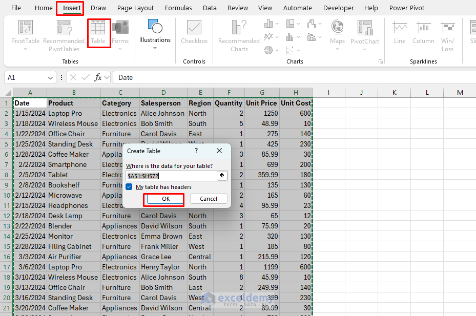
- Select your data.
- Go to the Insert tab >> select Table or press Ctrl+T.
- Check My table has headers.
- Click OK.
- Rename the Table:
- Go to the Table Design tab >> select Table Name >> insert Sales.

Step 2: Connect Power BI to Excel Workbook Data
Open Power BI Desktop:
- Download and install Power BI Desktop.
- Launch Power BI Desktop.
- Click Blank Report.

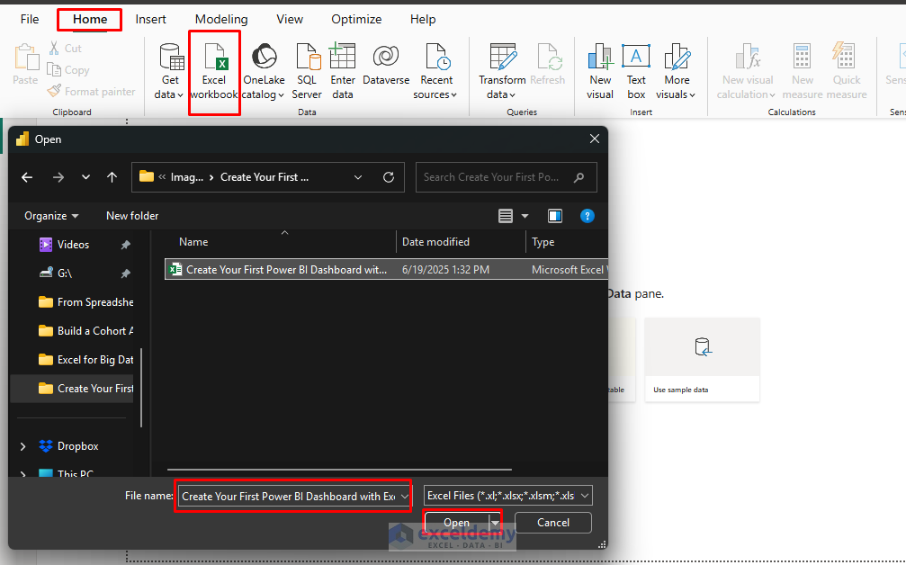
Import Data from Excel:
- Go to the Home tab >> from Data >> select Excel Workbook.
- Browse and select your Excel file>> click Open.
- In the Navigator window, you’ll see:
- Worksheets in your workbook.
- Tables, Named ranges, etc.
- Check the box next to your data source.
- Preview the data in the right panel.
- Click Load to import data directly or Transform Data to clean it first.

Step 3: Transform and Clean Your Data
If you click Transform Data, you’ll see the Power Query Editor, where you can clean and transform your data.
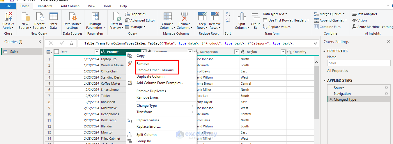
Remove Unnecessary Columns:
- Right-click column headers,
- Select Remove or Remove Other Columns.
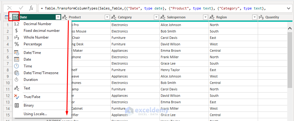
Change/Fix Data Types:
- Click the data type icon in column headers.
- Select the appropriate type (Text, Whole Number, Date, etc.).
Filter Data:
- Click the dropdown arrows in column headers.
- Check or Uncheck items you want to exclude.

Handle Missing Values:
- Right-click the column with missing data,
- Choose Replace Values or Remove Empty.

Add Calculated Columns:
- Go to the Add Column tab >> click Custom Column.
- Enter Name: Sales Amount.
- Insert the following formula.
=[Quantity] * [Unit Price]
- Click OK.

Applying Changes:
- Review all transformations in the Applied Steps panel.
- Go to the Home tab >> select Close & Apply to load the cleaned data into Power BI.

Step 4: Create Your First Visualizations
Understand the Interface:
- Fields pane: Shows your data columns.
- Visualizations pane: Contains chart types and formatting options.
- Report canvas: Where you build your visualizations.

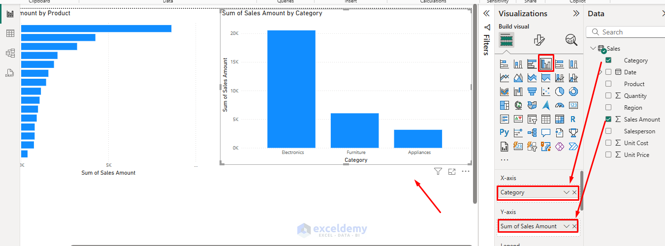
Add a Bar Chart: Sales by Product
- Select the Clustered Bar Chart from the Visualizations pane.
- Drag the Product to the Y-axis field.
- Drag Sales Amount to the X-axis field.
- Your chart will automatically appear on the canvas.
- See the products with the highest sales.

Create a Column Chart: Sales by Category
- Select the Column Chart from the Visualizations pane.
- Drag the Category to the X-axis field.
- Drag Sales Amount to the Y-axis field.
- The chart will automatically show the sales by category.
Create a Line Chart: Show Monthly Trends
- Select Line Chart from the Visualization pane.
- Drag Date to the X-axis field.
- Drag Sales Amount to the Y-axis field.
- Power BI will automatically aggregate by month/year.

Add a Pie Chart: Product Share
- Select Pie Chart from the Visualizations pane.
- Drag the Region to the Legend.
- Drag Sales Amount to Values.
- The pie chart will show the sales by region.
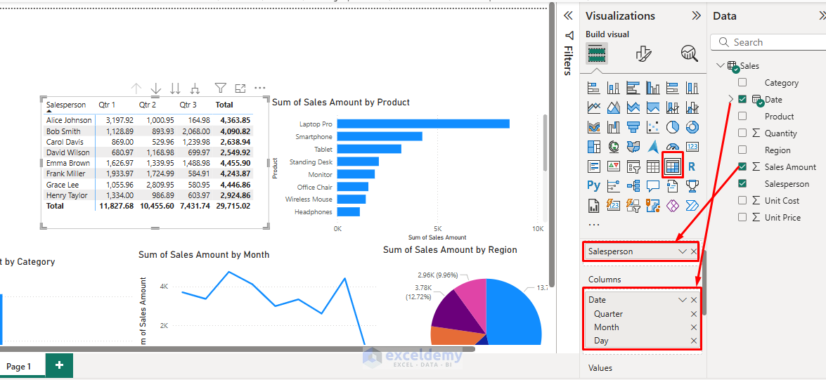
Insert Matrix Table:
- Select Matrix from the Visualizations pane.
- Drag Salesperson to Rows.
- Drag Date to Columns.
- Drag Sales Amount to Values.
- The table will show the quarterly sales by salesperson.
Slicers for Filtering:
- Select Slicer from the Visualization pane.
- Drag Category to Field.
- Repeat for other dimensions like Date, Region, or Category.

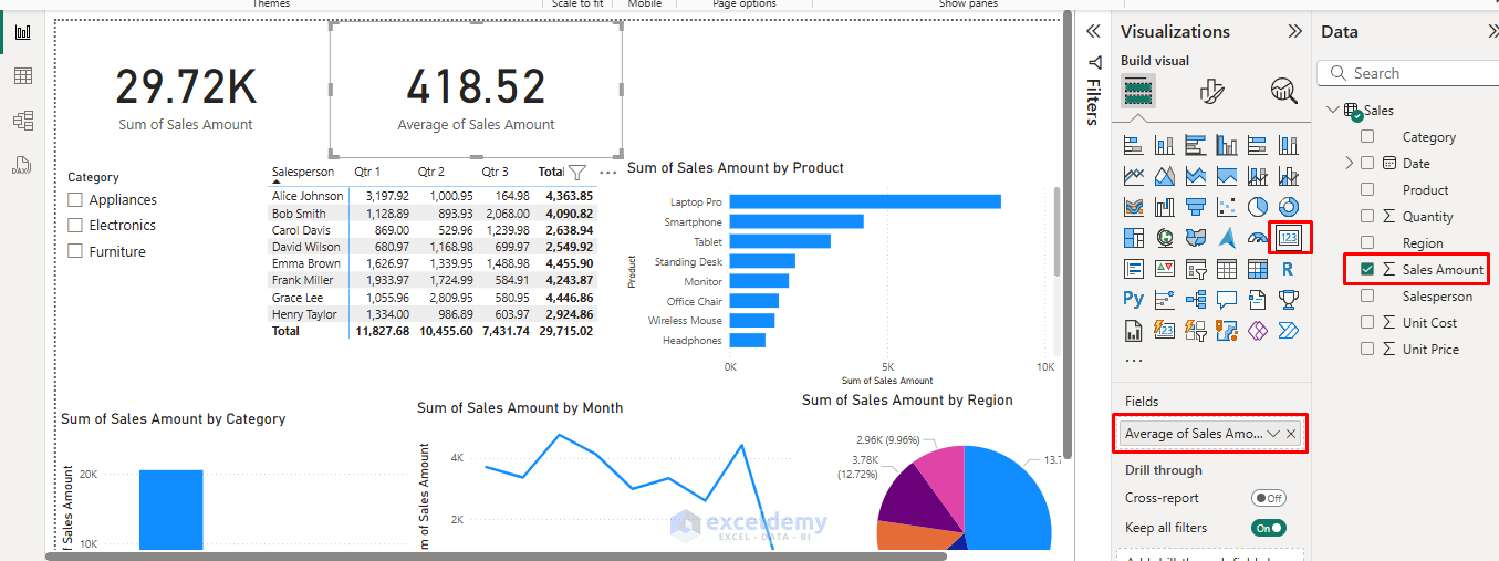
Add Cards for Key Metrics:
- Select Card from the Visualization pane.
- Drag Sales Amount to Fields.
- Repeat for other metrics like Average Sales and Quantity.
- Format cards with appropriate titles.
Step 5: Advanced Features
Create Measures with DAX: DAX (Data Analysis Expressions) allows for complex calculations:
- Open the Table view from the left navigation pane.
- Go to the Table Tools tab >> select New column.
- Enter DAX formula:
Revenue = Sales[Sales Amount]-Sales[Unit Cost]
- Use measures in visualizations like regular fields.

Step 6: Build Your Dashboard
Layout Planning: Before adding more visuals, plan your dashboard layout:
- Top row: Key performance indicators (KPIs) using cards.
- Middle section: Slicer, Main charts and graphs.
- Bottom section: Detailed tables or additional insights.
Cross-Filtering Setup: Power BI automatically enables cross-filtering between visuals. When you click on a bar in one chart, other visuals will filter accordingly.
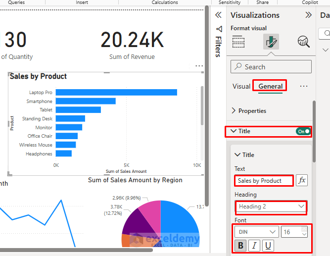
Format Your Dashboard:
- Select any visual.
- Use the Format Pane (paint roller icon) to:
- Change colors.
- Adjust fonts.
- Modify titles.
- Add data labels.
- Go to the View tab >> select any theme of your choice.

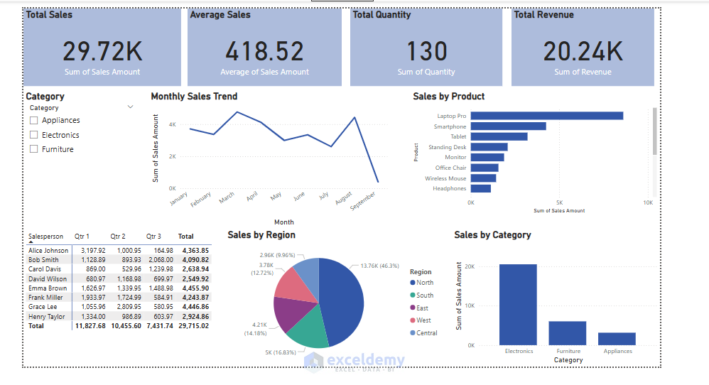
Dashboard:
Test Interactivity:
- Select a category for the slicer.
- Power BI automatically updates all the visuals.

Step 7: Publish and Share
Save Your Report:
- Click File tab >> select Save to save as a .pbix file.
Publish to Power BI Service:
- Go to the Home tab >> select Publish.
- Sign in to your Power BI account >> select Continue.

- Select a destination: My workspace.

- Access your dashboard online and share with your team.
- On Power BI Service, you can pin visuals to dashboards, set up email alerts, and share dashboards with others.
- Explore drill-down, filters, and interactive features for deeper analysis.
Conclusion
By following the above steps, you can create your first Power BI dashboard using Excel workbook data. This tutorial will help you create meaningful visualizations to build interactive dashboards and share insights with others. Remember that dashboard creation is iterative. Start simple, gather feedback, and continuously improve your reports. As you become more comfortable with Power BI, explore advanced features like custom measures, complex relationships, and automated refresh schedules.
Get FREE Advanced Excel Exercises with Solutions!

Please for the practice file.
Many Thanks
Hello Nelson,
We uploaded the practice file in the article. Please download it from there.
Keep exploring Excel with ExcelDemy!
Regards,
ExcelDemy
Where is this file you speak of?
Hello Thomas,
The file mentioned in the tutorial refers to the sample Excel workbook used to demonstrate how to build the Power BI dashboard. If you want, you can use your own sample file. If you need the article one, we are attaching it here:
Sample-Source-Data.xlsx
Regards,
ExcelDemy