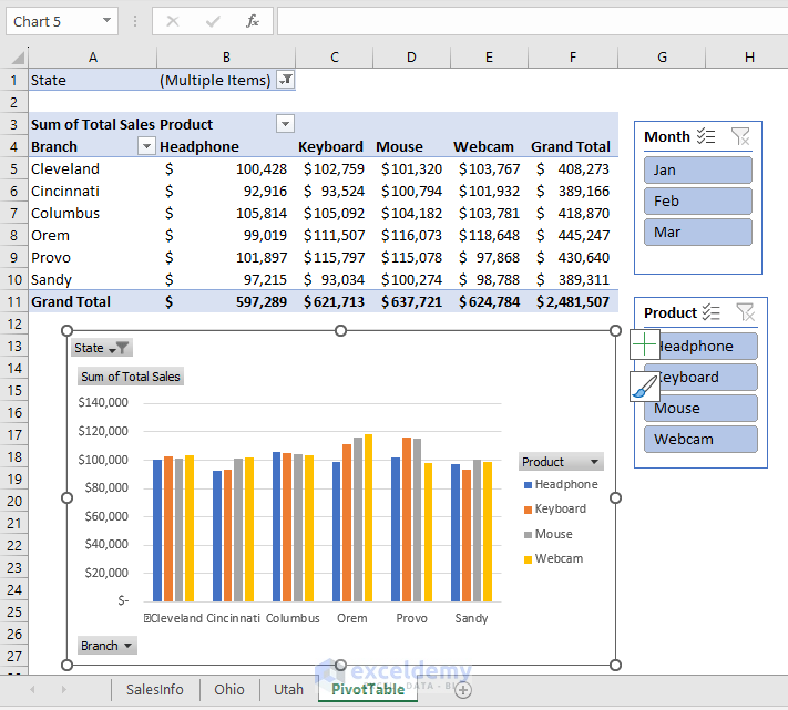
Although the primary task of a pivot table is to offer different setups for analyzing data effectively, it can also create reports such as the one below, including a chart.
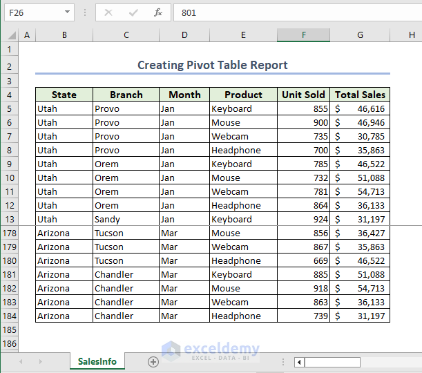
We’ll create a pivot table and report using the dataset below, which contains the sales info of different products in different branches in different states.
We have used the Microsoft Excel 365 version here. If any of the steps don’t work in your version, please leave a comment below to let us know.
Step 1 – Specifying Data Range
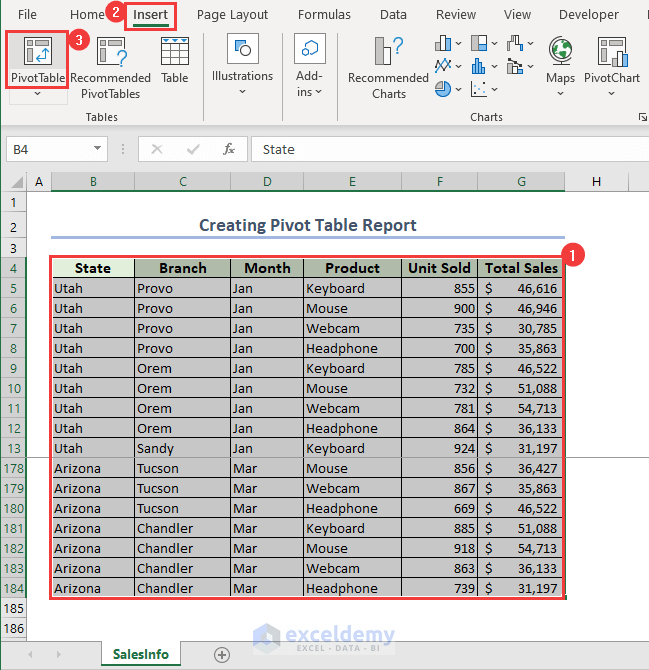
- Select the entire dataset.
- Go to the Insert tab.
- Click on PivotTable from the Tables group.
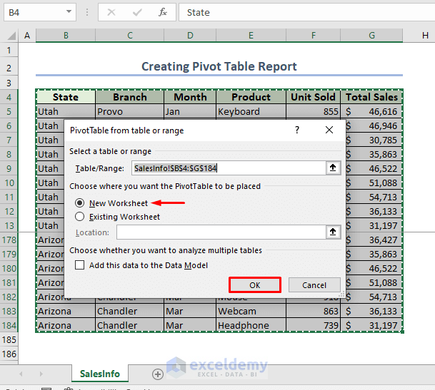
The PivotTable from table or range dialog box opens. Our data range is automatically detected and placed in the Table/Range box.
- In the Choose where you want the PivotTable to be placed section, select New Worksheet.
- Click OK.
This will place our PivotTable in a new worksheet.
Step 2 – Creating the Pivot Table Layout
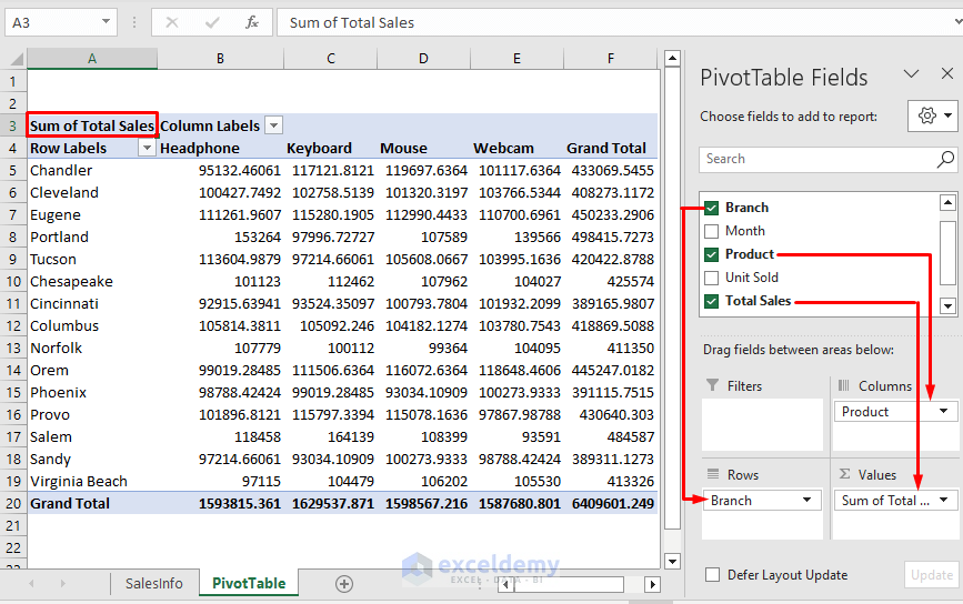
- In the PivotTable Fields task pane, drag Branch into the Rows area and Product into the Columns area.
- Move the Total Sales field into the Values area.
A simple PivotTable will be created.
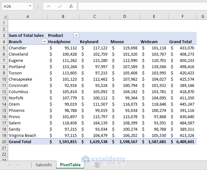
Step 3 – Changing the Layout
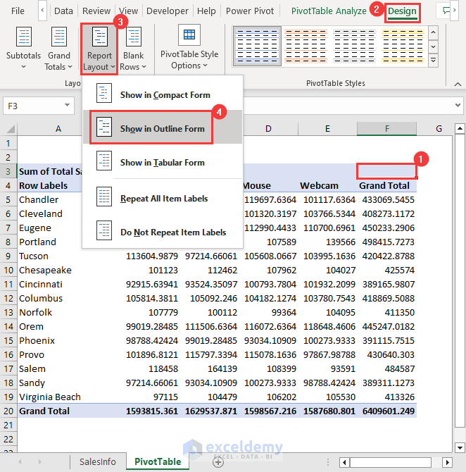
- Select any cell inside the Pivot Table.
- Go to the Design tab.
- In the Layout group, click on the Report Layout drop-down.
- Click Show in Outline Form from the list.
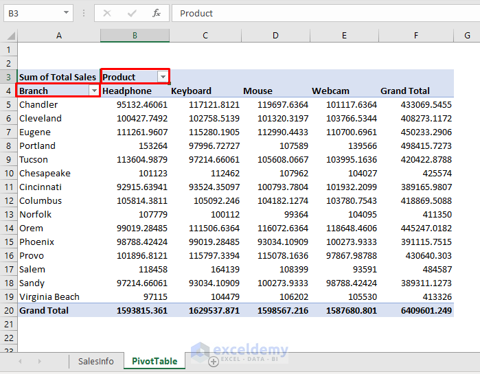
The headings are magically changed.
Step 4 – Changing Number Format
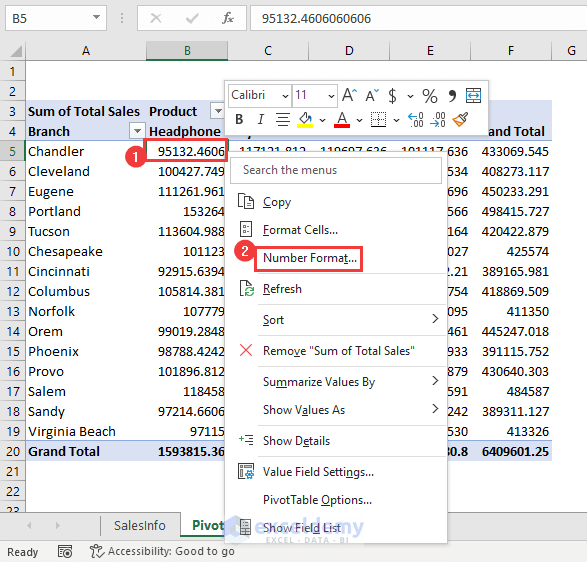
- To display the sales amounts in currency units, right-click on cell B5 to open the context menu.
- Select Number Format from the available options.
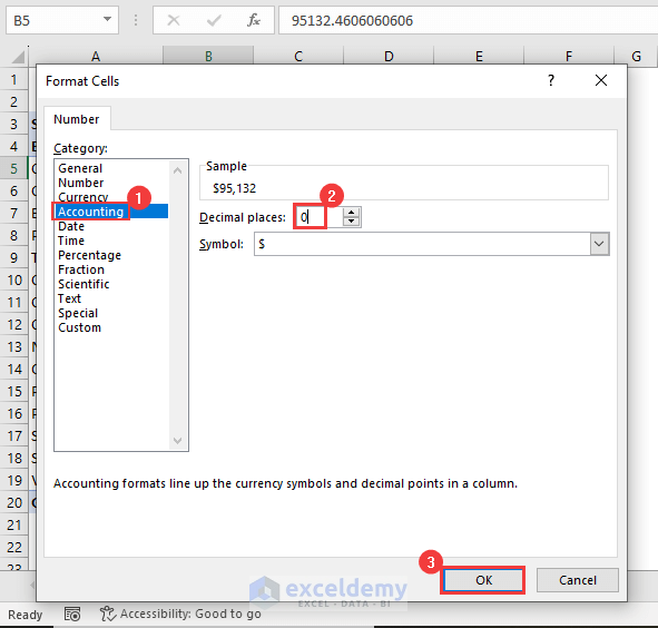
- In the Format Cells dialog box, choose Accounting in the Category section.
- Select 0 in the Decimal places box.
Step 5 – Using Filter Options
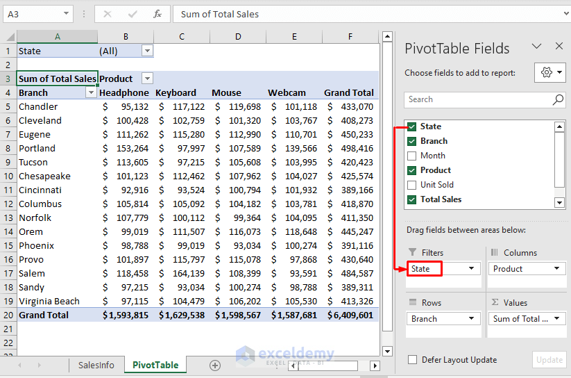
Now we can Filter the table according to our preference.
- Select any cell inside the PivotTable to open the PivotTable Fields task pane.
- Drag the State field into the Filters area.
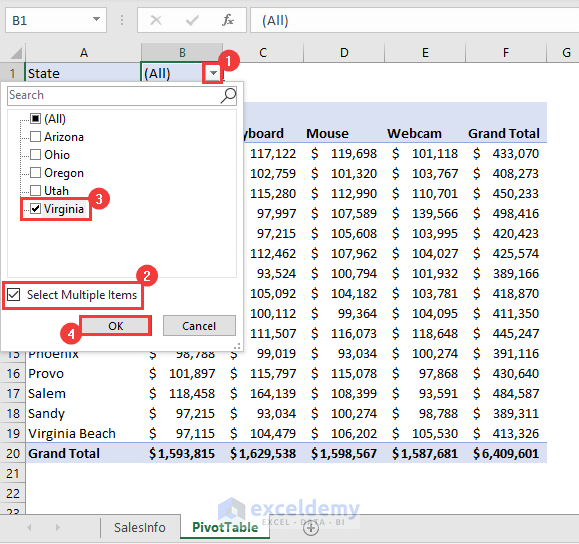
- To use the Filter, click on the drop-down icon beside State.
- Check the Select Multiple Items box.
- Select Virginia only.
- Click OK.
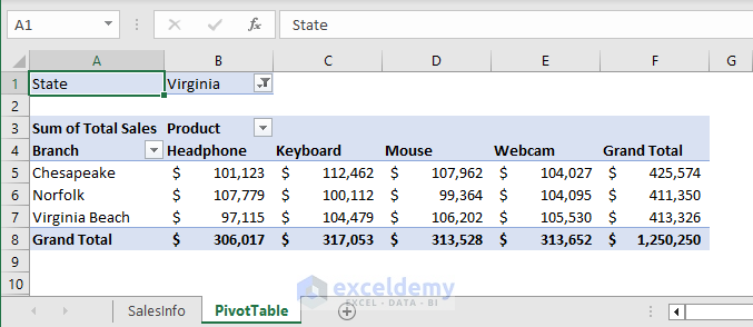
The sales info of Virginia state only are displayed.
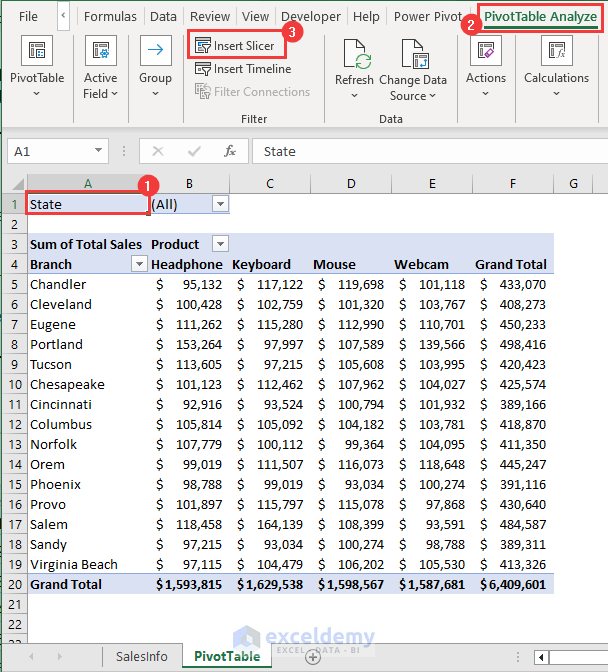
We can also insert Slicers in the report, which will make the report more dynamic and modifiable with just a few clicks.
- Select any cell inside the table.
- Go to the PivotTable Analyze tab.
- Click on Insert Slicer from the Filter group.
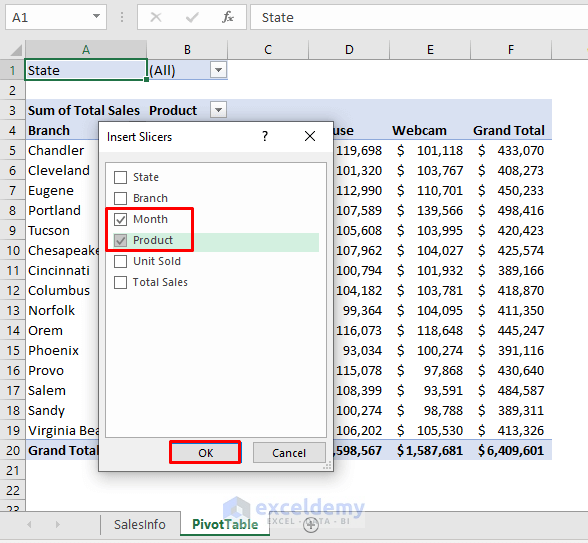
The Insert Slicers dialog box opens.
- Check the boxes of Month and Product.
- Click OK.
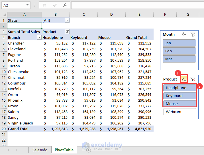
Two slicers are placed in the worksheet beside the Pivot Table.
In the Product slicer, click on the icon of Multi-Select. Alternatively, press ALT+S.
This enables us to select multiple items at a time.
- Select Headphone, Keyboard, and Mouse from the list.
Only the selected products are displayed in the pivot table.
Another beneficial tool is the PivotTable Timeline. Use this tool if you have dates in your data.
Step 6 – Showing Report Filter Pages
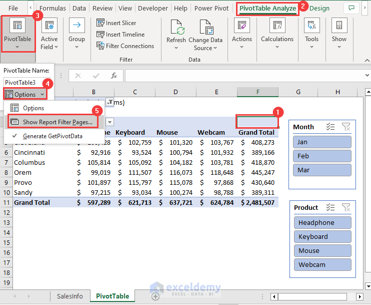
Suppose we want the filtered reports in separate worksheets. To do this:
- Go to PivotTable Analyze and click on the PivotTable drop-down.
- From the drop-down list, select Options >> Show Report Filter Pages.
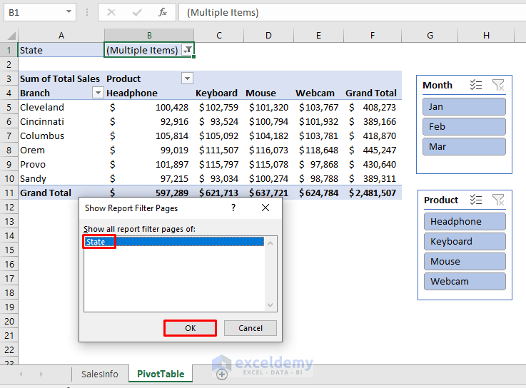
- In the Show Report Filter Pages dialog box, click OK.
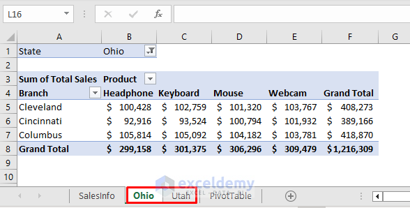
Two new worksheets named Ohio and Utah are created.
Step 7 – Inserting Pivot Chart
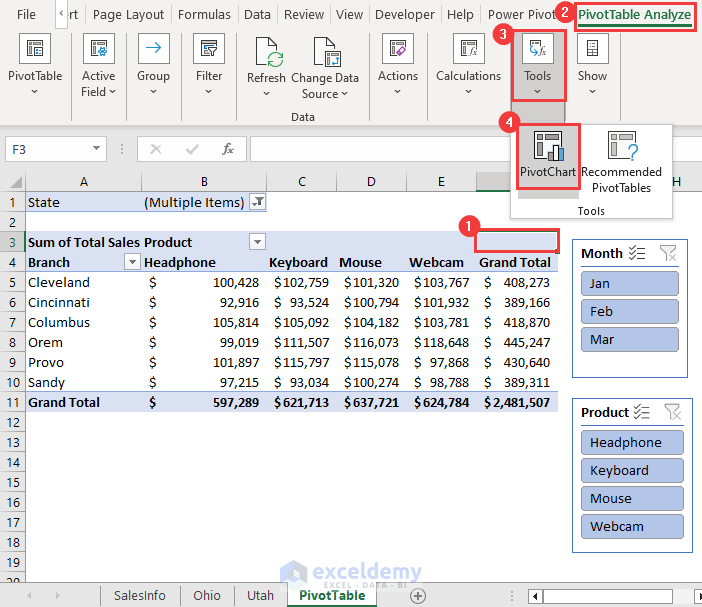
- Go to the PivotTable Analyze tab.
- Click on the Tools group drop-down.
- Select PivotChart.
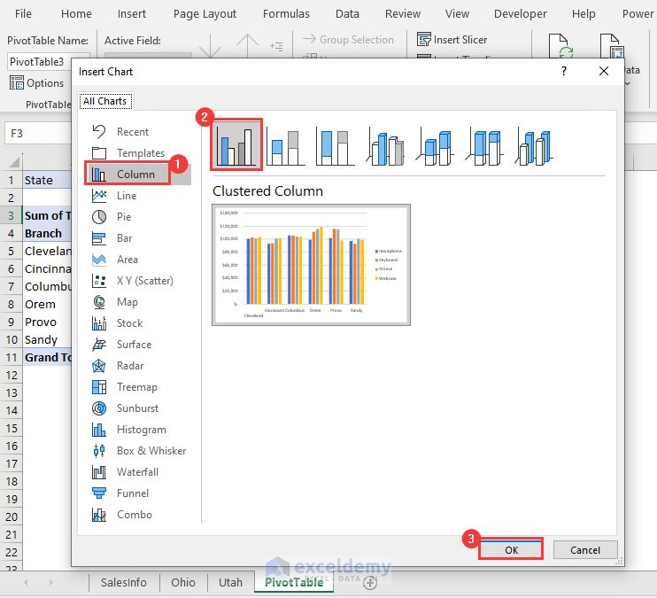
- In the Insert Chart dialog box, select Column from the All Charts list.
- Choose a 2-D Clustered Column from the options.
- Click OK.

Download Practice Workbook
Related Articles
- How to Insert A Pivot Table in Excel
- Creating a Pivot Table Automatically in Excel
- How to Create Pivot Table in Excel for Different Worksheets
- How Do I Create a Pivot Table from Multiple Worksheets
- How to Use Excel VBA to Create Pivot Table
- VBA Code to Create Pivot Table with Dynamic Range in Excel
- How to Use VBA to Create Pivot Table from Named Range in Excel
<< Go Back to How to Create Pivot Table in Excel | Pivot Table in Excel | Learn Excel
Get FREE Advanced Excel Exercises with Solutions!
