Method 1 – Utilizing Combo Chart
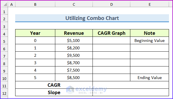
The sample dataset below contains the following known values.
Steps:
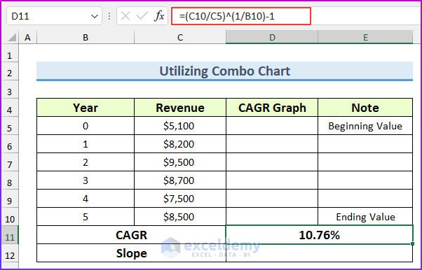
- Enter the following formula in cell D11 to get the CAGR value.
=(C10/C5)^(1/B10)-1
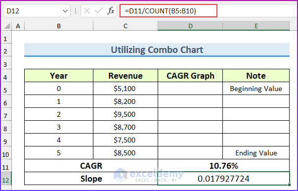
- Enter the following formula to get the slope value.
=D11/COUNT(B5:B10)
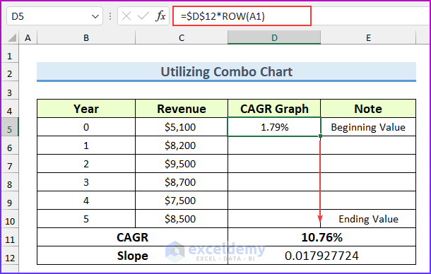
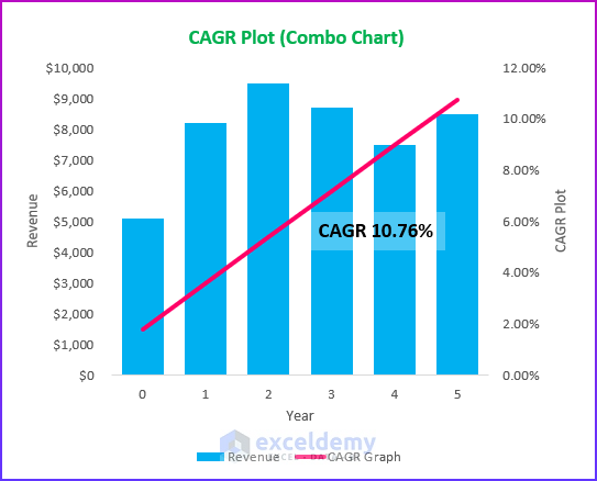
- Insert another formula to find the CAGR graph values. We will plot these values in the secondary axis in a line chart to create the CAGR graph. Fill the formula down.
=$D$12*ROW(A1)
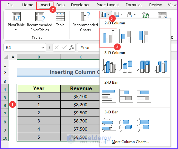
- Select the cell range B4:D10.
- From the Insert tab ➤ Insert Combo Chart ➤ select Clustered Column – Line.
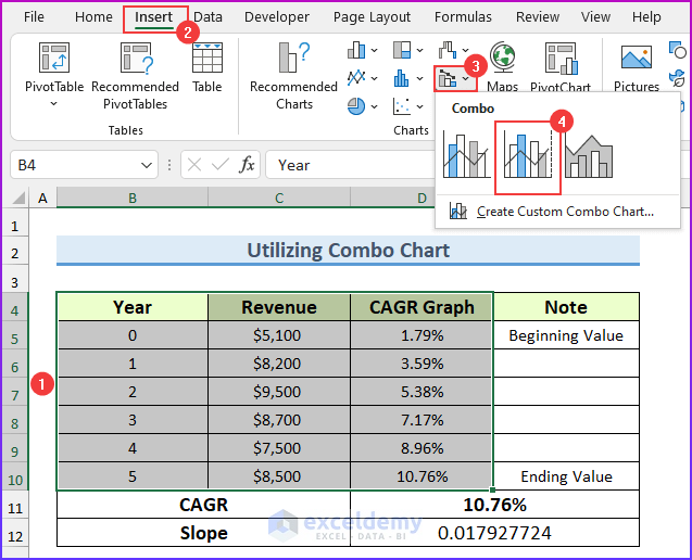
- A default combo chart will pop up.
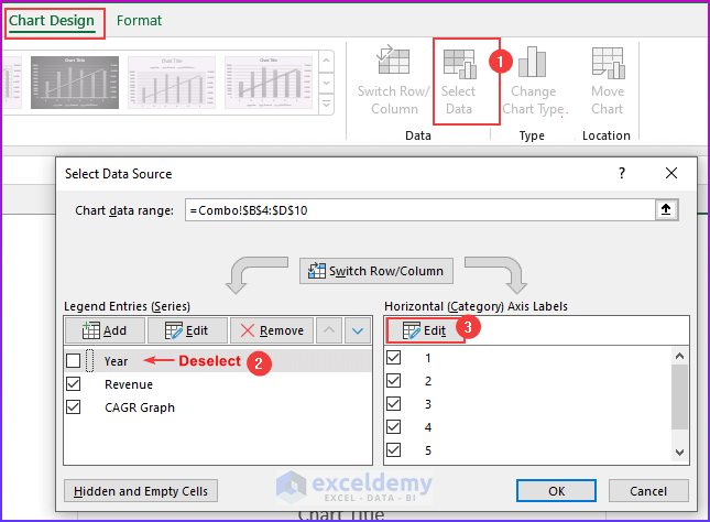
- Select the chart and from the Chart Design tab, click on “Select Data”.
- A dialog box will appear.
- Deselect “Year” and edit the horizontal axis labels.
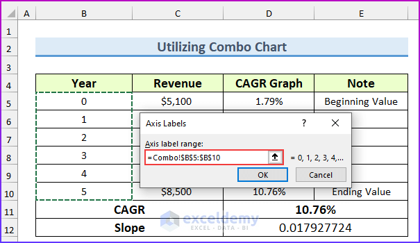
- Set the Axis Labels to the cell range B5:B10 and press OK.
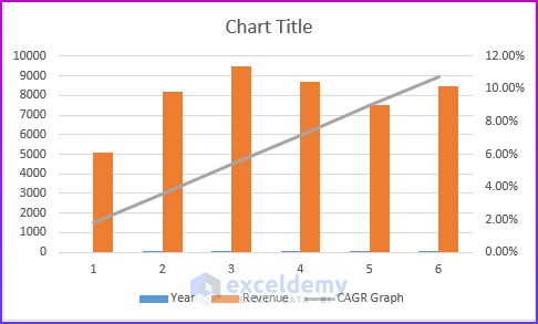
- The CAGR graph will be inserted.
Read More: Excel Formula to Calculate Average Annual Compound Growth Rate
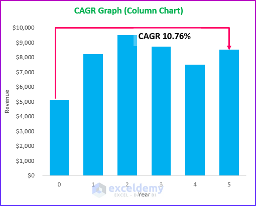
Method 2 – Inserting Column Chart to Plot CAGR Graph in Excel
Steps:
- Select the dataset range.
- From the Insert tab ➤ Insert Column or Bar Chart ➤ select Clustered Bar.
- A basic chart will appear.
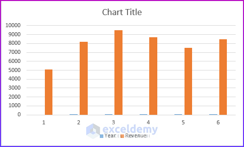
- You can change the chart properties to make it look better.
Read More: How to Calculate Future Value When CAGR Is Known in Excel
Download Practice Workbook
Related Articles
<< Go Back to Compound Interest in Excel | Excel for Finance | Learn Excel
Get FREE Advanced Excel Exercises with Solutions!
