Excel’s PivotTables is a favorite tool for summarizing and exploring data. They’re great for quick analysis, but as your needs grow, like sharing dynamic reports, handling bigger data, or creating visually impressive dashboards, you’ll start to feel their limits.
In this tutorial, we will show how Power BI visualizes Excel data with interactive charts beyond PivotTables.
Why Go Beyond PivotTables?
PivotTables are powerful, but they also have limitations that often hold people back:
- Static Views: You must manually update filters and layouts to see new perspectives.
- Limited Visuals: PivotTables offer only basic visualizations, such as tables and charts.
- Hard to Share: Sharing requires emailing files, and others can’t explore the data themselves.
- Performance Limits: Large datasets can cause Excel to slow down or crash.
Let’s consider a sample sales dataset to visualize it by using Power BI’s interactive charts. Make sure your data is in a well-structured table, with headers and no blank rows.
Connect Excel to Power BI
- Open Power BI Desktop.
- Go to the Home tab >> from Data >> select Excel Workbook.
- Browse and open your Excel file.

- The Navigator window will display all available tables and sheets:
- Select the Sales sheet.
- Preview the data in the right panel to ensure it looks correct.
- Click Load to import data directly.
- Or click Transform Data to open Power Query Editor (recommended for data cleaning).

Build Interactive Visualizations
Sales Trend Line Chart (Replacing PivotTable Line Charts)
Create the Visual:
- Select Line Chart from the Visualizations pane.
- Drag Date to the X-axis.
- Drag Sales Amount to the Y-axis.
- Add Category to Legend.

Interactive Features:
- Hover tooltips: Show exact values and dates.

- Zoom: Mouse wheel to focus on specific months.

- Legend filtering: Click Electronics to show only that category.

- Cross-filtering: Will filter other charts when you click data points.
- Drill-through: Explore the hierarchy through drill-through.

PivotTable Comparison: Unlike static PivotTable charts, users can now dynamically explore different periods and categories.
Regional Performance Bar Chart
Create the Visual:
- Select Clustered Column Chart from the Visualizations pane.
- Drag the Region to the X-axis.
- Drag Sales Amount to the Y-axis.
- Add Category to Legend.

Enhanced Interactivity:
- Click on the North bar to filter all other visuals to the North region.
- Hover to see exact sales figures.
- Right-click for drill-through options.

Product Performance Scatter Plot
Create the Visual:
- Select Scatter Chart from the Visualizations pane.
- Drag Sales Amount to the Values.
- Drag Quantity to Y-axis.
- Add Product to Legend.
- Add Category to Play Axis.

Advanced Features:
- Animation: Use Play Axis to show changes over time.
- Quadrant analysis: Products in the top-right are high-value, high-volume.

Easily identify which products generate high revenue with low volume (premium items) vs. high volume with lower revenue (commodity items).
Salesperson Performance Matrix
Create the Visual:
- Select Matrix visualization.
- Drag Salesperson to Rows.
- Drag Category to Columns.
- Drag Sales Amount to Values.

Add Conditional Formatting:
- Right-click on the Values field >> select Conditional formatting >> select Background color.

- Set color scale from red (Minimum), yellow (Center) to green (Maximum).
- Click OK.

- Matrix table with formatting.

Creating a Cross-Filtering Dashboard
Add Interactive Slicers
Date Range Slicer:
- Add the Slicer visual from the Visualizations pane.
- Drag Date to Field.

Category Filter:
- Add another Slicer.
- Drag Category to Field.
- Use a dropdown or list style.

Test Interactivity
Try these interactions:
- Click Accessories in the category slicer.
- Select date range from 1/5/2022 to 4/3/2022.
- Click Sarah Wilson in the salesperson matrix.
- All the visuals are updated dynamically.

Advanced Analytics Features
Add Trend Line
- Select your Line chart.
- Go to the Analytics pane.
- Add available trend lines.

Create Custom DAX Measures
- Right-click on the Data field>> select New Measure.

Total Sales:
Total Sales = SUM(Sales[Sales Amount])
Average Order Value:
Average Order Value = DIVIDE([Total Sales], SUM(Sales[Quantity]))
YTD Sales:
YTD Sales = TOTALYTD([Total Sales], Sales[Date])

Add KPI Cards
- Select the Card from the Visualizations pane.
- Drag Total Sales to the Field.
- Drag Average Order Value to the Field.
- Drag Sales Growth to the Field.

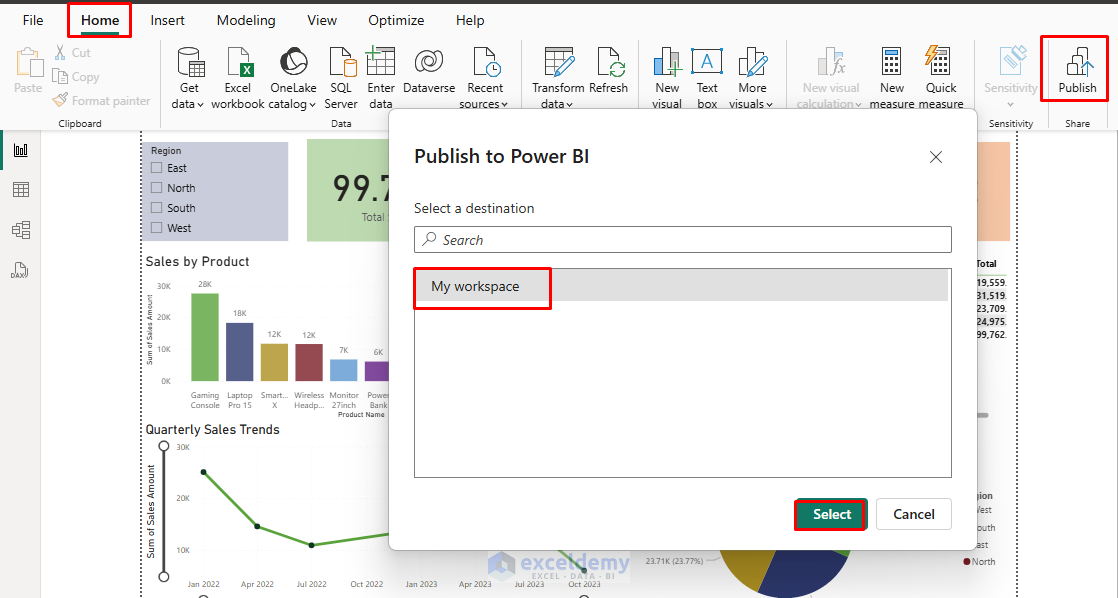
Publish and Share Report
- Go to the Home tab >> click Publish.
- Sign in to your Power BI account.
- Select workspace destination.
- Share with colleagues via the Power BI service.
Conclusion
Power BI transforms static Excel data into dynamic, interactive visualizations that provide deeper insights than traditional PivotTables. By following this tutorial, you can learn to create dynamic data visualizations that engage users and drive better decision-making. The transition from PivotTables to Power BI isn’t just about better charts; it’s about empowering users to explore data and discover insights independently.
Get FREE Advanced Excel Exercises with Solutions!

Mam, please share data file for better practice.
Hell Usman,
I am attaching the sample practice file. Download it from here:
Sample Excel File
By following the tutorials steps, upload it in Power BI then use interactive charts to visualize data.
Regards
ExcelDemy