
Survey data often contains a large number of responses, which can be overwhelming when you’re dealing with hundreds or thousands of rows. Instead of manually counting responses or creating static tables, use PivotTables and PivotCharts in Excel. They allow you to quickly categorize answers, calculate frequencies, and visualize key trends.
In this tutorial, we show how to analyze survey data with PivotTables and PivotCharts in Excel.
Survey data almost always comes in rows of individual responses with several categorical fields like Age Group, Region, or a 1–5 Satisfaction rating, and the columns capture demographic and feedback details.
Part 1: Insert PivotTable To Analyze Survey Data
PivotTables allow you to group and summarize data without altering the original dataset.
Insert PivotTable
- Select the entire dataset
- Go to the Insert tab >> select PivotTable
- Place the PivotTable on a New Worksheet
- Click OK

1. Categorize Answers (Responses)
Let’s find how many respondents fall in each Satisfaction level.
- From the PivotTable Fields list:
- Drag Satisfaction into Rows
- Drag RespondentID into Values and change to Count
- Right-click >> select Value Field Settings >> select Count
- Rename RespondentID to Responses
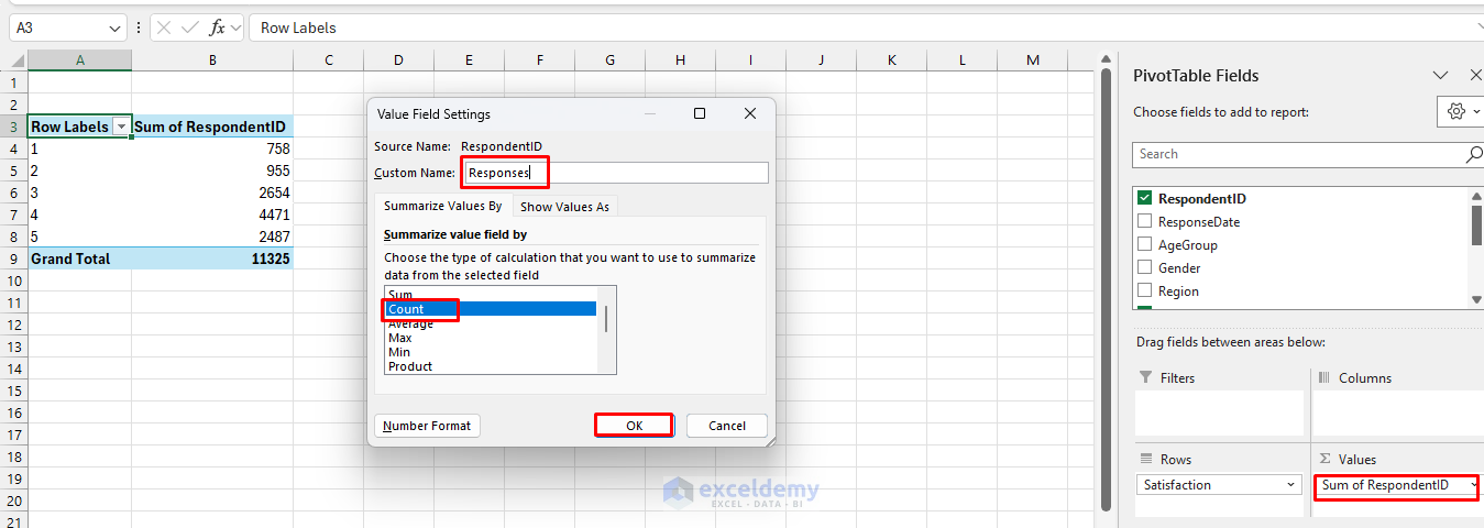
- Add RespondentID to Values again
- Right-click >> select Show Values As >> select % of Grand Total
- Rename as % of Responses

- Sort Satisfaction 1→5 if needed
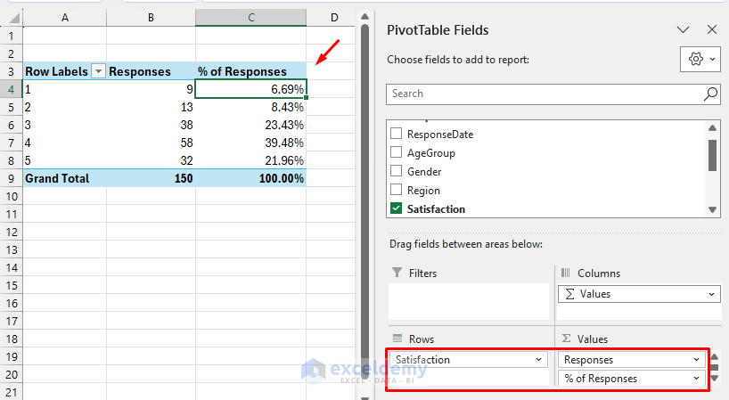
Now you have a frequency table of responses by satisfaction category. Most respondents rated 4 or 5, showing overall positive satisfaction.
2. Cross-Tabulate Responses By Age Group
Analyze Satisfaction by Age Group.
- Create another PivotTable
- From the PivotTable Fields list:
- Drag Age Group to Columns
- Drag Satisfaction to Rows
- Drag RespondentID (Count) to Values

- Right-click any number in the Values area
- Select Show Values As >> select % of Column Total

A PivotTable creates a cross-tab view showing how Satisfaction levels vary across different age groups. The 25–34 group shows the highest Satisfaction ratings overall.

3. Compare Regions With A Cross-Tab
Analyze data by Region.
- Create another PivotTable
- From the PivotTable Fields list:
- Drag Region to Filters
- Drag Satisfaction to Rows
- Drag RespondentID (Count) to Values
- Add a second RespondentID (Count) to Values
- Right-click any number in the Values area
- Select Show Values As >> select % of Column Total

- Select a Region in Filters
- Click OK

- The PivotTable filters to show the East region’s responses

4. Analyze Recommendation Behavior
Calculate how many respondents said Yes to recommending.
- Create another PivotTable
- From the PivotTable Fields list:
- Drag Recommend to Rows
- Drag RespondentID to Values and change to Count

- Add a second RespondentID (Count) to Values
- Right-click any number in the Values area
- Select Show Values As >> select % of Grand Total
- Rename the fields

The PivotTable shows that 75% of respondents recommend the product.
5. Compare Favorite Features
Which feature is most valued?
- Create another PivotTable
- From the PivotTable Fields list:
- Drag FavoriteFeature to Rows
- Drag RespondentID to Values (Count)

This shows that Ease of Use is the most important feature.
Part 2: Visualize Trends With PivotCharts
PivotCharts make your insights visual. Create PivotCharts from your PivotTables.
Insert PivotChart
- Select a PivotTable
- Go to the Insert or PivotTable Analyze tab >> select PivotChart

Satisfaction By Responses
- Go to the Insert or PivotTable Analyze tab >> select PivotChart
- Select a Clustered Column chart

Younger age groups (18–24, 25–34) show higher positive responses.
Satisfaction By Region
- Go to the Insert or PivotTable Analyze tab >> select PivotChart
- Select a Bar chart
- Use Filters to drill down (for example, Satisfaction in a specific Region)

- Visualize total responses by Region

Favorite Features Distribution
- Go to the Insert or PivotTable Analyze tab >> select PivotChart
- Select a Pie chart

Ease of Use dominates as the top feature.
Trend Responses Over Time
- Create a new PivotTable:
- Drag ResponseDate to Rows
- Drag RespondentID (Count) to Values
- Insert a Line chart for response volume over time

- Create a Timeline filter using ResponseDate to see how Satisfaction changes over time
- Go to the PivotTable Analyze tab >> select Insert Timeline
- Select ResponseDate
- Click OK

Conclusion
You can analyze survey data effectively with PivotTables and PivotCharts in Excel. By following the steps above, you can transform raw survey data into clear insights. Quickly change PivotTable fields and refresh PivotCharts to explore different trends without rewriting formulas. This approach helps businesses and researchers identify trends, preferences, and areas for improvement.
Instead of manual counting or static formulas, PivotTables provide dynamic, flexible analysis, while PivotCharts offer visual clarity.
Get FREE Advanced Excel Exercises with Solutions!

It is extreme learning.
Hello Mohammad Afzal,
Thank you for your feedback! Yes, survey data analysis with Pivot Tables can feel intense at first, but once the core concepts are clear, it becomes much more manageable and very powerful for real-world analysis.
Regards,
ExcelDemy