
Image by Editor
Power BI is a powerful tool for data visualization, offering advanced features to analyze and interact with data in meaningful ways. It can create dynamic, user-friendly reports through advanced filtering and interactivity.
In this tutorial, we’ll explore how to use advanced filtering, slicers, and drill-down techniques to enhance your Power BI reports and dashboards.
Let’s use a sample sales dataset to explore advanced filtering, slicers, and drill-down techniques.
Load the Dataset into Power BI
- Open Power BI Desktop.
- Go to the Home tab >> select Get Data.
- Choose your data source (Excel, SQL Database, CSV files, etc.)
- Navigate to your files and select them.
- Preview the data and load it into Power BI.
Advanced Filtering in Power BI
Power BI provides three filter scopes, each serving different levels of report control.
Filter Hierarchy in Power BI:
- Visual-Level Filters: These filters apply only to the selected visual. You can use them to narrow down data without affecting other visuals.
- Page-Level Filters: These filters apply to all visuals on a report page.
- Report-Level Filters: These filters apply across all pages in the entire report.

Basic vs. Advanced Filters:
- Basic filtering allows selection of one or more values in a column.
- Advanced filtering lets you define logical conditions (e.g., is greater than, contains).
Advanced Filter Types
Advanced filters let you define conditions such as text, number, date, and top n.

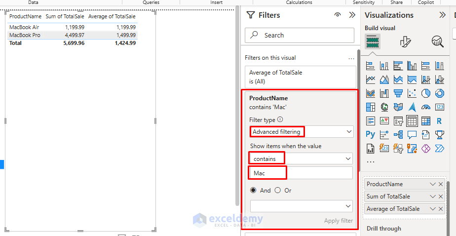
1. Advanced Text Filtering
Advanced text filtering filters data based on specific text. Let’s find all products in a specific category.
- Create a table showing product performance.
- Add ProductName to the filters section.
- In Filter type: choose Advanced filtering.
- Set the condition to contains >> enter Mac.
- Click Apply filter.
This filter will only show Apple Mac products (MacBook Pro and MacBook Air).
2. Relative Date Filtering
Let’s create a line chart showing sales trends over time and apply a relative date filter.
- Select a Line chart from the Visualization pane.:
- Y-axis: Date
- X-axis: TotalSale
- Select the visual and open the Filter pane.
- Drag Date to the filters section.
- In Filter type: select Relative date filtering.
- Select is in the last >> enter 30 >> select days.
- Click Apply filter.
This allows your sales team to see the most recent month of data without manually updating filters.

3. Top N Filtering
You can filter top values by using the Top N filtering. Let’s identify best-selling products.
- Select a Bar chart from the Visualization pane.
- Y-axis: ProductName
- X-axis: TotalSale
- Select the visual and open the Filter pane.
- Add ProductName to the filters section.
- In Filter type: select Top N filtering.
- Set show items >> select Top >> enter number 10.
- In By value: add TotalSale as the value to rank by.
- Click Apply filter.
This will highlight the top 10 selling products.

Advanced Slicer Techniques
Slicers act as visual filters on a report page and allow users to filter the report easily.
- Select Format your visual from the Visualizations pane.
- Slicer types:
- List/Dropdown: Select one or more values.
- Date/Range: Use for selecting between dates.
- Between: For numeric ranges.
- Hierarchical: Drill into multi-level categories (e.g., Continent → Country → City).
Tip: Use the formatting pane to enable single selection, search, and selection controls for a better experience.
1. Numeric Range Slicers
You can filter numbers based on ranges by using numerical range slicers. Let’s create a price range slicer.
- Add Price as a slicer in the report.
- Power BI automatically creates numeric range slicers, or you can select Between from Format your visual.

- You can now adjust the minimum and maximum price values.
- This slicer will filter products between specific price points, such as $200-$1500.

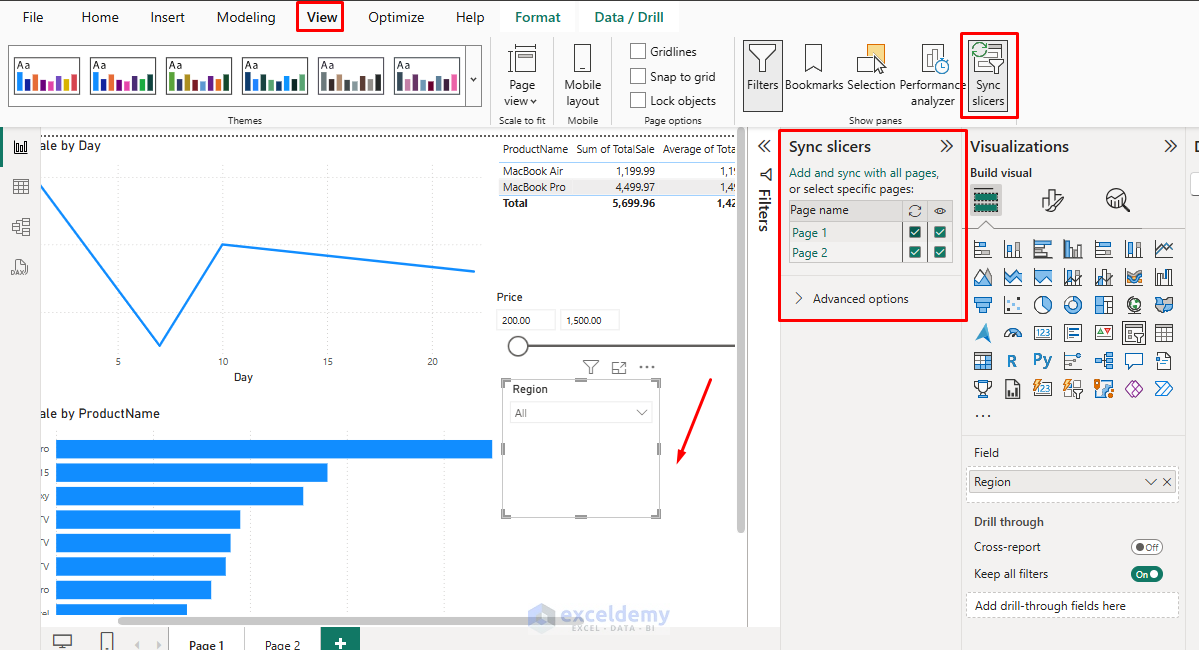
2. Sync Slicers Across Pages
Power BI allows you to synchronize a slicer across multiple report pages.
- Create a dropdown slicer for Region.
- Click the slicer visual.
- Go to the View tab >> select Sync slicers.
- Select the Region slicer.
- Check the pages where you want the same region to filter to apply.
This ensures that when someone selects North America on one page, all synced pages will also filter to North American data.
3. Custom Slicer Formatting
You can customize slicers by using options, style, types, etc. Let’s create a visually appealing category filter and customize it.
- Add Category as a slicer.
- Go to Format your visual.
- Select Selection >> turn on the Show ‘Select All’ option.
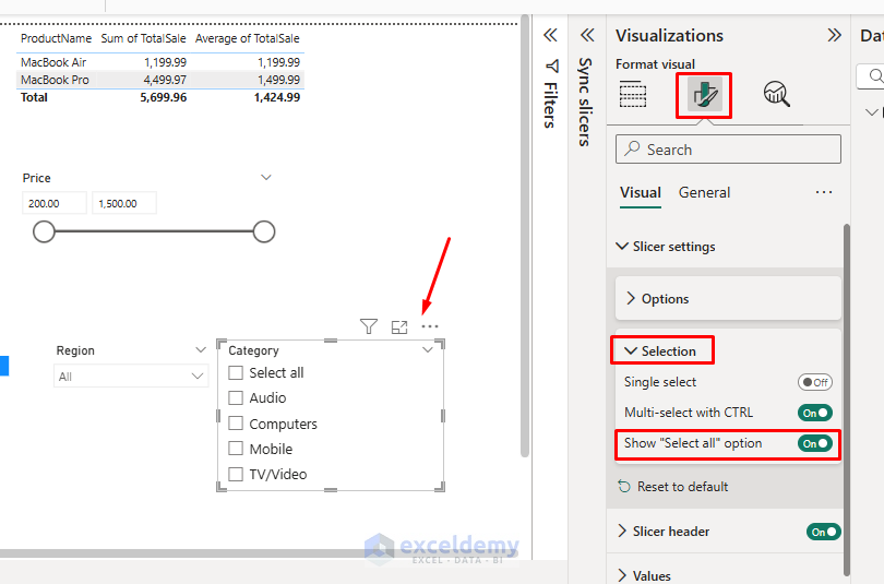
- Select Options >> under Style >> select Tile layout.

- Select Background >> apply custom colors for each category.

- Add Title text Product Category, and format it.
- This transforms a simple dropdown into an intuitive, visual filtering experience.

4. Hierarchy Slicers
For drilling through product categories:
- Select Slicer from the Visualization pane.
- Add the following fields in order:
- Category
- Subcategory
- ProductName
- You can expand/collapse levels.
- You can start with Audio, expand to see Earbuds, Headphones, and Speakers, then expand them to see specific models.

5. Date Hierarchy Slicer
For flexible time-based filtering, you can use the date hierarchy slicer.
- Select Slicer from the Visualization pane.
- Add the Date data fields.
- Create a date hierarchy from the Date field (Power BI often creates this automatically).
- Year
- Quarter
- Month
- Day
- Or, expand/right-click date field >> select Date Hierarchy.
- You can select specific years, months, or days.

6. Create Slicer Panels
You can use slicer panels to clean up your report interface. Let’s place slicers in a group.
- Select all Slicers.
- Right-click >> select Group >> select Group.
- Create bookmarks for when the slicer panel is shown and hidden.
- Use buttons to toggle between those states using bookmark actions.

Drill-Down, Drill-Up, and Drill-Through
1. Standard Drill-Down/Drill-Up
Let’s explore standard drill options.
- Select Column chart from Visualizations.
- X-axis: Category → Subcategory → Product (adding them in this order creates a hierarchy).
- Y-axis: TotalSale
- Enable the drill-down button in the top right corner of the visual.
- You can click on the icons to drill down and see sales by subcategories.
- You can use these options:
- ↑ – Drill Up: Move one level up in the hierarchy.
- ↓ – Drill Down: Enable drill down to go one level deeper by clicking.
- ⇅ – Go to Next Level: Go one level down in the hierarchy across all values.
- ⇵ – Expand All Down One Level: Show data for all items across levels at once.

- Explore drill-down options.

2. Drill-Through
Create a detailed product analysis page.
- Create a Summary page showing sales by category and product table.
- Create a detailed page focused on individual product performance.
- Add visuals to the detail page:
- Product sales over time (line chart).
- Sales by store (bar chart).
- Sales by region (donut chart).
- On the detail page, add Product as a drill-through filter.

Test the Drill-Through Feature:
- Go to your Summary page.
- Right-click on a specific product (e.g., AirPods) in the table or chart.
- Click on Drill through >> select Product Details.

Power BI will:
- Navigate to the Product Details page.
- Automatically apply a filter where ProductName = AirPods.
- All visuals on this page now show only data for AirPods.

Advanced Filter Context Manipulation with DAX
For advanced filtering needs, create calculated tables or measures using DAX.
- Go to the Modeling tab in the ribbon.
- Click New measure.
- In the formula bar, enter the following DAX formulas.
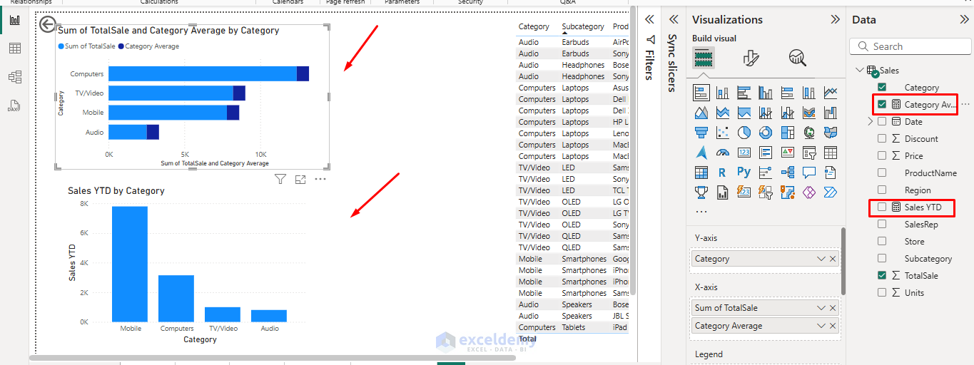
1. Dynamic Year-to-Date Calculations
Sales YTD =
TOTALYTD(SUM('Sales'[TotalSale]), Sales[Date])
This measure shows year-to-date sales and automatically adjusts based on date filters.
2. All Categories Average Regardless of Current Filter
Category Average =
CALCULATE(
	AVERAGE(Sales[TotalSale]),
	ALL(Sales[Category])
)
This filter’s categories average sales.
Best Practices
- Limit filters to visuals where necessary to avoid confusion.
- Name drill-through pages clearly (e.g., Details by Category).
- Test slicer syncs to ensure consistency.
- Use default filters in bookmarks for guided storytelling.
Conclusion
Mastering advanced filtering, slicers, and drill-down in Power BI will help you transform static dashboards into dynamic, interactive dashboards. Whether building dashboards for business leaders or detailed analysis for team reports, these techniques give users control and insight at multiple levels. By following the above techniques and steps, you can create more interactive and insightful Power BI reports that allow users to explore data more effectively.
Get FREE Advanced Excel Exercises with Solutions!
