Most people imagine Excel dashboards as a collection of bar charts, pivot tables, and slicers sitting in a grid. With the right techniques, you can transform them into sleek, modern designs that look nothing like traditional spreadsheets.
In this tutorial, we show 7 ways to make Excel dashboards that don’t look like Excel dashboards — dashboards that feel like apps or professional BI tools, all inside Excel.
1. Master The Art Of Whitespace And Clean Layout
Most Excel dashboards suffer from information overload. Every inch of space is filled with data, charts, and tables, creating a cluttered interface that’s hard to navigate.
Modern dashboard design follows the principle of “less is more”.
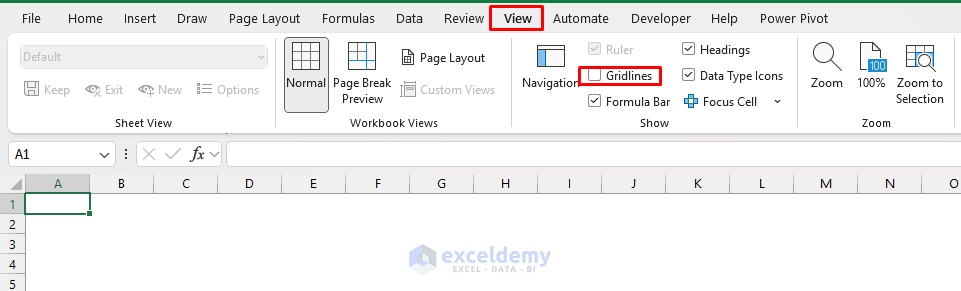
Remove Gridlines Completely:
- Go to the View tab >> uncheck Gridlines
- For individual ranges:
- Select cells
- Go to the Home tab >> select Borders dropdown >> select No Border
Create Strategic Whitespace:
- Leave at least 2–3 empty columns between different sections
- Use empty rows to separate content vertically
- Don’t fill every available cell just because you can
Implement The 60–30–10 Rule
- 60% white/neutral space
- 30% primary content (charts, key metrics)
- 10% accent elements (highlights, callouts)
2. Adopt A Consistent & Professional Color Palette
Excel’s default blue headers, standard chart colors, and basic formatting immediately identify your work as a spreadsheet rather than a professional dashboard. Random colors across charts feel cluttered.
Create A Cohesive Color Scheme:
- Choose a primary palette (3–4 colors maximum)
- Use tools like Coolors or Adobe Color to generate harmonious palettes
- Consider your brand colors if applicable
- Ensure sufficient contrast for accessibility
Recommended Professional Palettes:
- Corporate Blue: #1f4e79, #70ad47, #ffc000, #c5504b
- Modern Minimalist: #2c3e50, #3498db, #95a5a6, #e74c3c
- Sophisticated Neutral: #34495e, #16a085, #f39c12, #8e44ad
Implementation Strategy:
- Create a custom theme:
- Go to the Page Layout tab >> select Colors >> select Customize Colors
- Apply colors consistently across all elements
- Use the 60–30–10 rule for color distribution
- Reserve bright colors for highlighting important data points
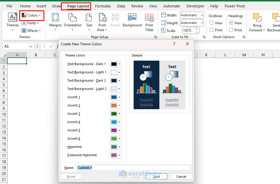
Chart Color Best Practices:
- Use different shades of the same color for related data series
- Apply the darkest shade to the most important data
- Use neutral colors (grays) for less important comparison data
3. Use Modern Fonts And Titles
Default Excel fonts can feel “old-school”. Typography can instantly elevate your dashboard from amateur to professional. The right fonts convey authority, improve readability, and create visual hierarchy.
For Headers And Titles:
- Calibri Light (built into Office)
- Segoe UI Light
- Avenir Next (if available)
- Google Fonts imported via PowerPoint
- Sizes:
- 18–24 pt for main titles, 14–16 pt for section headers

For Body Text And Data:
- Calibri Regular
- Segoe UI Regular
- Consolas (for numbers and data tables)
- Sizes:
- 10–12 pt for regular text, 8–10 pt for detailed data

Advanced Typography Techniques:
- Use cell formatting to create consistent spacing
- Align text strategically (left for readability, center for headers)
- Adjust row heights to create comfortable line spacing
- Create bold section headers with smaller sub-labels
- Align elements consistently; left-aligned titles and centered numbers work well
A simple typography update can make your dashboard feel like a web app.
4. Turn KPIs Into Cards With Big Numbers
Tables of numbers are overwhelming. Replace raw values in cells with cards that use soft backgrounds, bold numbers, and tiny trend lines.
Highlight Key Performance Indicators (KPIs) in bold “info cards”.
Insert Shapes:
- Draw rectangular shapes to hold your charts or KPIs.
- Go to the Insert tab >> select Illustrations >> select Shapes >> select Rectangles

- Add rounded corners for a polished look
- Link the shape’s text box to a formula cell
- Apply a bold font and a contrasting color

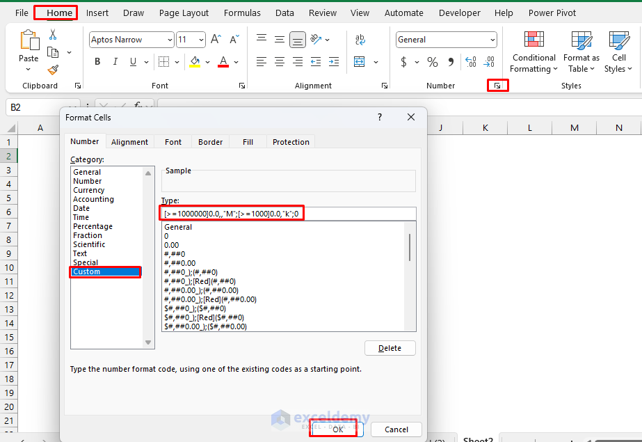
Format Large Numbers:
- Format the number with an app-style scale
- Right-click >> select Format Cells >> select Custom
- Insert formatting to show numbers using K, M, etc.
- This shows 1,234,567 as 1.2M and 12,300 as 12.3k
A few well-placed KPI cards make your dashboard clean and focused. Cards are the universal visual language of modern dashboards (mobile apps, SaaS admin pages) and they immediately hide “Excel-ness”.
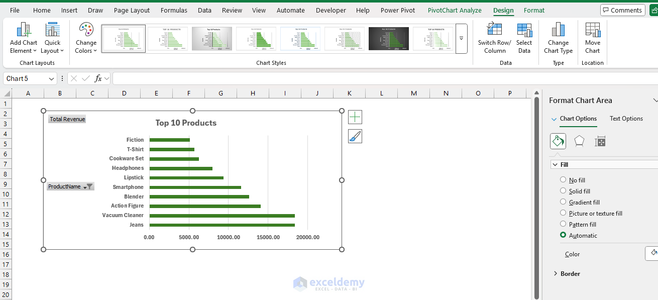
5. Make Your Charts Look Like UI Components
Default Excel charts are functional but aesthetically outdated. Modern dashboard charts are clean, focused, and visually appealing. Ditch the default Excel chart look and aim for “component” styling.
Remove Chart Clutter:
- Delete unnecessary gridlines (keep only major horizontal lines)
- Remove chart borders
- Eliminate 3D effects entirely
- Simplify axis labels
- Remove legends when data is self-explanatory
Enhance Visual Appeal:
- Use subtle shadows instead of borders
- Apply consistent color schemes; use your Theme colors for series fills and lines
- Highlight data points that represent key insights
- Add custom data labels that tell a story
Chart Type Recommendations:
- For KPIs And Metrics:
- Create custom gauge charts using doughnut charts
- Build speedometer-style indicators
- Design traffic-light status indicators
- For Trends:
- Clean line charts with minimal gridlines
- Prefer column-and-dot charts or lines with markers for trends
- Use area charts with transparency for overlapping data
- Embed sparklines within data tables
- For Comparisons:
- Horizontal bar charts (easier to read labels); use them for ranking
- Clustered column charts with strategic spacing
- Waterfall charts for change analysis
Flat, minimal charts feel like modern components, not legacy chart objects.
6. Add Interactive Elements That Engage Users
Interactive elements transform a dashboard from a static report into an engaging analytical tool.
Dynamic Filters And Slicers:
- Create dropdown menus using Data Validation
- Implement slicers for PivotTables and charts
- Use form controls (buttons, scroll bars) for parameter adjustment
Conditional Formatting For Visual Cues:
- Color-code performance metrics automatically
- Create data bars and icon sets that update with data
- Implement heat maps for quick pattern recognition
Hover Effects And Tooltips:
- Use comment boxes for additional context
- Create hyperlinks between dashboard sections
- Implement show/hide functionality with buttons
Interactive Chart Techniques:
- Drill-Down Capabilities: Link summary charts to detailed views
- Dynamic Date Ranges: Allow users to select time periods
- Comparison Modes: Toggle between different data sets or metrics
7. Use Professional Layout And Navigation
A professional dashboard guides users through information logically and intuitively. Apply proven layout principles.
The F-Pattern Layout:
- Place the most important information in the top-left
- Create horizontal scanning areas for key metrics
- Use vertical flow for detailed information
Grid-Based Design:
Web dashboards sit on grid systems; mirror this approach in Excel.
- Set a 12-column layout by adjusting column widths (for example, thin gutters on the sides, equal content columns)
- Hide gridlines and view at 110–120% zoom for a crisp canvas
- Place cards and charts to span 3, 4, 6, or 12 columns
- Align all elements to grid points
- Maintain consistent margins and padding
- Use the rule of thirds for element placement
Interactive Navigation Menus:
Users often scroll through endless sheets. Add a navigation menu like an app sidebar.
- Insert a vertical rectangle along the left side
- Add text or icons like “Sales,” “Finance,” “HR”
- Use hyperlinks (Ctrl + K) to jump to dashboard sections
- Apply contrasting background colors for the sidebar
Multi-Tab Dashboards:
- Rename worksheet tabs with clear, descriptive names
- Color-code tabs by functional area
- Create a main “Overview” tab that links to details
- Use consistent navigation elements across tabs
Now your Excel dashboard feels like a web app with tabs.
Additional Tips
Use Sparklines Instead Of Mini-Charts: Place sparklines inside cells to show trends and avoid cluttering the canvas with too many charts.
- Go to the Insert tab >> select Sparklines
- Choose Line, Column, or Win/Loss
- Place them next to KPI values
Replace Slicers With Icon Buttons: Slicers are useful but bulky. Create icon-based buttons for filtering.
- Insert icons (Excel 365)
- Go to Insert >> select Icons
- A shopping-cart icon filters by “Retail,” a factory icon filters by “Manufacturing”
- Assign each icon a macro or link it to a filter cell using formulas
- Use hover or color changes to give a clickable feel
Separate Source And Dashboard: Modern dashboards have a data layer and a presentation layer. When the UI and data are separated, the dashboard feels like software and is easier to maintain and restyle later.
Conclusion
These 7 techniques will help you build Excel dashboards that don’t look like Excel dashboards. They can transform obvious spreadsheets into professional, engaging data-visualization tools. Approach dashboard design like a web or UX professional would — prioritize user experience, visual hierarchy, and clean aesthetics over showing every possible data point.
Great dashboard design is iterative. Start with these principles, gather user feedback, and refine continuously.
Get FREE Advanced Excel Exercises with Solutions!
