
Excel is a powerful platform for visual storytelling. The key to transforming spreadsheets into compelling narratives lies in strategic visualization techniques that guide your audience through insights naturally. It helps to communicate insights clearly and drive impactful decision-making.
In this tutorial, we will show 7 Excel techniques that turn data into compelling visual stories.
1. Conditional Formatting for Instant Insights
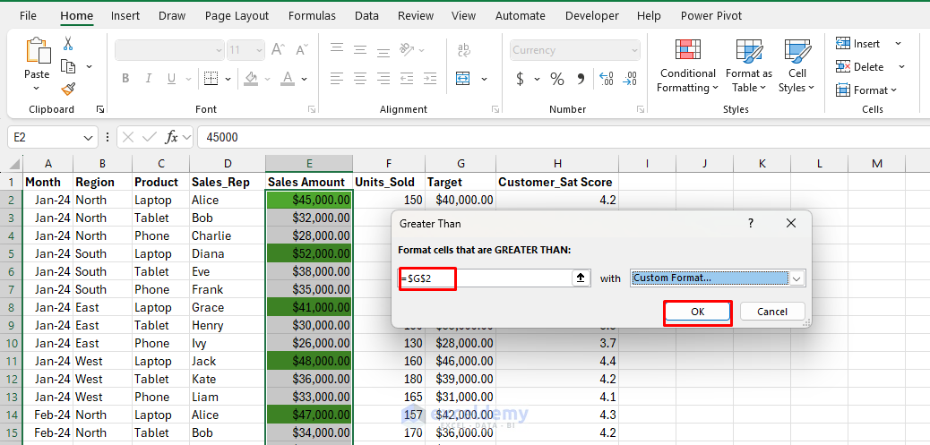
Conditional formatting visually distinguishes data through colors and icons based on specified conditions. This instantly highlights key metrics or anomalies.
Let’s instantly identify if the sales target is greater than that or not.
Steps:
- Select your data range (e.g., Sales Amount).
- Go to the Home tab >> select Conditional Formatting >> select Highlight Cell Rules >> select Greater Than.
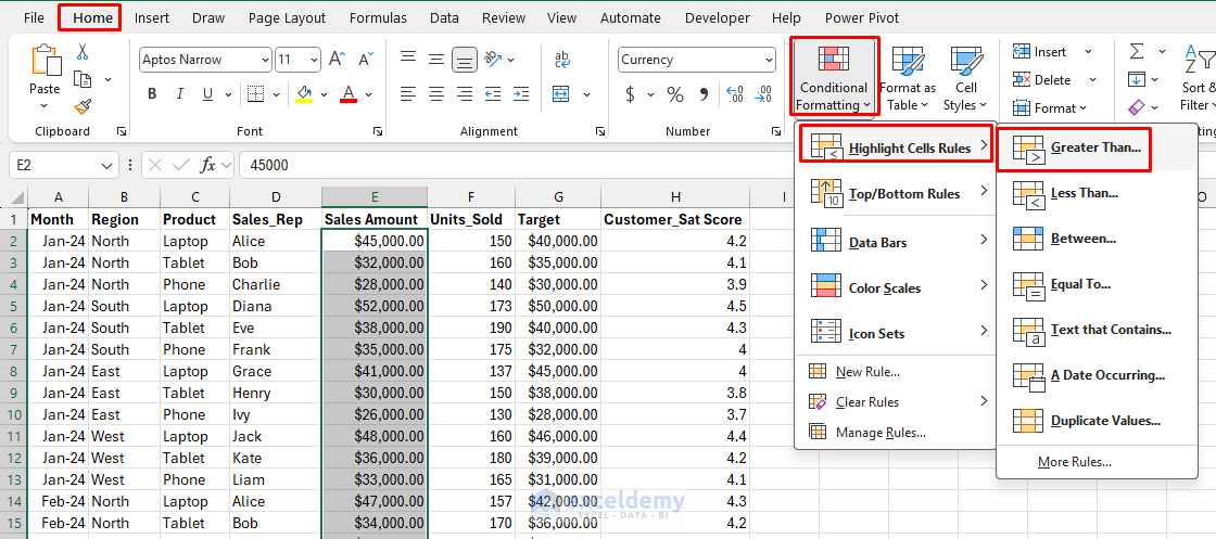
- In the Greater Than box;
- Select the Target cell (e.g., G2).
- Choose the preferred fill color (e.g., green).
- Click OK.
2. Sparklines for Micro Visualizations
Sparklines are small, intense charts embedded in individual cells, ideal for displaying trends alongside data.
Display monthly sales trends per product directly next to your sales numbers.
Steps:
- Click an empty cell next to your data.
- Go to Insert tab >> from Sparklines >> choose Line.
- In the Create Sparklines;
- Enter the Data Range: (e.g., B2:C2).
- Select the Location Range: (e.g., D2:D13).
- Click OK.

- Customize with markers, colors, and axis settings.

Advanced Storytelling Uses:
- Progress Tracking: Show individual employee performance trends over time.
- Comparative Analysis: Place sparklines next to names or categories for instant comparison.
- Seasonal Patterns: Reveal cyclical trends that might be hidden in large datasets.
3. PivotCharts for Dynamic Storytelling
Pivot charts transform large datasets into clear, interactive visual summaries that viewers can easily interpret.
You can easily visualize sales trends by region.
Steps:
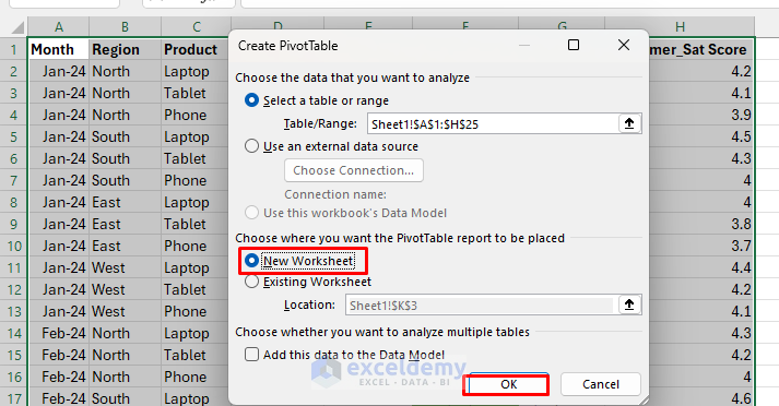
- Select your dataset.
- Go to Insert tab >> select PivotChart >> select PivotChart & PivotTable.
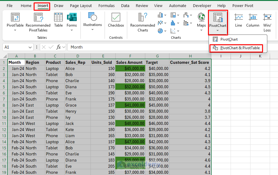
- Select location New Worksheet.
- Click OK.
- Drag fields into the axis, legend, and values boxes.
- Region in Axis.
- Sales in Values.
- Customize chart type (bar, column, line, etc.).

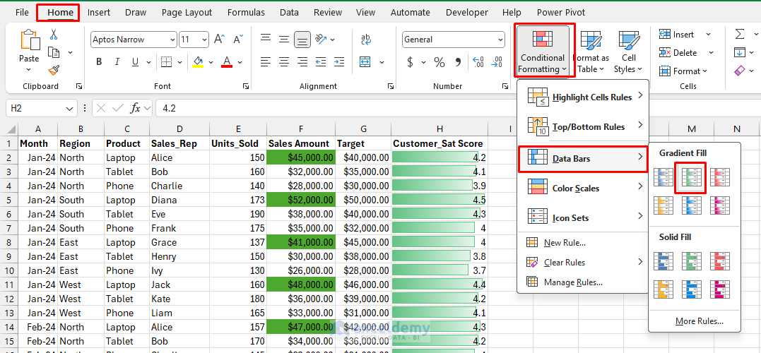
4. Data Bars for In-Cell Visualization
Data Bars (a feature of Conditional Formatting) turn numbers into in-cell bar graphs, instantly visualizing relative values inside the cell itself. This makes it easy to see highs, lows, and patterns without creating a separate chart.
It can quickly compare performance scores.
Steps:
- Select the Sales Amount values.
- Go to the Home tab >> click Conditional Formatting >> select Data Bars.
- Choose a style (Gradient Fill or Solid Fill).
- Instantly, each cell displays a colored bar indicating its value relative to others in the list.
Explore:
- Heat Maps: Use color scales to show performance intensity across a data range.
- Icon Sets: Use traffic lights or arrows to indicate performance levels.
- Custom Rules: Create complex formulas to highlight specific story elements.
5. Excel Maps for Geographical Data
Geographical data can be visually engaging using Excel’s map chart feature, providing insights related to location.
Easily visualize sales performance across different regions.
Steps:
- Highlight your data, including geographic names.
- Go to the Insert tab >> select Maps >> select Filled Map.
- Excel automatically visualizes the data geographically.
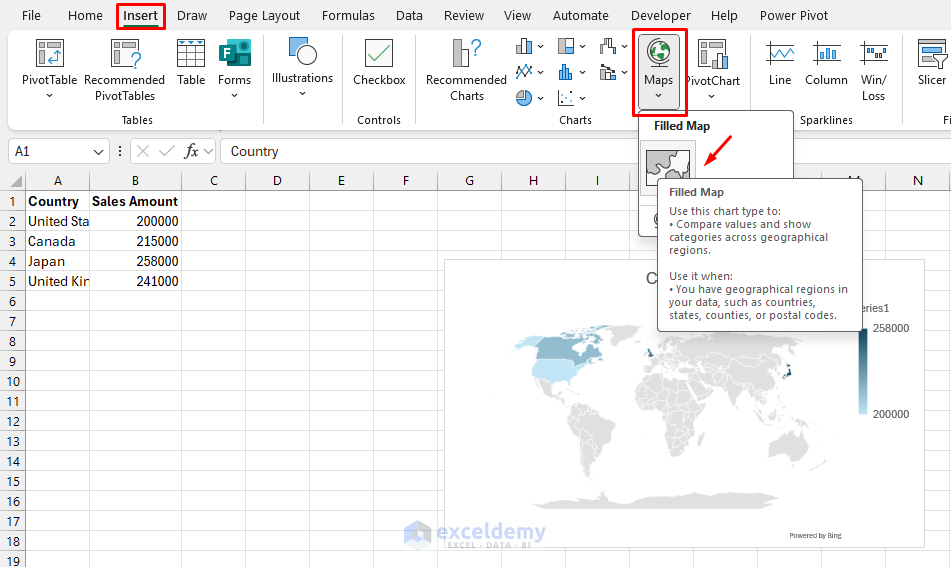
- Customize the chart to show data labels, titles, etc.

6. Combo Charts for Comparative Visualization
Combo charts combine different chart types into one, clearly presenting data relationships and comparisons.
You can compare revenue growth with profit margins.
Steps:
- Select your data.
- Go to Insert tab >> select All Charts >> select Combo Chart.
- Choose the Clustered Column-Line type.
- Adjust the secondary axis for the target.
- Click OK.
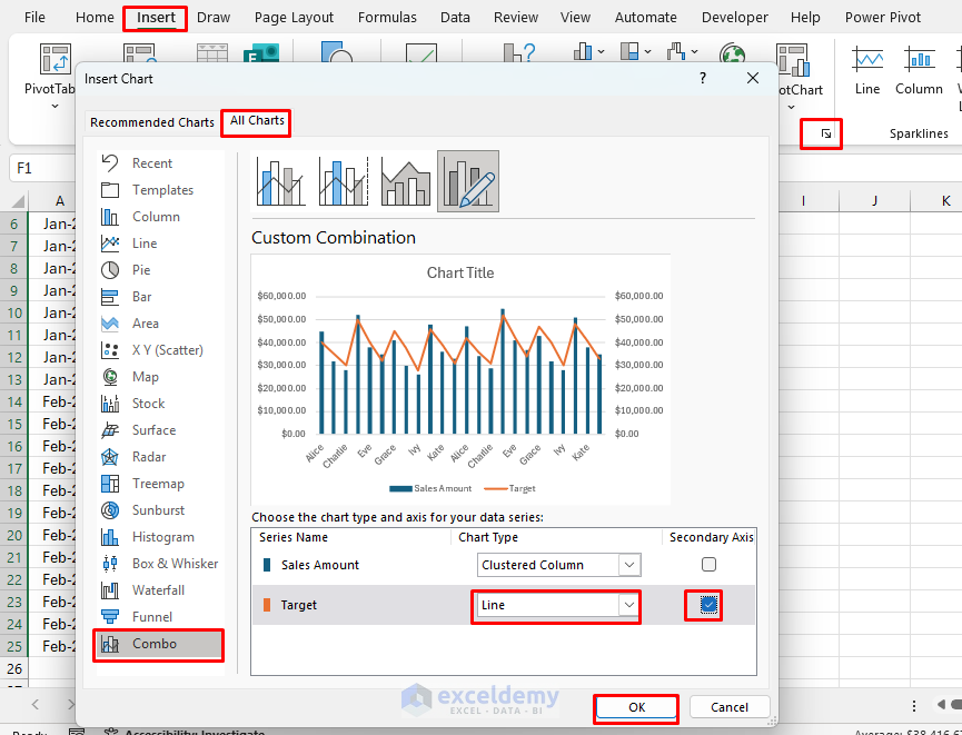
- The combo chart will show comparative analysis of sales and target of sales rep.

Compelling Applications:
- Revenue vs. Profit Margins: Show volume (columns) and efficiency (line) together.
- Budget vs. Actual: Display planned spending (line) against actual costs (columns).
- Growth Correlation: Combine absolute numbers with percentage changes.
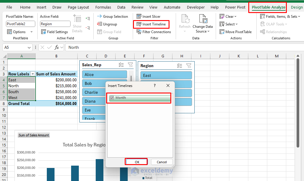
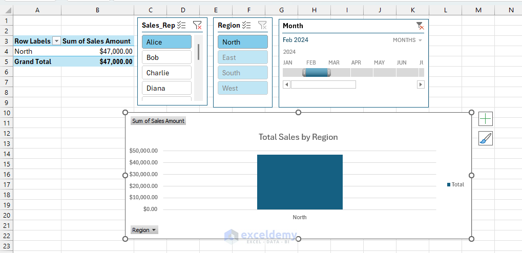
7. Interactive Dashboards with Slicers
Interactive dashboards make large datasets user-friendly, allowing viewers to explore data dynamically through slicers. Slicers and Timelines make dashboards interactive by providing dynamic filtering capabilities.
Create an interactive dashboard that allows users to filter sales by region, product, or period easily.
Steps to Add Slicers to PivotChart:
- Select your PivotTable or PivotChart.
- Go to the PivotTableAnalyze tab >> select Insert Slicer.
- Choose fields (e.g., Region, Product).
- Arrange slicers neatly next to your chart.

Adding a Timeline:
- Go to the PivotTable Analyze tab >> select Insert Timeline.
- Choose date fields (e.g., Month).
- Use the timeline slider for interactive date filtering.
Interactive Dashboard:
Annotated Storytelling with Text Boxes and Callouts
Strategic annotations transform charts from passive displays into guided narratives that ensure your key messages aren’t missed.
Advanced Annotation Techniques:
- Contextual Callouts: Add text boxes pointing to specific data points with explanations.
- Trend Lines with Commentary: Use Excel’s trendline feature and annotate the implications.
- Reference Lines: Add horizontal or vertical lines to show targets, averages, or benchmarks.
- Story Progression: Use numbered callouts to guide viewers through your logical flow.
Quick Tips for Better Visual Storytelling
- Use clear titles and labels: Always clearly define your axes, titles, and legends.
- Minimize Clutter: Keep visualizations simple to maintain clarity.
- Interactive Elements: Allow users to explore data dynamically with interactive elements.
Conclusion
Excel offers versatile visualization tools that transform data into compelling visual stories. By mastering these seven techniques, you can effectively engage your audience, clearly highlight key insights, and drive informed decisions with power. The best data stories don’t just show what happened; they reveal why it matters and what to do next. Master these techniques, and your Excel reports will become powerful tools for driving understanding and decision-making across your organization.
Get FREE Advanced Excel Exercises with Solutions!
