
Conditional Formatting in Excel is not just a highlighting tool; you can use it as a dynamic, powerful analysis tool. It allows you to automatically apply formatting (such as colors, icons, or bars) to cells based on their values or custom rules. This turns raw data into visual insights, making it easier to spot trends, outliers, and patterns without manual charting.
In this tutorial, we’ll explore 5 ways to use conditional formatting as a powerful analysis tool.
1. Create Heatmaps with Color Scales
Color scales apply a gradient of colors to cells based on their relative values, turning your data into a heatmap. Heatmaps are ideal for visualizing high-to-low distributions across a range, like identifying top-performing regions by sales.
Steps:
- Select the column (e.g., Sales)
- Go to the Home tab >> select Conditional Formatting >> select Color Scales
- Choose a Green–Yellow–Red scale

- Higher sales get greener shades, lower ones get redder
- This instantly highlights who is overperforming or underperforming
- To Customize:
- Go back to Conditional Formatting >> select Manage Rules

-
- Select Edit Rule
- Adjust the midpoint or colors for better contrast

Choose Color Scheme:
- Red–Yellow–Green: Best for performance metrics (red = poor, green = excellent)
- Blue–White–Red: Ideal for variance analysis (blue = below average, red = above average)
- White–Blue: Perfect for density or volume data
2. Data Bars to Show Growth Distribution
Data Bars transform a column into a mini horizontal bar chart. They add horizontal bars inside cells proportional to their values, making it easy to compare magnitudes at a glance, like seeing sales distributions without a separate bar chart.
Steps:
- Select the column (e.g., Growth)
- Go to the Home tab >> select Conditional Formatting >> select Data Bars
- Pick a style, such as “Gradient Fill” or “Solid Fill”
- Choose a Solid Fill – Green

- Positive growth has longer bars; negative growth has shorter bars or none
- It becomes easy to compare relative performance without separate charts
- For negative values or customization:
- Go back to Conditional Formatting >> select Manage Rules >> select Edit Rule >> check Show Bar Only to hide numbers, or adjust the bar color

3. Customer Ratings with Icon Sets + Custom Thresholds
Icon sets insert symbols (like arrows or traffic lights) based on thresholds, and combining them with rules lets you flag outliers—for example, customer ratings that deviate significantly from the average. Icon sets work well when combined with clear numeric cutoffs.
Let’s flag customer ratings that are high, average, or low.
Steps:
- Select the column (e.g., Customer Rating)
- Go to the Home tab >> select Conditional Formatting >> select 3 Traffic Lights
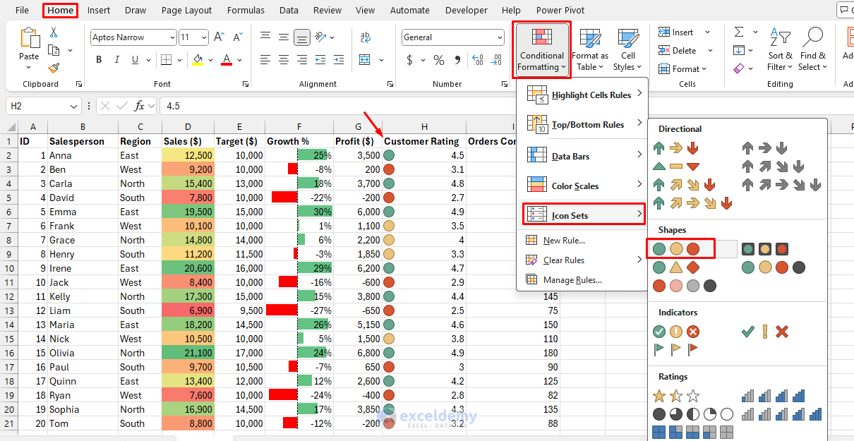
- Go to the Home tab >> select Conditional Formatting >> select Manage Rules >> select Edit Rule
- Set Type to Number and configure thresholds:
- Green light: >= 4
- Yellow light: >= 3.0
- Red light: < 3.0
- Set Type to Number and configure thresholds:

- Now, high performers get a green light, average performers yellow, and underperformers red

4. Building a Trend Analysis with Top/Bottom Rules
Top/Bottom rules automatically color the highest or lowest values—great for pinpointing extremes like top 10% performers or bottom deciles in sales data. Highlighting the top or bottom values helps track trends.
Steps:
- Select the column (e.g., Orders Completed)
- Go to the Home tab >> select Conditional Formatting >> select Top/Bottom Rules
- Choose Top 10%

- Format with Green Fill with Dark Green Text

- Choose Bottom 10%
- Format with Light Red Fill with Dark Red Text

Now the best and worst growth rates stand out clearly. This helps track extreme performance trends—both positive and negative.
5. Using Custom Rules to Highlight Cells
A custom-formula rule in Conditional Formatting lets you decide exactly when a cell formats: Excel applies the format whenever your formula returns TRUE for that row. Custom formulas extend conditional formatting to non-numeric data.
Let’s highlight rows where sales miss the target.
Steps:
- Select the range (e.g., entire table A2:I21)
- Go to the Home tab >> select Conditional Formatting >> select New Rule

- Select Use a formula to determine which cells to format
- Enter formula:
=$D2<$E2
- Format with red fill to flag misses
- Click OK

- Sales that didn’t meet the target are highlighted

Highlight Recent Data:
=A2>=TODAY()-7
- Highlights data from the last 7 days
Duplicate Detection:
=COUNTIF($A$2:$A$100,A2)>1
Tips for Advanced Analysis
- Layer Rules: Use Manage Rules to order them (e.g., outliers first, then color scales)
- Clear Formatting: Select range >> Conditional Formatting >> select Clear Rules to reset
- Performance: For very large datasets, avoid volatile formulas; use static references
- Alternatives: In Google Sheets, access via Format >> select Conditional Formatting; steps are nearly identical
Final Thoughts
You can apply these five approaches to transform conditional formatting into a powerful analysis tool. By mastering these techniques, conditional formatting becomes a dynamic analysis method, saving time on visualizations and revealing insights hidden in plain data. Experiment with your own datasets to see the impact—it can turn raw data into meaningful insights without even making a chart.
Get FREE Advanced Excel Exercises with Solutions!
