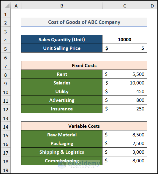
This dataset includes the Sales Quantity in units, the Unit Selling Price, the components of Fixed Cost, and the components of Variable Cost.
Step 1 – Calculate Different Cost Components
Steps:
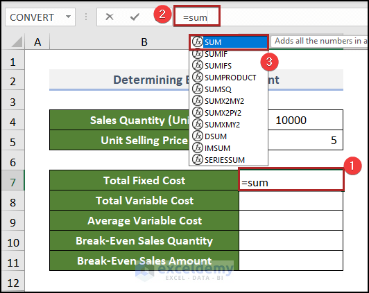
- Select C7 and enter the following.
=sum- Double-click the SUM function to select it or press TAB.
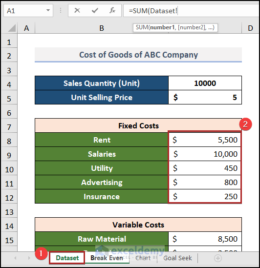
- Select C8:C12 (the fixed cost).
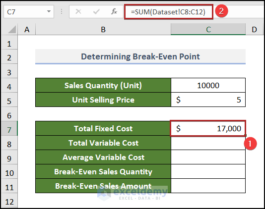
- Use this formula in C7:
=SUM(Dataset!C8:C12)- Press ENTER.
- Use this formula in C8 to find the Total Variable Cos.
=SUM(Dataset!C15:C18)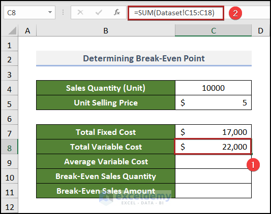
You can find the Average Variable Cost (the mean of the variable cost for each unit of product) by dividing the total variable cost by the total production unit:
- Use the formula.
=C8/C4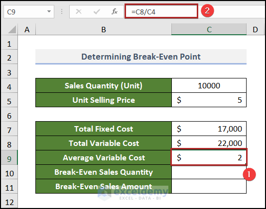
Read More: How to Calculate Break Even Analysis with Formula in Excel
Step 2 – Compute the Break-Even Point of Sales
Steps:
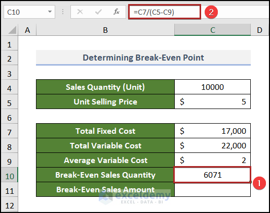
- Select C10 and enter the formula below.
=C7/(C5-C9)- Press ENTER.
- Go to C11 and enter the following formula.
=C7/((C5-C9)/C5)- Press ENTER.
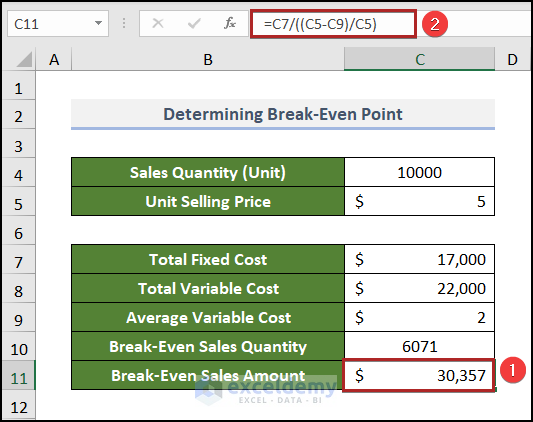
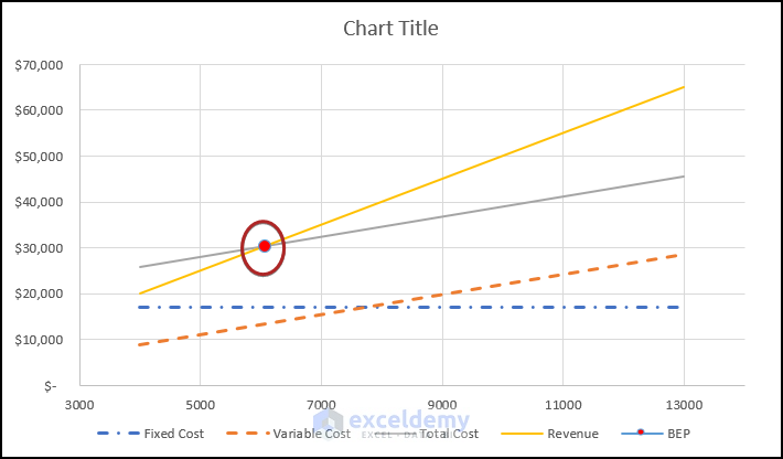
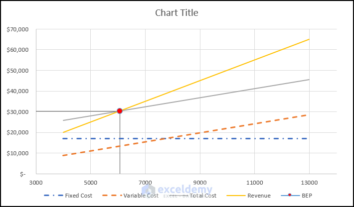
After selling 6071 units, the company will reach its break-even point. The sales amount will be $30,357.
Read More: How to Calculate Break-Even Sales with Formula in Excel
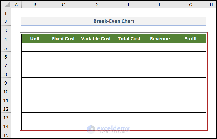
Step 3 – Create a Table of Costs, Revenue, and Profit
Steps:
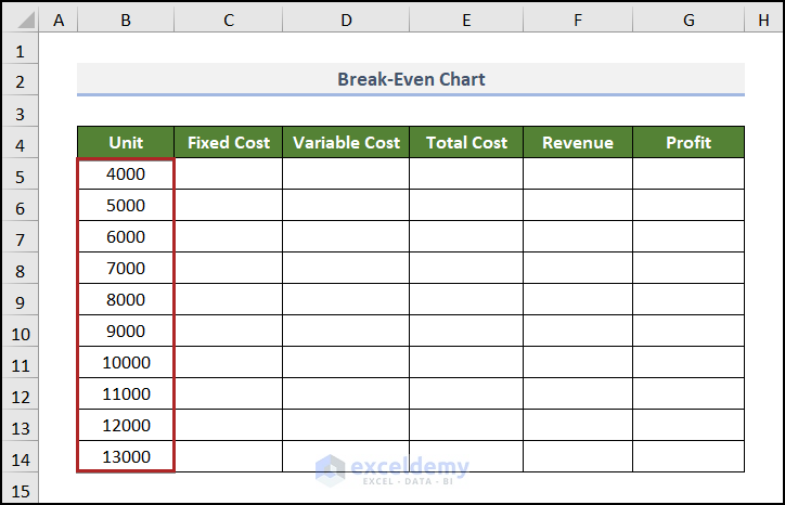
- Create the basic outline of the table in B4:G14.
- Enter units in ascending order in the Unit column.
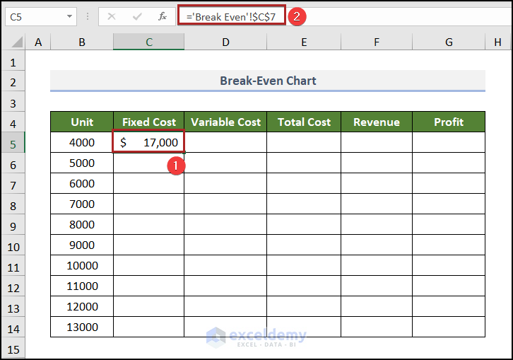
- Go to C5 and enter the following formula.
='Break Even'!$C$7- Press ENTER.
- Find the Fill Handle at the right-bottom corner of C5: a plus (+) sign.
- Double-click it.
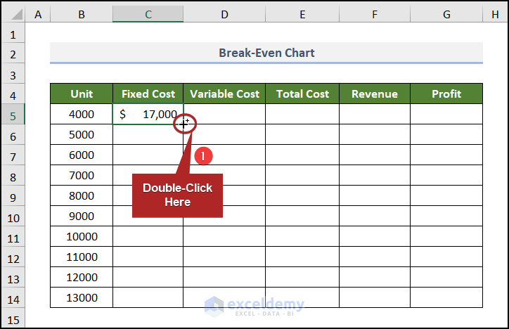
The other cells are automatically filled.

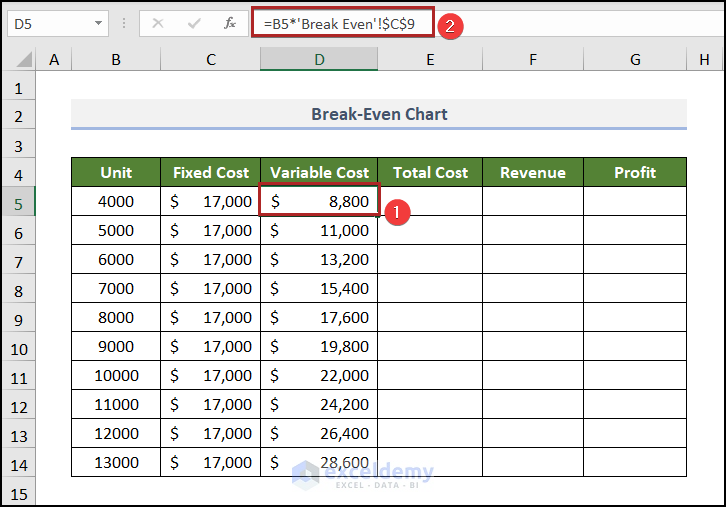
- Select D5 and use the formula below.
=B5*'Break Even'!$C$9The number of Units was multiplied by the Average Variable Cost. An absolute cell reference was used.
- Add the variable cost to the fixed cost to get the Total Cost in E5.
=C5+D5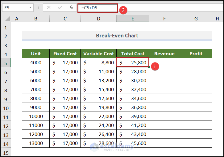
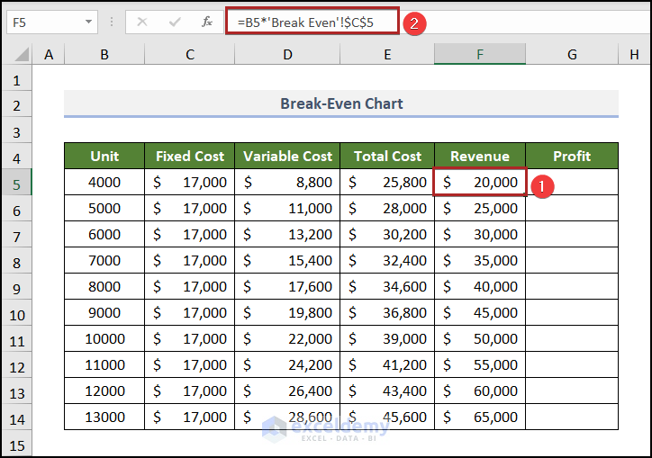
- To find the Revenue, multiply the Units in B5 by the Unit Selling Price in C5 in the Break Even worksheet.
- Go to F5 and enter the formula below.
=B5*'Break Even'!$C$5- Press ENTER.
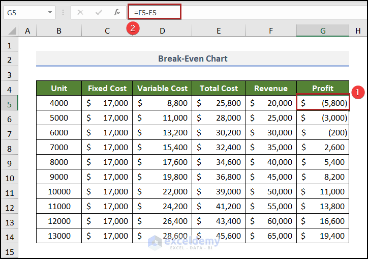
- Go to G5 and use the following formula.
=F5-E5- Press ENTER.
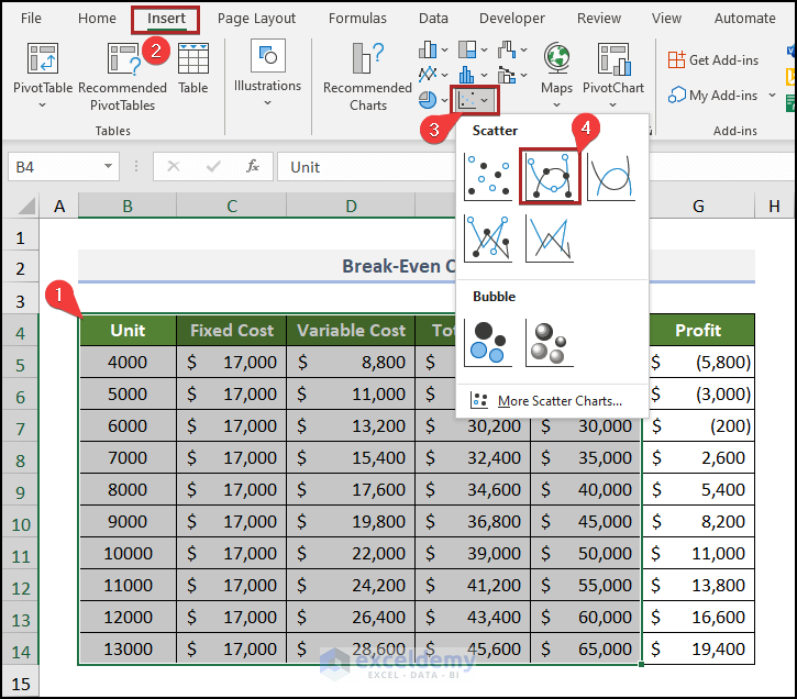
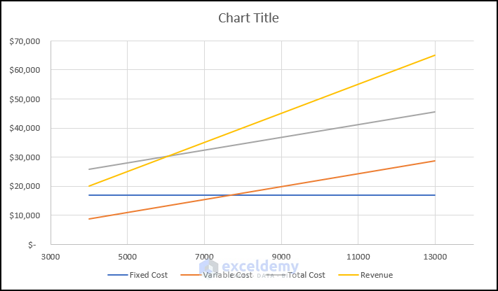
Step 4 – Insert Break-Even Chart
Steps:
- Select the table without the Profit column.
- In Insert, click Insert Scatter (X, Y) or Bubble Chart.
- Choose Scatter with Smooth Lines and Markers.
The chart will be displayed.
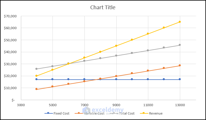
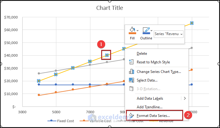
- Right-click the marker on the line of any series.
In the context menu:.
- Click Format Data Series… .
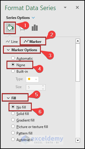
In Format Data Series :
- Click Fill & Line.
- Select Marker.
- Expand the Marker options and select None.
- Expand the Fill section and choose No fill.
Follow the same procedure for the other series.
To distinguish the line of fixed and variable cost.
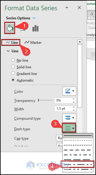
- Right-click the line of fixed cost.
- Select Format Data Series….
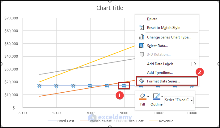
In Format Data Series:
- Click Fill & Line.
- In Line, set the Dash type as Long Dash Dot.
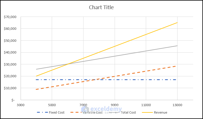
This is the output.
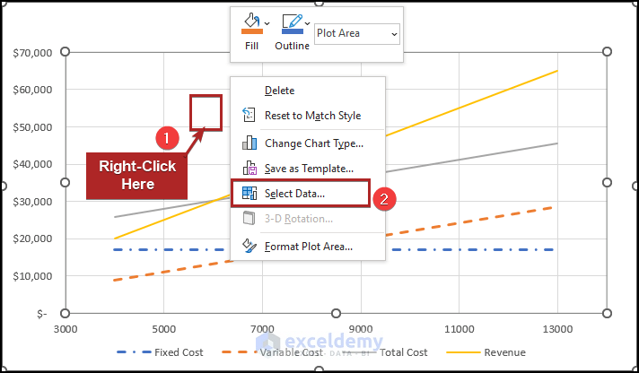
Step 5 – Determine the Break-Even Point in the Chart
Steps:
- Right-click inside the plot area.
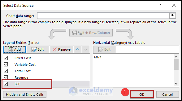
- Choose Select Data… .
- Click Add in the Select Data Source dialog box.
In Edit Series:
- Enter BEP in Series name.
- Go to the Break Even worksheet and give the references of C10 and C11 in the Series X values and Series Y values.
- Click OK.
- Click OK.
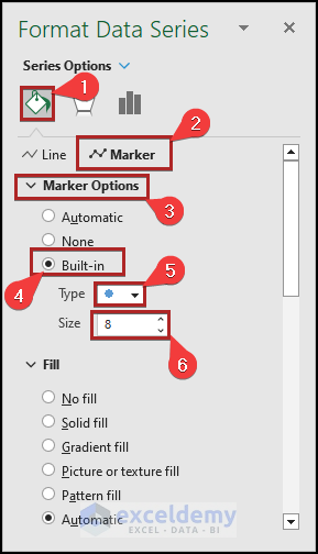
- Open Format Data Series for the new series.
- Go to Marker options.
- Select Built-in and choose the circle marker in Type.
- Set the marker Size to 8.
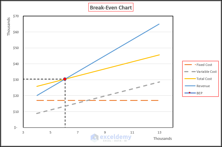
This is the output.
Step 6 – Apply a Break-Even Line
Steps:
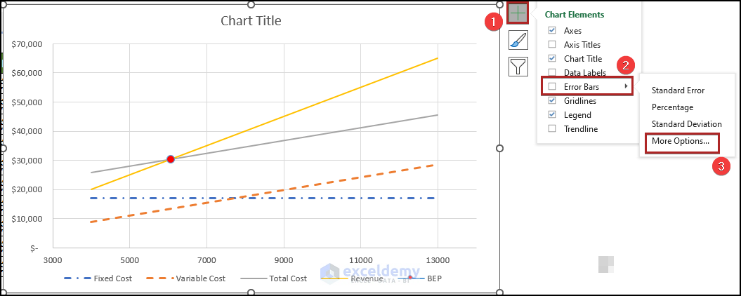
- Click the plus-shaped Chart Element icon.
- Click the arrowhead at the right of Error Bars.
- Select More Options….
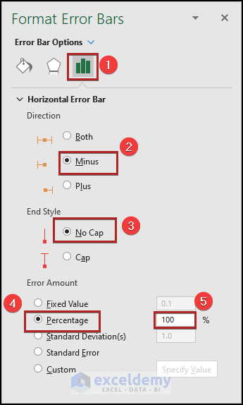
In the Format Error Bars task pane:
- Select Error Bar Options.
- Choose Minus in Direction and No Cap in End Style.
- In Error Amount, select Percentage and set it to 100%.
- Click the drop-down arrow in Error Bar Options.
- Select Series “BEP” Y Error Bars and follow the same procedure for the Vertical Error Bar.

This is the output.
Calculating the Selling Price at BEP (Break-Even Point) Using the Goal Seek Tool in Excel
TSteps:
- To calculate the Revenue, enter the following formula in C9.
=C4*C5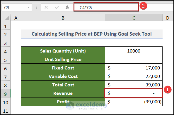
- Use this formula to determine the Profit in C10.
=C9-C8
The break-even point is the condition of a company or business before it starts to gain profit.
- Go to the Data tab.
- Click What-If-Analysis in Forecast.
- Select Goal Seek.
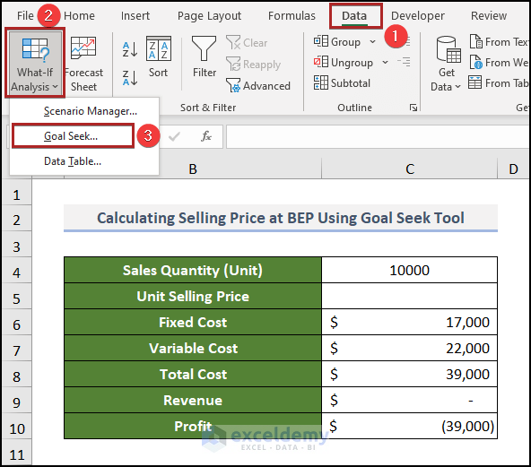
- In the Goal Seek dialog box, enter the references as shown below, and click OK.
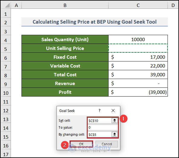
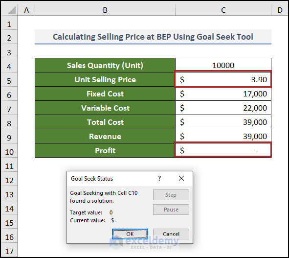
C10 is set as 0 by changing the value of C5.
The output is: 3.90 for Unit Selling Price.
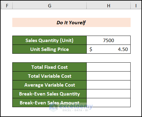
Practice Section
Practice here.
Download Practice Workbook
Download the following Excel workbook.
Related Articles
- How to Calculate Break-Even Points in Excel
- How to Do Multi-Product Break-Even Analysis in Excel
- How to Do Break-Even Analysis with Goal Seek in Excel
<< Go Back To Break Even Analysis Excel | Excel For Finance | Learn Excel
Get FREE Advanced Excel Exercises with Solutions!
