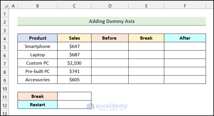
Method 1– Adding a Dummy Axis
Step 1: Adding a Break Value and a Restart Value
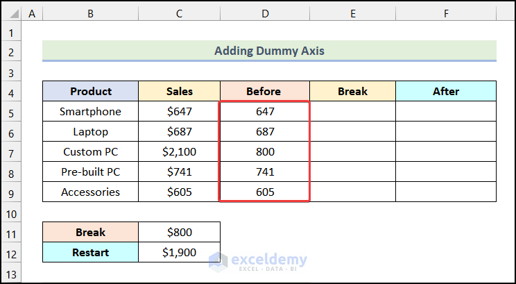
- Create 3 new columns after Product and Sales, named Before, Break, and After.
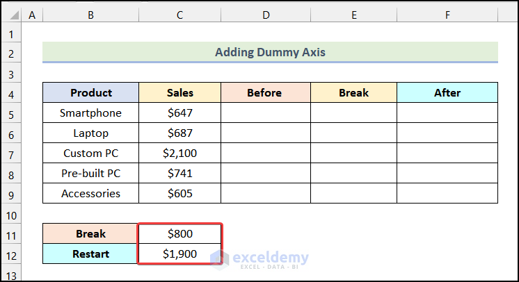
- Name 2 cells as Break and Restart. We will store the Break Value and our Restart Value in these 2 cells.
- Enter the Break Value in cell C11. It is the value from which the column will start to break. Here, we have used $800 as the Break Value.
- Enter the Restart Value in cell C12. This is where the break ends. In this case, we used $1900.
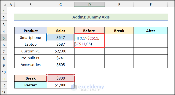
Step 2: Using Formula to Prepare Dataset
- Enter the following formula in cell D5:
=IF(C5>$C$11,$C$11,C5)Cell C5 refers to the cell of the Sales column, and cell $C$11 indicates the cell of Break.
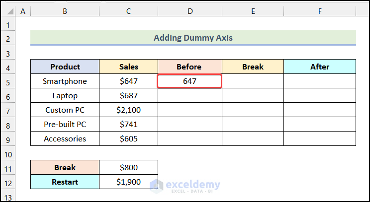
- Press ENTER.
You will see the following output on your worksheet.
- Use the AutoFill option of Excel to get the rest of the outputs.
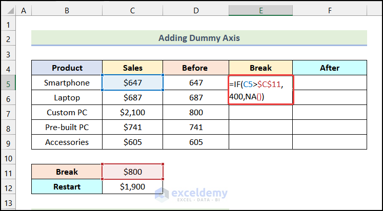
- Enter the formula given below in cell E5:
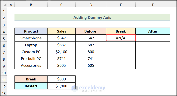
=IF(C5>$C$11,400,NA())- Hit ENTER.
You will have the following output, as shown in the picture.
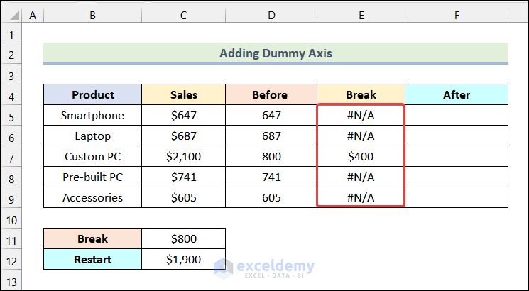
- Use the AutoFill feature of Excel to get the remaining outputs.
- Enter the following formula in cell F5:
=IF(C5>$C$11,C5-$C$12,NA())Here, cell $C$12 refers to the cell of Restart.
- Press ENTER.
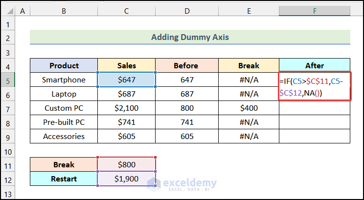
You will have the output for the first cell of the column named After.
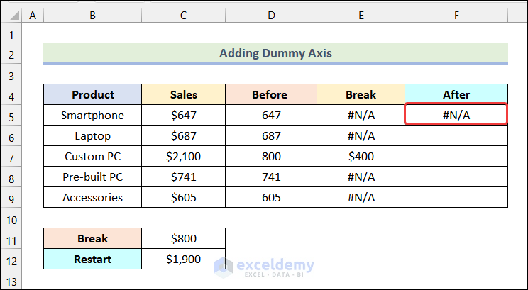
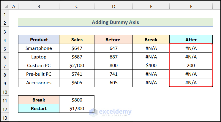
Use Excel’s AutoFill feature to get the rest of the outputs.
Step 3: Inserting a Column Chart
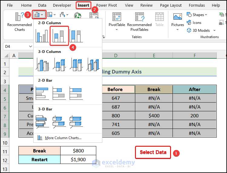
- Press CTRL and select the data of columns named Product, Before, Break, and After.
- Go to the Insert tab from the Ribbon.
- Choose the Insert Column or Bar Chart option.
- Select the Stacked Column option from the drop-down.
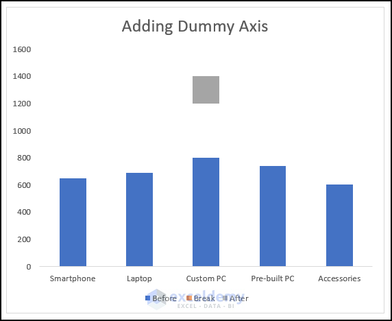
You have a Stacked Column Chart, as shown in the following image.
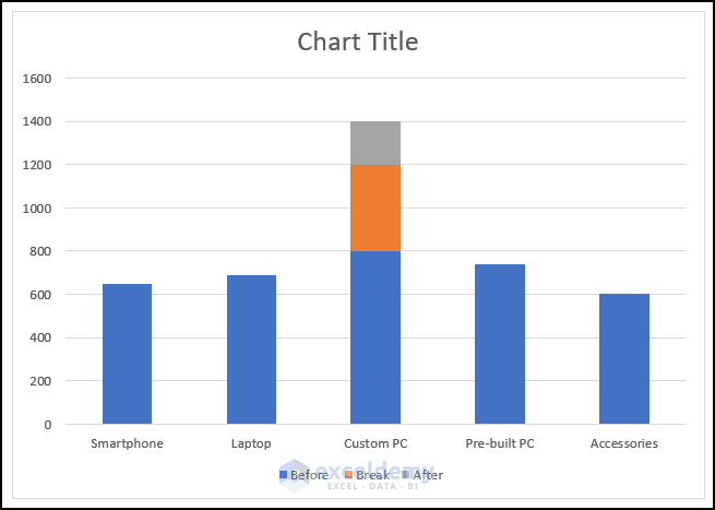
- Rename the Chart Title, as shown in the image below. Here, we used Adding Dummy Axis.

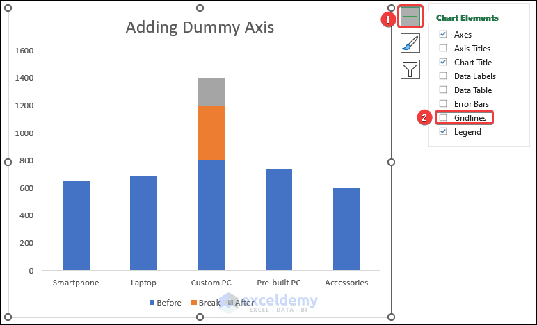
- Click on the Chart Elements options and uncheck the box of Gridlines.
The gridlines from the chart will be removed.
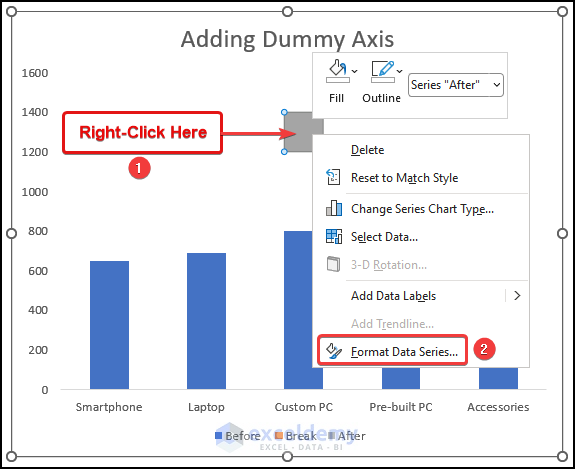
Step 5: Creating a Break in the Chart
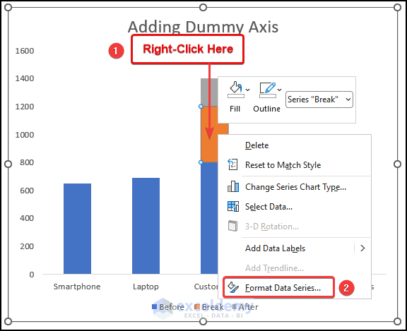
- Right-click on the marked region of the following image.
- Choose the Format Data Series option.
The Format Data Series dialogue box will open on your worksheet.
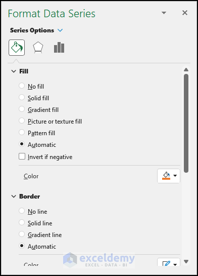
- Select the Fill & Line tab from the Format Data Series dialogue box.
- Choose the No fill option under the Fill Section.
- In the Border section, select No line.
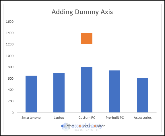
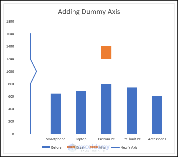
A break will appear in your chart, as demonstrated in the following image.
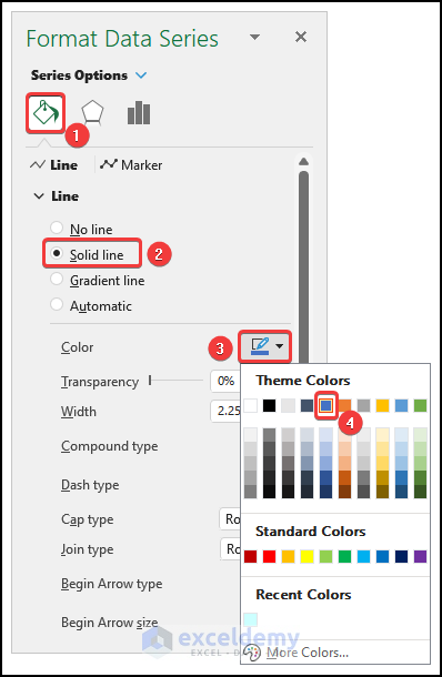
- Right-click on the marked region of the following picture and select Format Data Series.
- Go to the Fill & Line tab in the Format Data Series dialogue box.
- Choose Solid Fill in under the Fill section.
- Click on the Color option and choose your preferred color from the drop-down.
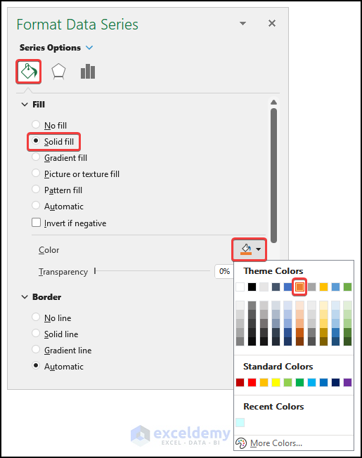
You will have the following output on your worksheet, as shown in the following image.
Step 6: Constructing a New Y-Axis
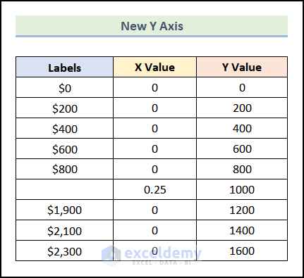
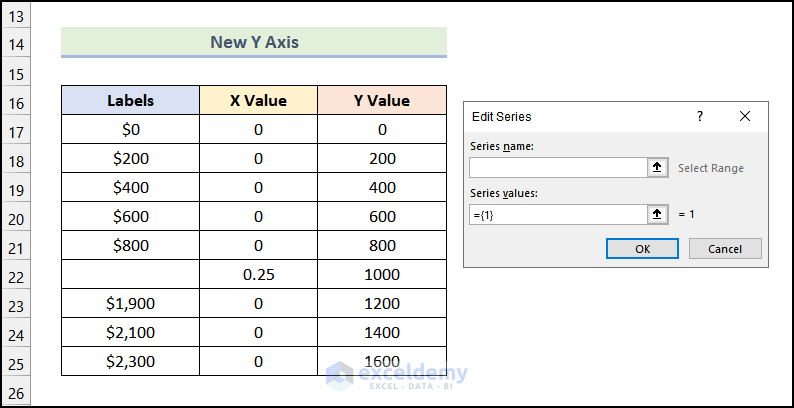
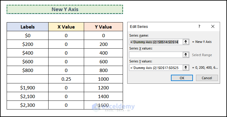
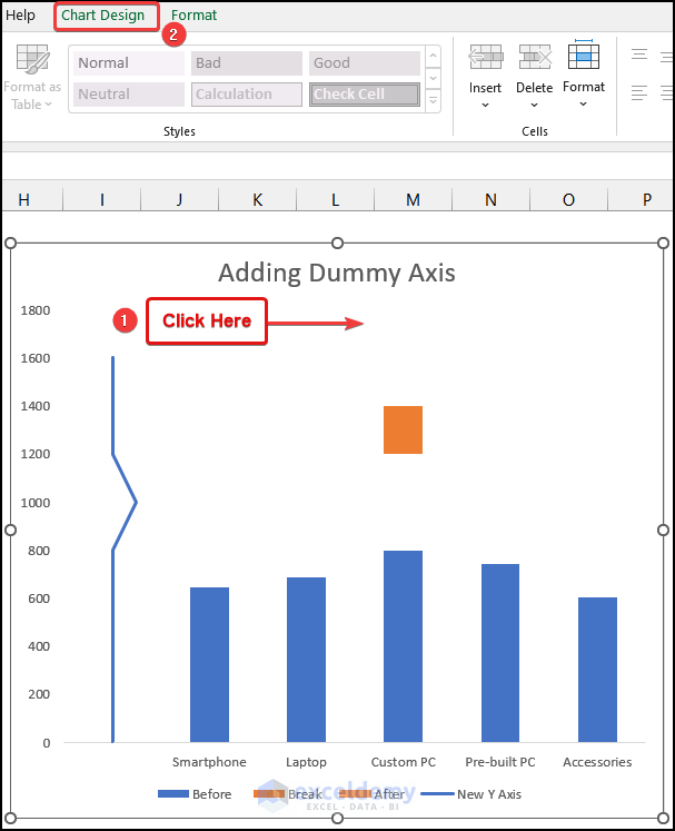
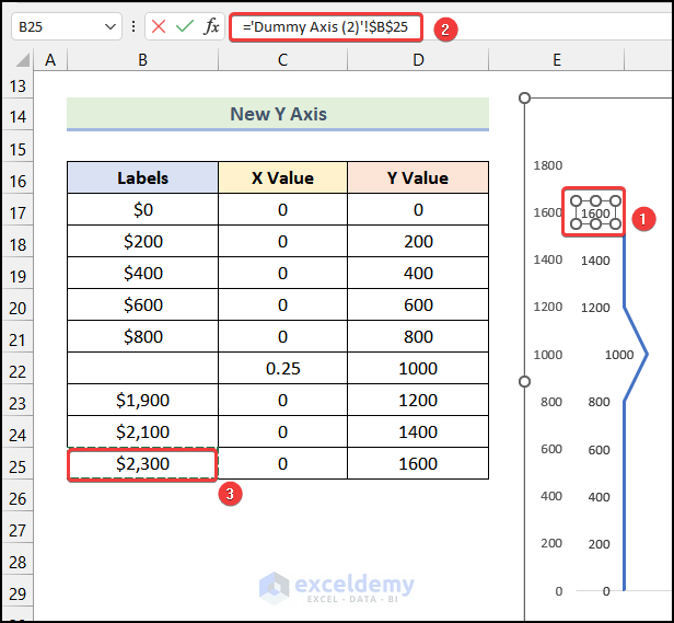
- Create a table on your worksheet, as shown in the following image.
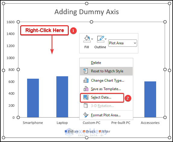
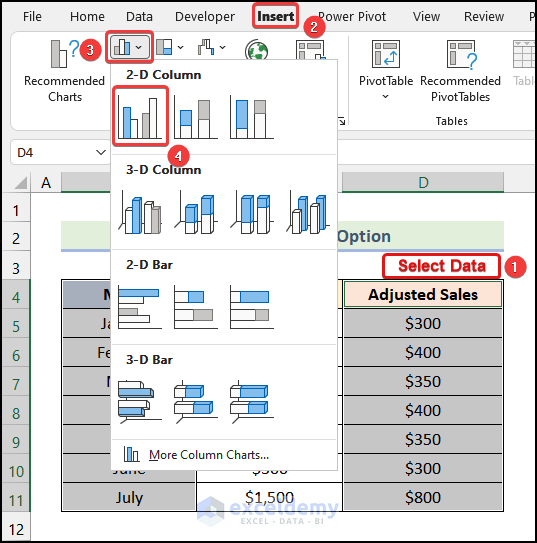
- Right-click on anywhere inside the chart area and choose the Select Data option.
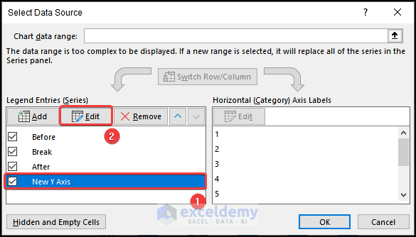
The Select Data Source dialogue box will open.
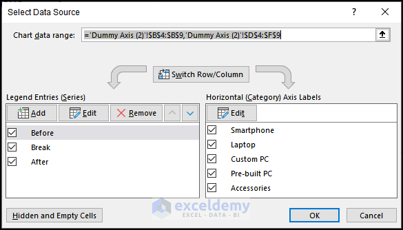
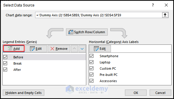
- Choose the Add option from the Select Data Source dialogue Box.
The Edit Series dialogue box will be available, as shown in the following image.
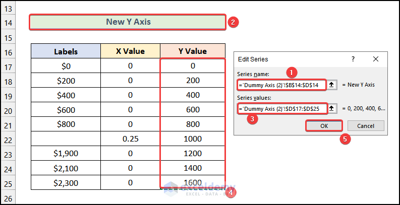
- Click on the Series name box and choose the cell that contains New Y-Axis, as marked in the following image.
- Click on the Series values box and select the range D17:D25.
- Click on OK.
- It will redirect you to the Select Data Source dialogue box and select OK.
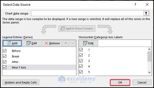
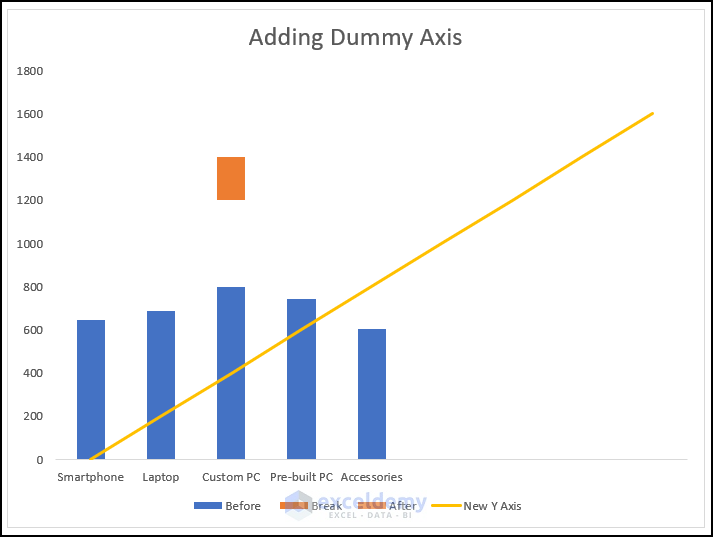
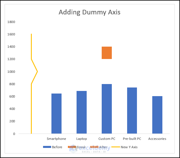
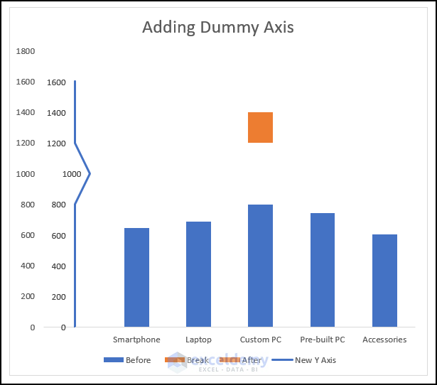
A new set of column charts will be added to your Stacked Column Chart, as shown in the following image.
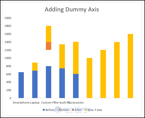
- Right-click on any section of the newly created chart and choose the Change Series Chart Type option.
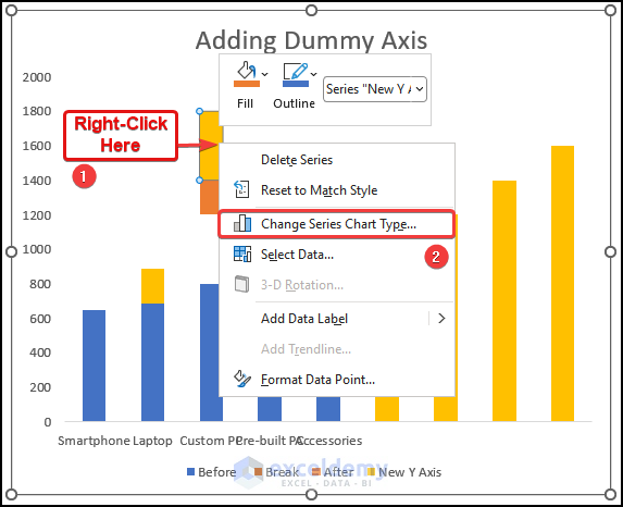
The Change Chart Type dialogue box will open, as shown below.
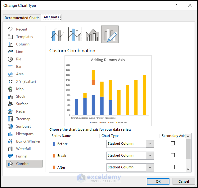
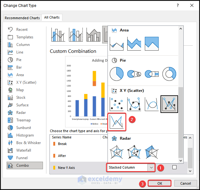
- In the Change Chart Type dialogue box, click the drop-down icon beside the New Y-Axis series name.
- Choose the Scatter with Straight Lines option in the X Y Scatter section.
- Click on OK.
You will have a straight line going through the center of the chart area, as shown in the following image.
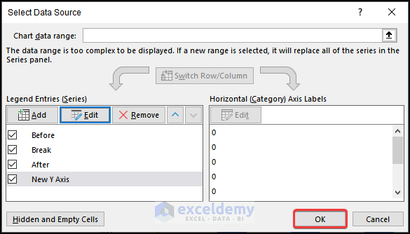
- Right-click on the straight line and choose the Select Data option.
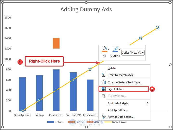
- Select the New Y-Axis option, as marked in the following image.
- Click on the Edit option.
The Edit Series dialogue box will open on your worksheet.
- In the Edit Series dialogue box, click on the Series X values box and choose the range C17:C25.
- Click on OK.
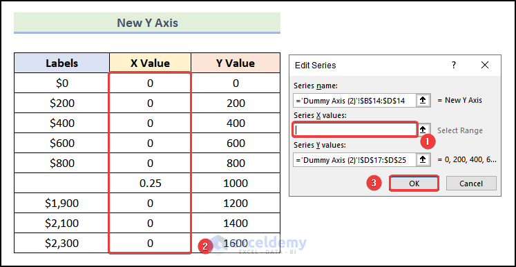
- You will be redirected to the Select Data Source dialogue box and select OK.
You will have the New Y-Axis, as demonstrated in the following picture.
Step 7: Editing a New Y-Axis
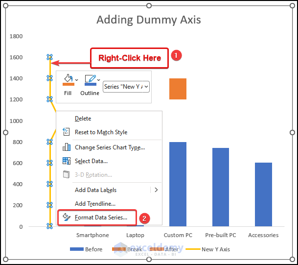
- Right-click on the newly created Y-axis and select the Format Data Series option.
- Go to the Fill & Line tab in the Format Data Series dialogue box.
- Choose Solid Line under the Line section.
- Click on the Color option and choose your preferred color from the drop-down.
The color of your Y-axis will be changed to your selected color, like in the following image.
Step 8: Adding Labels to the New Y-Axis
- Click on any portion of the chart area.
- Go to the Chart Design tab from Ribbon.
- Select the New Y-Axis.
- From the Chart Design tab, choose the Add Chart Element option.
- Select the Data Labels option from the drop-down.
- Choose the Left option.
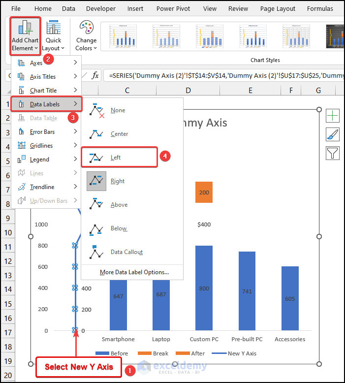
Labels will be added to the left of the New Y-Axis, as shown in the image below.
- Click on the top label, as marked in the following picture.
- Go to the Formula Bar and enter in =.
- Select cell B25 as it is the highest value.
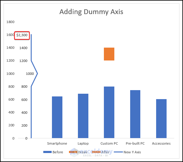
The top label will be changed, as shown in the image given below.
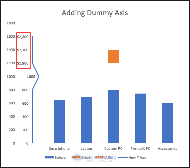
- Use the same steps to change the remaining labels above the break line, as marked in the picture demonstrated below.
- Select the label beside the break line and press DELETE.
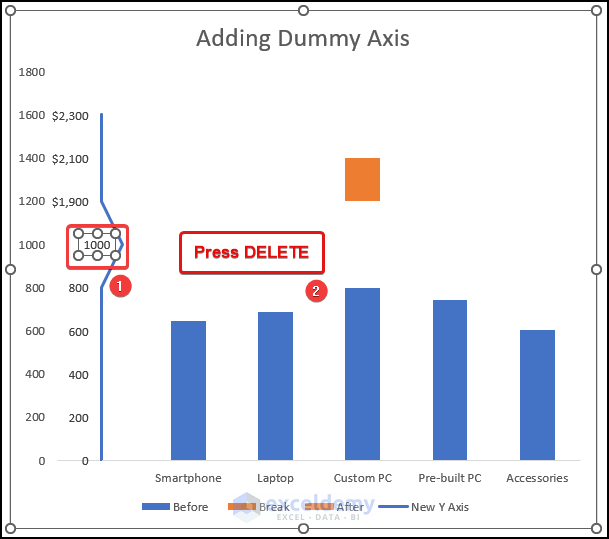
- Select the axis of the chart as marked in the following image.
- Hit DELETE.
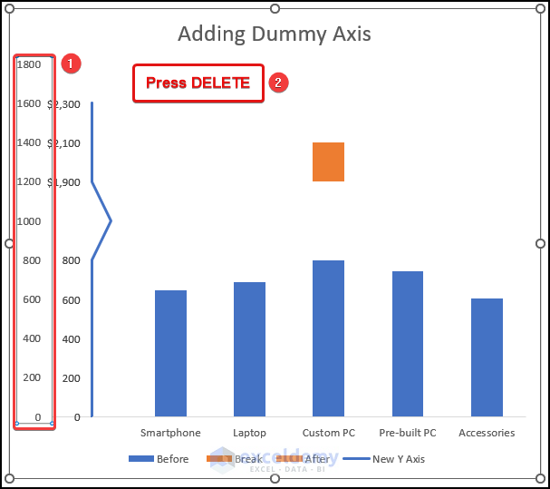
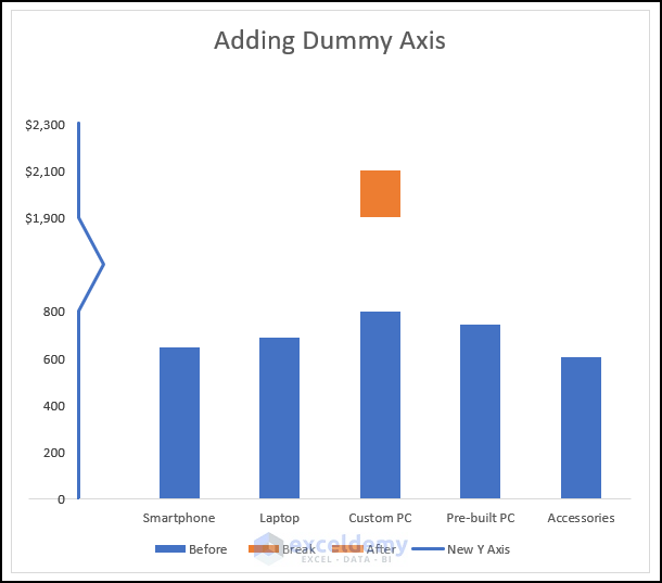
You will have a chart that has a broken axis scale, as demonstrated in the picture below.
Method 2 – Using the Format Shape Option
Step 1: Inserting a Column Chart
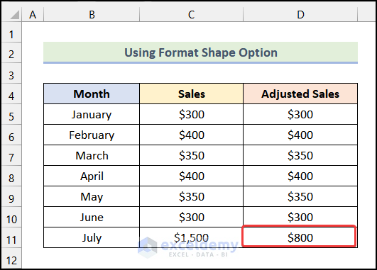
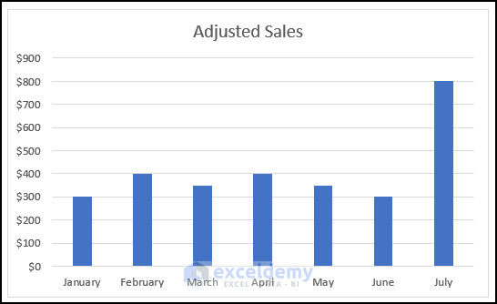
- Create a new column named Adjusted Sales.
Note: In the Adjusted Sales column, enter exactly the values of the Sales column except for the cell of large Sales amount. For that cell, enter a value close to the maximum value of the remaining cells. Here, we used the value of $800.
- Press CTRL and select the cells of the columns Month and Adjusted Sales.
- Go to the Insert tab from the Ribbon.
- Choose the Insert Column or Bar Chart option.
- Select the Clustered Column option from the drop-down.
You will have the following output on your worksheet.
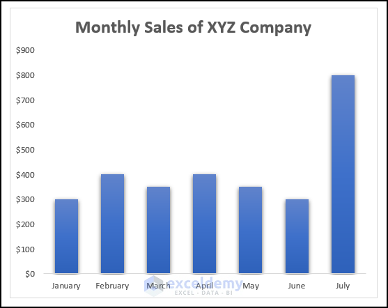
Step 2: Formatting the Chart
- Use the steps mentioned in Step 04 of the 1st method to format the chart.
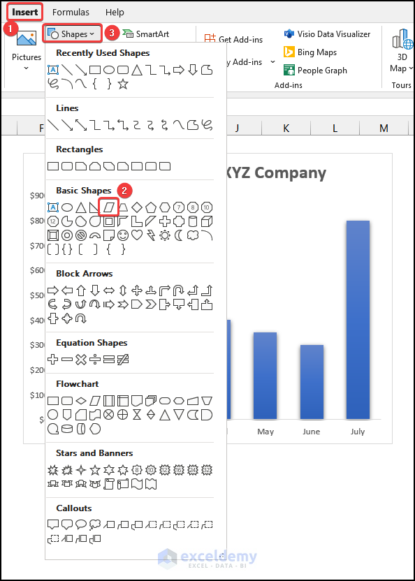
Step 3: Inserting and Formatting Shape
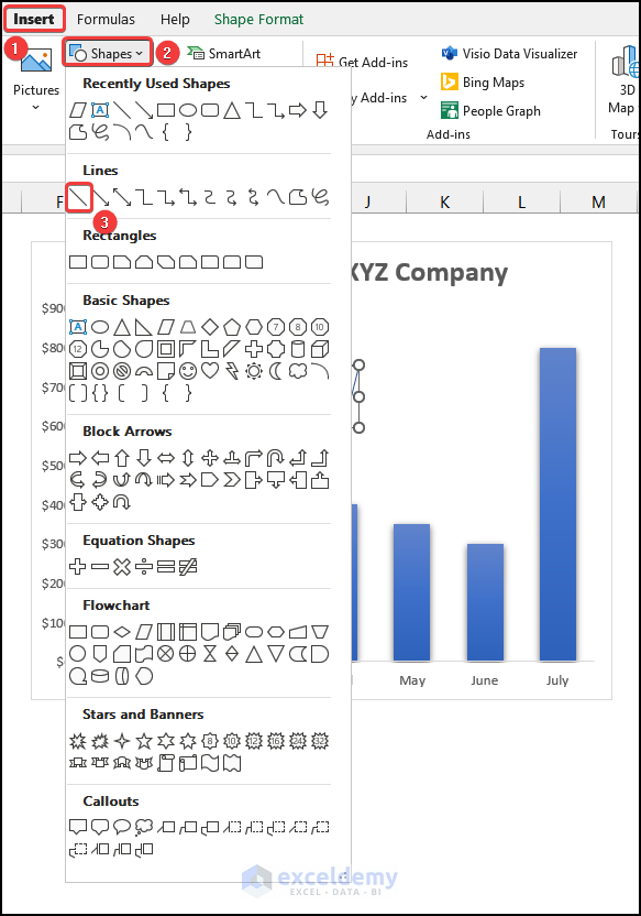
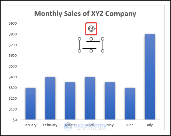
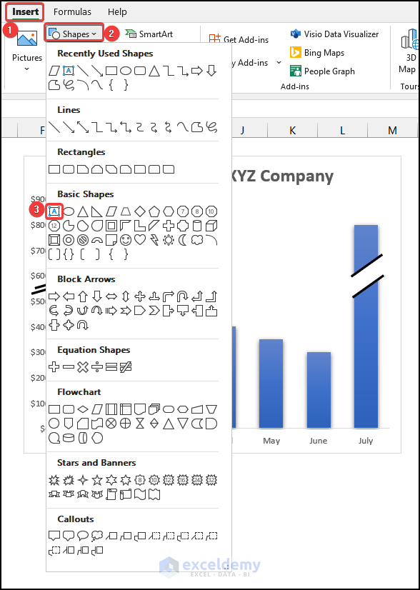
- Go to the Insert tab from Ribbon.
- Choose the Shapes option.
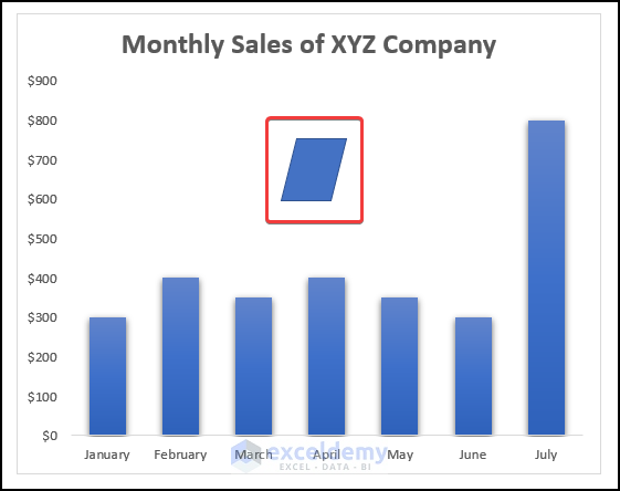
- Select the Parallelogram shape from the drop-down.
- Left-click and then hold and drag your mouse to specify the size and shape of the parallelogram shape.
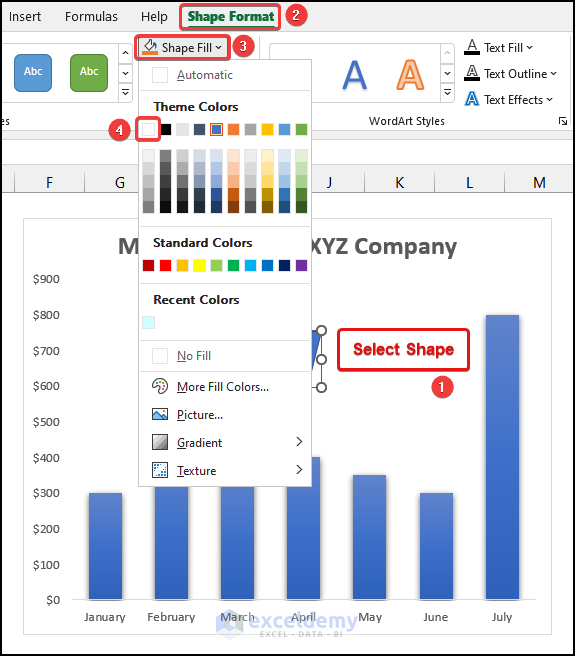
- Select the shape to make the Shape Format tab visible.
- Go to the Shape Format tab from the Ribbon.
- Choose the Shape Fill option.
- Choose the color White, as shown in the following image.
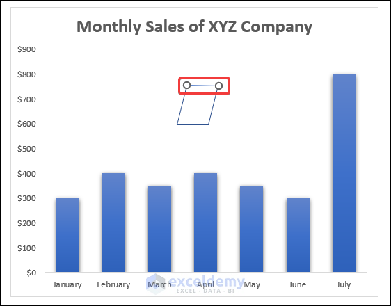
- Go to the Insert tab and choose the Shapes option.
- Select the Line option.
- Draw a line over the parallelogram, as shown in the following image.
- Click on the line and go to the Shape Format tab from the Ribbon.
- Select the Shape Outline option.
- Choose the Black color.
- Click on the Weight option and select the 2¹/⁴ pt option, as marked in the following picture.
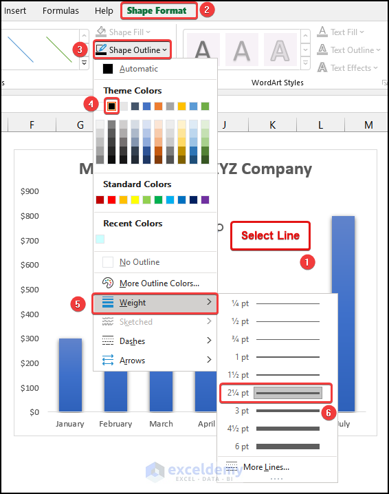
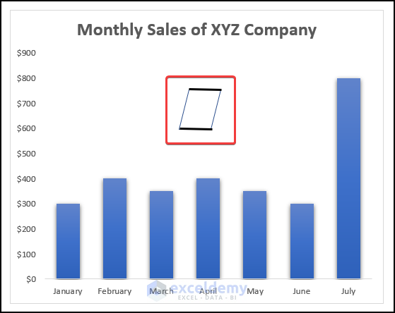
You have a dark black line on top of your parallelogram shape.

- Copy the line and paste it onto your worksheet.
- Reposition the lines on the two opposite sides of the parallelogram, as shown in the image below.
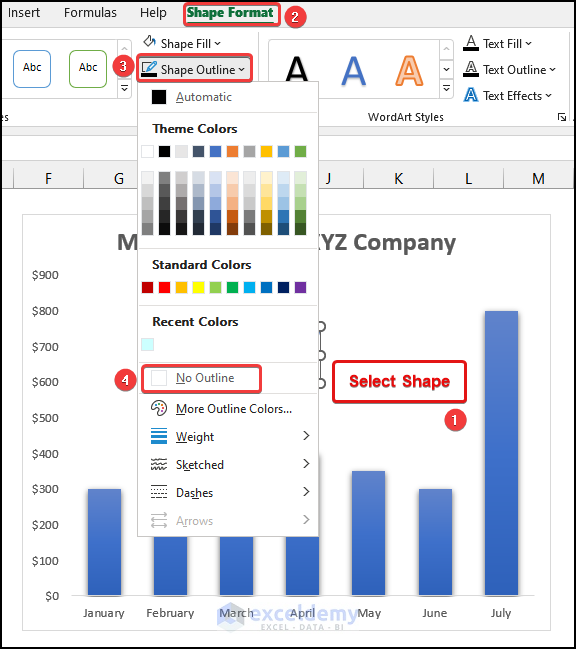
- Click on the parallelogram shape and go to the Shape Format tab from the Ribbon.
- Choose the Shape Outline option.
- Select the No Outline option.
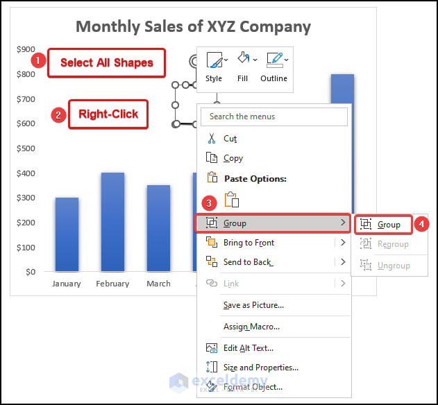
- Press CTRL, select the lines and the parallelogram shape and right-click.
- Select the Group option to move and resize them as a unit according to your needs.
Step 4: Repositioning Shape to Break Axis
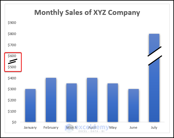
- Click on the rotate option and rotate the shape, as marked in the following image.
- Reposition the shape on the large column to look like a break in the column.

- Copy and paste the shape on your worksheet.
- Resize the copied shape and reposition it between the two labels named $500 and $600.
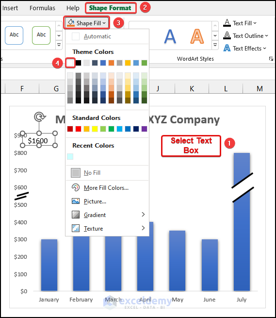
Step 5: Inserting and Formatting Text Boxes to an Add Label
- Go to the Insert tab from the Ribbon.
- Choose the Shapes option.
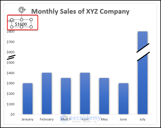
- Select the Text Box option from the drop-down.
- Click on the Text Box and type in $1600, as shown in the following image.
- Select the Text Box and go to the Shape Format option from the Ribbon.
- Choose the Shape Fill option.
- Choose the color White, as marked in the picture given below.
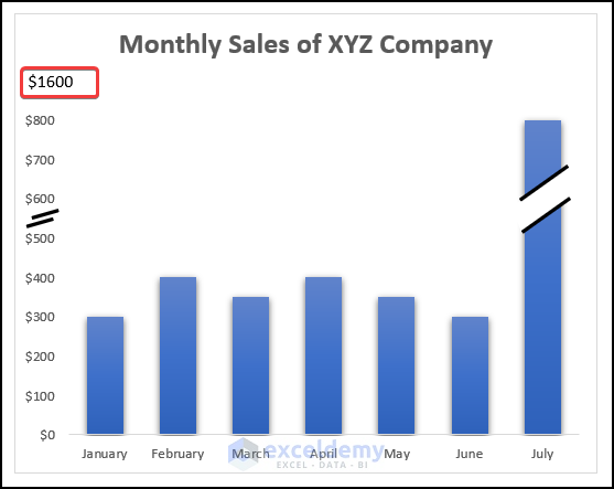
- Reposition the text box so the label from the chart’s axis gets hidden.
If you can do it correctly, you will see the following output on your worksheet, as shown in the image below.
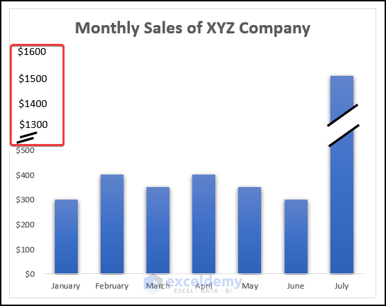
- Add 3 more text boxes following the same steps to get the following output.
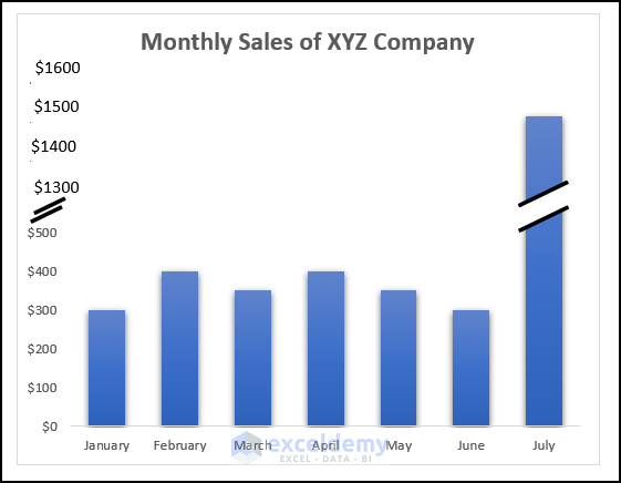
The final output should look like the following picture.
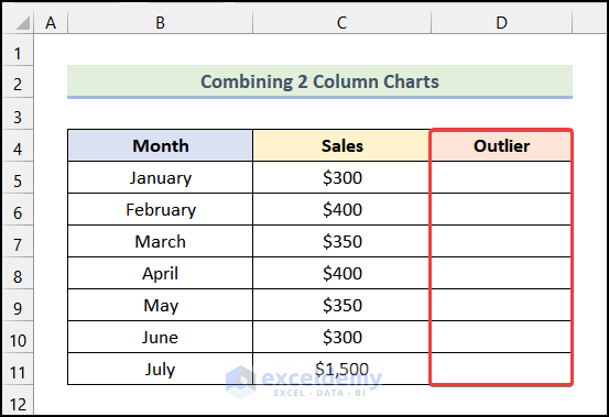
Method 3 – Overlapping 2 Column Charts
Step 1: Preparing a Dataset to Break Axis
- Create a new column named Outlier, as shown in the following image.
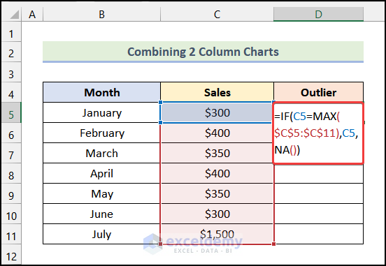
- Enter the following formula in cell D5:
=IF(C5=MAX($C$5:$C$11),C5,NA())Here, cell C5 refers to the cell of the Sales column, and the range $C$5:$C$11 represents all of the cells of the Sales column.
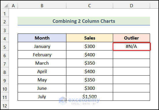
- Hit ENTER.
You will have the following output on your worksheet.
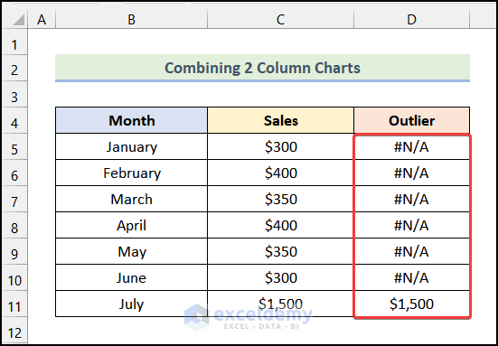
- Get the remaining outputs by using the AutoFill option of Excel.
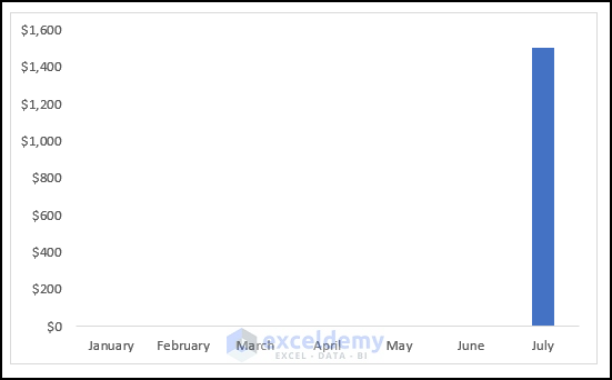
Step 2: Inserting 2 Column Charts
- Select the cells of the columns named Month and Sales.
- Go to the Insert tab from the Ribbon.
- Click on the Insert Column or Bar Chart option.
- Select the Clustered Column option from the drop-down.
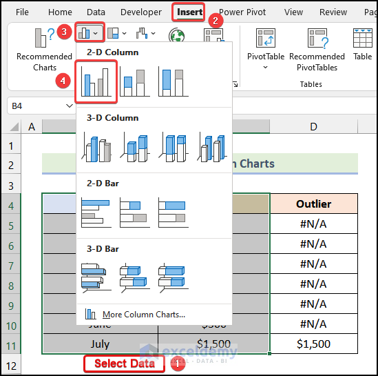
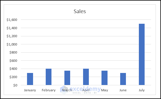
The following Column Chart will be visible on your worksheet.
- Follow the steps used in Step 04 of the 1st method to format the chart.
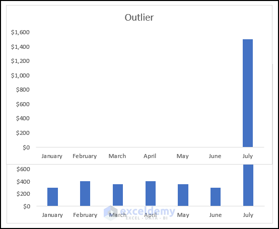
- Press CTRL and select the columns named Month and Outlier.
- Go to the Insert tab from the Ribbon.
- Click on the Insert Column or Bar Chart option.
- Select the Clustered Column option from the drop-down.
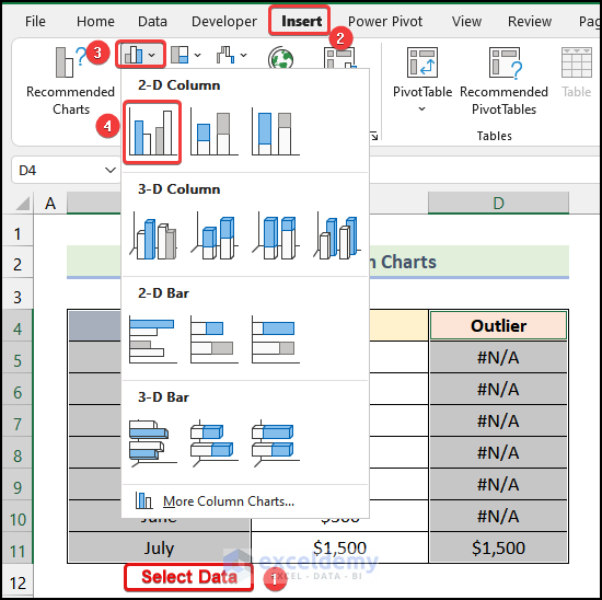
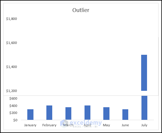
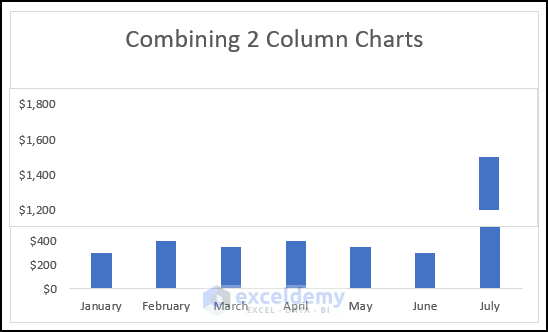
You will have the following chart, which shows only the unusually large value.
Step 3: Editing and Repositioning 2 Column Charts
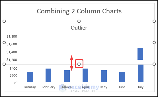
- Reposition the Outlier chart on top of the first chart to look like the following image.
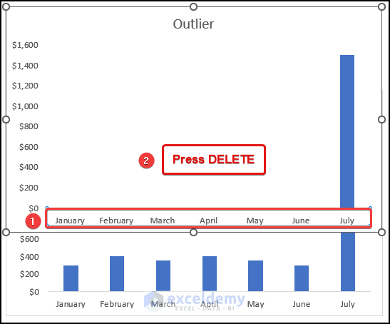
- Select the Horizontal Axis of the Outlier chart and hit the DELETE key.
- Right-click on the Vertical Axis of the Outlier chart and select the Format Axis option.
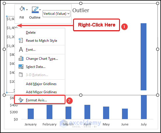
The Format Axis dialogue box will open on your worksheet, as shown in the following image.
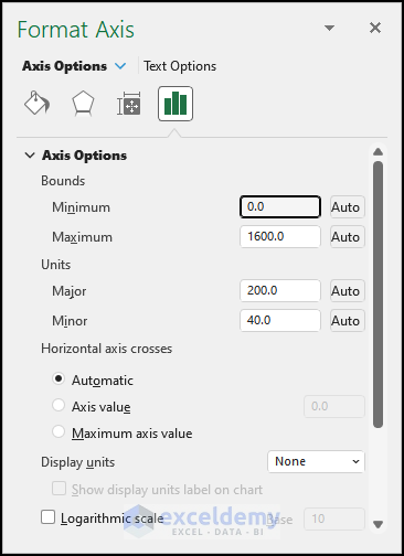
- In the Format Axis dialogue box, go to the Axis Options tab.
- In the Minimum box, type in 1200, and the Maximum box, type in 1800.
- Under the Units section, in the Major box, type in 200.
you will get the following output, as shown in the following image.
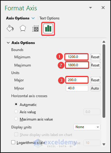
- Resize the Outlier chart by dragging the marked portion of the following image so that the gap between the labels of the Outlier chart matches with the first chart.
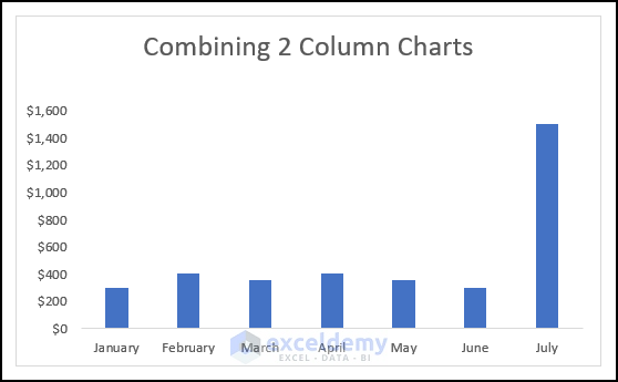
Your combined chart should look like the following image.
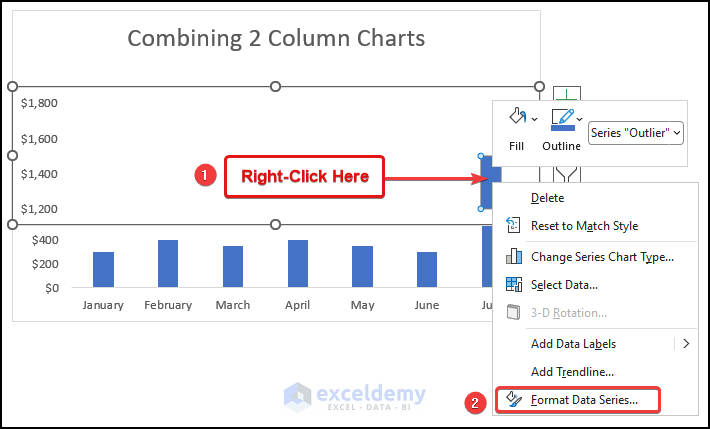
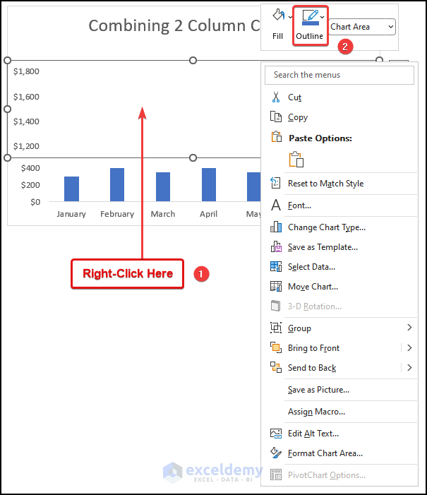
- Right-click on the marked portion of the following image.
- Select the Format Data Series option.
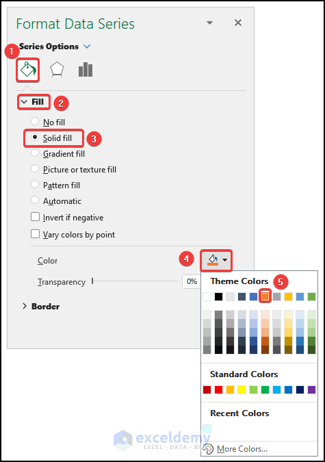
- From the Format Data Series dialogue box, go to the Fill & Line tab.
- Under the Fill section, choose the Solid Fill option.
- Click the Color option and choose your preferred color from the drop-down.
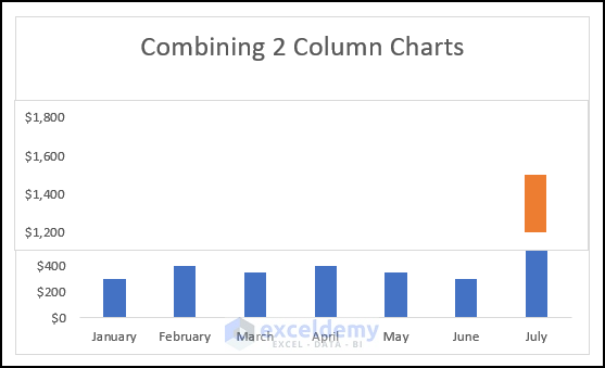
The top part of the combined column chart will look like the image demonstrated below.
Step 4: Formatting the Combined Column Charts
- Right-click on the marked area of the following image.
- Click on the Outline option.
- Select the No Outline option from the drop-down.
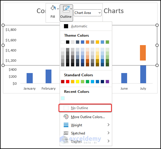
The outline from one chart will be removed, as shown in the following image.
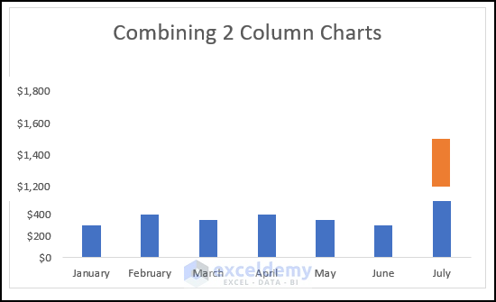
- Follow the same steps to remove the outline from the other chart.
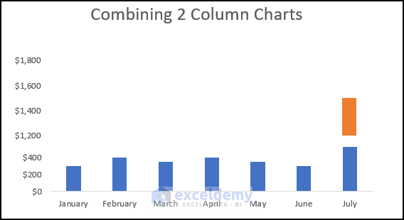
- Click the Chart Elements option.
- Check the box of Data Labels.
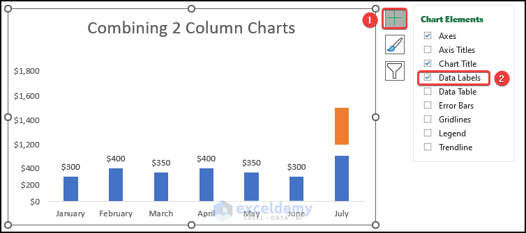
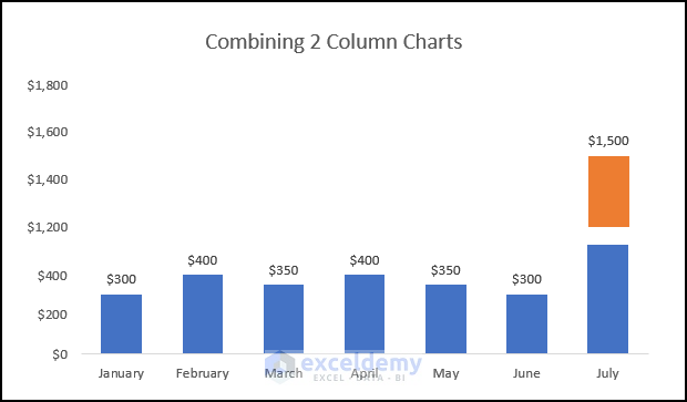
You will have the following final output on your worksheet.
How to Break the X-Axis in an Excel Scatter Plot
Step 1: Using Formula to Prepare Dataset
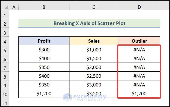
- Create a new column named Outlier in the given dataset.
- Enter the following formula in cell D5:
=IF(B5=MAX($B$5:$B$10),B5,NA())Here, cell B5 represents the cell of the Profit column, and the range $B$5:$B$10 refers to the range of the cells of the Profit column.
- Press ENTER.
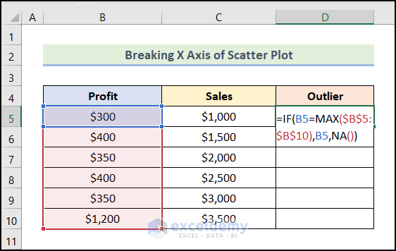
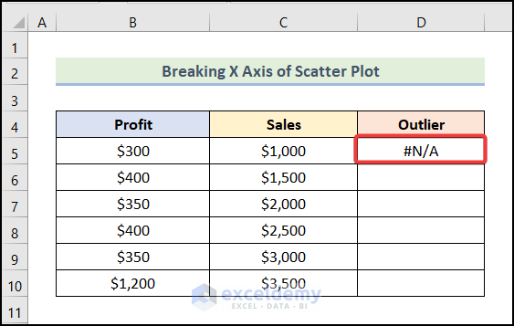
You will see the following output on your worksheet.
- Use the AutoFill feature of Excel to get the remaining outputs, as shown in the following image.
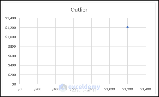
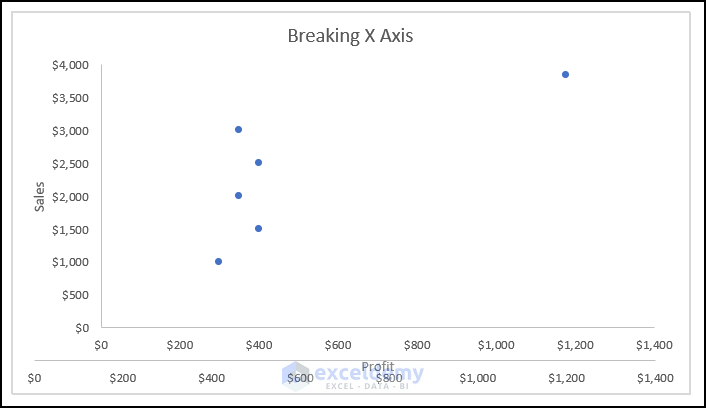
Step 2: Inserting the First Scatter Chart
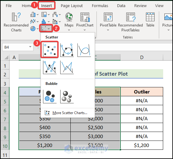
- Select the columns named Profit and Sales and go to the Insert tab from the Ribbon.
- Select the Insert Scatter (X, Y) or Bubble Chart option.
- Choose the Scatter option from the drop-down.
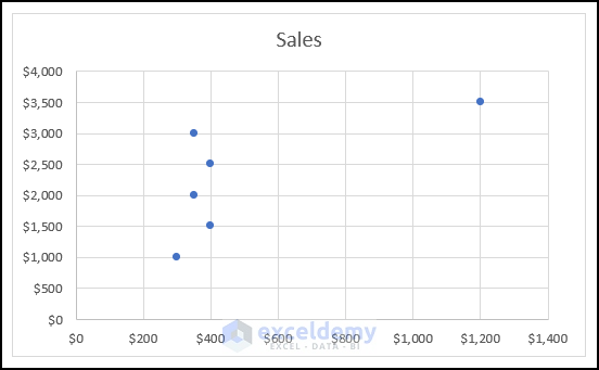
You will have a Scatter Chart like in the following picture.
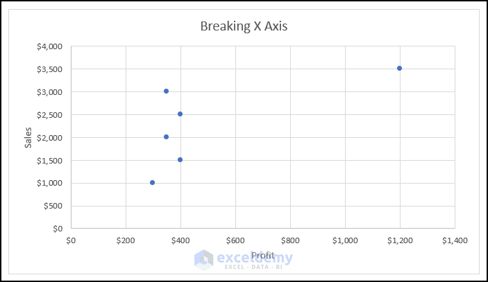
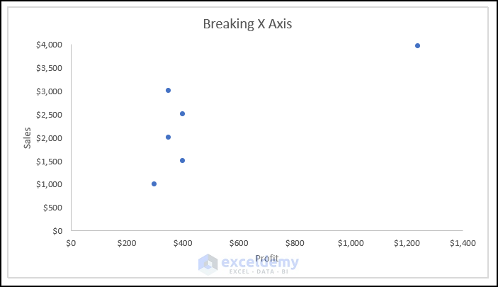
Step 3: Formatting the First Scatter Chart
- Follow the steps mentioned in Step 04 of the 1st method to format the chart.
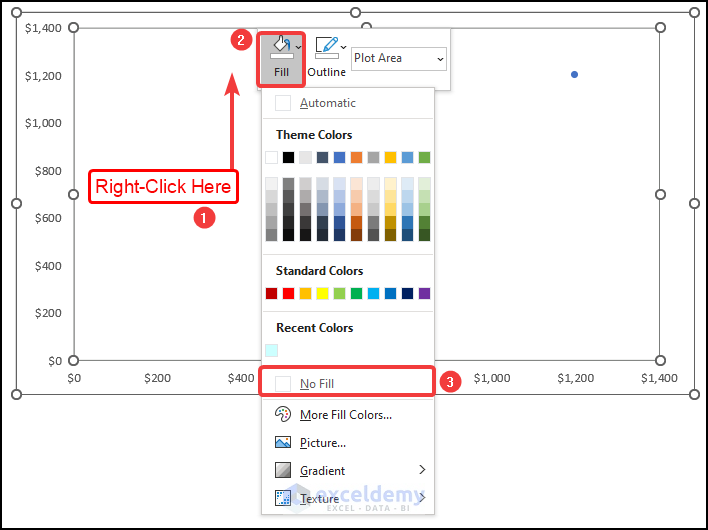
- Double-click on the rightmost data point of the chart.
- Right-click on the data point.
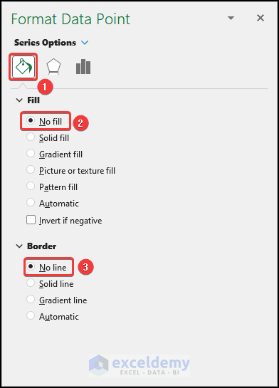
- Choose the Format Data Point option.
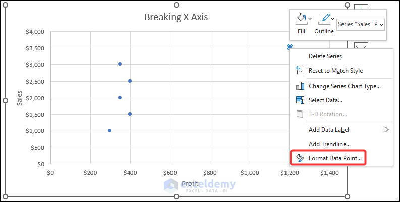
The Format Data Point dialogue box will open, as shown in the following image.
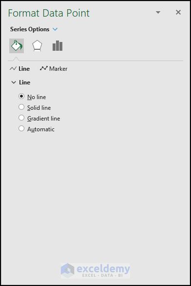
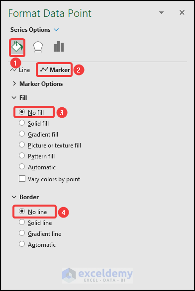
- In the Format Data Point dialogue box, go to the Fill & Line tab.
- Choose the Marker option.
- Select the No fill option under the Fill section.
- Choose the No line option under the Border section.
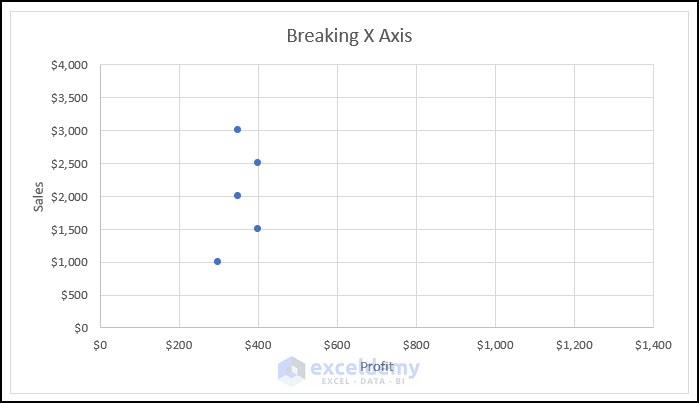
You will see that the rightmost data point is no longer visible on your worksheet like in the image below.
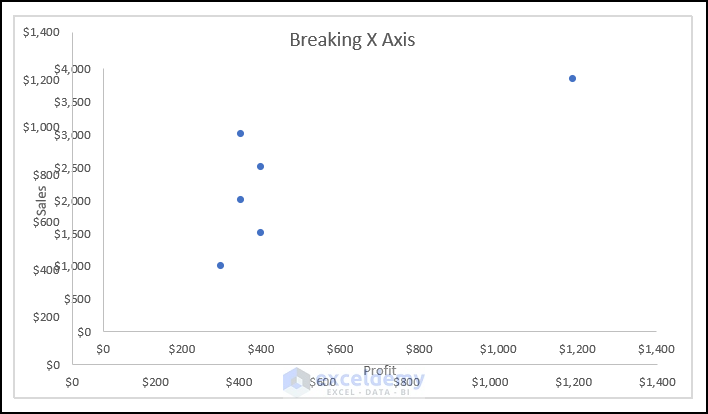
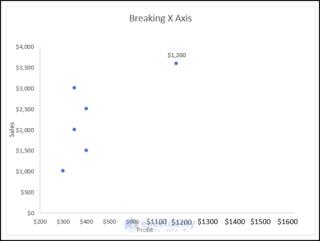
Step 4: Inserting the Second Scatter Chart
- Select the columns named Profit and Outlier and follow the steps mentioned in Step 02 of this method to get the following scatter chart,
Step 5: Formatting the Second Scatter Chart
- Use the steps used in Step 04 of the 1st method to format the chart.
- Resize and reposition the second chart on top of the first chart.
- Right-click anywhere on the chart area of the second chart.
- Click on the Fill option.
- Select the No Fill option from the drop-down.
You will see the following output on your worksheet.
- Select the vertical axis as shown in the following image, and then press DELETE.
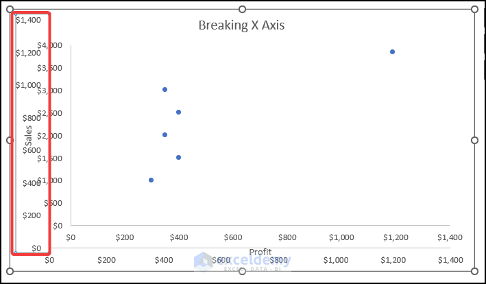
The vertical axis will be removed from the chart like in the image below.
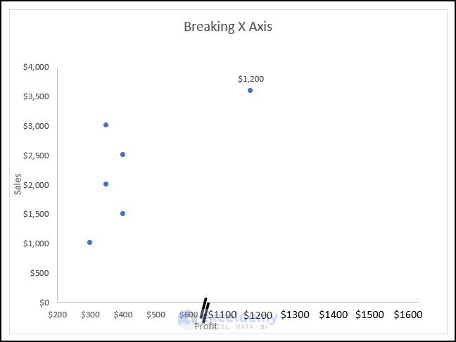
Remove the horizontal axis, and your chart will look like the following picture.
Step 6: Adding a Text Box and Break Shape
- Use the steps mentioned in Step 05 of Method 2 to add text boxes, as shown in the following image.
- Follow the procedure discussed in Step 03 of Method 2 to add the break shape to your chart.
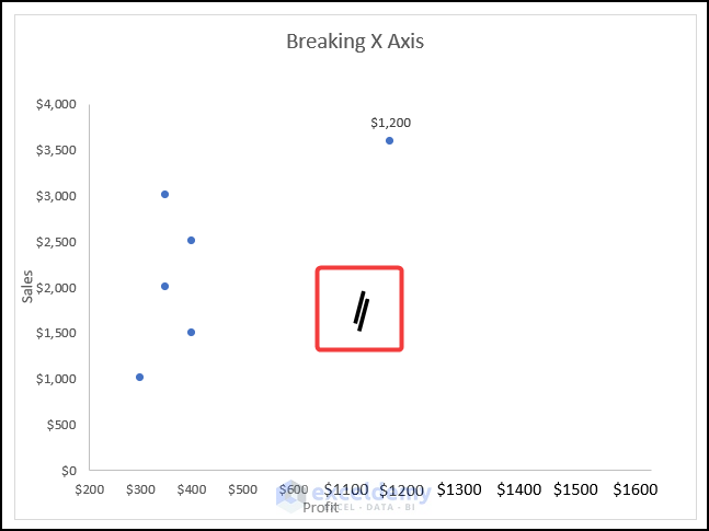
- Resize and reposition the shape like in the following picture.
You have your desired broken X-Axis in an Excel Scatter Plot.
Download the Practice Workbook
Related Articles
- How to Change Axis Scale in Excel
- How to Change X Axis Scale in Excel
- How to Change Y Axis Scale in Excel
- Automatic Ways to Scale Excel Chart Axis
- How to Scale Time on X Axis in Excel Chart
- How to Set Logarithmic Scale at Horizontal Axis of an Excel Graph
- How to Change Axis to Log Scale in Excel
- How to Set Intervals on Excel Charts
<< Go Back to Excel Axis Scale | Excel Charts | Learn Excel
Get FREE Advanced Excel Exercises with Solutions!
