
Dynamic data visualizations enhance your Excel reports by automatically updating charts when data changes. Charts respond instantly to updates and empower users with interactive controls, providing a seamless experience.
In this tutorial, we will show how to create interactive, real-time charts in Excel for dynamic data visualizations.
Method 1: Dynamic Table Chart (Auto-Expanding)
Excel Tables automatically expand to include new data. When you create a chart from a Table, it automatically grows as you add rows, eliminating the need for updates.
Convert Your Data into an Excel Table:
- Select the data (including headers).
- Go to the Insert tab >> select Table.
- Check “My table has headers” is checked.
- Click OK.
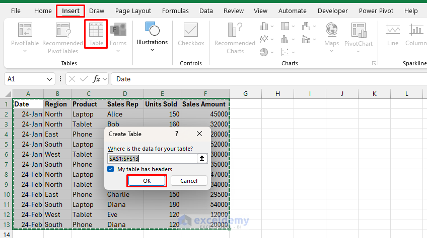
- Now your data is formatted as an Excel Table, automatically expandable.
Create the Chart:
- Select the Product and Sales Amount columns (hold Ctrl to select both).
- Go to the Insert tab >> select Column or Bar Chart >> select Clustered Column.
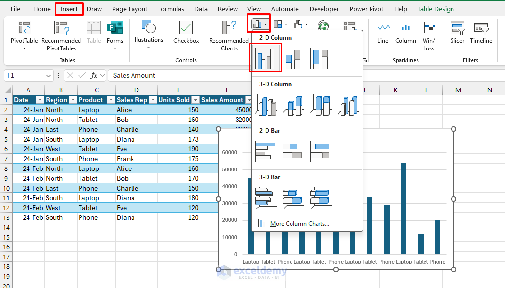
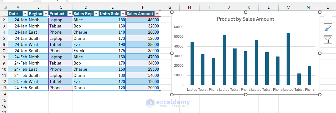
- You will get the dynamic chart.
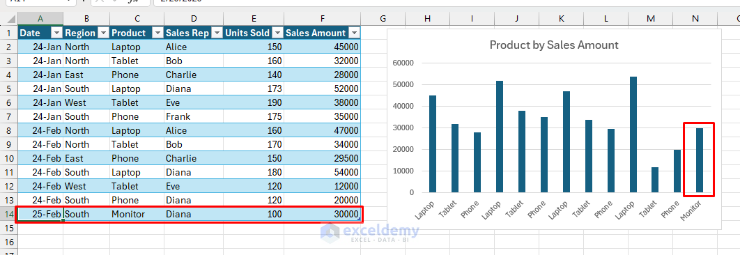
Dynamic Behavior:
- Add a new row.
- The chart instantly includes this data without manual updates.
Method 2: Dynamic Named Range Chart
You can use named ranges with formulas (e.g., OFFSET & COUNTA) to make charts auto-expand for new data, even if you aren’t using a Table.
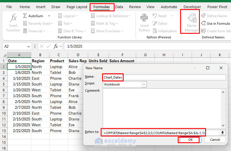
Create Named Ranges:
- Go to Formulas tab >> select Name Manager >> select New.
- Name: Chart_Dates.
- In Refers to: insert the following formula.
=OFFSET('Named Range'!$A$2,0,0,COUNTA('Named Range'!$A:$A)-1,1)
- Click OK.
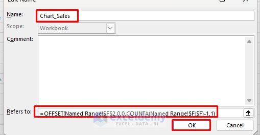
- Add another Named Range.
- Name: Chart_Sales.
- In Refers to: insert the following formula.
=OFFSET('Named Range'!$A$2,0,0,COUNTA('Named Range'!$A:$A)-1,1)
- Click OK.
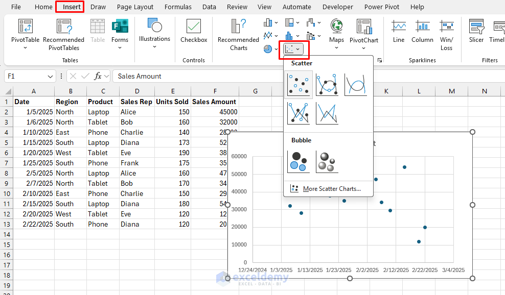
Create a Chart:
- Go to the Insert tab >> select Scatter Chart (with markers).
- Right-click chart >> choose Select Data.
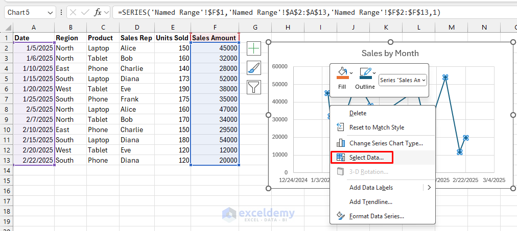
- Select Edit from Legend Entries (Series).
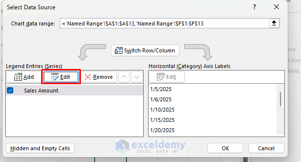
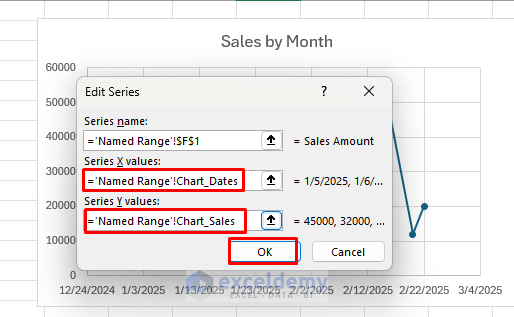
- For series X values, enter:
='Named Range'!Chart_Dates
- For Y values, enter:
='Named Range'!Chart_Sales
- Click OK.
Dynamic Behavior:
- It will update the chart with the dynamic named ranges.
- Add a new row and chart updates in real-time.
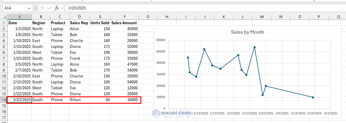
- As you add more dates and sales, the scatter chart expands, with no manual range editing required.
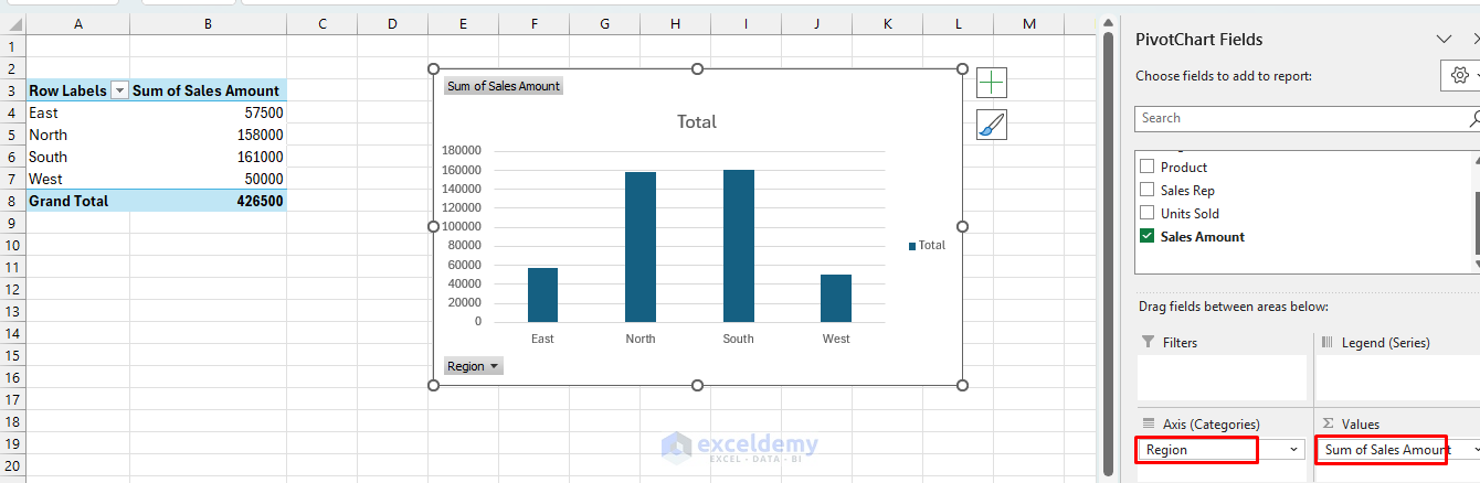
Method 3: Interactive Pivot Chart with Slicers
PivotTables paired with slicers create interactive dashboards. Users click buttons to filter the chart.
Create PivotTable & PivotChart:
- Go to the Insert tab >> from Charts >> select PivotTable & PivotChart.
- Select location: New Worksheet.
- Click OK.
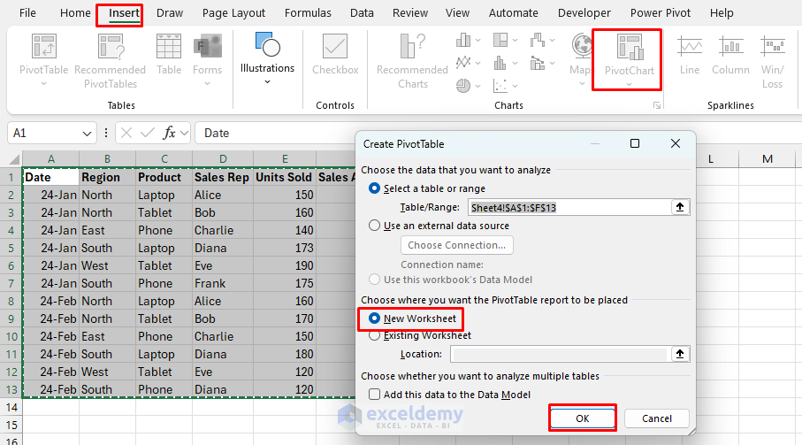
- In the PivotChart Fields list;
- Drag the Region to the Axis.
- Drag Sales Amount to Values.
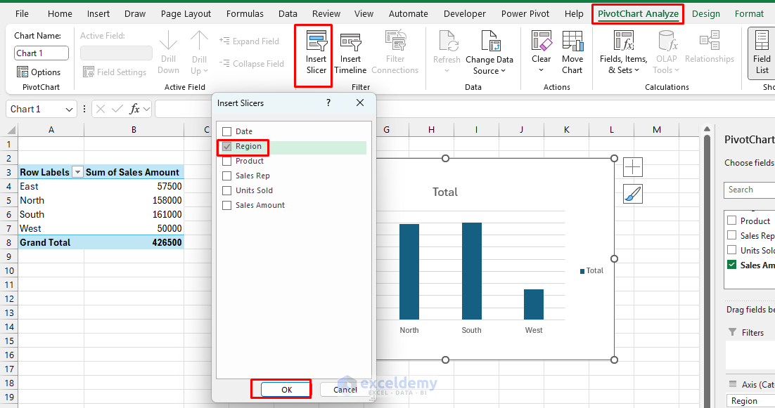
Add a Slicer:
- Click the PivotTable.
- Go to the PivotTable Analyze tab >> select Insert Slicer.
- Choose Region.
Dynamic/Interactive Behavior:
- Click “East” on the slicer, and the chart updates to show only East’s product sales.
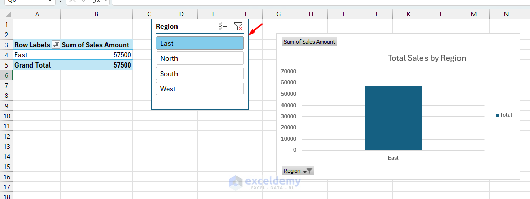
- You can select multiple regions, and the chart combines those.
Method 4: Formula-Driven Interactive Chart (Drop-Down Filtering)
Let’s use drop-down lists (Data Validation) and the FILTER function to let users pick a value (e.g., Product), updating the chart instantly.
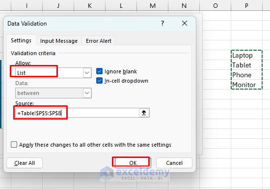
Create a drop-down:
- In A1, type “Select Product”.
- Select cell B1.
- Go to the Data tab >> select Data Validation.
- In Allow: select List.
- In Source: Select unique products. Use a unique formula in another sheet and refer to it from there.
=Table!$P5:$P8
- Click OK.
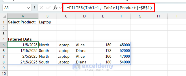
Filter data:
- Select a cell and insert the following formula.
=FILTER(Table1, Table1[Product]=$B$1)
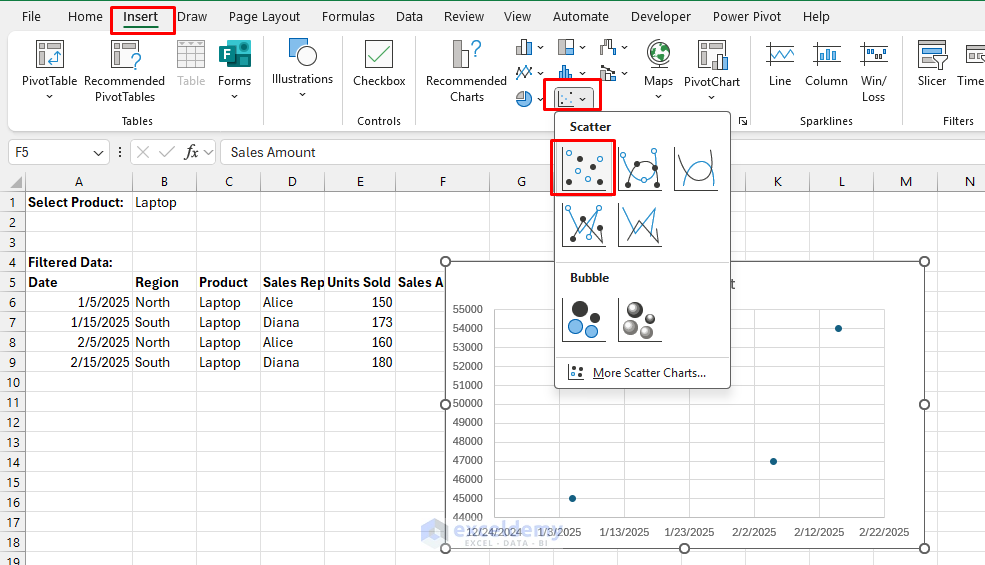
Create a Chart:
- Select the filtered table (e.g., Date and Sales Amount columns).
- Go to the Insert tab >> select Scatter Chart.
Dynamic Behavior:
- Change the product in the drop-down, and the chart automatically shows only data for that product.
- Whenever you change the product in cell B1, the chart updates immediately.

Method 5: Interactive Charts Using Drop-down Lists (Form Controls)
Interactive charts allow users to control displayed data dynamically.
Insert Drop-down Form Control:
- Click the Developer tab >> select Insert >> select Combo Box form Form Controls.
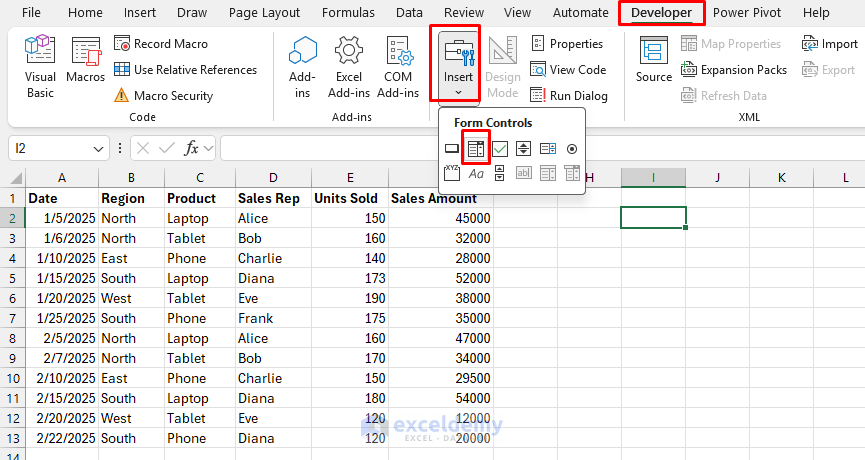
- Draw the Combo Box on the worksheet.
- Right-click on Combo Box >> select Format Control.
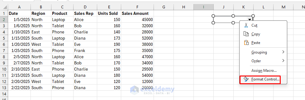
- Set Input Range: A list of products.
- Create a unique list of products in a distance column; later, you can hide it.
=UNIQUE(C2:C13)
-
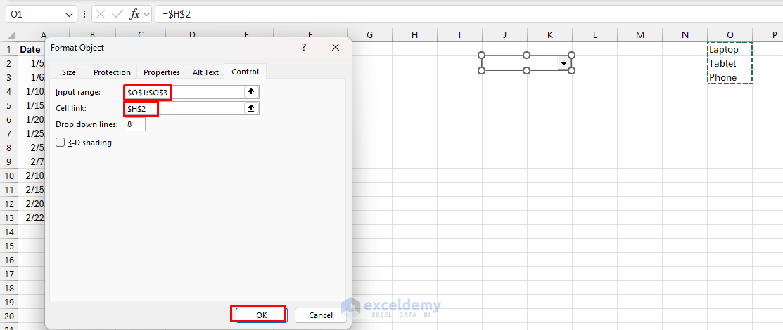
- Select O1:O3.
- Set Cell Link: Select cell H2.
- Click OK.
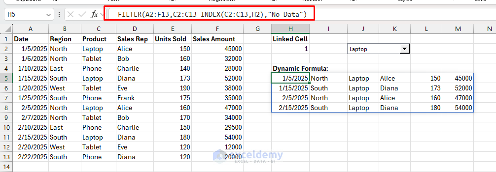
Create Linked Dynamic Formula:
- Select a cell and insert the following formula.
=FILTER(A2:F13,C2:C13=INDEX(C2:C13,H2),"No Data")
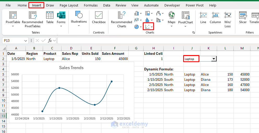
Create the Interactive Chart:
- Select the Date and Sales Amount column from the filtered data.
- Go to the Insert tab >> choose a Scatter Chart.
Dynamic Chart:
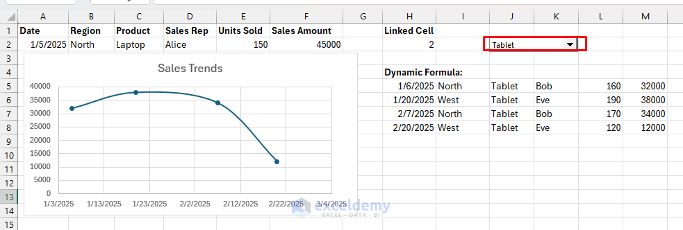
- Changing the Combo Box selection dynamically updates your visualization.
Best Practices & Tips
- Use Tables for most dynamic needs.
- PivotTables and slicers make dashboards accessible for all users.
- Named ranges work best when you need chart data that isn’t easily Table-based.
- Always label axes and titles clearly for context.
Conclusion
By following the above techniques, you can create interactive, dynamic charts that update in real-time. Dynamic and interactive charts transform Excel into a data exploration tool. This enhances your reporting, making it more engaging and responsive to user interaction. Among all the methods, choose the one that best fits your scenario. Try experimenting with updated features to make the visualizations dynamic and efficient.
Get FREE Advanced Excel Exercises with Solutions!
