The Cash Flow Waterfall Chart in Excel is a great feature that allows you to present the cash flows in a smart way. Creating a Waterfall chart has become easier for users of Excel 2016 and later versions due to the newly added Waterfall chart type. However, it is a little complicated to create on in Excel 2013 and earlier versions. Follow the article to learn how how to do that in both Excel versions.
How to Create a Cash Flow Waterfall Chart in Excel: 2 Ways
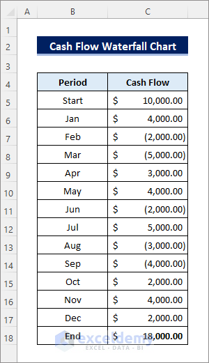
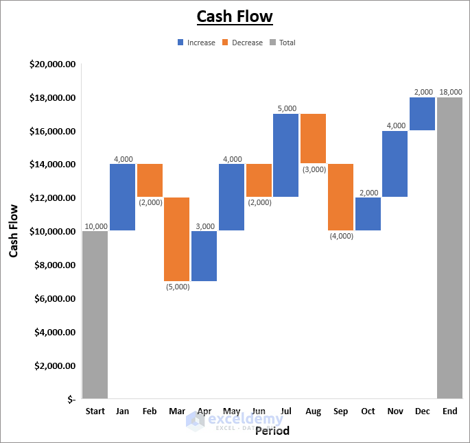
Suppose you have the following dataset containing the monthly cash flows within a year. The numbers in brackets indicate a negative value. The End row has the total of the rows above.
1. Create a Cash Flow Waterfall Chart in Excel 2016 and Later Versions
It is extremely easy to create a cash flow waterfall chart in Excel 2016 and later versions due to the newly added Waterfall Chart type.
Follow the steps below to be able to do that.
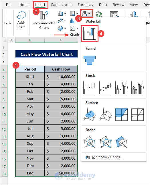
- First, select the entire dataset. Then go to Insert >> Insert Waterfall, Funnel, Stock, Surface, or Rudder Chart >> Waterfall as shown below.
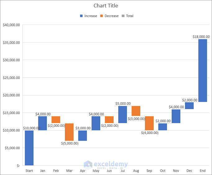
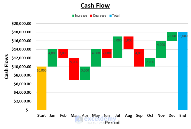
- Next, you will get the following waterfall chart for the cash flow dataset.
- After that, you need to format the chart as required to make it more presentable. For example, click on the Chart Title and rename it as desired. Then enable Axis Title using the Chart Element menu at the top-right corner of the chart and rename them. Alternatively, you can use the Chart Design and the Format tabs to do that. You need to select the chart to access those options.
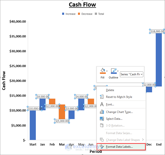
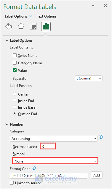
- Now, notice that the Data Labels are not properly visible. So, right-click on any data label and select Format Data Labels.
- Now, you can set the decimal places to 0 and remove the $ symbol if you want to make the labels shorter.
- Another way to make the labels fit properly is by making the columns wider. Right-click on any column and select Format Data Series to do that.
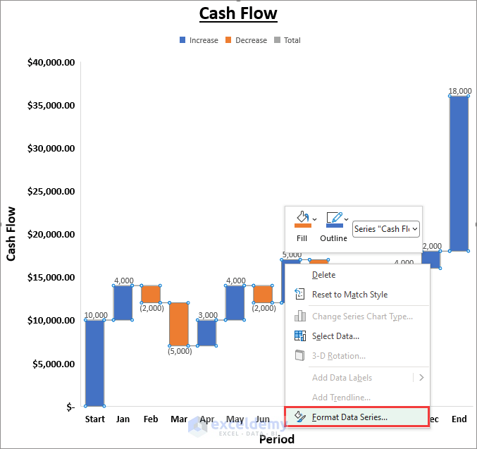
- Then reduce the Gap Width as required. After that, the columns will become wider.

What to Do If the “Set As Total” Column Is Not Showing in Cash Flow Waterfall Chart
- Now, notice that the “Total” Legend is visible at the top of the chart. But no column in the chart has that color indicating that the chart is not showing the Total.
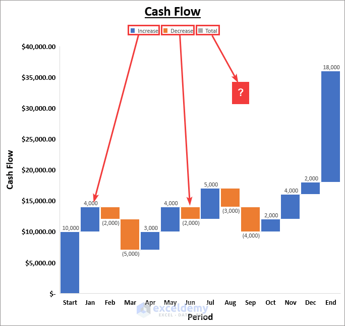
- This is because you haven’t yet set any column as Total. In this case, the End column contains the total cash flow of the year. So, triple-click on that column or click twice (not double-click) to select it. This will select that column and all other columns will become blurred out.
- Now right-click on that column and select Set as Total as follows.
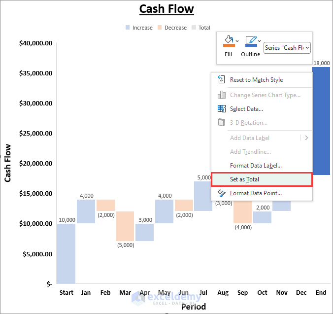
- Finally, the Total column will look as follows. You can do the same to the Start column also as it is merely the total balance at the start.
Read More: How to Calculate Payback Period in Excel
2. Create a Cash Flow Waterfall Chart in Excel 2013 and Earlier Versions
Unfortunately, there is no direct way to create a Waterfall Chart in Excel 2013 and earlier versions. But there is a way around doing that using the Stacked Column Chart.
This method may seem a little complicated. So follow the steps carefully.
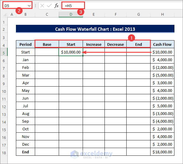
- First, insert 5 columns between the Period and the Cash Flow columns and label them as Base, Start, Increase, Decrease, and End respectively as shown below. Then either input the Start amount in the first cell of the Start column or use cell reference (=H5) from the Cash Flow Keep the rest of that column empty.
- Now you need to copy the positive amounts from the Cash Flow column to the Increase You can use the IF function to create the following formula for that.
=IF(H5>0,H5,0)- Alternatively, you can create a simpler formula using the MAX function. Apply the following formula in cell E6 which corresponds to the first month (Jan) and drag the Fill Handle icon up to cell E17 which corresponds to the last month (Dec).
=MAX(H6,0)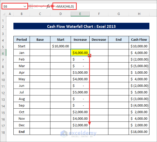
- Then you need to copy the negative amounts from the Cash Flow column to the Decrease column and convert them to positive amounts. You can use the IF function in this case also.
=-IF(H5<0,H5,0)- But again, will use another simpler formula using the MIN function. So, enter the following formula in cell F6 and drag the Fill Handle icon up to cell F17.
=-MIN(H6,0)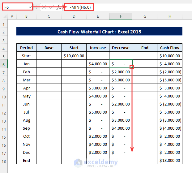
- Now you need to fill the Base column so that the Increase and Decrease columns do not start from the horizontal axis in the chart. You need to hide this column in the chart later on.
- So, create the following formula using the SUM function in cell C6 and drag the Fill Handle icon up to the last cell (C18) of this column. Then drag and move the last cell (C18) of this column to the last cell of the End column (G18).
=SUM(C5,D5:E5)-F6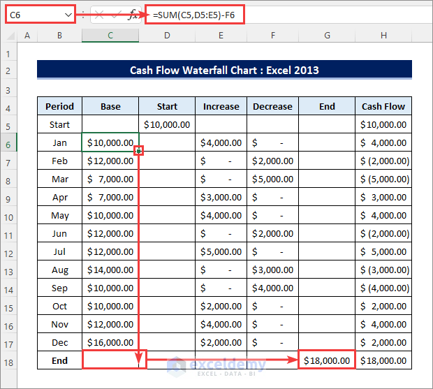
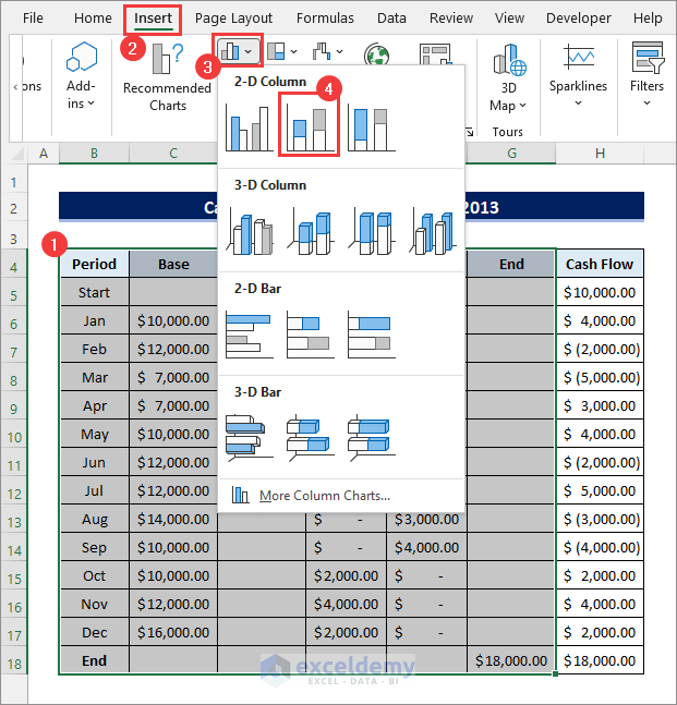
- Now it’s time to create the chart. First, select the entire table except for the Cash Flow column. Then go to Insert >> Insert Column or Bar Chart >> 2-D Column >> Stacked Column as shown below.
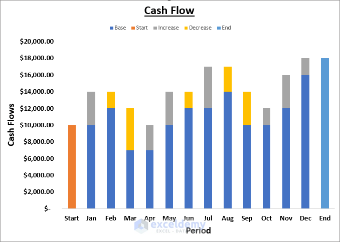
- After that, you will have the following chart. Well, obviously this is not what you were looking for, but don’t worry. You will need to format a few properties of the chart to make it look like a Waterfall Chart as created earlier.
- First, right-click on the Base data series i.e. the blue bars, and change the Fill and the Outline to No Fill.
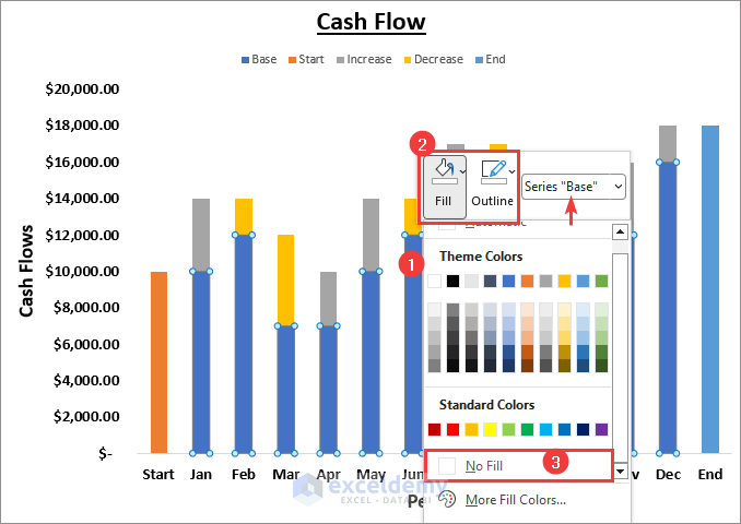
- After that, the chart will look as follows.
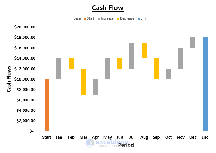
- Now you need to right-click on each Data Series and change the Fill Color as required. Then right-click and Format Series to reduce the Gap Width. You can change the End column label in the dataset to Total. You can also add Data Labels as in the earlier method and remove the data labels of the Base data series.
- As a result, the cash flow waterfall chart will look as follows.
Read More: How to Calculate Payback Period with Uneven Cash Flows
Things to Remember
- The Waterfall Chart type is only available in Excel 2016 and later versions. It has limited formatting options.
- Follow the steps carefully if you are using the second method as each step in that method, especially up to creating the data table, is very important.
Download Practice Workbook
You can download the practice workbook from the download button below.
Conclusion
Now you know how to create a cash flow waterfall chart in excel. Do you have any further queries or suggestions? Please let us know in the comment section below.
Related Articles
- How to Calculate Incremental Cash Flow in Excel
- How to Calculate Cumulative Cash Flow in Excel
- Calculating Payback Period in Excel with Uneven Cash Flows
- How to Calculate Discounted Payback Period in Excel
- How to Apply Discounted Cash Flow Formula in Excel
- How to Calculate Operating Cash Flow in Excel
- How to Calculate Net Cash Flow in Excel
<< Go Back to Excel Cash Flow Formula | Excel Formulas for Finance | Excel for Finance | Learn Excel
Get FREE Advanced Excel Exercises with Solutions!
