
Cohort analysis is an essential data science technique that helps us to understand user behavior, retention, and engagement over time by grouping users into distinct cohorts. Excel is a powerful tool that allows you to easily build, visualize, and analyze cohort data.
In this tutorial, we will build a cohort analysis tool in Excel for data science.
What Is Cohort Analysis?
A cohort is a group of people who share a common characteristic within a defined time frame (e.g., sign-up month). Cohort analysis lets you see how different cohorts behave over time. For example, how many users who signed up in January keep returning in the following months?
Step 1: Prepare Your Data
Organize your data into clear columns, including at a minimum:
- User ID
- Signup Date
- Activity Date
Ensure dates are formatted correctly (Date format in Excel).
Step 2: Assign Cohorts
To assign cohorts, follow these steps:
- Add a column labeled Cohort Month.
- Select cell D2 and insert the following formula.
- Drag this formula down for all rows.
=TEXT(B2, "YYYY-MM")
This formula formats the date as Year and Month.

Step 3: Calculate the Cohort Index
Create a column to track the number of months since the user’s cohort. This will show the number of months since the signup date.
- Label the column as CohortPeriod.
- Select cell E2 and insert the following formula.
=(YEAR(C2)-YEAR(B2))*12+MONTH(C2)-MONTH(B2)+1
This formula gives the number of months since sign-up (1 = signup month, 2 = 1 month after, etc).

Step 4: Insert Pivot Table
Now, create a pivot table:
- Select your entire data range.
- Go to the Insert tab >> select PivotTable.
- Place the pivot in a new worksheet.
- Click OK.

- From the PivotTable Field List, drag the fields as follows:
- Rows: CohortMonth.
- Columns: CohortPeriod.
- Values: User ID.
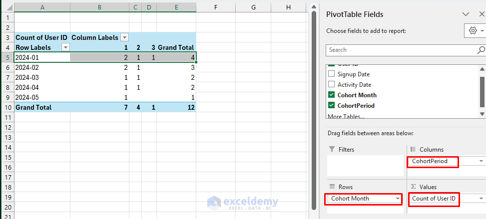
Interpretation (2024-01):
- Period 1 (Jan): 2 users signed up.
- Period 2 (Feb): 1 user active from the original 2 users.
- Period 3 (Mar): 1 user active from the original 2 users.
Tip: Ensure to set the value field settings to “Count of distinct User ID” if you have Excel 365 or a compatible version.
Step 5: Calculate Retention Rates
Convert the numbers to retention rates by dividing each cell by the cohort size. Either you can copy the Pivot Table in another sheet or calculate the retention rate in the same sheet.
- Copy the cohort month and periods from the pivot table.
- Paste it in the new worksheet.
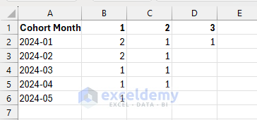
- Select cell B10 and insert the following formula.
- Drag this across and down to fill all periods.
- Format the cells as Percentage (%).
=IF($B2=0,0,B2/$B2)
This formula shows the retention percentage of users remaining active over each subsequent period compared to the first period.

Interpretation (2024-01):
- Period 1: 100% retention (baseline, all signed-up users are active).
- Period 2: 50% retention (1 out of 2 original users remained active).
- Period 3: 50% retention (1 out of 2 original users still active).
Step 6: Visualize the Cohort Analysis
Apply Conditional Formatting on the retention table.
- Select the retention table.
- Go to the Home >> select Conditional Formatting >> select Color Scales.
- Choose a suitable gradient for clarity (green for high retention, red for low).

Overall Insights from the Cohort Analysis:
- Cohort 2024-01 shows good initial retention (50% after 2 months).
- Cohort 2024-02 retained half of its users in the second month.
- Cohorts from later months show initial retention but less data due to recent signup, making it difficult to analyze long-term retention at this stage.
Conclusion
By following these steps, you can build a powerful Excel-based cohort analysis tool. This tool will help you get insights about user retention and engagement, which is crucial for informed data-driven decisions. Cohort analysis in Excel is an invaluable technique for tracking user engagement and retention over time, allowing data scientists and analysts to uncover actionable insights.
Get FREE Advanced Excel Exercises with Solutions!

GOOD EXPLANATION AND GIVES CLARITY
Hello Kalai,
Thanks for your feedback and appreciation. Glad to hear that you liked our explanation and clarity.
Regards,
ExcelDemy