When you work on a large dataset and try to present it, the viewers get lost right after the start. Because the amount of the dataset is so big that they cannot understand it properly. In this case, the Pivot Chart helps a lot to project the dataset in a summarized and more definite way. In this article, we will get to know the pivot chart and the 7 most popular types of pivot charts in Excel.
What Is Pivot Chart?
To get to know the Pivot Chart, we must know the Pivot Table before. The pivot table is used to summarize the original dataset you prepare. But you cannot see all the data at once. This is where the pivot chart is required. It complements the pivot table by visualizing the summary dataset in an easier way. The Pivot Chart helps to illustrate comparisons, patterns, and trends.
Types of Pivot Charts in Excel: 7 Most Popular Ones
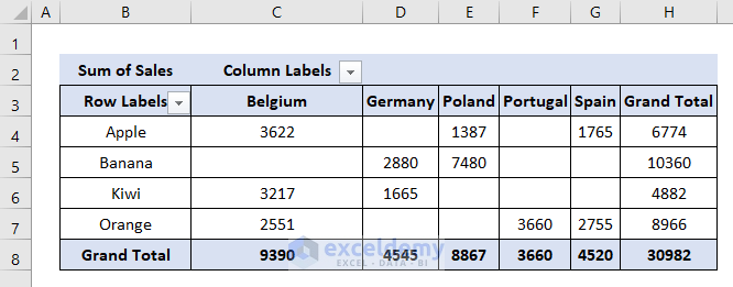
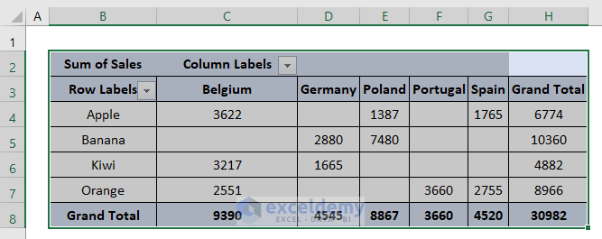
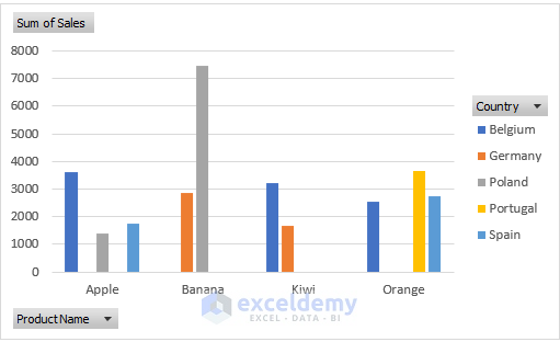
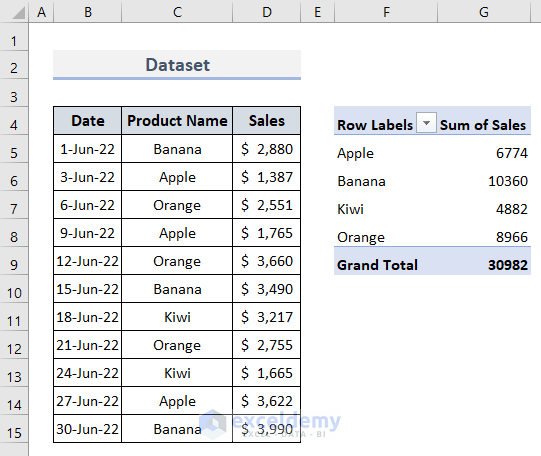
For example, we have prepared a pivot table with the information on sales of 4 types of fruits in 5 European countries. As you can see the pivot table seems quite confusing. Therefore we need a pivot chart to explain this clearly.
Let us now explore the 7 most popular types of pivot charts in Excel based on this dataset.
1. Column Chart
The column chart is helpful for visually comparing values across a few categories over a period of time. It typically displays information based on the horizontal axis and the vertical axis.
Let’s follow the steps to create a column chart from the pivot table in Excel.
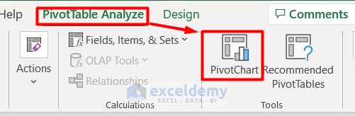
- Firstly, select the whole pivot table.
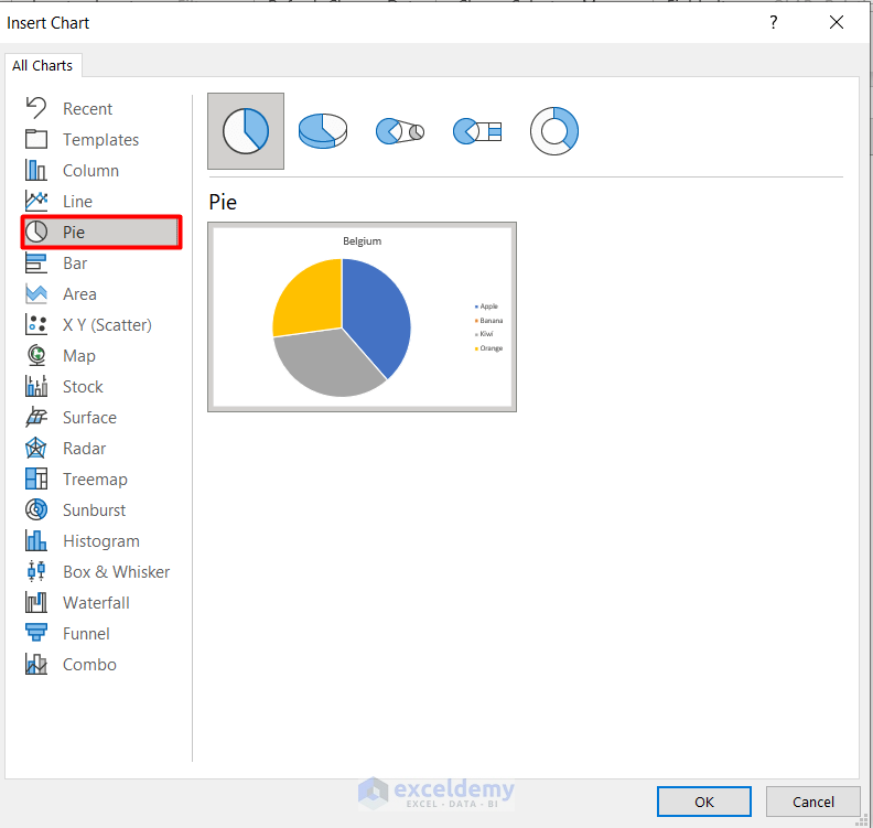
- Secondly, select PivotChart in the Tools section of the Pivot Table Analyze tab.
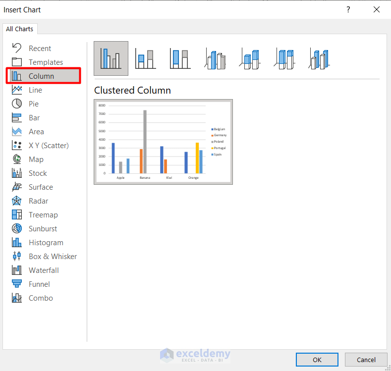
- After that, select Column from the Insert Chart window.
- Here, you can see different styles of column charts. Choose any one of them.
- Next, press OK.
- Finally, you can see a column chart in the workbook based on the pivot table.
Read More: Use Excel VBA to Create Chart from Pivot Table
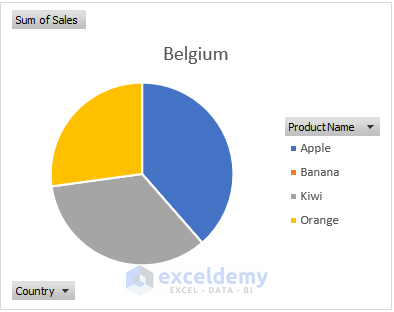
2. Pie Chart
The pie chart is a fun and interesting type of pivot table. It originates from a circle and divides into several pies according to the categories of the pivot table. The data points are shown as a percentage of the whole pie. Each of the pieces changes its size accordingly. Let’s make a pie chart.
- The process to select a pivot chart is similar to the above.
- All you need to do is choose the type of chart you want from the Insert Chart window.
- Here, we are choosing a Pie chart.
- That’s it, we successfully made a pie chart of the pivot table.
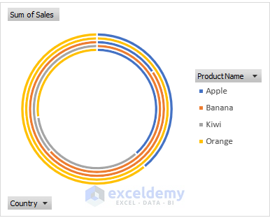
3. Doughnut Chart
The doughnut chart is similar to the pie chart. The only difference is that it can contain more data series at once.
- You can find the doughnut chart in the Pie chart section of the Insert Chart window.
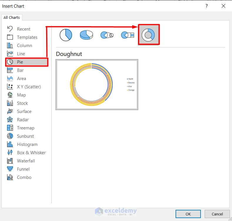
- Finally, you can see the doughnut chart here.
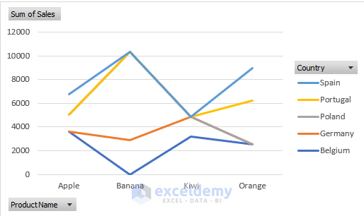
4. Line Chart
The line chart is an ideal pivot chart to show trends of data in equal intervals, especially time differences. It also represents data evenly scaled based on the horizontal and vertical axis.
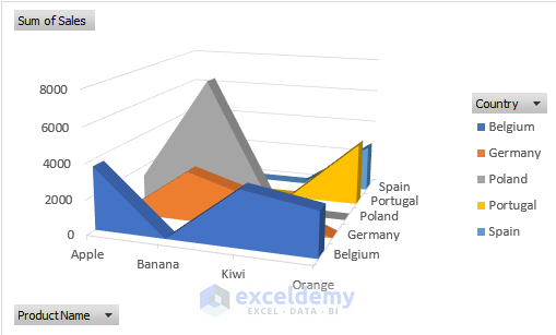
5. Area Chart
In case you want to visualize your pivot chart in a solid area rather than single bars or lines, the area chart can be the useful one. Apart from showing plot change over time, it also shows the relationship between parts. The area chart can be 2D or 3D as well. Here you can see an area chart based on the initial pivot table.
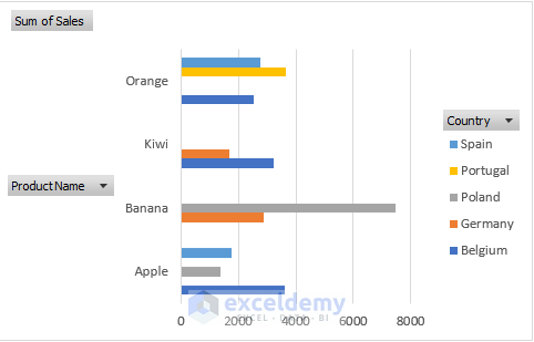
6. Bar Chart
The bar chart is apparently the opposite of the column chart as it shows the values along the horizontal axis and categories along the vertical axis. Other than that, it commonly illustrates comparisons among distinctive items.
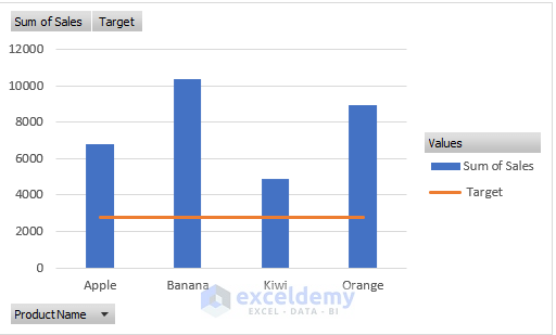
7. Combo Chart
Combo Chart is a bit complex among other pivot charts. It requires two or more chart types to make the data understandable. It is mostly used for a mixed type of data such as price, volume etc. follow the steps below to create a combo chart:
- At first, create a pivot table with two different data types like this:
- Secondly, choose the Calculated Fields from Fields, Items, and Sets drop-down in the Pivot Table Analyze tab.
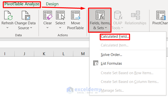
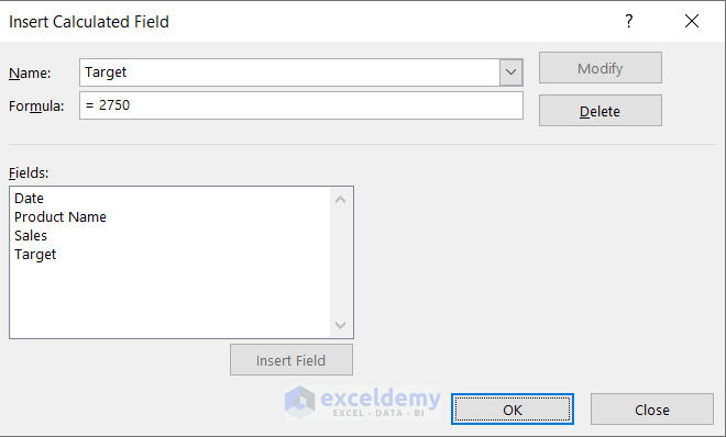
- After that, add Name and Formula in the Inset Calculated Field section.
- Press OK.
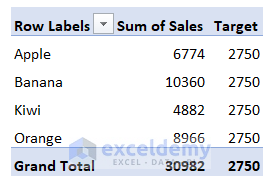
- Now, the pivot table will look like this:
- After this, like before, choose Combo from the Insert Chart window.
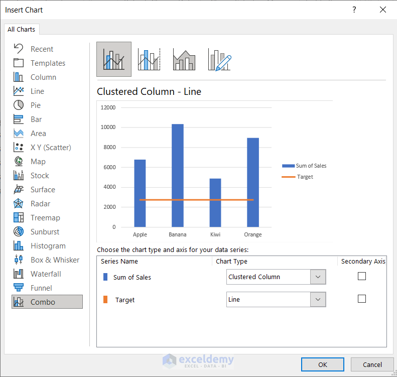
- Finally, we have our combo chart based on the pivot table.
Types of Pivot Charts in Excel: 5 Less Popular Ones
Here, we will discuss in short about rarely used pivot charts in Excel.
1. Scatter Chart
It is mostly used to compare scientific or statistical numbers with horizontal and vertical axes. The scatter chart is helpful to change logarithmic scale, axis values, and shows information for grouped set values. Remember that, the more you insert data, the more scatter charts will be better to understand.
2. Bubble Chart
Compared to the scatter chart, the bubble chart is quite similar except for the difference of having an additional third column. It is required to show data points in the data series.
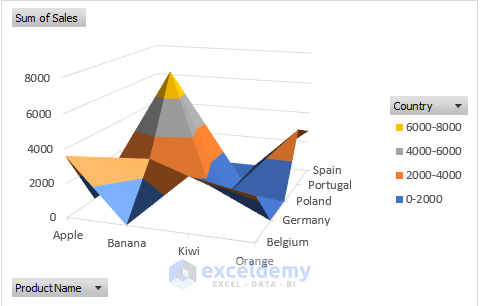
3. Surface Chart
The surface chart apparently acts as a topographic map with colors, and patterns indicating the areas of the values given.
4. Stock Chart
The stock chart is basically used to show fluctuations among the same type of data. It can be prices, temperatures, wind flow amount etc. It is targeted to show high-low variation among datasets.
5. Funnel Chart
The funnel chart is one of the few pivot charts that represent data without any axis information. It represents data as an inverted triangle with a hierarchical structure.
How to Customize Pivot Charts in Excel
After you create a pivot chart in Excel it requires some editing and customization in Excel. Here are some tips to do that.
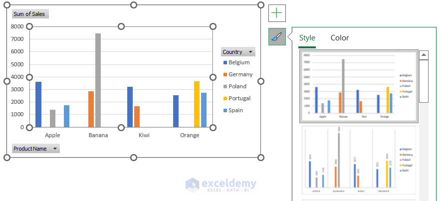
- Select the chart and you will see a Plus (+) icon that enables you to edit Chart Elements.
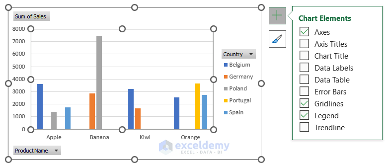
- The Brush icon below helps to edit the Style and Color of the chart.
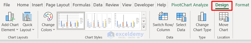
- Apart from this, you can also edit the pivot chart from the Design tab.
Read More: How to Use Pivot Chart in Excel
Things to Remember
- A pivot chart is a key metric tool to view sales, timeline, productivity and other criteria.
- You can easily navigate negative values from the pivot chart.
- As it directly depends on the pivot table, flexibility is bounded as the source data is fixed.
Download Practice Book
Get the sample file here and practice by yourself.
Conclusion
Concluding the article, we have learned about the pivot chart and the types of pivot charts in Excel. Go through the practice book and try to create your own pivot chart. Don’t forget to leave your suggestions.
Related Articles
- How to Refresh Pivot Chart in Excel
- Data Labels in Excel Pivot Chart
- Difference Between Pivot Table and Pivot Chart in Excel

