
Image by rawpixel.com on Magnific
A well-organized Excel worksheet should do more than store data. A good presentation helps readers understand important numbers quickly, identify trends, and focus on the information that matters. You do not need complex dashboards or advanced VBA to make a worksheet look professional. Excel already includes several simple features that can dramatically improve how your data is presented.
In this tutorial, we will show 10 Excel hacks for better data presentation, from cleaning up number formats to adding visual indicators and interactive controls.
1. Convert Your Data Range into an Excel Table
One of the easiest ways to improve the appearance of raw data is to convert it into an Excel Table. Tables automatically add consistent formatting, filters, alternating row colors, and expandable ranges.
Steps:
- Select your data range
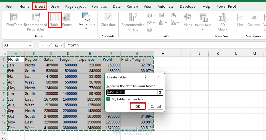
- Go to the Insert tab >> select Table or press Ctrl + T
- Check My table has headers
- Click OK
- Go to the Table Design tab >> in Table Name, enter a suitable name like SalesData
- You can also enable or disable options such as:
- Header Row
- Total Row
- Banded Rows
- First Column
- Last Column
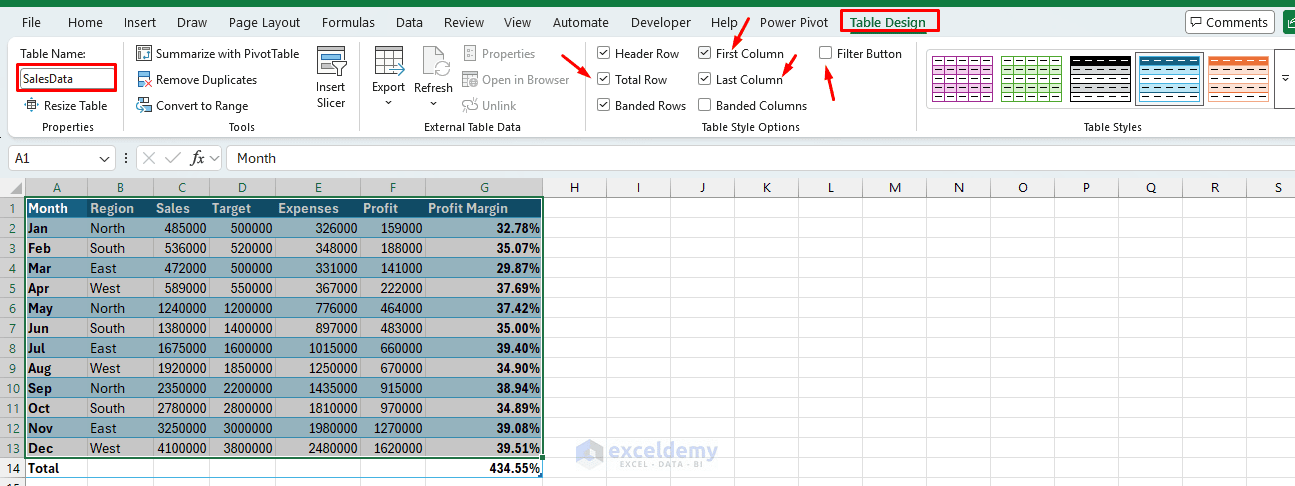
Why It Helps: A table immediately separates headers from data, making large datasets much easier to scan. It also automatically expands when you add new rows.
2. Hide Gridlines for a Cleaner Worksheet
Default Excel gridlines are useful while entering data, but they can make a finished report look cluttered. Removing them often gives the worksheet a cleaner, report-like appearance.
Steps:
- Go to the View tab >> from the Show group >> uncheck the Gridlines checkbox
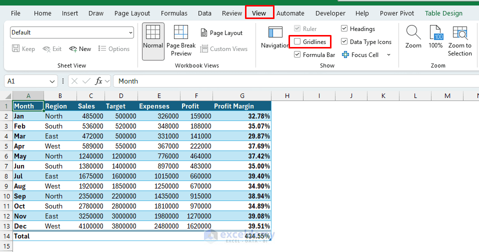
You can then use borders only where they are actually needed.
Presentation Tip: Avoid adding borders around every single cell after hiding gridlines. Instead, use subtle borders around headers, totals, or important sections.
3. Use Custom Number Formats Instead of Long Numbers
Large numbers can make reports difficult to scan. Custom number formats allow you to display numbers in a shorter form while keeping their actual values unchanged.
Large values, such as 1,250,000, take up extra space and are harder to scan quickly. Custom number formats can display the same number as $1.25M without changing the underlying value.
Display Thousands:
- Select the data column
- Right-click >> select Format Cells or press Ctrl + 1
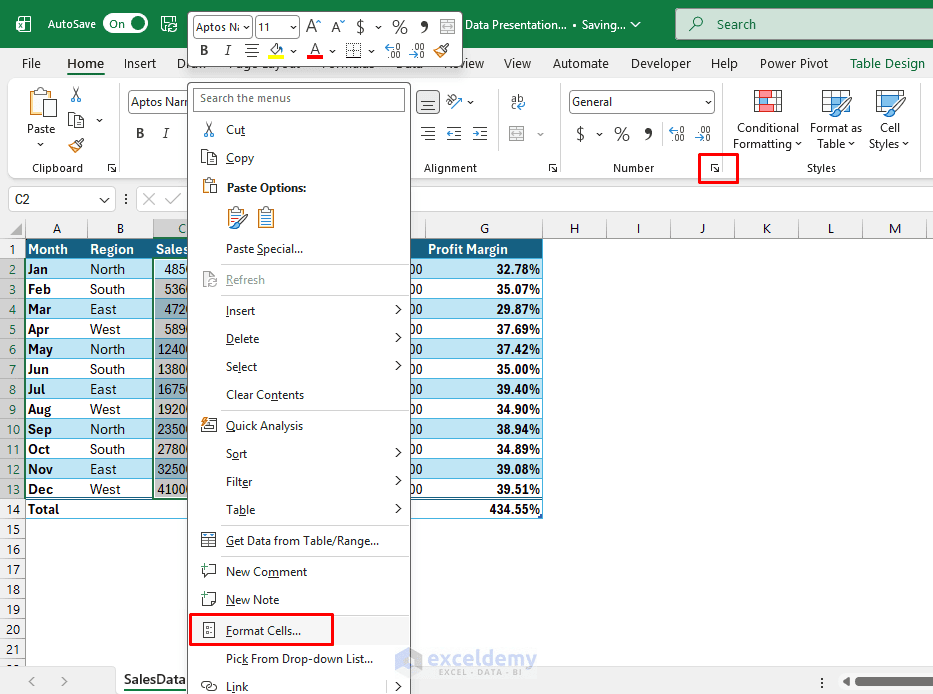
- Choose Custom and enter:
$0.0,”K”

Display Millions:
- Insert the following custom code:
$0.0,,”M”
You can increase the decimal places from the Number group or add an extra zero in the custom code: $0.00,,”M”
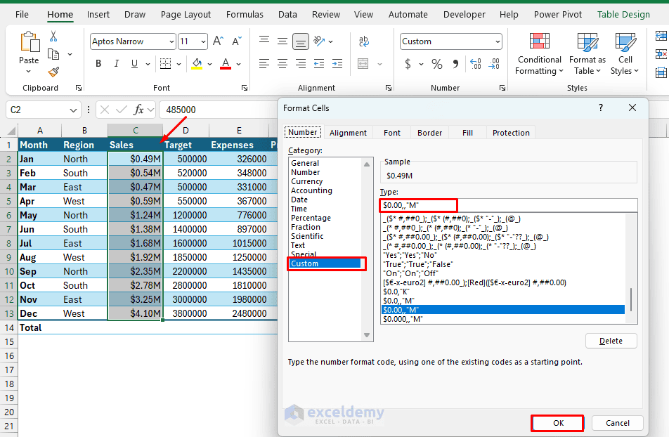
Why It Helps: Shortened numbers make reports, dashboards, and management summaries much easier to read while preserving the original numeric values for calculations.
4. Use Conditional Formatting to Highlight Insights
Conditional Formatting allows Excel to automatically emphasize values based on rules. It can automatically color cells, add data bars, apply color scales, or display icons based on values so that patterns stand out immediately.
Steps:
- Select the numeric range
- Go to the Home tab >> select Conditional Formatting
- Common choices:
- Color Scales (green-yellow-red or blue-white-red) for heat maps
- Data Bars for relative magnitude
- Icon Sets (arrows, traffic lights) for status or trends
- Highlight Cells Rules (Greater Than, Top 10%, etc.) for specific thresholds
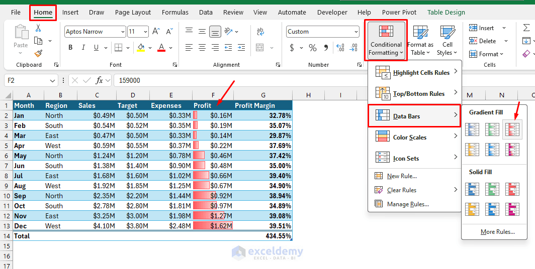
- Manage rules via Conditional Formatting >> Manage Rules to fine-tune or stop if true
Apply a Formula:
- Go to Home >> select Conditional Formatting >> select New Rule
- Select Use a formula to determine which cells to format
- Enter:
=C2>D2
- Click Format >> select a fill or font style
- Click OK
Excel will now highlight every value that exceeds its corresponding target.
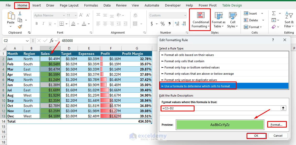
Pro tip: Combine a color scale with data bars, or use formula-based rules (e.g. =$B2>AVERAGE($B$2:$B$100)) for more advanced highlighting. Limit colors to 2–3 for professional results.
5. Create In-Cell Mini Charts with Sparklines
Sparklines are tiny charts displayed inside worksheet cells. They are useful when you want to show trends without creating a large conventional chart.
Steps:
- Select the cell where you want the Sparkline
- Go to the Insert tab >> select Sparklines >> select Line
- In the Data Range box:
- Select B2:M2
- Confirm the location range
- Click OK
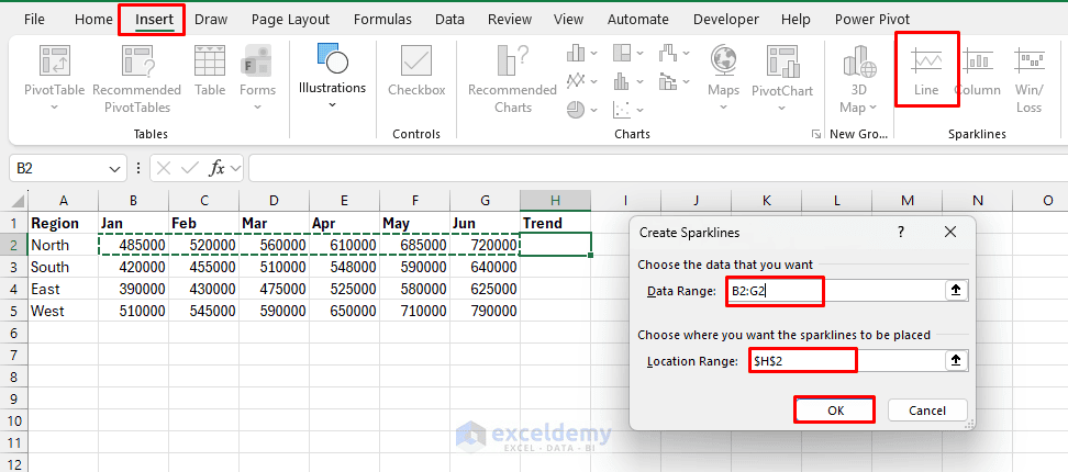
- Excel creates a miniature trend chart inside the selected cell
- You can use the Sparkline tab to display:
- High Point
- Low Point
- First Point
- Last Point
- Negative Points
- Markers
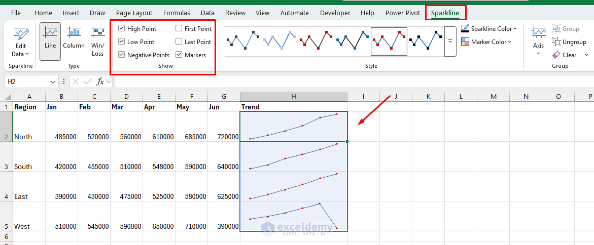
Why It Helps: Sparklines are excellent for compact dashboards where you want to show the direction of a metric without adding several full-sized charts.
6. Create a Dynamic Report Title with a Formula
Report titles do not always need to be typed manually. You can create titles that automatically update based on worksheet values.
- Suppose cell A1 contains: 2026
- You could create the following formula:
=”Regional Sales Performance – “&A1
The result will be Regional Sales Performance – 2026
- You can also combine dates
- Use the following formula:
=”Sales Report – “&TEXT(TODAY(),”mmmm yyyy”)
If the current month were September 2026, Excel would display: Sales Report – September 2026
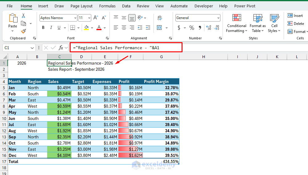
Why It Helps: Dynamic titles are useful for reusable monthly and yearly reporting templates because users do not have to manually update headings each reporting period.
7. Freeze Headers So They Stay Visible
When a worksheet contains many rows, the column headings disappear as you scroll down. Freezing the header row makes the worksheet much easier to navigate.
Steps:
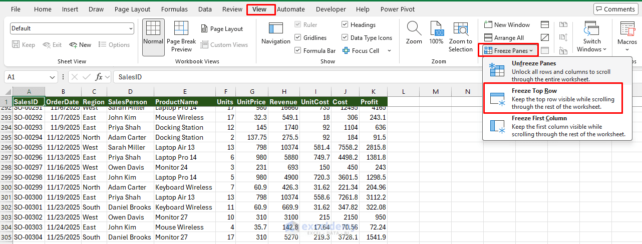
- Go to the View tab >> click Freeze Panes
- Select Freeze Top Row
The headings will remain visible while you scroll.
Freeze Both Rows and Columns:
Suppose you want to keep Row 1 and Column A visible.
- Select cell B2
- Go to the View tab >> select Freeze Panes
Excel freezes everything above and to the left of the selected cell.
Why It Helps: This is especially useful for wide or long datasets where readers need to continuously reference labels.
8. Use Drop-Down Lists for Cleaner Interactive Reports
Drop-down lists allow users to select values instead of typing them manually. Suppose you want users to select a region such as:
- North
- South
- East
- West
Steps:
- Select the target cell
- Go to the Data tab >> select Data Validation
- Under Allow, select List
- In Source, enter the following:
North,South,East,West
- Click OK
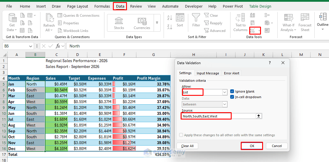
Instead of typing manually, you can select the region from the drop-down.
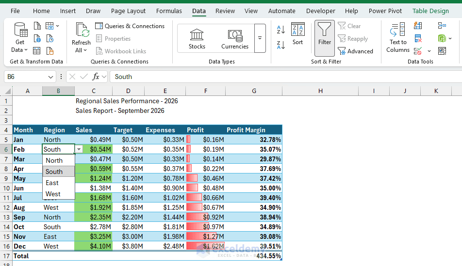
The selected value can then control formulas, charts, or dashboard elements.
- For example:
=SUMIFS(C2:C100,A2:A100,F2)
If F2 contains the selected region, the formula returns sales only for that region.
Drop-down controls make reports more interactive while reducing input errors.
9. Add Interactive Slicers to Tables
Filters are useful, but Slicers provide a more visual way to filter data. If your dataset is already formatted as an Excel Table, you can add a Slicer for Region.
Steps:
- Click anywhere inside the Excel Table
- Go to the Insert tab >> select Slicer
- Check Region
- Click OK
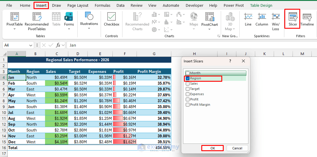
Click a button to instantly filter the table.
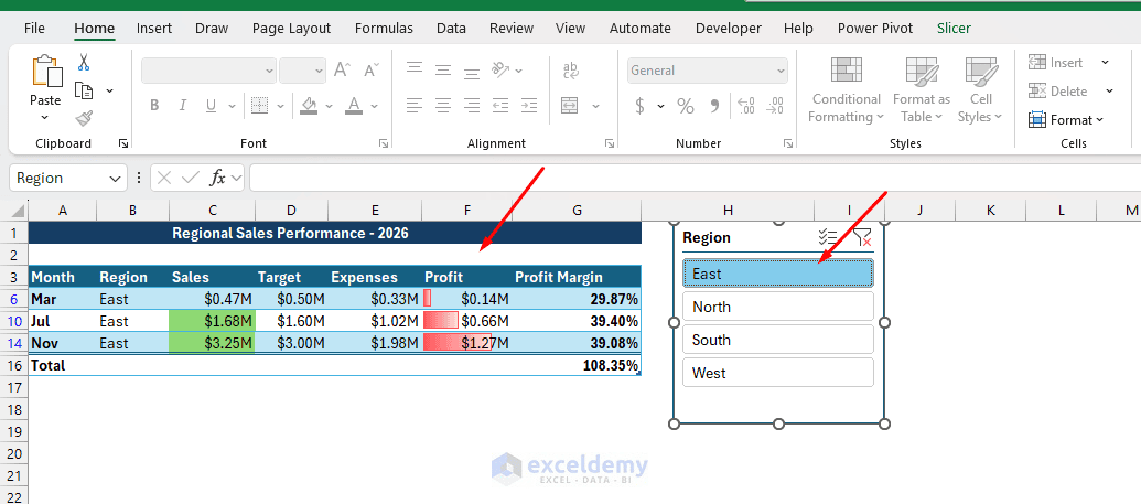
- To select multiple items, use the Multi-Select button on the Slicer
- To remove the filter, click the Clear Filter button
Why It Helps: Slicers make filtering more obvious and user-friendly, particularly when a workbook will be used by people who are not comfortable working with standard Excel filters.
10. Use a Consistent Theme (Fonts, Colors, Cell Styles)
Inconsistent fonts and colors are the most common giveaway of an unpolished spreadsheet.
Steps:
- Go to the Page Layout tab >> select Themes >> pick or customize a theme (fonts + color palette)
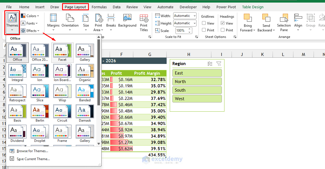
- Use Cell Styles:
- Go to the Home tab >> select Cell Styles for headers, totals, and inputs, instead of manually formatting each cell
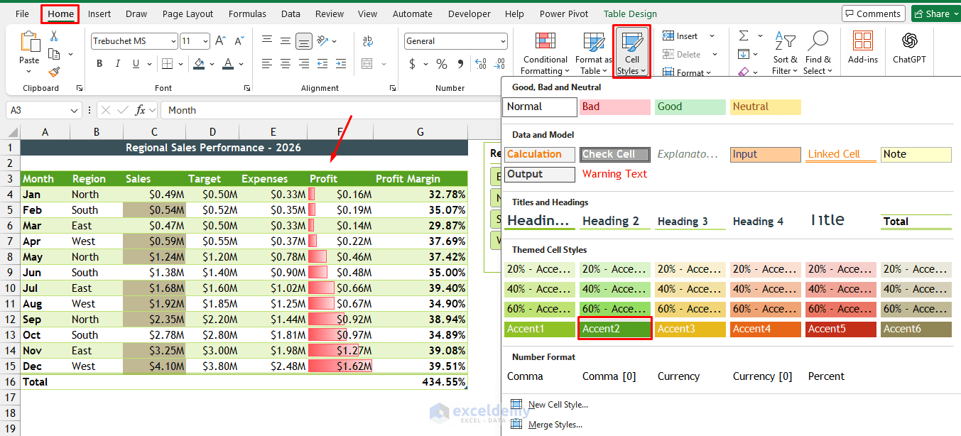
- Stick to 2 fonts maximum (one for headers, one for body) and 2–3 accent colors maximum
- Avoid excessive colors:
- Use color primarily to indicate meaning, such as positive performance, warnings, or categories
- Align values logically:
- Text usually looks better left-aligned, while numeric values are easier to compare when right-aligned consistently
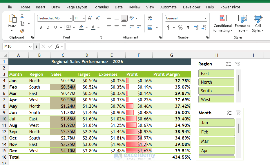
Pro tip: Create your own custom Cell Styles once (go to Home >> Cell Styles >> New Cell Style) so every future report matches instantly.
Bonus: Keep a Consistent Visual Hierarchy
A good Excel presentation is not only about individual features. The overall structure of the worksheet also matters.
Try to maintain a simple hierarchy:
- Report Title
- Key KPIs
- Charts and Visual Summaries
- Detailed Tables
Use larger fonts for titles, medium-sized fonts for headings, and standard fonts for data.
You should also keep:
- Font styles consistent
- Decimal places consistent
- Date formats consistent
- Alignment consistent
- Colors limited to a small palette
Consistency usually makes an Excel report look more professional than adding extra decorative elements.
Conclusion
You can follow these 10 Excel hacks for better data presentation. Better Excel presentation does not necessarily require complicated dashboards or advanced VBA. Small formatting and visualization techniques can significantly improve how quickly users understand your data. The key is to use these features selectively. A good Excel report presents the important information clearly without overwhelming the reader with unnecessary formatting.
Get FREE Advanced Excel Exercises with Solutions!