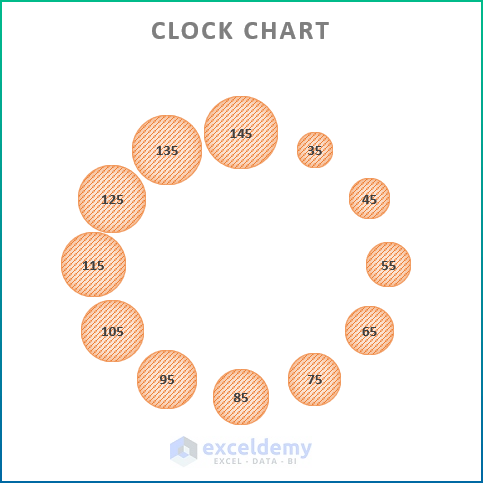
What Is a Clock Chart?
There is no direct way to make a clock chart in Excel. However, you can make one using the bubble chart from the charts group of commands, and you can easily draw it if you have the hourly data. The Bubble Chart is a type of scatter plot chart that replaces data points with bubbles. It has horizontal and vertical axis like the scatter plot chart and also has an additional dimension of data that represents the size of the bubble.
Step-by-Step Procedure to Make a Clock Chart in Excel
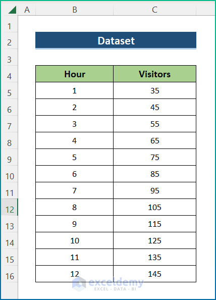
Step 1 – Select the Dataset
The dataset contains Hours of daytime and the number of Visitors who have visited a grocery store hourly.
Read More: How to Create Analog Clock in Excel
Step 2 – Convert Data to Make a Clock Chart
- Select cell D5 and insert the following formula to get the value of the X-axis.
=ROUND(SIN(RADIANS(B5*30))*100,0) + 100
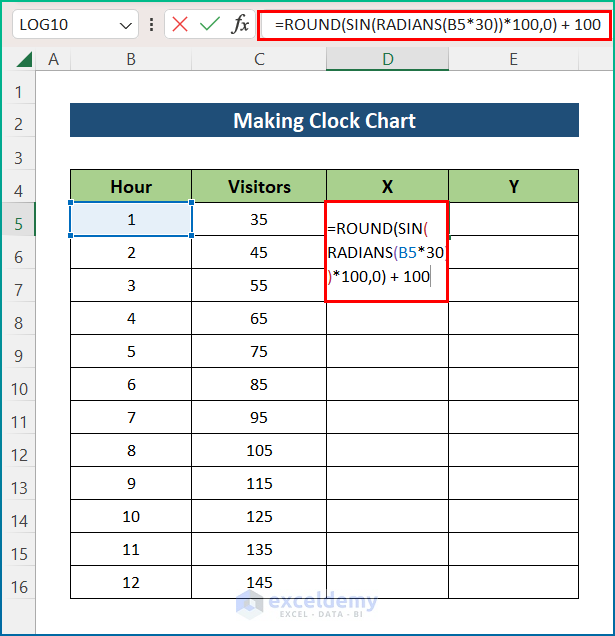
Formula Breakdown:
- Each clock contains 12 hours and covers a whole circle (360°). So, every part is 30° (360°/12).
- RADIANS(B5*30) converts the product of 30 and cell B5 into a radian unit.
- The SIN function provides the output as 5. It is multiplied by 100.
- The ROUND function takes the output value and rounds it.
- 100 is added to it in order to get the final output.
- Press Enter and use the AutoFill tool to apply the formula to the entire column.
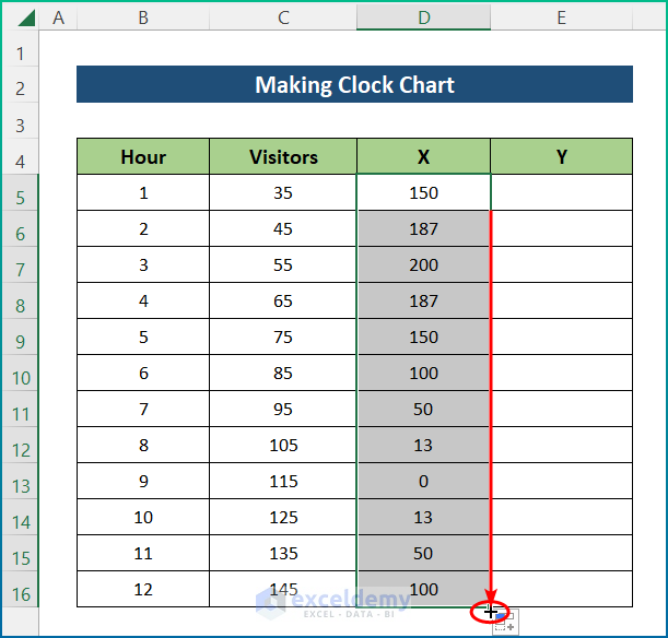
- Click on cell E5 and insert the formula below to get the value of the Y-axis. We have used the COS function instead of the SIN function.
=ROUND(COS(RADIANS(B5*30))*100,0)
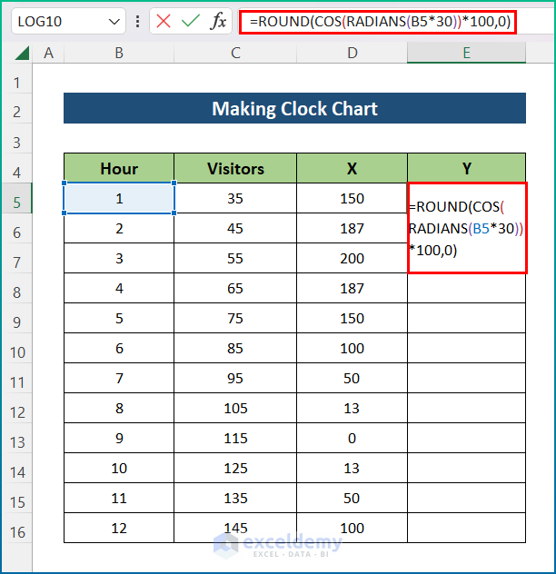
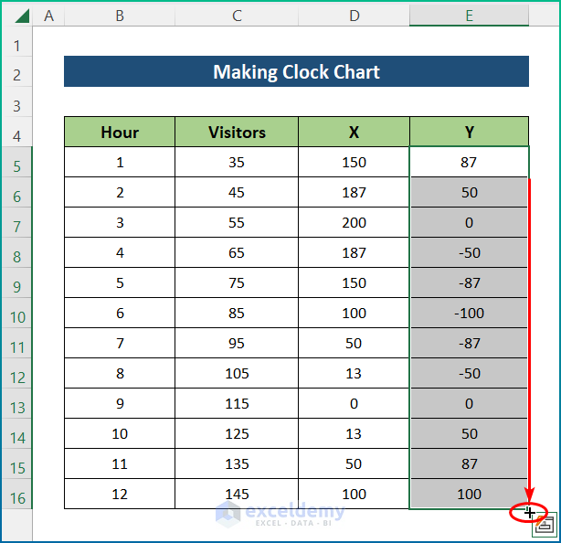
- Hit the Enter key and utilize the AutoFill tool to the whole column.
Read More: How to Create Digital Clock in Excel
Step 3 – Create a Clock Chart in Excel
- Select the X and Y columns.
- Go to the Insert tab.
- Select Bubble chart from the Charts group of commands.
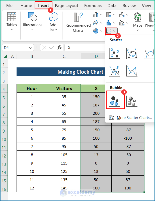
- A bubble chart will appear.
- From the Chart Elements, check the Chart Title and Chart Labels.
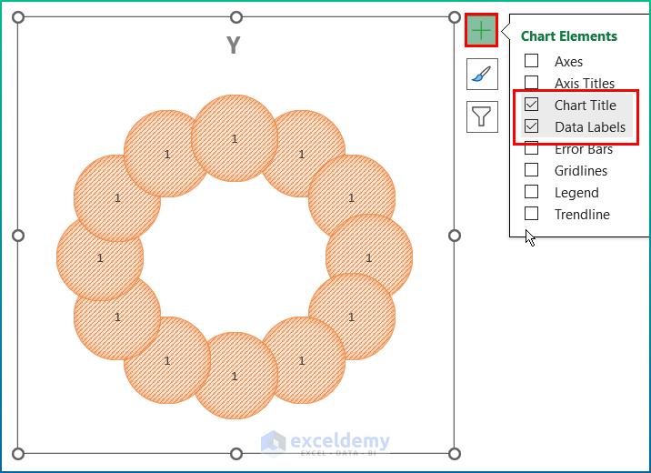
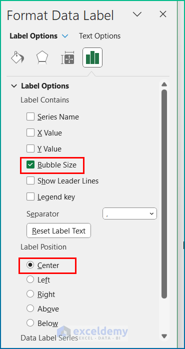
- Double-click on a label to open the Format Data Labels dialog box.
- Check Bubble Size as a Label Options if not checked.
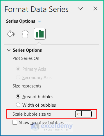
- Click on the bubble to open Format Data Series.
- Select Scale bubble size to 65.
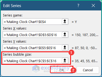
- Right-click on the chart and choose Select Data from the context menu.
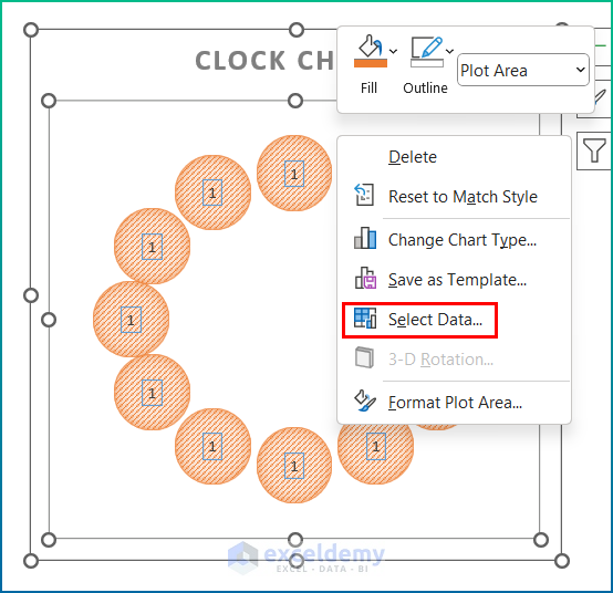
- Press Edit.
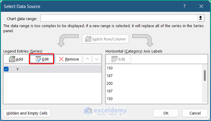
- Select the Series bubble size as your number of Visitors column and press OK.
Read More: How to Use VBA Code for Creating Digital Clock in Excel
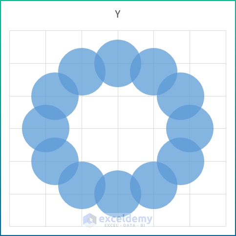
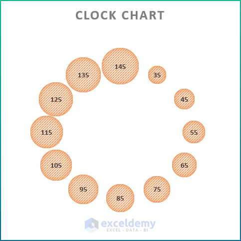
Step 4 – Final Output
You can perform some modifications on styles and colors.
Read More: How to Make a Running Clock in Excel
Download the Practice Workbook

