Method 1 – Using a Color Combination Based on Values
Steps:
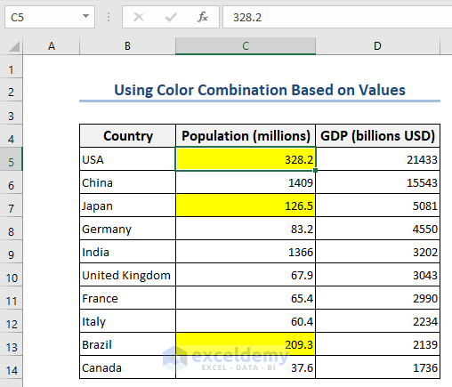
- Choose the set of cells containing the values you want to make a good color combination. We have used the B5 to B14 cell range, which contains numerical values.
- Go to Home>>Styles group >>Conditional Formatting>>New Rule.
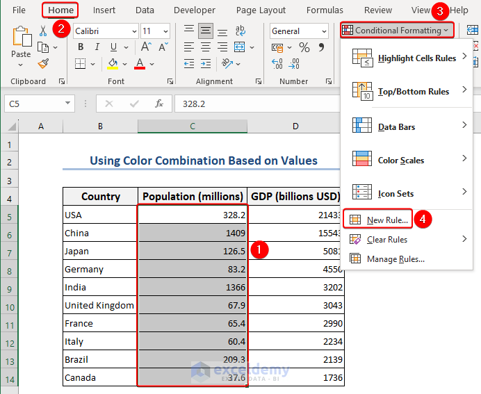
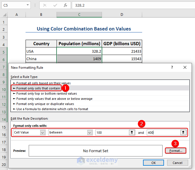
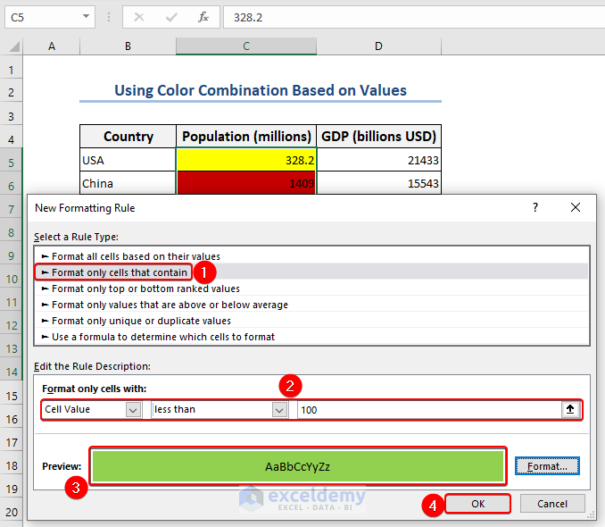
- Choose Format only cells that contain under Select a Rule Type in the New Formatting Rule Choose the put between condition and the values 100 and 400 in the rule description.
- Click on Format.
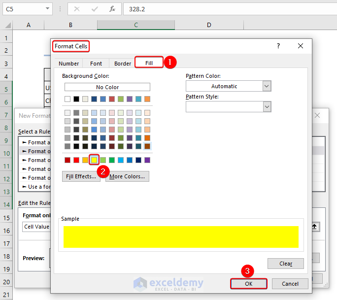
- Choose Fill>> pick a color>> click OK.
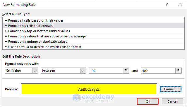
- To complete the task in the New Formatting Rule box, click OK.
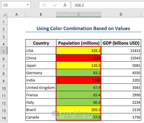
The final output will look like the following image.
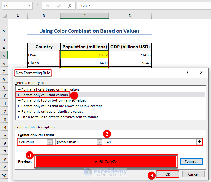
- In the New Formatting Rule box, select Format only cells that contain under Select a Rule Type.
- Choose the greater than condition and the value 400 in the rule description.
- Click on Format, choose a color, and click OK twice.
- The cells are filled with the red color as those countries have more population than 400 million.
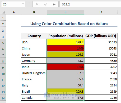
- To complete the color combination, select the range C5:C14, and click on conditional formatting. The New Formatting Rule window will appear again.
You get the color combination to highlight the Population (millions) column.
Method 2 – Using Color Combination Based on Multiple Criteria
Steps:
- The Population (millions) and GDP (billions USD) values can be found in cells C5:C14 and D5:D14.
- Select the range B5:D14.
- Go to the “Home” tab and select “Conditional Formatting” >> “New Rule“.
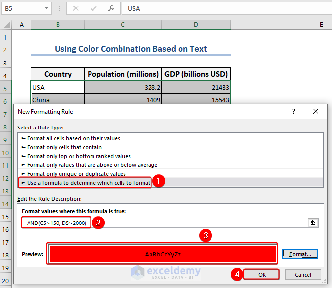
- Follow the process: Select a Rule Type: Use a formula to decide which cells to format in the New Formatting Rule dialog box.
- Fill out the “Format values where this formula is true” field with the formula given below:
=AND(C5>150, D5>2000)- Click the “Format” button.
- In the dialog box for the new formatting rule, click “OK” to apply the rule.
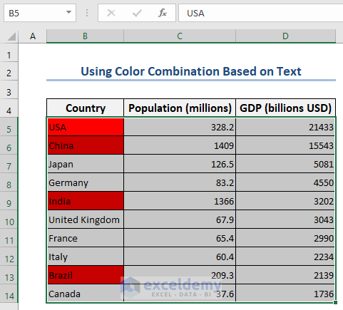
- The cells in column B are highlighted in red.
- To apply formatting for the rest of the cells, follow the process:
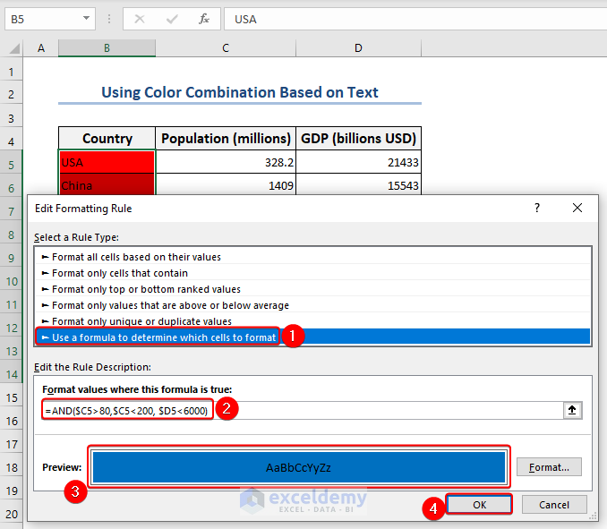
- Select a Rule Type: Use a formula to decide which cells to format in the New Formatting Rule dialog box.
- Enter the following formula in the “Format values where this formula is true” field:
=AND($C5>80,$C5<200, $D5<6000)- Click the “Format” button to select color options for cells that meet the double criteria.
- Click “OK“.
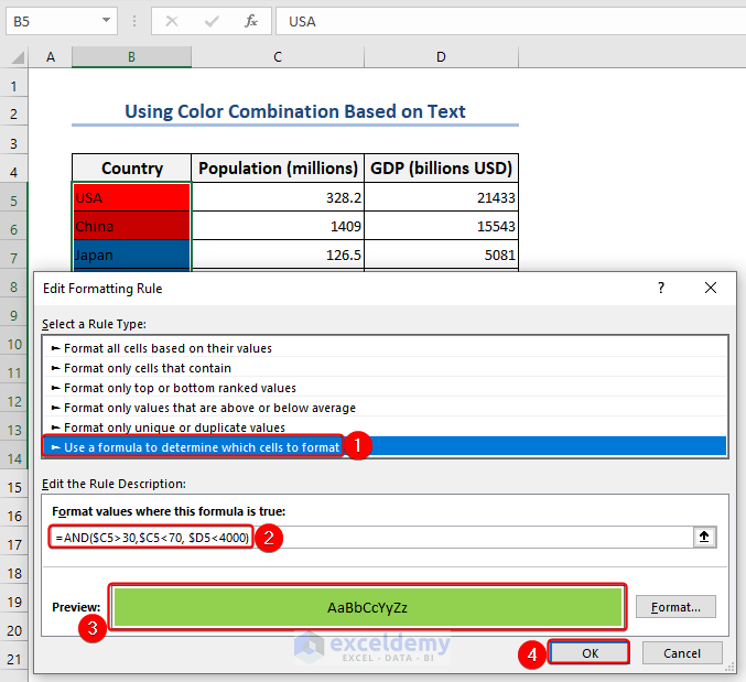
- For the remaining cells, follow the process: Select a Rule Type: Use a formula to decide which cells to format in the New Formatting Rule dialog box.
- Enter the following formula in the “Format values where this formula is true” field:
=AND($C5>30,$C5<70, $D5<4000)- Select the “Format” button to modify the formatting color options for cells that meet the triple requirements.
- Select “OK“.
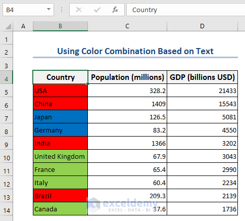
You get the color combination, like in the image below.
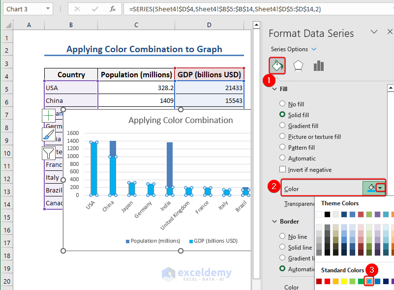
Method 3 – Applying a Color Combination to a Graph
Steps:
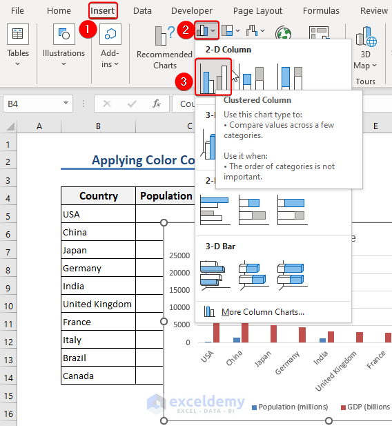
- Using your desired data, make a column chart in Excel.
- Go to Insert>> Charts>> 2-D column.
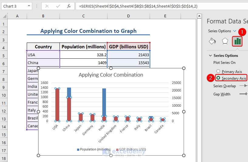
- Right-click on the data series you want to format and select “Format Data Series” from the context menu.
- Select a secondary axis for perfect visualization.
- Go to the “Fill & Line” tab in the Format Data Series pane.
- From the Fill drop-down menu, select “Solid fill“.
- To choose the ideal color scheme for the data series, click the color picker or color options.
- The data series in the graph will be updated with the new colors.
- Alternatively, you can repeat the procedure for additional data series in the graph or modify additional formatting options in the Format Data Series pane.
Read More: How to Create an Excel Theme
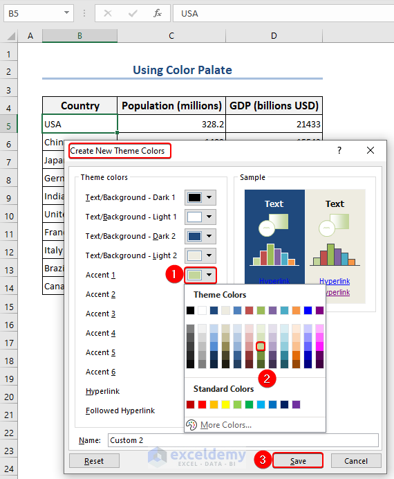
Method 4 – Using a Color Palate
Steps:
- Follow the path: Page Layout>> Colors>>Customize Colors
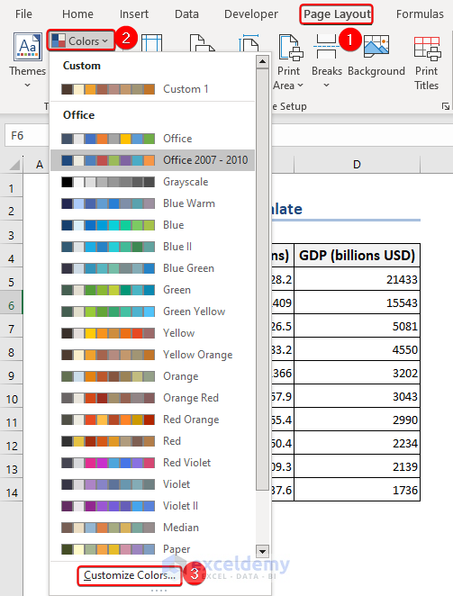
- A Create New Theme Colors window will appear.
- Make changes to your preference.
Read More: How to Change Theme Colors in Excel
Method 5 – Applying a Color Combination Based on Text
Steps:
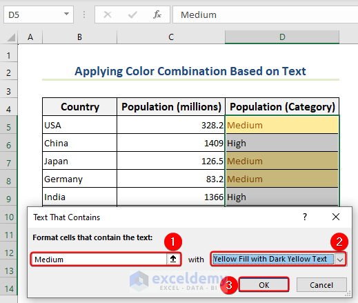
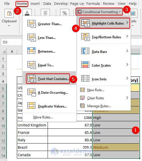
- Follow the path: Select the column(column D)>>Home>>Styles>>Conditional Formatting>>Highlight Cells Rules>>Text that Contains.
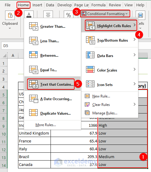
- Text That Contains window will appear in Excel.
- Select your text, for example, Medium, under the “Format Cells that contain the text:” and choose a color: Yellow Fill with Dark Yellow Text.
- Click OK.
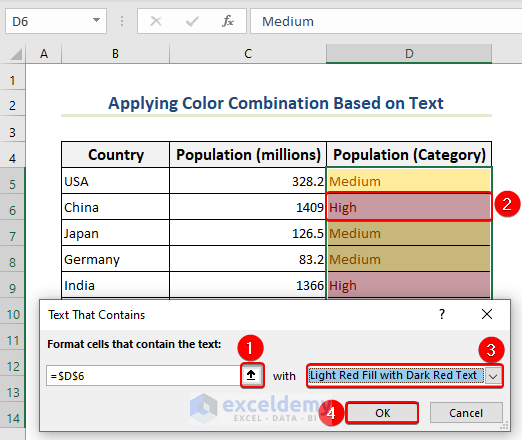
- Follow the path: Select the column(column D)>>Home>>Styles>>Conditional Formatting>>Highlight Cells Rules>>Text that Contains.
- A Text That Contains window will appear.
- Choose a color that has been selected, Light Red Fill with Dark Red Text in that window’s “Format Cells that contain the text:” section, and select your text, for instance, High.
- Press OK.
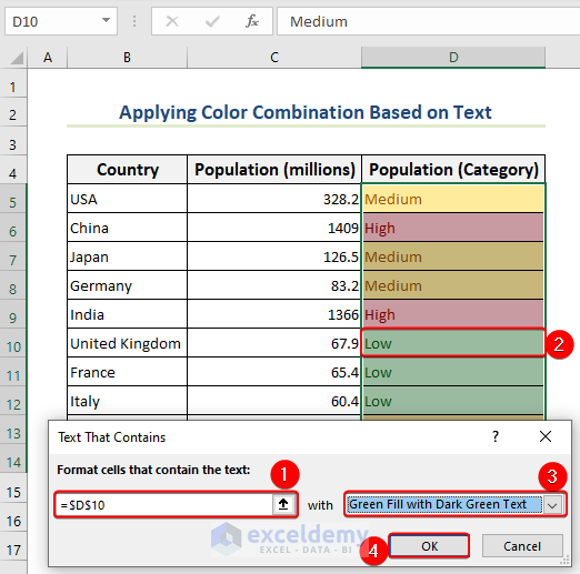
- Excel will display a Text That Contains Under “Format Cells that contain the text:“
- Select your text, for instance, Low, and then pick the color Green Fill with Dark Green Text.
- Click OK.
Read More: How to Change Excel Theme to Black
Download the Practice Workbook
You can download the workbook to practice.
Related Articles
- How to Change Theme Font in Excel
- Excel Themes Option Is Not Working
- Excel Feathered Theme Missing
- How to Add Excel Feathered Theme
- How to Apply Parallax Theme in Excel
- How to Apply Slice Theme in Excel
<< Go Back to Excel Theme | Learn Excel
Get FREE Advanced Excel Exercises with Solutions!
