Method 1 – Inserting Chart Elements Command to Add Data Labels in Excel
Step 1:
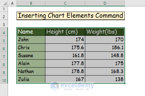
- Select your entire data set to create a chart or graph.
- The cell range is B4:D10 in our example.
Step 2:
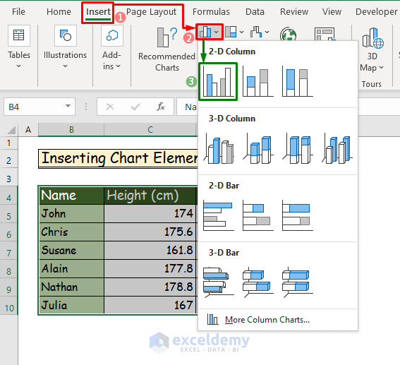
- Create a 2D clustered column chart.
- Go to the Insert tab of the ribbon.
- Choose the Insert Column or Bar Chart command from the Chart group.
- Select the Clustered Column command.
Step 3:
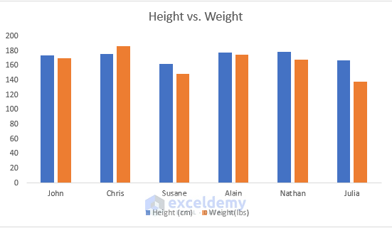
- After selecting, you will be able to create the chart.
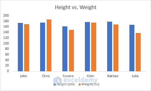
- Name the chart “Height vs. Weight” for example.
- You will notice that there are no data labels in the chart.
Step 4:
- Add the data labels to our chart.
- Click on the chart and you will see three icons right beside the chart.
- Of the three icons, the first one is the Chart Elements command.
- Click on that command, and you will see more commands regarding the chart.
- Mark the Data Labels command, which was previously unmarked.
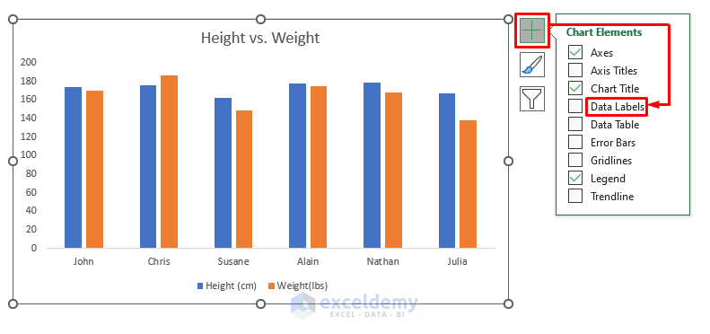
- After marking the command, you will see all the data labels above the columns accordingly.

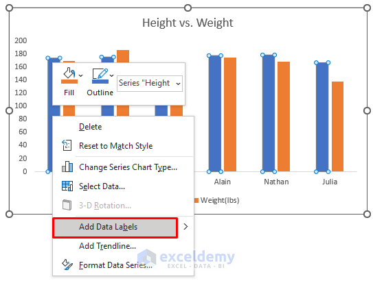
Step 5:
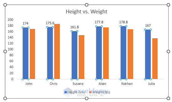
- Add the data labels in another way, then select any column of the same variable and then right-click on it.
- Rght-click on the column that represents Height.
- Select the Add Data Labels command.
- See the data labels for the columns that represent Height.
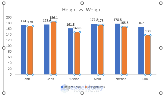
Step 6:
- Repeat the same process from Step 5 by selecting any column that represents the person’s weight.
- See the data labels after repeating the process.
Method 2 – Applying VBA to Add Data Labels in Excel
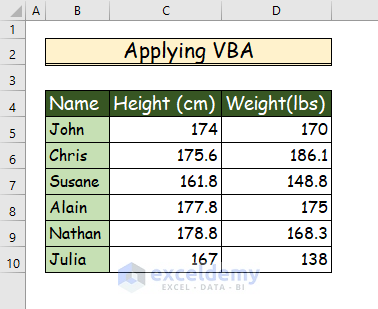
Step 1:
- Use the following data set for our procedure.
Step 2:
- Create a 2D clustered column chart by using the above data set.
- Repeat Step 1 to Step 2 from the previous method to get our chart.
- Name the chart “Height vs. Weight.”
Step 3:
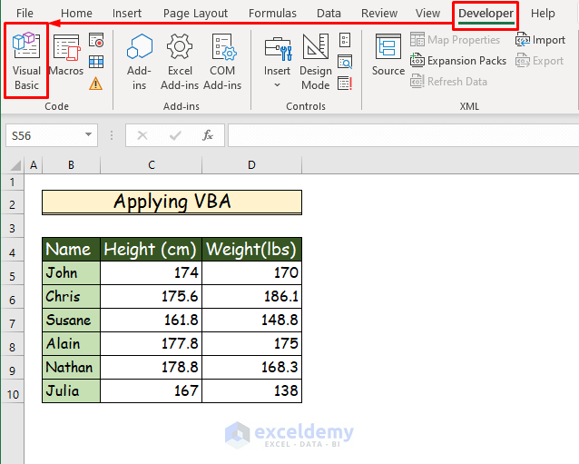
- Choose the Visual Basic command from the Code in the Developer tab of the ribbon.
Step 4:
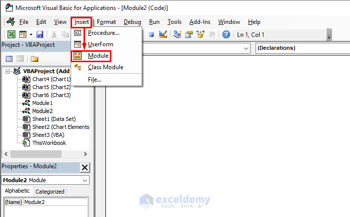
- A new tab will open after choosing this command.
- From the new tab, select Module from the Insert tab.
Step 5:
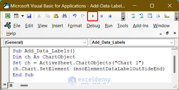
- Into the Module paste the following VBA Code, which will add data labels after running the program.
Sub Add_Data_Labels()
Dim ch As ChartObject
Set ch = ActiveSheet.ChartObjects("Chart 1")
ch.Chart.SetElement (msoElementDataLabelOutSideEnd)
End Sub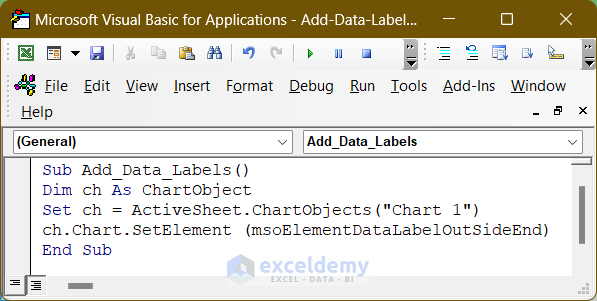
- Save the program in the module and press the play button to run the code.
Step 6:
- Add data labels to the chart with the help of VBA.

How Does the Code Work?
Set ch = ActiveSheet.ChartObjects("Chart 1")
This line of code assigns the chart to the chart type variable ch on which we want to add the data label (Chart 1 in my case).
ch.Chart.SetElement (msoElementDataLabelOutSideEnd)
This line of code adds data labels with Outside End orientation to the chart. We can use, such as Inside End, Inside Base, Data Callout, etc. For using any of those, we need to use their corresponding property in SetElemet.
You can download the free Excel workbook from here and practice on your own.
Related Articles
- [Fixed!] Excel Chart Data Labels Overlap
- How to Add Outside End Data Labels in Excel
- How to Use Millions in Data Labels of Excel Chart
- How to Show Data Labels in Thousands in Excel Chart
- How to Show Data Labels in Excel 3D Maps
- How to Use Conditional Formatting in Data Labels in Excel
<< Go Back To Data Labels in Excel | Excel Chart Elements | Excel Charts | Learn Excel
Get FREE Advanced Excel Exercises with Solutions!
