What Is a Stacked Waterfall Chart in Excel?
A stacked waterfall chart is a special type of graph that illustrates how values change across different categories. It resembles a series of bars stacked on top of each other. However, unlike a standard bar chart, a stacked waterfall chart can display multiple sets of data side by side within each category. This allows you to visualize how various factors impact the overall result.
Example of a Single-Series Waterfall Chart: Consider the dataset showing the cash flow of a store.
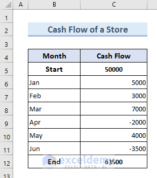
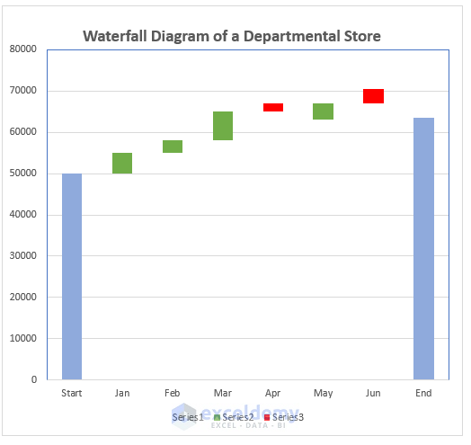
The waterfall chart below represents this data.
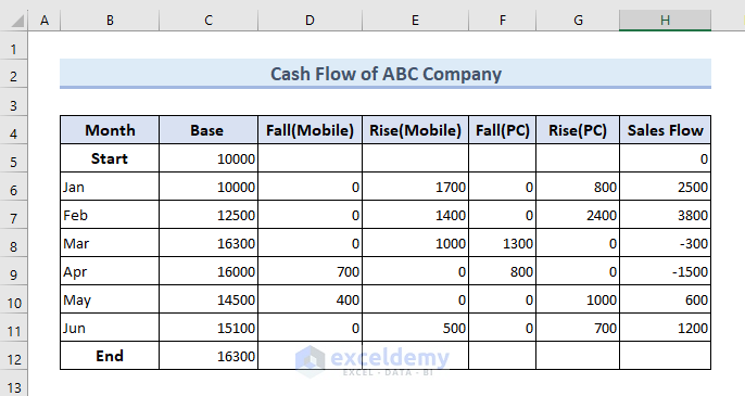
Let’s walk through the steps to create a stacked waterfall chart using an example dataset for ABC company’s sales flow from January to June. In this dataset:
- “Rise” indicates profit or positive cash flow.
- “Fall” indicates loss or negative cash flow.
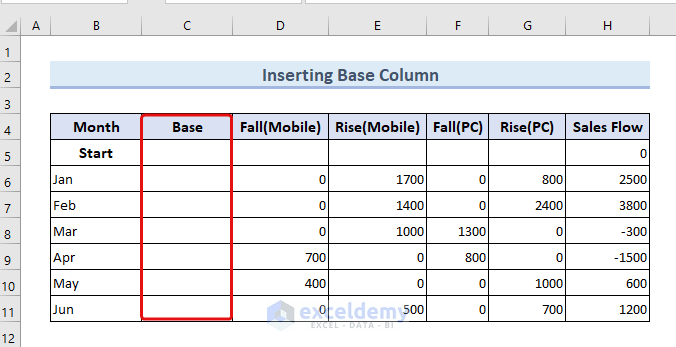
Step 1: Modifying the Dataset
- Add a column to store the base value for each category.
- Start the initial base value at 10,000.
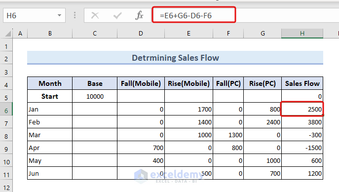
- Calculate the sales flow using the formula in cell E6:
=E6+G6-D6-F6- Drag down the Fill Handle up to cell H11.
- Adjust the base value based on the sales flow by entering the following formula in cell C6:
=C5+H5- Drag down the fill handle up to the cell C11.
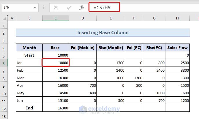
If the end base value is below 10,000, the company faces losses. If it’s higher, the company gains profit. For example, an end cash flow of 16,300 indicates profitability.
Read More: How to Create a Stacked Waterfall Chart in Excel
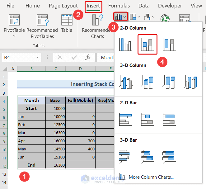
Step 2: Inserting the Stacked Waterfall Chart
- Select the Data Table:
- Highlight the entire table containing your data (excluding the sales flow column).
- Insert the Chart:
- Go to the Insert tab.
- From the Charts group, select the 2-D Stacked Column chart.
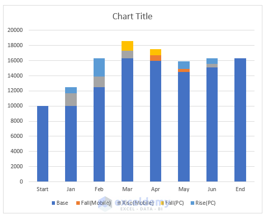
You’ll now have a stacked chart, but it won’t look like a Stacked Waterfall chart yet.
Read More: How to Make a Waterfall Chart with Multiple Series in Excel
Step 3: Formatting the Stacked Waterfall Chart
- Remove Base Stacks:
- Double-click on any of the base stacks (the initial and final columns) in the chart.
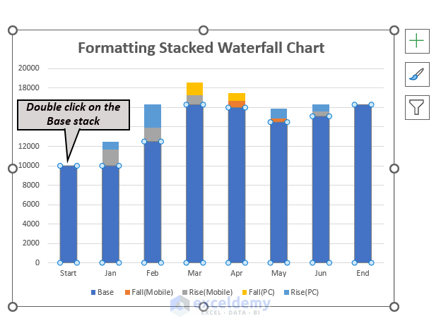
-
- In the Format Data Series window that appears on the right, go to the Fill and Border options.
- Select No fill and No line respectively.
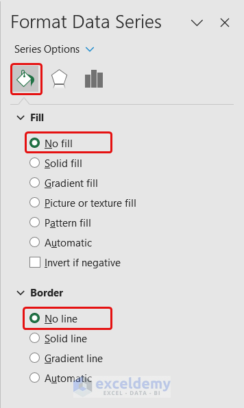
Your chart will now resemble a Stacked Waterfall chart.
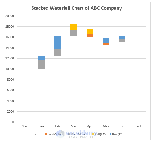
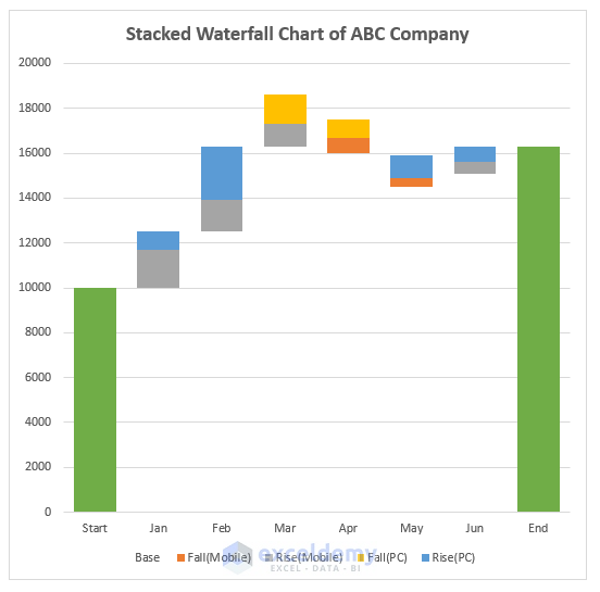
- Additional Modifications:
- For visual appeal, consider adding base stacks at the starting and ending points of the chart.
- Adjust the grid width as needed.
- Customization:
- Excel offers various customization features. You can:
- Add data labels.
- Change colors.
- Adjust axes.
- Explore other options based on your specific use case.
- Excel offers various customization features. You can:
Read More: How to Create a Waterfall Chart in Excel
Things to Remember
- The default waterfall chart feature in Excel 2016 and later versions allows creating a waterfall chart with a single series.
- Ensure the chart size is appropriate for its presentation medium (e.g., paper, slide, online platform).
- When building a waterfall chart with multiple series using the default 2D stacked column chart:
- Group positive values (e.g., sales, earnings) together.
- Group negative values (e.g., losses, expenses) separately.
- Calculate the base value considering revenue items add up and expense items subtract from the running total.
- Use distinct colors for positive and negative values within each series.
- Consider adding data labels for clarity, especially when dealing with multiple series.
Frequently Asked Questions
- Difference between Waterfall and Stacked Waterfall Chart:
- Waterfall Chart: Shows cumulative changes in data over categories, highlighting positive and negative impacts on a starting total.
- Stacked Waterfall Chart: Extends the waterfall chart by incorporating multiple series, making it useful for financial data analysis and budget comparisons.
- Limitation of the Stacked Waterfall Chart:
- Complexity: Too many series or categories can visually clutter the chart.
- Readability: Numerous stacked segments may affect readability.
- Other Names for Waterfall Charts:
- Flying Bricks Chart, Mario Chart, or Bridge Chart.
- Multiple Series in a Stacked Waterfall Chart:
- Yes, you can have as many series as needed to visualize complex data with multiple contributing factors.
Download Practice Workbook
You can download the practice workbook from here:
Related Articles
- How to Make a Vertical Waterfall Chart in Excel
- Excel Waterfall Chart with Negative Values
- Excel Waterfall Chart Change Colors
- Excel Waterfall Chart Total Not Showing
<< Go Back to Waterfall Chart in Excel | Excel Charts | Learn Excel
Get FREE Advanced Excel Exercises with Solutions!
