The default waterfall chart feature in Excel 2016 and later versions can be used to create a waterfall chart with just one series. However, it is possible to make a waterfall chart that incorporates multiple series by utilizing the stacked column chart feature across all Excel versions.
What Is a Waterfall Chart?
A Waterfall chart is a type of graph in Excel that helps you see how different positive or negative values add up over time. It shows the overall impact of these values as they are introduced one after the other in a sequence, essentially representing the running total. This graph shows how the running total changes over time and the effects of each constituent or item on the running total.
Typically, the chart begins with an initial value, and each column that follows shows the result of successively adding or subtracting values. Positive values are represented by columns that rise above the baseline, while negative values are shown as columns that fall below the baseline.
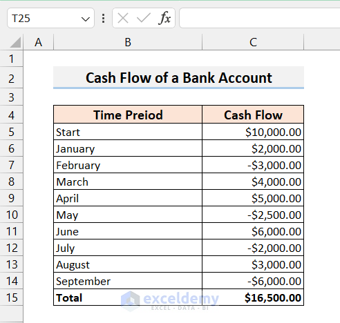
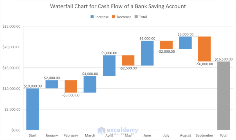
A typical single-series waterfall chart is given below. It’s based on the following dataset, containing the cash flow of a bank account.
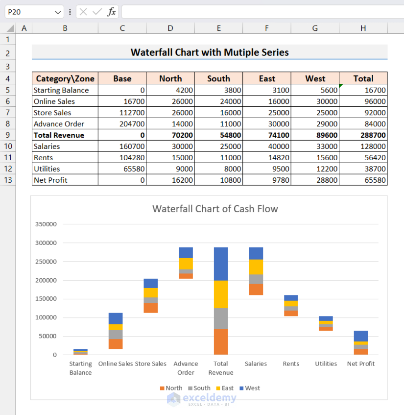
Now let’s make make a waterfall chart with multiple series in Excel. We’ll use the following dataset:
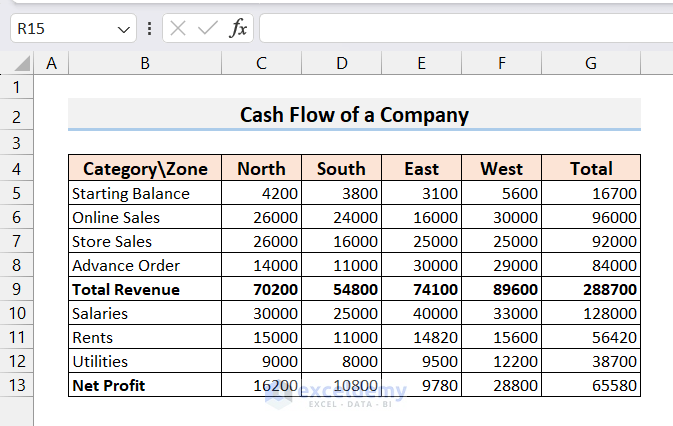
In the dataset, there are four series for four regions: North, South, East, and West. In the last column, we have the Total of the four series/zones for each category. Importantly, we grouped all the revenue categories on top, calculated the Total Revenue, and below this, we grouped all the Expense categories (Salaries, Rents, and Utilities).
It is essential to group all the positive and negative values separately for multiple series datasets.
Step 1 – Insert a Base Column
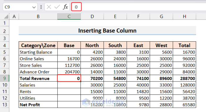
The waterfall chart will have different bases for each column or category. To put the base values of all the categories in the waterfall chart in their corresponding positions, we need to specify the base value for each category. Hence, we insert a column to store the base value.
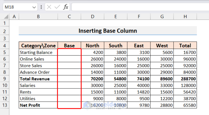
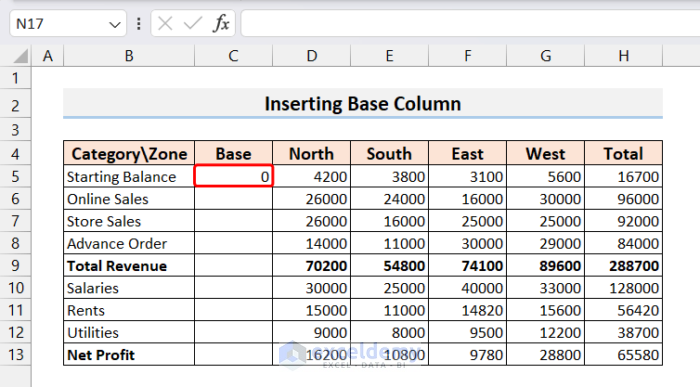
- Let’s add a value to the base of each category. The Starting Balance is always 0, so we put 0 in cell C5.
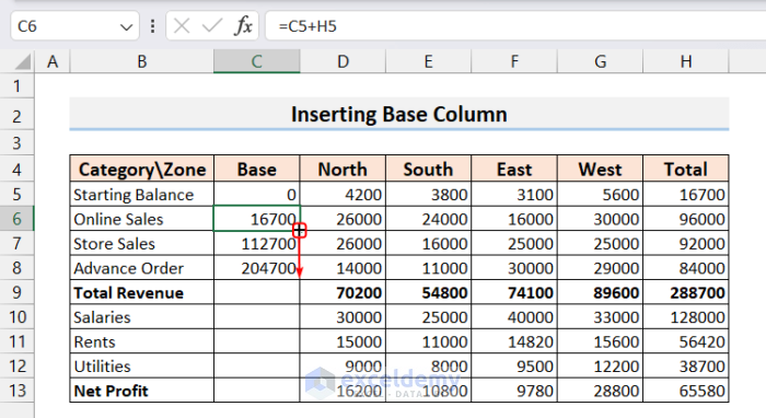
- The base of Online Sales will be the sum of the Base and Total in the Starting Balance column, so we add C5+H5 in cell C6.
=C5+H5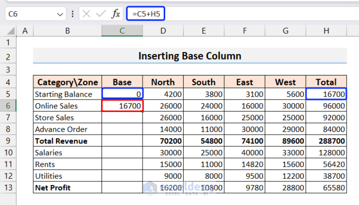
- The Store Sales and Advance Order will also have the base value of the sum of Base and Total of the previous row. So we drag the Fill Handle down to autofill cells C7 and C8.
- The Total Revenue row will have a base value of 0, as it is the sum/subtotal of all the previous revenue categories, so isn’t added to the running total.
Now, let’s calculate the base values for the Expense categories (Salaries, Rents, and Utilities). As opposed to calculating bases for Revenues, Expenses are subtracted from the running total.
- For the first expense row (Salaries), the base value will be the difference between the Total Revenue (H9) and Total Salaries (H10).
- Enter the following formula in cell C10:
=H9-H10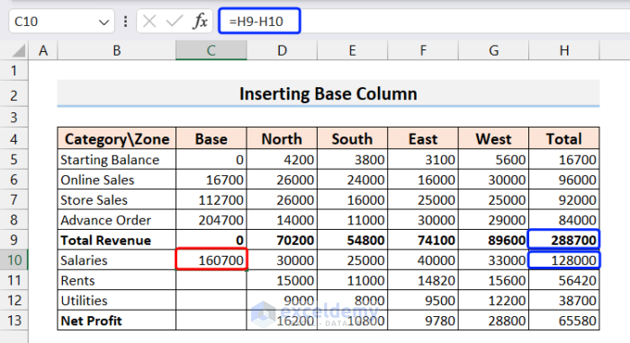
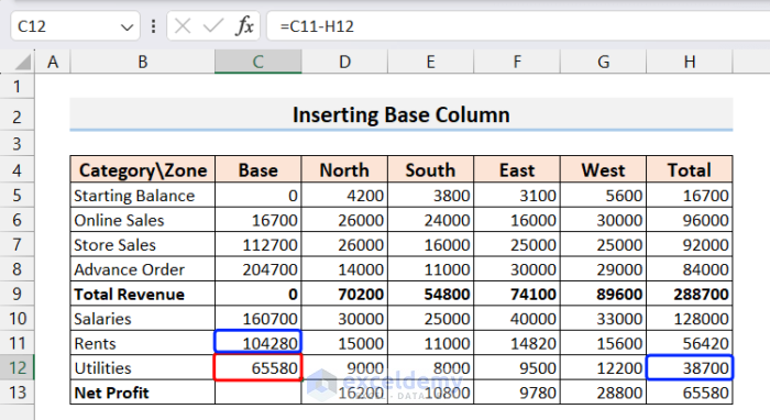
- The base value of the next row, Rents, will be the difference between the base value of Salaries (C10) and the Total of Rents (H11).

- Similarly, the base value of Utilities will be the difference between the base value of Rents (C11) and the Total of Utilities (H12).
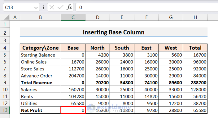
- Like for Total Revenue, the base value of Net Profit will be 0 as it is the final Running Total.
Read More: How to Create a Waterfall Chart in Excel
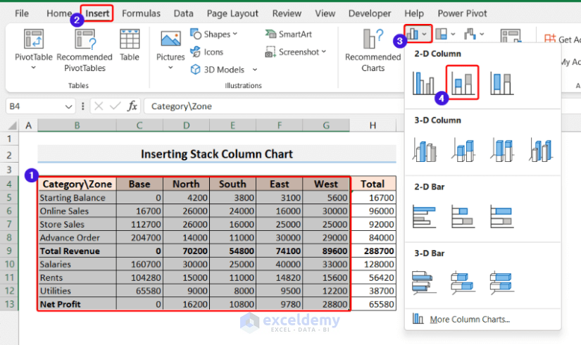
Step 2 – Create a 2-D Stacked Column Chart
We now insert a 2D Stacked column chart.
- Select the entire table except the Total column.
- Go to the Insert tab.
- From the Charts group, select the 2D Stacked Column chart.
A stacked chart will be generated.
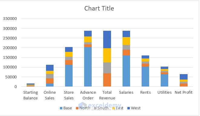
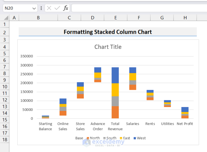
As it doesn’t look like a Waterfall chart, we need to customize it to turn it into one.
Read More: How to Create a Stacked Waterfall Chart in Excel
Step 3 – Formatting the Stacked Column Chart into a Waterfall Chart
We need to remove the Base stacks from the chart.
- Double-click on any of the Base stacks on the chart.
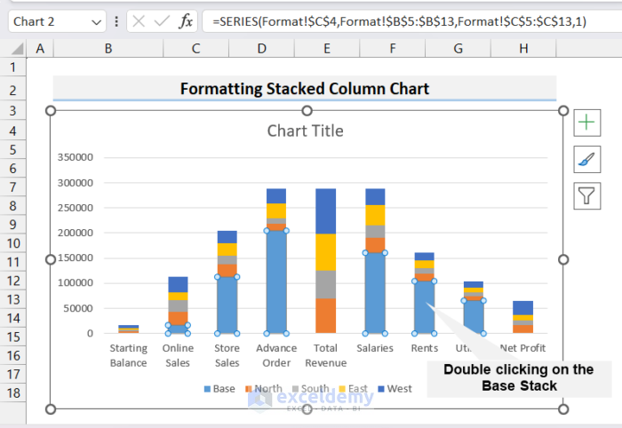
The Format Data Series window will open up on the right side.
- Go to the Fill Series option and select No fill and No line in the Fill and Border options respectively.
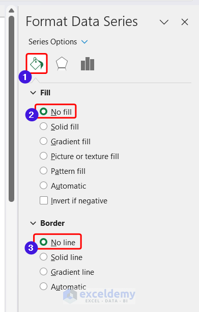
Your chart now looks like a waterfall chart.
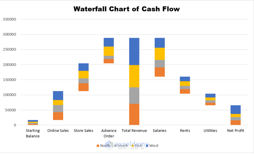
We can further beautify the waterfall chart by modifying formatting like the Chart Title and Color of the axis, and deleting the Base legend. After performing some beautification, our final waterfall chart looks like this:
Read More: Create Stacked Waterfall Chart with Multiple Series in Excel
Things to Remember
- While creating a waterfall chart with multiple series using a default 2D stacked column chart, you must group all the positive values (such as revenues, profits, etc.) together in one group and all the negative values (such as loss, insurance, compensations, etc.) together separately.
- When calculating the base value, revenue items (positive values) will add up to the running total, and expense items (negative values) will be subtracted from the running total. Hence, the formula for calculating the base value will be different for expense items and revenue items.
Frequently Asked Questions
- What are other names for the waterfall chart?
The waterfall chart is also known as the Flying Bricks Chart, Mario Chart, or Bridge Chart.
- What is the limitation of the waterfall chart?
Iit can be challenging to compare the various segments without a common baseline. Even with labels, it can be challenging for a viewer to identify the true differences between the bars.
- Can I use the default Excel waterfall chart for multiple series?
Unfortunately not. However, as demonstrated above, we can customize the 2D stack column to display it as a waterfall chart with multiple series.
Download Practice Workbook
Related Articles
- How to Make a Vertical Waterfall Chart in Excel
- Excel Waterfall Chart with Negative Values
- Excel Waterfall Chart Change Colors
- Excel Waterfall Chart Total Not Showing
<< Go Back to Waterfall Chart in Excel | Excel Charts | Learn Excel
Get FREE Advanced Excel Exercises with Solutions!
