
Simply displaying charts and numbers is no longer enough. Storytelling with data transforms your analytical insights into clear, compelling narratives. Whether you’re a business analyst, researcher, or student, presenting numbers with a narrative helps your audience understand, engage, and remember. Power BI is more than just a data visualization tool; it’s a storytelling platform that allows you to shape your insights into compelling data-driven narratives.
In this tutorial, we will show you how to build narrative-driven reports in Power BI.
Why Storytelling Matters in Data Reporting
- Data alone rarely drives change. People connect with stories, not spreadsheets.
- Stories help explain “why” and “what’s next.” While charts can show trends, a story provides context and recommendations.
- Good stories are memorable. A narrative-driven report makes insights stick and motivates action.
Define the Story You Want to Tell
Before starting to build the report, you must define the story.
- Objective: What decision or insight do you want to convey?
- Audience: Who are the end-users?
- Executives need summary insights along with KPI, but analysts may want deeper data.
- Outline objectives: What actions do you want your audience to take?
- Structure: Follow the storytelling arc: context → conflict → resolution.
Choose the Right Visuals
Select visuals that clearly illustrate your narrative:
- Line and Area Charts: They show trends over time.
- Bar and Column Charts: Best for categorical comparisons.
- Pie and Donut Charts: Best for proportion and distribution.
- Maps: It is important for geographical data storytelling.
- Cards: Best to show KPI matrix such as Total Sales, % of Target Achieved, Avg Customer Satisfaction.
- Slicers: Filter data dynamically.
Structure Your Report
After creating your visuals, it is important to organize the report using a clear, logical flow:
- Introduction: Set the context.
- Rising Action: Highlight key trends and patterns.
- Climax: Showcase the main insights or discoveries.
- Resolution: Provide actionable recommendations.
Utilize Power BI’s Unique Features
Bookmarks:
Bookmarks are one of the most useful features. It lets you create interactive, narrative-driven navigation:
- Go to the View tab >> activate the Bookmarks Pane.
- Set your visuals, filters, and slicers for each narrative step.
- Click Add Bookmark to save each state.
Buttons:
You can combine buttons with bookmarks to enable narrative flow:
- Go to the Insert tab >> select Buttons.
- Link buttons to bookmarks for easy navigation.
Tooltips:
You can also use custom tooltips for additional context:
- Create a separate page in Power BI formatted specifically for tooltips.
- Assign this page as a tooltip via the visual’s formatting pane.
Drill through:
Enable drill through to let users explore deeper layers of your narrative:
- Set up a dedicated drill through page.
- Define the drill through fields on that page.
Title & Text Box:
Add descriptive Titles and text boxes to the report. Each visual should answer a question.
Text boxes are useful for:
- Introducing sections.
- Providing interpretations.
- Summarizing insights.
- Title: “2024 Sales Performance Story”
- Subtitle: “Are we meeting targets, and how happy are our customers?”
- Text Box: Short intro: “This report explores regional sales performance and customer feedback to guide management focus.”
Enhance Visual Appeal
Make your report visually appealing and easy to understand:
- Always use consistent colors and themes.
- You can use the Format Pane to customize the color, background, font, etc of visuals.
- Go for a minimalist design to avoid clutter.
- Describe the story through colors and size for key metrics and messages.
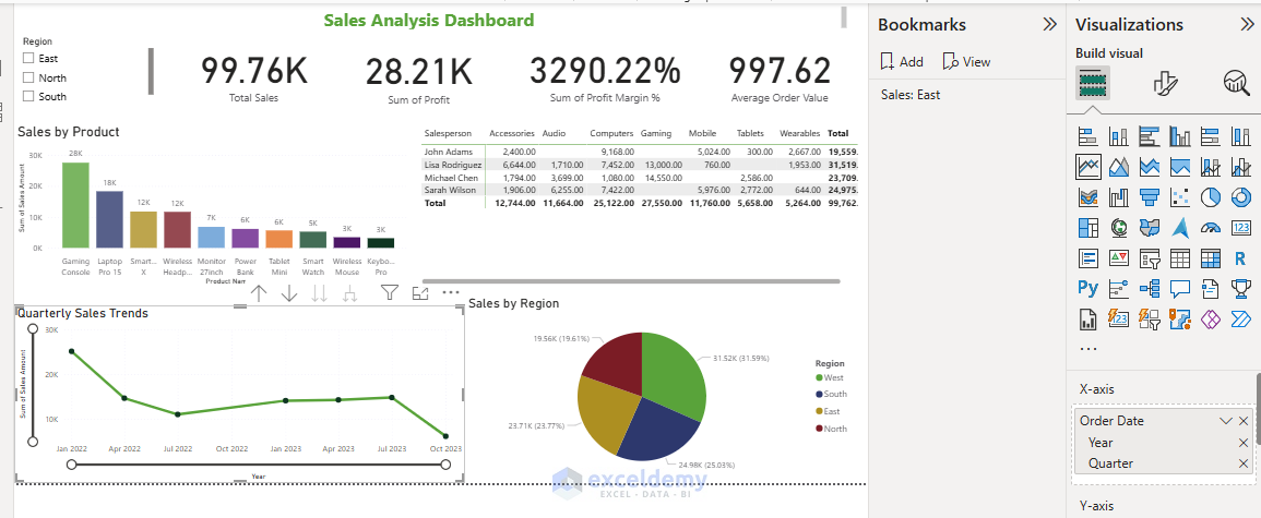
Example: Sales Performance Narrative
Let’s consider a monthly sales review for a retail chain.
- Add Title: Insert proper title.
- Intro: Overview of KPI’s using Card.
- Rising Action: Line chart highlighting increasing sales trends.
- Climax: Bar chart pinpointing the highest-performing products and a Pie chart showing regions.
- Resolution: You can add a Recommendations text box highlighting opportunities and next steps.
Review and Refine
Share your report with others to iteratively improve your report:
- Seek feedback from end users.
- Adjust visuals, narratives, and structure accordingly.
Conclusion
Effective storytelling in Power BI guides the audience through data with a clear, compelling narrative. Insightful narratives empower the audience with clarity. By strategically structuring your reports and leveraging Power BI’s robust visualization features, you ensure your data stories resonate and drive informed decision-making. Start to build a Power BI report, then experiment with storytelling, and gradually your report will become a narrative-driven report.
Get FREE Advanced Excel Exercises with Solutions!
