
Image by Editor
This tutorial is a beginner’s guide to breaking the pivot table ceiling by using Power BI.
Why Move Beyond Excel Pivot Tables?
- Data Limits: Excel slows down with huge datasets. Power BI handles millions of rows with ease.
- Multiple Data Sources: Need to combine Excel, SQL databases, web data, and more? Power BI brings them together.
- Visualization: Power BI offers rich, interactive visuals beyond Excel’s charts.
- Automation: Schedule refreshes and publish reports to the cloud for easy sharing.
- Advanced Modeling: Build relationships, calculated columns, and measures with DAX.
Import Your Excel Data
Getting Started:
- Download Power BI Desktop from Microsoft’s official site.
- Follow the installation wizard.
- Launch Power BI Desktop.
Import Excel Files:
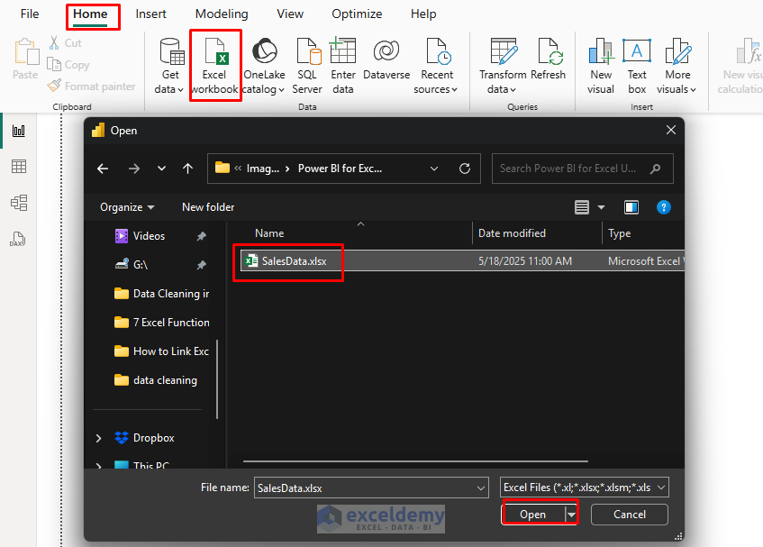
- Go to the Home tab >> select Excel Workbook.
- Browse to your Excel file and click Open.
- In the Navigator dialog, select the tables or sheets you want to import.
- Sales – Contains transaction data.
- Products – Product details and categories.
- Customers – Customer information.
- Regions – Geographic information.
- Select all tables and click Load.
- Or click Transform Data to open Power Query Editor.

Pro Tip: If you’re familiar with Power Query in Excel, you’ll feel right at home with Power BI’s data transformation capabilities, as they share the same engine. For example, if you need to clean your data:
- Select Transform Data instead of Load.
- Use familiar transformations like removing duplicates, replacing values, or splitting columns.
- Click Close & Apply when done.
From Pivot Tables to Power BI Visualizations
Creating visualizations in Power BI is similar to building pivot tables, but with more options:
- Select a visualization type from the Visualizations pane.
- Table, Matrix, Column Chart.
- Drag fields from the Fields pane to the visualization’s “Wells”.
- Values, Axis, Legend, etc.

Excel to Power BI Transition:
- Excel’s Pivot Table Values → Power BI’s Values field.
- Excel’s Row Labels → Power BI’s Axis field (for charts) or Rows field (for tables/matrices).
- Excel’s Column Labels → Power BI’s Legend field (for charts) or Columns field (for tables/matrices).
- Excel’s Filters → Power BI’s Filters pane.
Create Power BI Visualizations (Like Excel Pivot Table)
You can create a sales report that would typically be a pivot table in Excel.
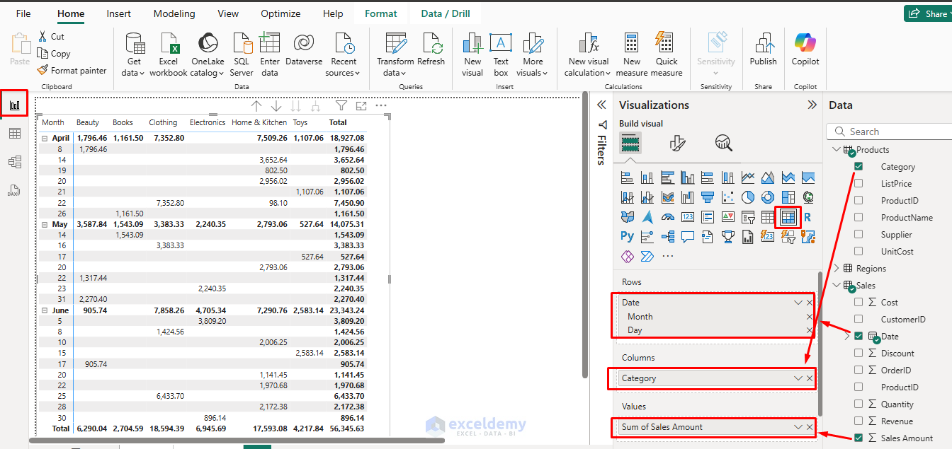
Create Matrix Table:
Let’s create a sales table with product category, date, and sales amount.
- Go to the Report view from the left navigation pane.
- Select the Matrix table from the Visualizations pane.
- Drag Sales[Date] to Rows. Select Date Hierarchy.
- Month
- Day
- Drag Products[ Category] to Columns.
- Drag Sales[Sales Amount] to Values.
- Drag Sales[Date] to Rows. Select Date Hierarchy.
- Click on the plus (+) icon to expand months like a pivot table.
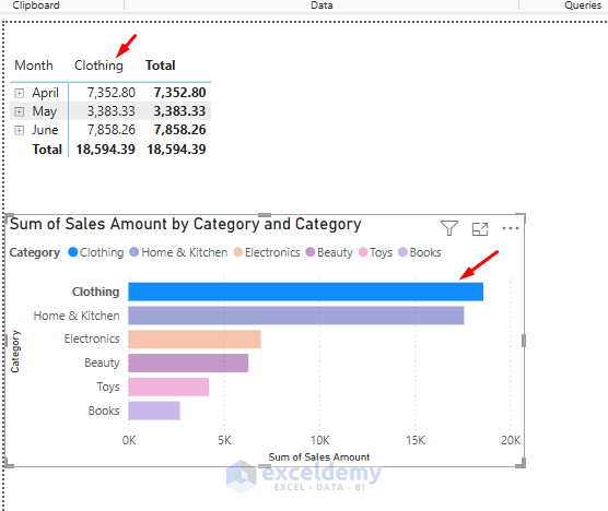
Create a Bar Chart:
Let’s create a chart to show sales by product category.
- Select the Bar chart from the Visualizations pane.
- Drag Products[Category] to the Y-axis.
- Drag Sales[Sales Amount] to the X-axis.
- Drag Products[ Category] to Legend.
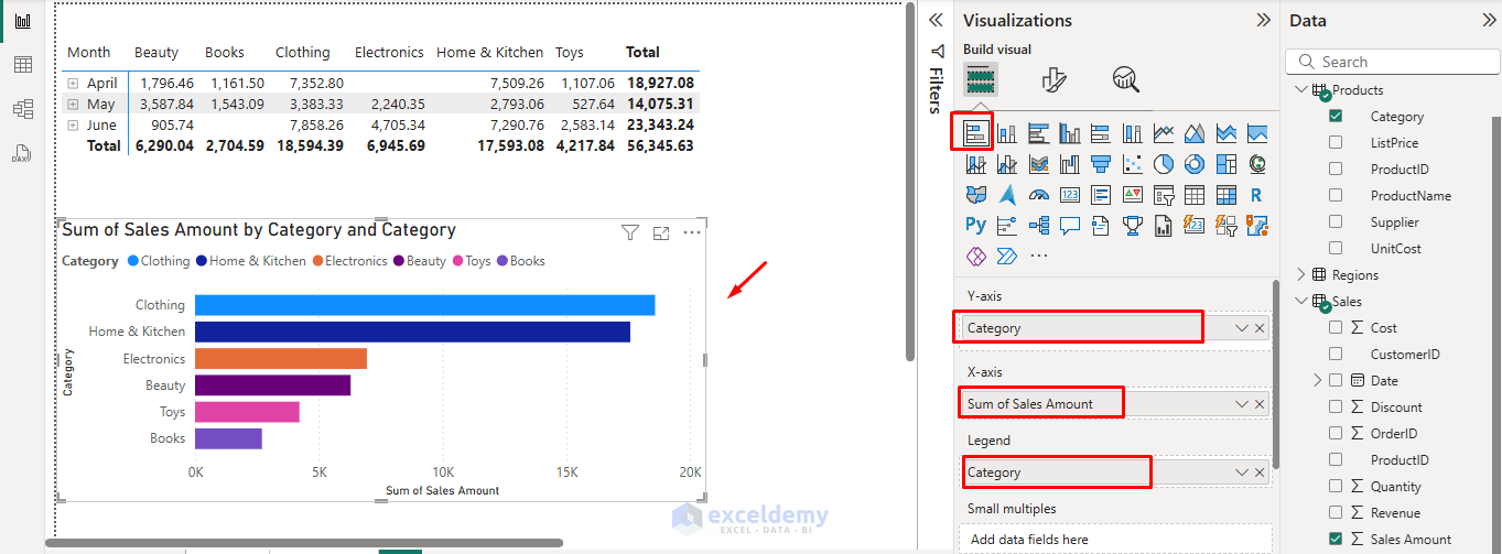
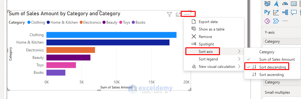
- Sort by Sales Amount by clicking the three-dot (…) in the top-right of the visual and selecting Sort by Sales Amount.
Create a Pie Chart:
- Select the Pie chart from the Visualizations pane.
- Drag Regions[City] to Legend.
- Drag Sales[Sales Amount] to Values.
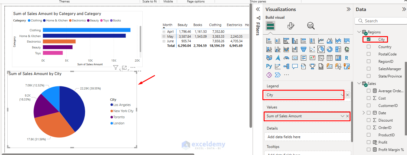
Add Slicers:
City Slicer:
- Select Slicer from the Visualizations pane.
- Drag Regions[City] to Field.
- Select any city to filter the dashboard.

Category Slicer:
- Select Button Slicer from the Visualizations pane.
- Drag Products[Category] to the Field.
- Select any category to filter the dashboard.

Interactivity:
- Clicking any value in your Matrix or Chart cross-filters other visuals, something classic Pivot Tables can’t do.
- Click on a category in the bar chart and watch how the matrix automatically filters to show only data for that category.
Notice how much faster and more interactive these visualizations are compared to Excel pivot tables.
Key Advantage: Unlike Excel pivot tables, Power BI visualizations are interactive by default. Clicking on elements in one visualization automatically filters related visualizations on the same page.
Advanced Features: Breaking the Ceiling
Once you’re comfortable with the basics, explore these powerful features.
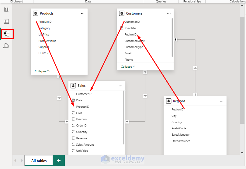
Create Relationships
- Excel relationships are limited, but Power BI’s data modeling is robust.
- Go to Model View and drag fields to build relationships (no more VLOOKUP!).
- Power BI detects a relationship between multiple tables, if a proper connection exists, it automatically creates the relationship.
- Or create relationships between tables by dragging fields between tables in the Model view.
- For our sales data:
- Link Sales[ProductID] to Products[ProductID]
- Link Sales[CustomerID] to Customers[CustomerID]
- Link Customers[RegionID] to Regions[RegionID]
Introduction to DAX (Pivot Table DAX)
Data Analysis Expressions (DAX) is Power BI’s formula language. If you know Excel formulas, you have a head start with DAX.
Excel to DAX Translation:
- =SUM(A1:A10) in Excel → SUM(Table[Column]) in DAX
- =IF(A1>10,”High”,”Low”) in Excel → IF(Table[Column]>10,”High”,”Low”) in DAX
Create a Calculated Column:
- Go to the Table view from the left navigation pane.
- Go to the Table Tools >> select New Column from Calculations.
- Or right-click on your table in the Fields pane >> select New Column.
- Enter the following DAX formula.
Profit:
Profit = Sales[Revenue] - Sales[Cost]

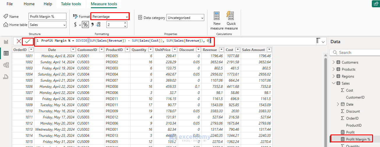
Create a Measure:
It is like a calculated field in Pivot Tables.
- Go to the Table view from the left navigation pane.
- Go to the Table Tools >> select New Measure from Calculations.
- Measures are dynamic calculations that respond to filters and slicers.
- Insert the following formulas to create new measures.
Total Sales:
Total Sales = SUM(Sales[Sales Amount])

Profit Margin:
Profit Margin % = DIVIDE(SUM(Sales[Revenue]) - SUM(Sales[Cost]), SUM(Sales[Revenue]), 0)
Average Order Value:
Average Order Value = Sales[Total Sales] / DISTINCTCOUNT(Sales[OrderID])

Time Intelligence:
One of DAX’s powerful features is its ability to perform time-based calculations easily.
Sales YTD = TOTALYTD(SUM(Sales[Sales Amount]), Sales[Date])
Sales Previous Year = CALCULATE([Total Sales], SAMEPERIODLASTYEAR(Sales[Date]))
YOY Growth % = DIVIDE(Sales[Sales YTD] - Sales[Sales Previous Year], Sales[Sales Previous Year])

Try adding these measures to visualizations to see how they dynamically update based on filters and slicers, and something that would require multiple pivot tables or complex formulas in Excel.
Note: To perform time intelligence operations, your data must contain multiple-year sales information.
Create Visualizations from Calculated Measures
Add Cards:
- Select Card from the Visualizations pane.
- Drag calculated measures here.
- Total Sales
- Profit
- Profit Margin
- Average Order Value

Add KPI:
- Select KPI from the Visualizations pane.
- Drag Sales[Sales Amount] to Values.
- Drag Sales[Date] to the Trend axis.
- Drag Sales[Goal] to Target.

Dynamic Visuals
Arrange Visuals:
- Go to the View tab >> select Align to neatly arrange visuals.
- Drag visuals on the canvas and resize as needed.
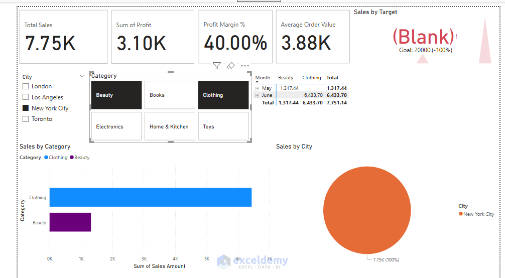
Cross-filtering in Action:
- Select a category in the column chart to see how it automatically filters the line chart, map, and updates the cards.
- This interactivity is much more powerful than anything possible with Excel pivot tables.
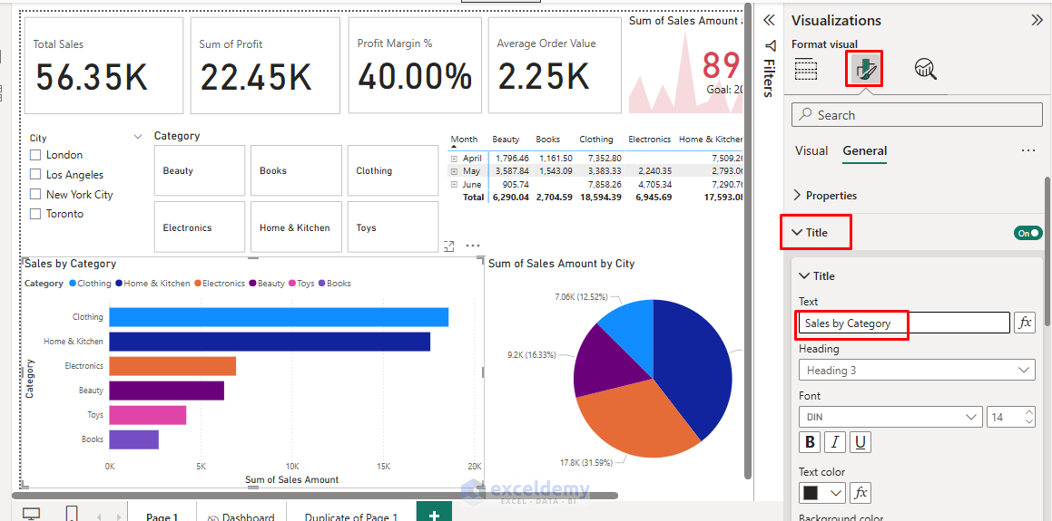
Add Titles and Backgrounds:
- Go to the Visualizations pane >> select Format to add descriptive titles.
- Add custom background colors to make your dashboard more visually appealing.
Add Drill-Through Functionality:
- Right-click on the product Category chart.
- Select Drill Through >> click Add drill-through, then select fields to include in the detailed view.
- Now users can right-click on any category bar to see detailed information.
Final Dashboard:

Test Interactivity:
Share and Collaborate with Power BI Service
Once your dashboard is ready:
- Go to the Home tab >> click Publish to share your report online.
- Set up scheduled data refreshes, no more manual emailing.
- Sign in with your Microsoft account or organizational account.
- Select a workspace to publish it.
- After publishing, open Power BI Service in your browser to view your report.
Tips for Excel Users Moving to Power BI
- Think in terms of models and visuals, not just sheets and formulas.
- Use DAX for calculations (lots of similarities to Excel, but more powerful).
- Save time by reusing visuals and publishing to the web.
- Embrace relationships, avoid the nested lookups.
Conclusion
As an Excel user, you already have a solid foundation for success with Power BI. The knowledge of pivot tables and formulas will help you to explore Power BI’s more advanced capabilities. Moving from Excel Pivot Tables to Power BI opens a world of possibilities. You’ll be able to handle larger data, create interactive dashboards, and automate your reporting, all without leaving your analytical comfort zone.
Get FREE Advanced Excel Exercises with Solutions!
