
Power BI is a powerful business analytics tool that quickly turns Excel data into insightful, interactive reports. You can transform your static Excel data into an interactive, professional Power BI dashboard in just 30 minutes.
In this tutorial, we will show the transformation of an Excel workbook to a Power BI report in 30 minutes.
Step 1: Prepare Your Excel Data (5 min)
Before importing to Power BI, ensure your Excel data follows these best practices.
1. Clean Your Data
- Make sure headers are in the first row.
- Keep headers descriptive and concise
- Ensure each column contains consistent data types.
- Remove empty rows/columns.
- Remove merged cells and blank rows in the data.
2. Format as Excel Table
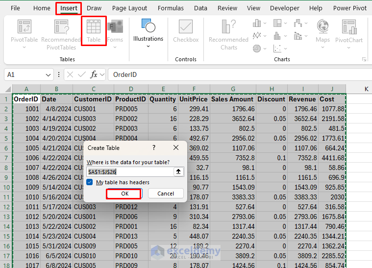
- Select your data range.
- Go to the Insert tab >> select Table, or press Ctrl + T.
- Ensure My table has headers is checked.
- Click OK.
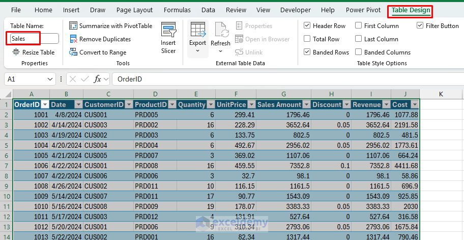
- Rename your table:
- Go to the Table Design tab >> select Table Name (use descriptive names like Sales, Products or EmployeeMetrics, etc.).
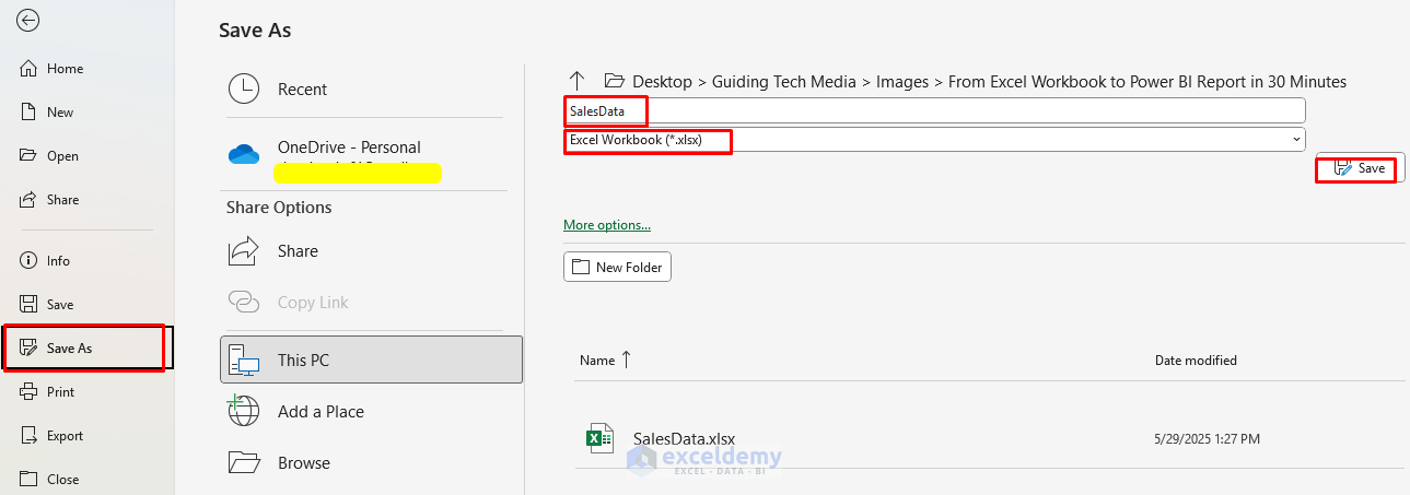
3. Save Your Workbook
Save your Excel file in an accessible location. Power BI will need to reference this path.
- Go to the File tab >>select Save As.
- Save your Excel file in a known location.
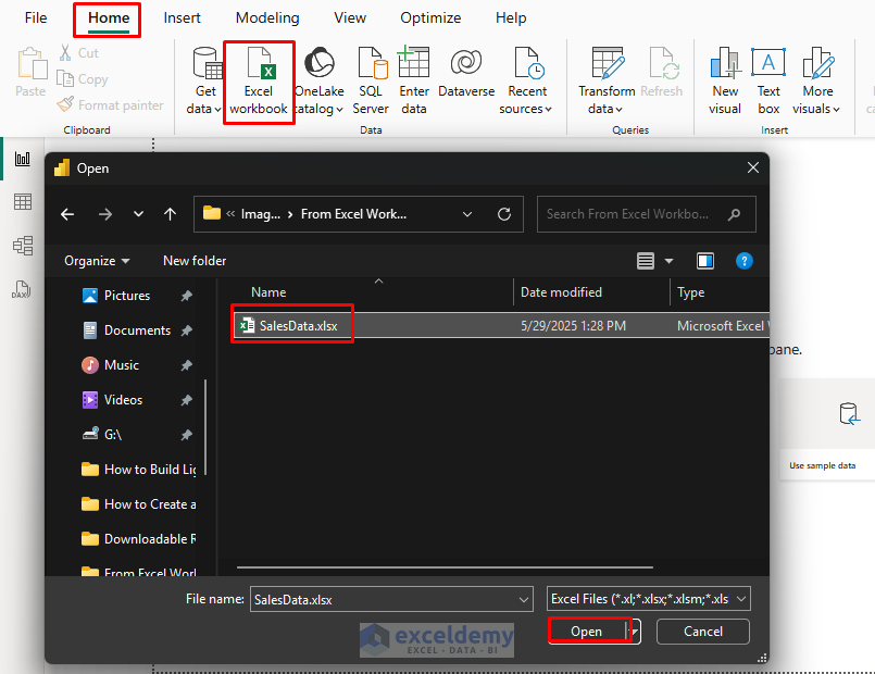
Step 2: Import Excel Data into Power BI (2 min)
- Open Power BI Desktop.
- Go to the Home >> from Data >> select Excel Workbook.
- Browse and select the Excel file.
- In the Navigator window, select the tables/sheets you want to import.
- Click Load to load data directly.
- Click Transform Data to open Power Query Editor (recommended for data cleaning).

Step 3: Transform Data (5 min)
In Power Query Editor, perform these common transformations:
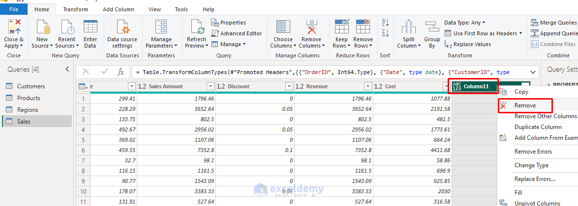
Remove Unnecessary Columns:
- Right-click columns you don’t need >> select Remove.
Fix Data Types:
- Click the data type icon next to the column names.
- Select the appropriate data type (Text, Whole Number, Decimal, Date, etc.).
Handle Missing Values:
- Right-click columns with blanks.
- Choose Replace Values or Remove Rows as appropriate.
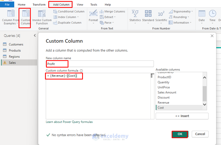
Create Calculated Columns (if needed):
- Go to the Add Column tab >> select Custom Column.
- Use the following simple formula for profit calculations.
- Click OK.
=[Revenue] - [Cost]
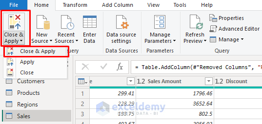
Load Data:
- Go to the Home tab >> select Close & Apply.
- Power BI loads data into a model.
Step 4: Create Visualizations (10 min)
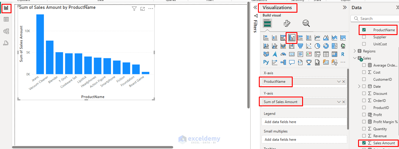
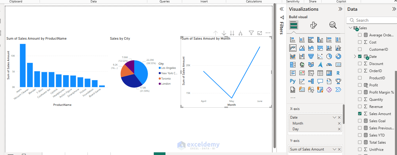
1. Create Your First Visual – Key Metrics
- Go to the Report view >> click on a blank canvas area.
- Select Clustered Column Chart from the Visualization pane.
- Drag ProductName to the X-axis.
- Drag Sales Amount to the Y-axis.
2. Create a Pie Chart
- Select Pie Chart from the Visualizations pane.
- Drag City to Legend.
- Drag Sales Amount to Values.
3. Add a Trend Chart
- Select Line Chart from the Visualizations pane.
- Drag the Date field to the X-axis and keep the Month.
- Drag Sales Amount to the Y-axis.
- Power BI automatically aggregates data.
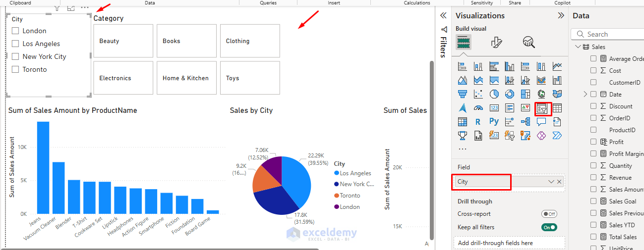
4. Add Interactive Filters
- Select Slicer from the Visualizations pane.
- Drag categorical fields (e.g., Category, City) to Field.
- This creates dropdown filters that affect all visuals.
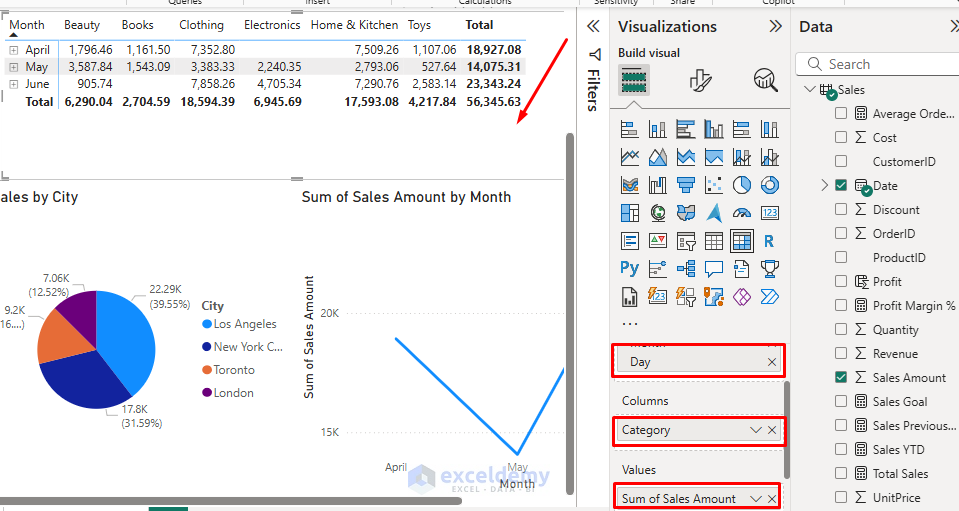
5. Create a Data Table
- Select Matrix from the Visualizations pane.
- Drag Date fields to Rows.
- Drag Category fields to Columns.
- Drag Sales Amount fields to Values.
- Useful for showing detailed breakdowns.
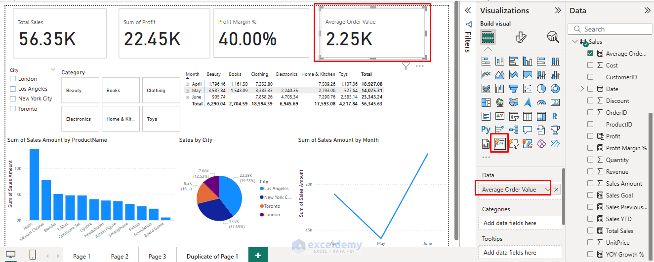
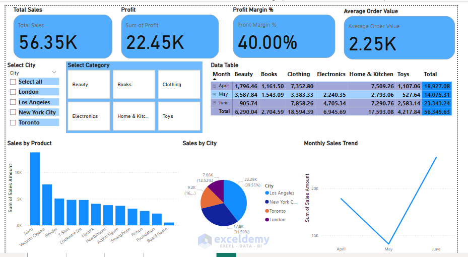
6. Add Cards
- Select the Card from the Visualizations pane.
- Drag your main metrics to the Fields well.
- Total Sales
- Total Profit
- Profit Margin %
- Average Order Value
- Resize and position the card.
Step 5: Format and Finalize (5 minutes)
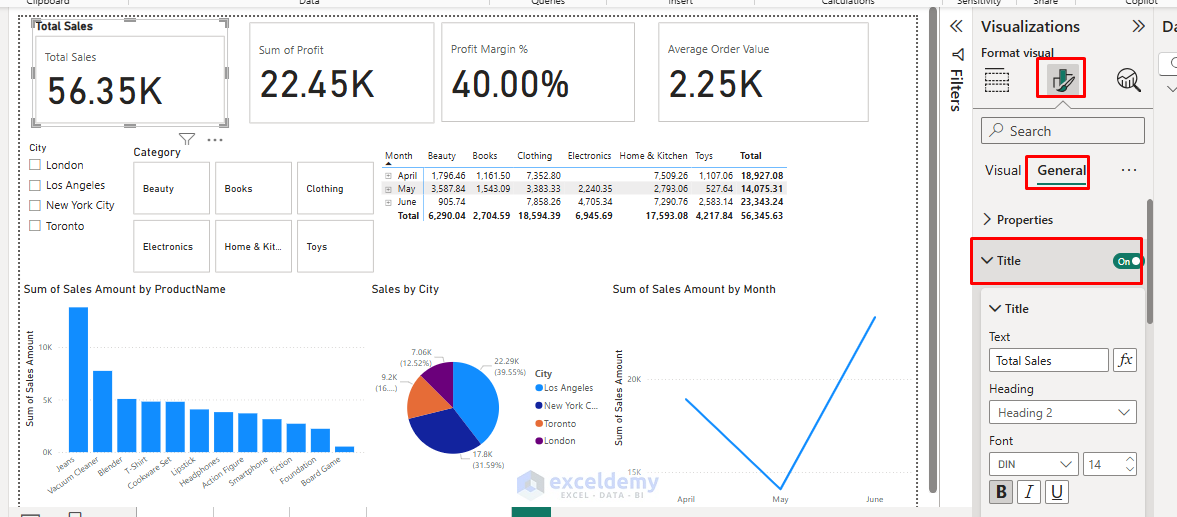
Add Titles and Labels:
- For each visual, go to Format pane >> select General >> select Title.
- Turn on titles and make them descriptive.
- You can add a report title using a text box (Insert > Text box).
Apply Consistent Formatting:
- Select each visual and use the Format pane to:
- Apply consistent colors.
- Adjust font sizes.
- Add data labels where helpful.
- Remove gridlines for a cleaner look.
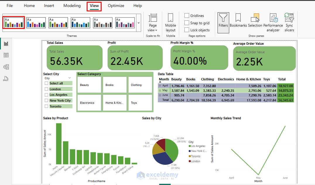
Arrange Layout:
- Resize and position visuals for logical flow.
- Use alignment tools ( go to Format tab >> select Align) for a professional appearance.
- Leave white space – don’t overcrowd.
- Go to the View tab >> select any Themes.
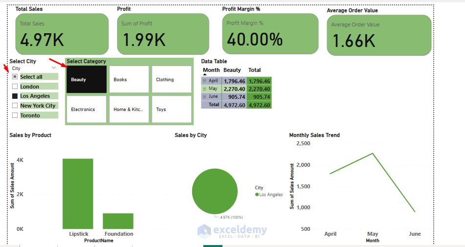
Test Interactivity:
- Click on different chart elements to see cross-filtering.
- Use slicers to filter data.
- Ensure interactions make sense.
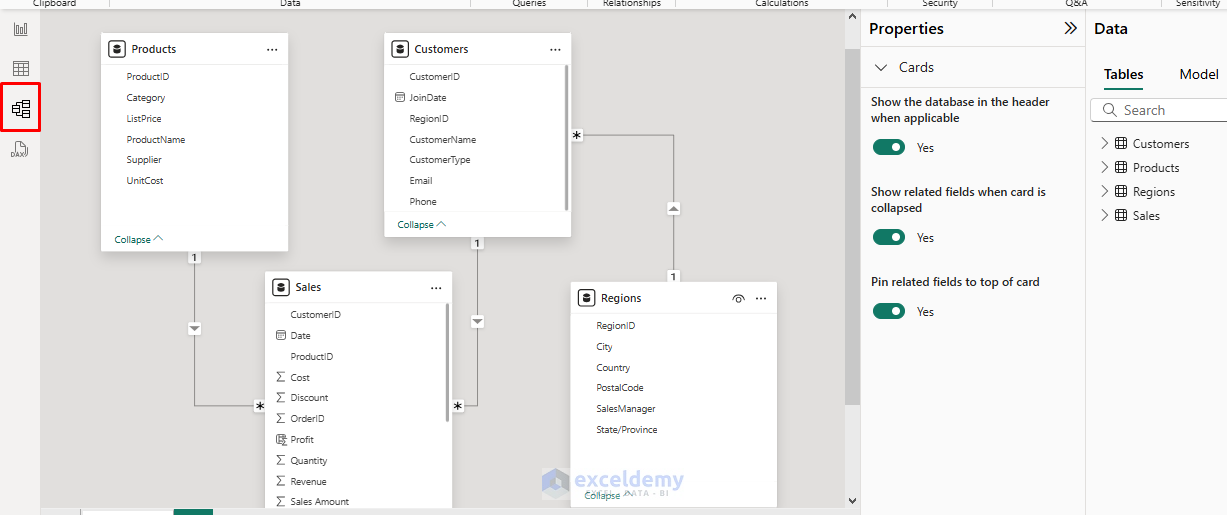
Step 6: Create Relationships (if multiple tables) (2 min)
- Go to Model View.
- Power BI automatically detects and creates relationships.
- Drag and drop fields to create relationships (e.g., CustomerID in Orders → CustomerID in Customers).
- Ensure the relationship is one-to-many, and the cross filter is set to both.
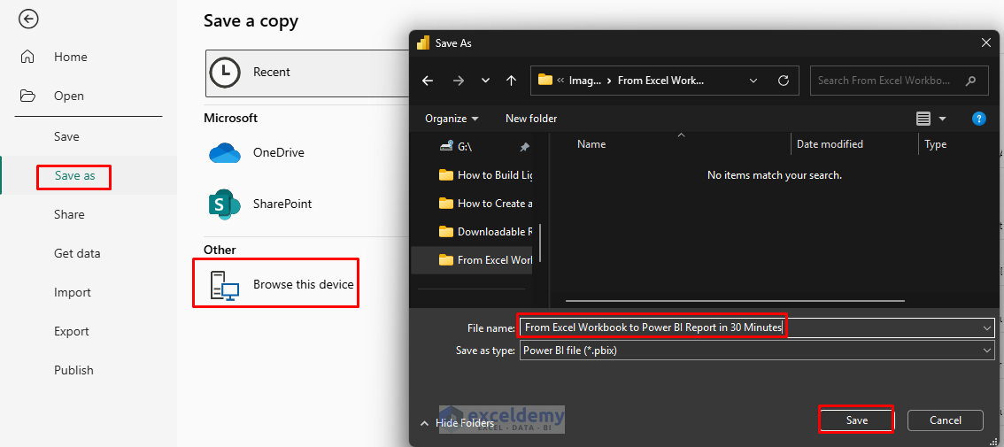
Step 7: Save and Publish Your Report (1 min)
Save Locally:
- Go to the File tab >> select Save and give your file a name.
Publish to Power BI Service:
- Go to the Home tab >> select Publish.
- Sign in with your Power BI account.
- Select your Workspace (e.g., My Workspace).
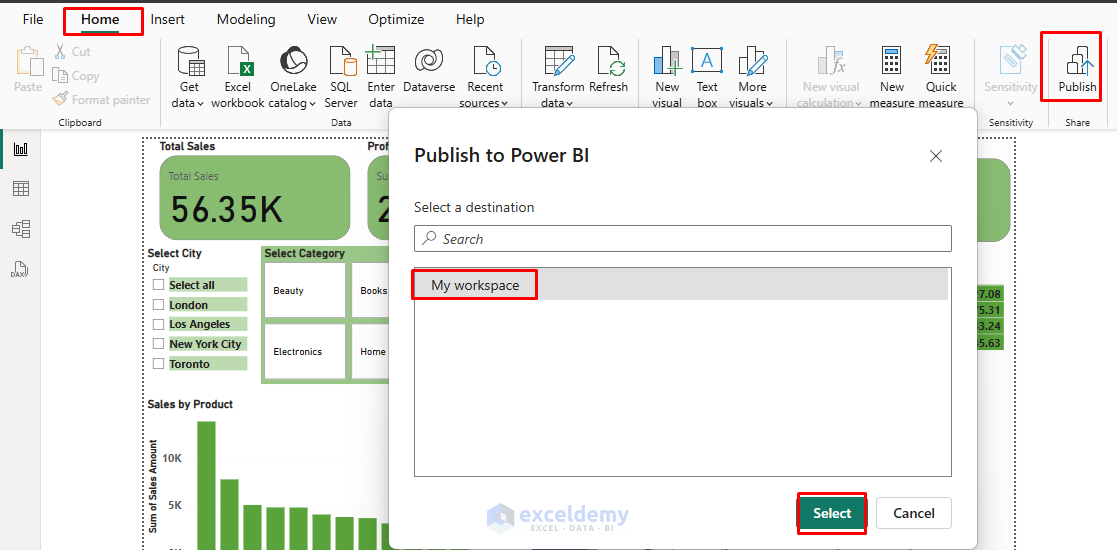
- Your report is now online and ready to share.

Bonus Tips for Faster Workflow
- Use well-structured Excel tables for easier import.
- Name columns clearly (avoid spaces/special characters for smoother modeling).
- Use Power BI Templates for repeated reports.
- Add bookmarks for navigation if your report is complex.
Conclusion
Within just 30 minutes, you can transform your raw Excel data into a shareable, interactive Power BI report. This process unlocks deeper insights and makes data-driven decision-making much more accessible. You can also explore other Power BI features to make your report more comprehensive and interactive.
Get FREE Advanced Excel Exercises with Solutions!
