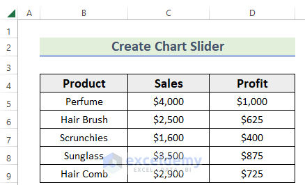
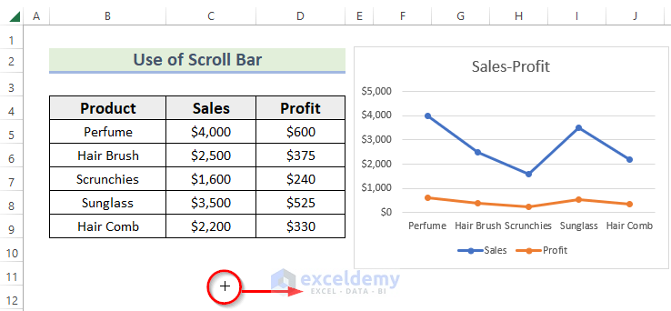
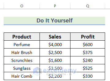
This is the sample dataset.
Method 1. Insert a Scroll Bar to Create a Chart Slider
Steps:
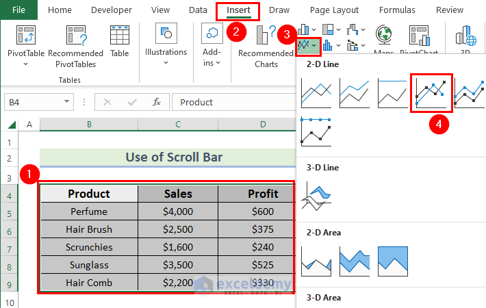
- Select the data. Here, B4:D9.
- Go to the Insert tab.
- In Charts, select Insert Line or Area Chart.
- Choose Line with Markers.
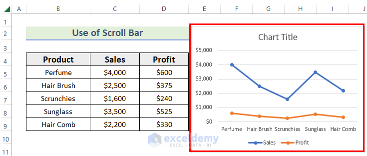
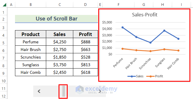
The following chart is displayed.
- Go to the Developer tab.
- In Insert >> choose Scroll Bar in Form Controls.
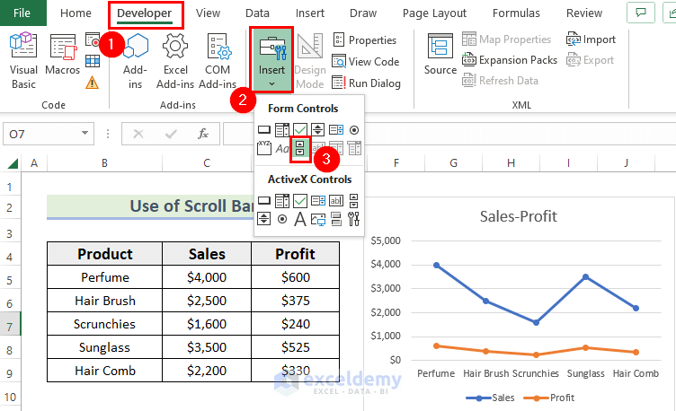
- Drag the mouse pointer.
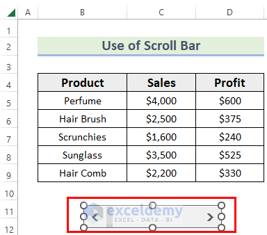
You will see the scroll bar.
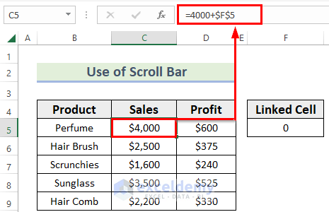
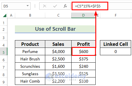
Link the Sales and Profit values with a blank cell: F5.
- Link the cells as shown below.
- You can also link the cells as shown below:
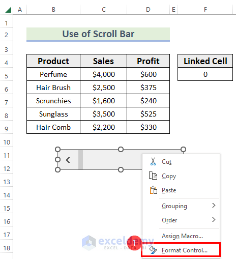
- Right-click the scroll bar.
- In the Context Menu, choose Format Control.
In Format Control.
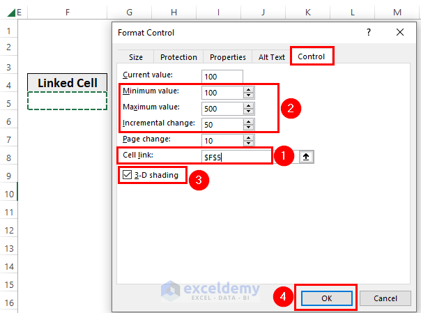
- Go to the Control menu.
- Select F5 in Cell link.
- Enter the Minimum value, Maximum value, Increment change.
- Check 3-D shading.
- Click OK.
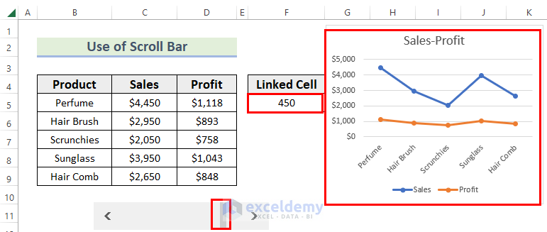
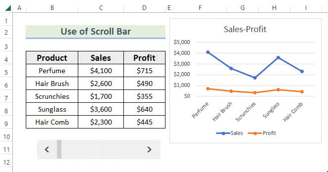
- If you click the scroll bar, the value of F5 will update along with the values of Sales and Profit.
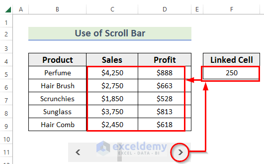
- The scroll bar was changed: the value of F5 >> the values of Sales and Profit >> the chart is updated.
- Drag the chart to hide the linked cell.
- A GIF of the chart slider was added.
Read More: How to Use Form Controls in Excel
Method 2 – Use a Spin Button to Create a Chart Slider
Steps:
- Create the chart.
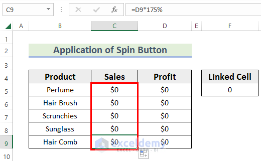
Link the Sales and Profit values with a blank cell: F5.
- Link the cells as shown below.
- You can also link the cells as shown below.
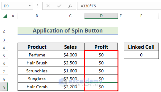
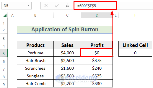
- Use a formula to link column C to F5.
- In the formula, the Sales and Profit values become zero because the F5 contains 0 as cell value.
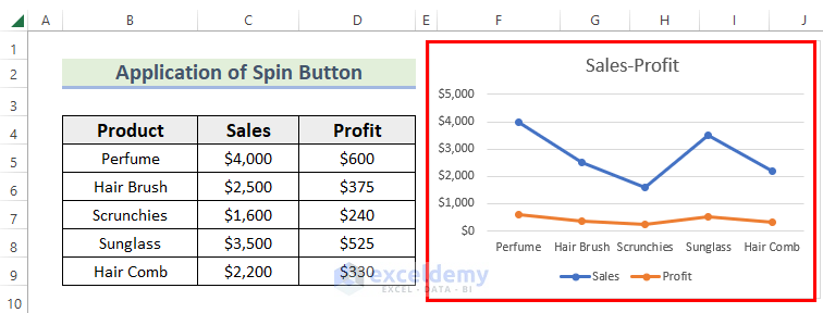
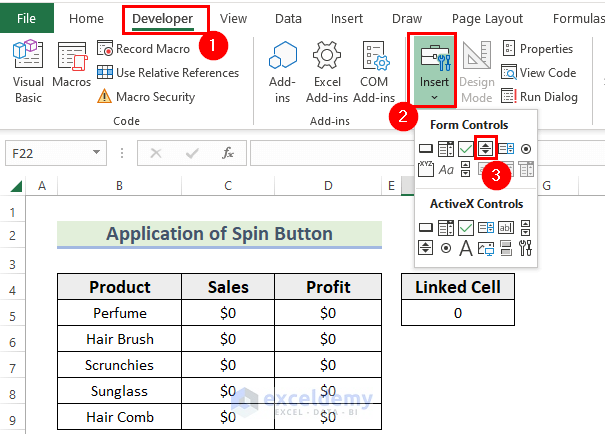
- Go to the Developer tab >> Insert >> choose Spin Button in Form Controls.
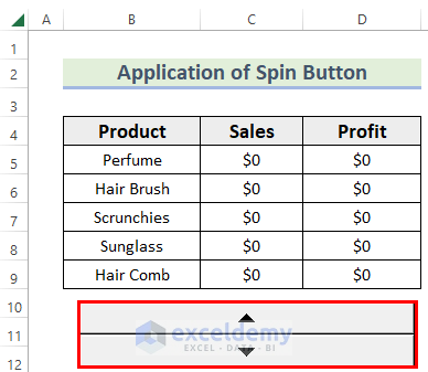
- Drag the mouse pointer.
- You will see the spin button.
- Right-click the spin button.
- In the Context Menu, choose Format Control.
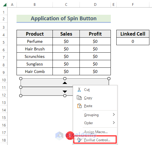
In Format Control:
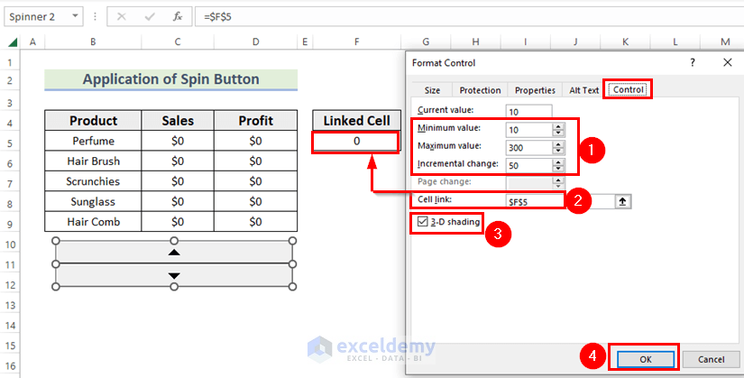
- Enter the Minimum value, Maximum value, Increment change.
- Select F5 in Cell link.
- Check 3-D shading.
- Click OK.
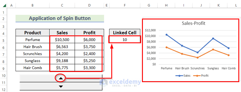
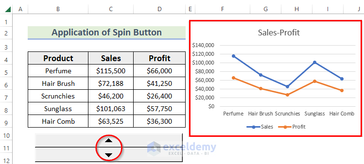
- If you click the spin button, the value of F5 cell will be updated along with the values of Sales and Profit and the chart.
- Drag the chart to hide the linked cell.
Read More: Key Differences in Excel: Form Control Vs. ActiveX Control
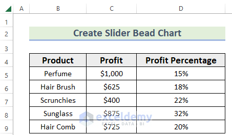
How to Make Slider Bead Chart in Excel
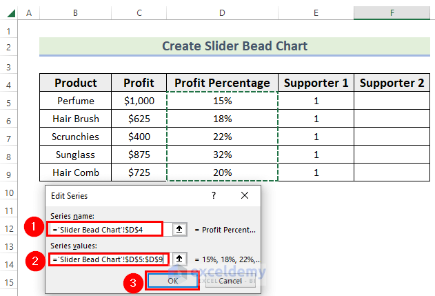
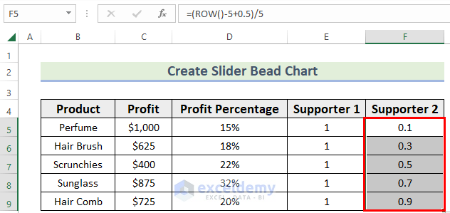
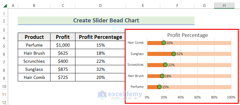
The dataset showcases the profit percentage of different products.
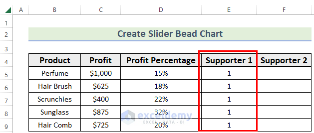
- Two columns were added: Supporter 1, and Supporter 2.
- Use cells value 1 in Supporter 1.
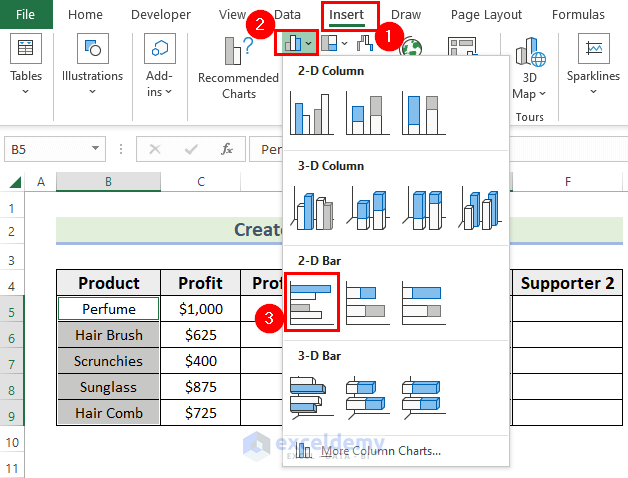
- Select the Product and Supporter 1 columns.
- In the Insert tab >> select Insert Column or Bar Chart in Charts.
- In 2-D Bar >> choose Clustered Bar.
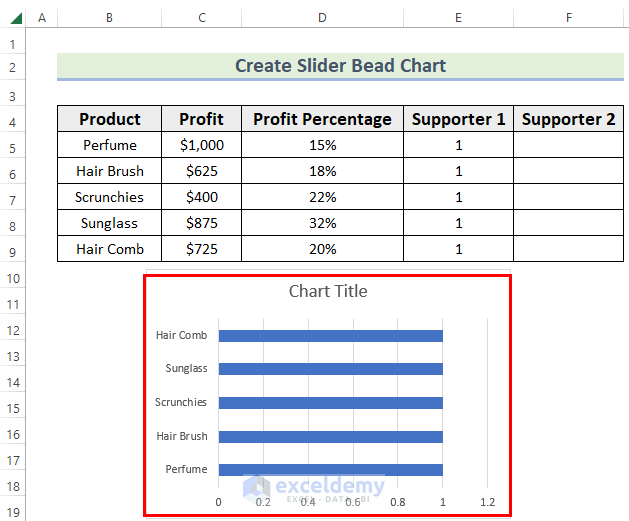
You will see the following chart.
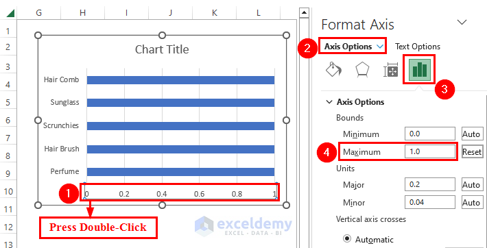
- Double-click the Horizontal (Category) Axis.
- In Format Axis, go to Axis Options.
- Choose Axis Options and set the maximum value as 1.
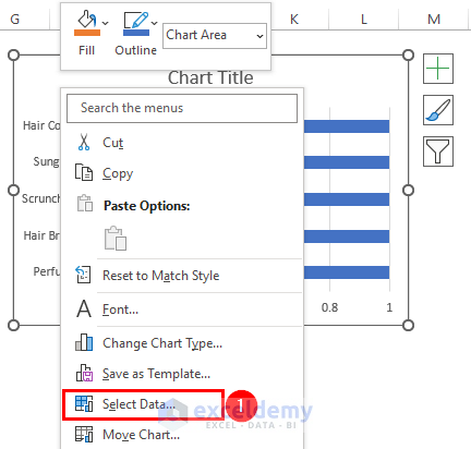
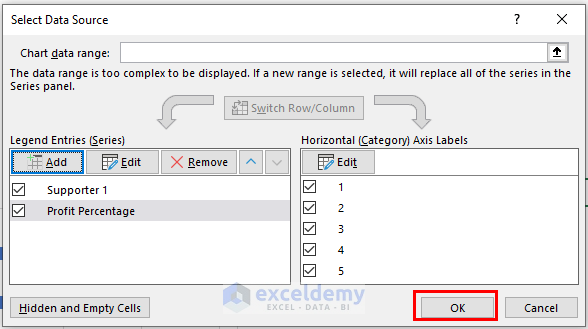
- Right-click the chart.
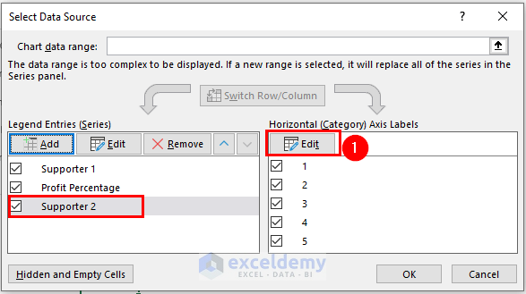
- In the Context Menu Bar, choose Select Data.
- In Select Data Source, choose Add.
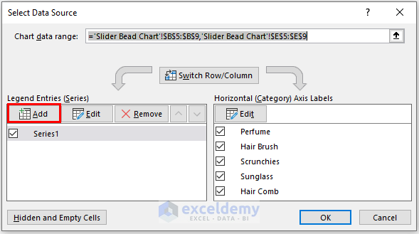
- In Edit Series will appear, enter the Series name. Here, Profit Percentage in D4.
- Enter the Series values. Here, D5:D9.
- Click OK.
- In Select Data Source, click OK.
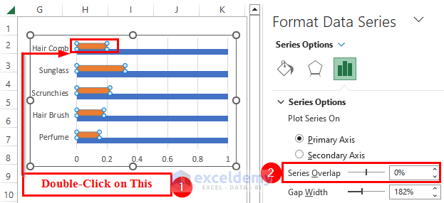
- Double-click the Profit Percentage chart.
- In Format Data Series, select Series Options.
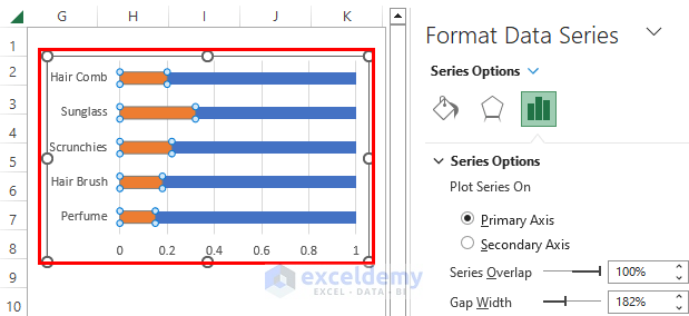
- In Series Options, set Series Overlap to 100%.
You will see the following output.
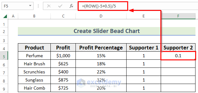
- In F5, enter the following formula.
=(ROW()-5+0.5)/5The ROW function was used. The 1st 5 is the row number containing the formula. The divisor 5 is the total row number without the header.
- Drag down the Fill Handle.
- Add the Supporter 2 column to the chart (follow the steps described in the previous method).
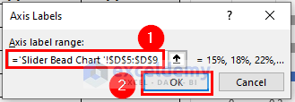
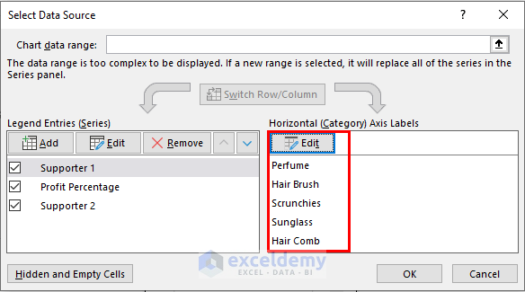
- Select Edit and change the Axis Labels.
- Select the Axis label range. Here, I D5:D9.
- Click OK.
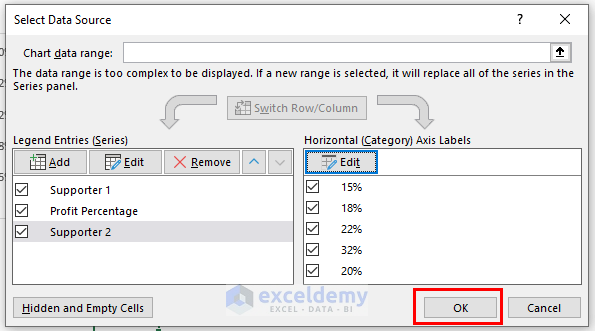
- Click OK in Select Data Source.
- Right-click the Supporter 2 chart.
- In the Context Menu Bar >> choose Change Series Chart Type.
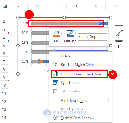
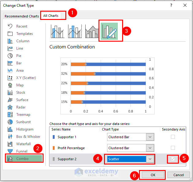
- In the Change Chart Type dialog box, select All Charts.
- Go to Combo chart and select Custom Combination.
- Choose Scatter for Supporter 2 and check Secondary Axis.
- Click OK.
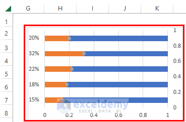
This is the output.
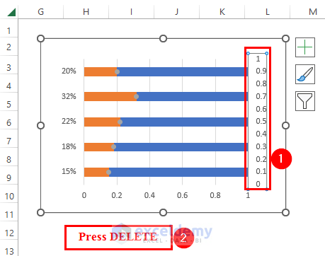
- Delete the secondary axis.
- Change the Horizontal (Category) Axis Labels to product name again.
- Click the Supporter 2 chart as shown below.
- In Format Data Series, select Series Options.
- Choose Fill & Line and go to Marker Options.
- Check Built-in and increase the size.

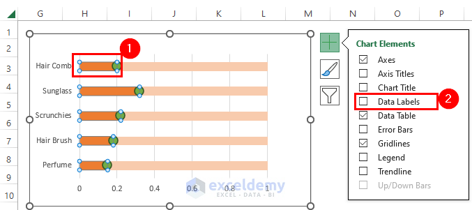
- Select Profit Percentage and in Chart Elements >> check Data Labels.
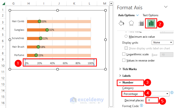
- Click the Horizontal (Category) Axis.
- In Format Axis, select Axis Options.
- Choose Axis Options and go to Number.
- Choose Category as Percentage and decrease the Decimal places to 0.
You will see the slider pellet chart.
Practice Section
Practice here.
Download Practice Workbook
Download the practice workbook here:
Related Articles
<< Go Back to Form Control in Excel | Learn Excel
Get FREE Advanced Excel Exercises with Solutions!
