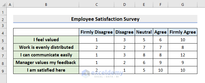
STEP 1 – Enter the Survey Results in Excel
- Enter the Survey Results in an Excel worksheet.
- The following is a sample dataset of an Employee Satisfaction Survey.
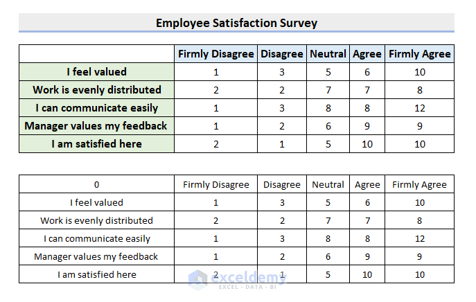
STEP 2 – Create a Data Preparation Table
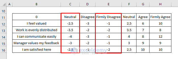
- Copy B4:G9 by pressing Ctrl + C.
- Select B11:G16 and paste it there, using the Paste Link feature.
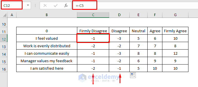
- Enter a Minus sign before the cell references in columns C and D.
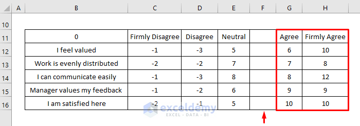
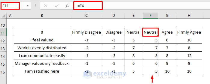
- Select F11:G16 and drag it to the next column.
Column F is blank.
- Select F11 and enter the formula:
=E4- Press Enter and use the AutoFill to see the result in the rest of the cells.
Another Neutral column will be displayed.
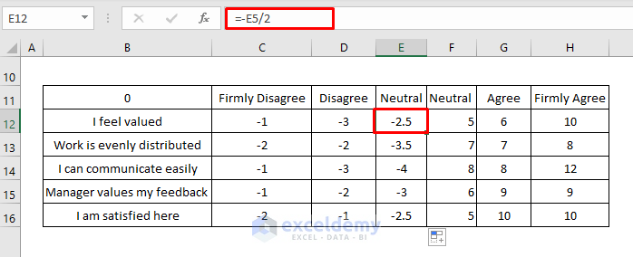
- In E12, enter this formula:
=-E5/2- Press Enter and use the AutoFill to see the result in the rest of the cells.
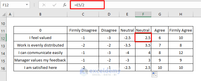
- In F12, enter this formula:
=E5/2- Press Enter and use the AutoFill to see the result in the rest of the cells.
The Data Preparation table is completed.
STEP 3 – Insert an Excel Stacked Bar Chart to Display Survey Results
- Select B11:H16.
- Go to the Insert tab.
- Choose a 2-D Bar chart.
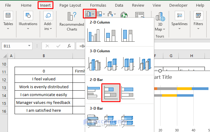
The chart will be displayed.
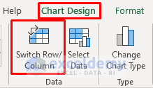
STEP 4 _ Switch Row & Column
- Select the chart.
- Go to the Chart Design tab and select Switch Row/Column.
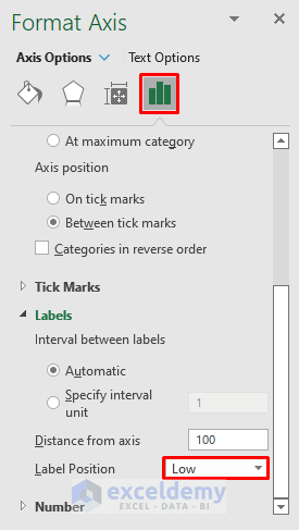
- Select the Y-axis labels and press Ctrl + 1.
- In the Format Axis pane, go to Label Position.
- Choose Low.
The new chart will be displayed.

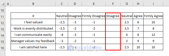
STEP 5 – Adjust the Excel Data Preparation Table
- Exchange C11:C16 with E11:E16 and use the original formulas.
The Firmly Disagree section and the Neutral section changed position.
STEP 6 – Edit the Color Scheme
- In Fill color, select a color.
- Here, Light Orange for Neutral, Orange for Disagree, Deep Orange for Firmly Disagree, Light Green for Agree, and Green for Firmly Disagree.

STEP 7 – Update the Legend
- Click the Legend to activate it.
- Click the Neutral (leftmost) reference.

- Press Delete.
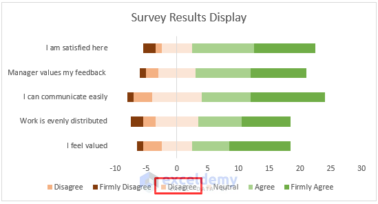
- Now, insert a blank Disagree column by dragging F11:H16 one column to the right.
- Copy the blank range F11:F16 and paste it into the chart.
A new Disagree reference will be displayed in the Legend.

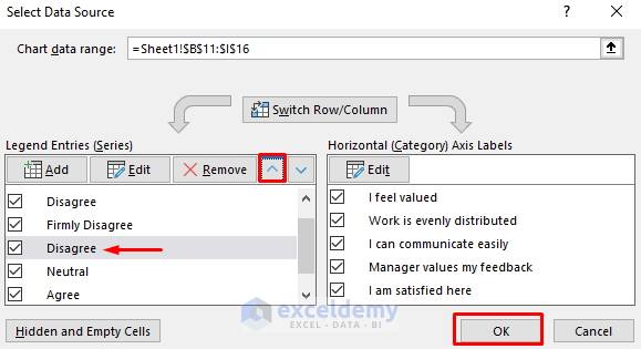
- Right-click the chart and choose Select Data.
- The Select Data Source dialog box opens.
- Select Disagree (the last one in the list) and move it to the position between Firmly Disagree and Neutral by pressing the upper arrow icon.
- Click OK.
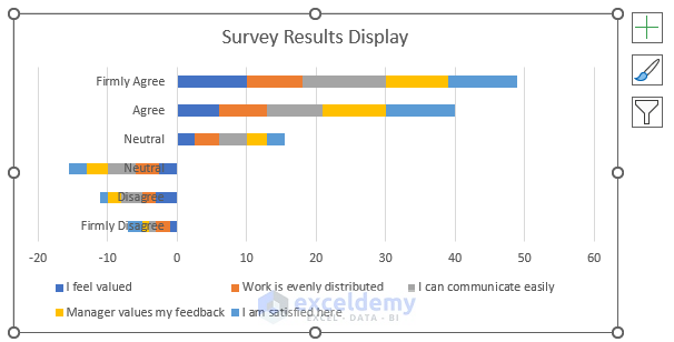
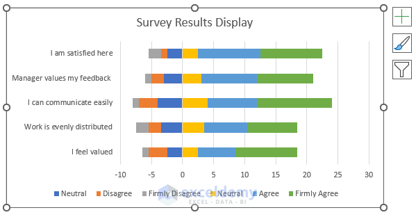
This is the output.
Final Output
- Select Disagree in the Legend and press Delete.
You’ll see a precise Display of the Survey Results in Excel.

Download Practice Workbook
Download the following workbook to practice.
Related Articles
- How to Tabulate Data in Excel
- How to Create a Questionnaire in Excel
- How to Encode Survey Data in Excel
- How to Analyze Survey Data in Excel
- How to Tally Survey Results in Excel
- How to Analyze Satisfaction Survey Data in Excel
- How to Analyze Survey Data with Multiple Responses in Excel
<< Go Back to Survey in Excel | Excel for Statistics | Learn Excel
Get FREE Advanced Excel Exercises with Solutions!
