
Image by Editor
Power BI is a powerful business analytics tool that allows you to create interactive visualizations and dashboards for better decision-making. These dashboards help visualize complex datasets and provide insights in a visually appealing manner.
In this tutorial, we will show how to design interactive visualizations and dashboards in Power BI.
Step 1: Load Data into Power BI
Connecting to Data Sources:
Power BI connects to numerous data sources. To design interactive visualizations and dashboards, let’s work with the following dataset.
- Sales data: Transaction records with details like product sold, quantity, price, and date.
- Orders data: Order information including customer details, shipping, and status.
- Products data: Product catalog with categories, costs, and specifications.
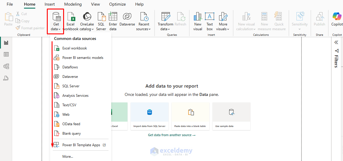
To connect to your data:
- Open Power BI Desktop.
- Go to the Home tab >> select Get Data.
- Choose your data source (Excel, SQL Database, CSV files, etc.).
- Navigate your files and select them.
- Preview the data and load it into Power BI.
- Click Load to import the data.
Step 2: Data Transformation in Power Query
Clean data leads to reliable insights. Using Power Query Editor:
- Click Transform Data to launch the Power Query Editor.
- Remove unnecessary columns.
- Rename columns for clarity (e.g., “Prod_ID” to “ProductID”).
- Handle missing values.
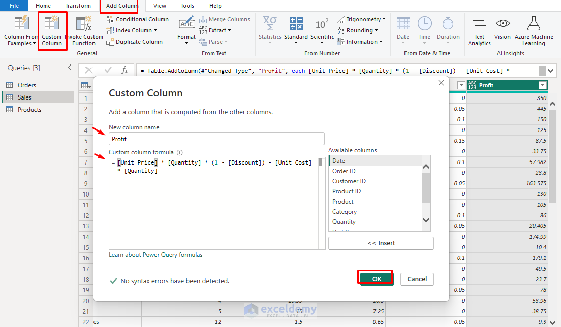
- Create calculated columns where needed.
- Create a calculated column for profit:
- Go to the Add Column >> select Custom Column.
- Insert the column name Profit >> insert the following formula:
= Sales[Total] - (Sales[Quantity] * Products[UnitCost])
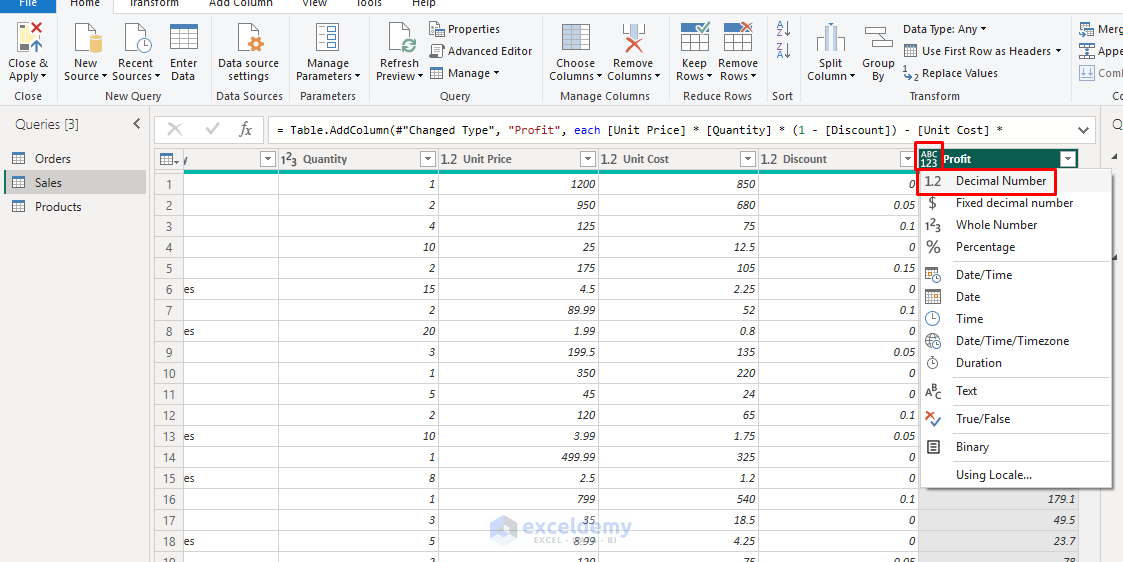
- Change data types (ensure dates are formatted as dates, numbers as numbers).
- Click Close & Apply to load the transformed data.
Step 3: Create Relationships Between Tables
- Go to the Model view (on the left pane).
- You should see three tables: Sales, Orders, and Products.
- Power BI automatically creates a relationship between tables. If you want, you can drag the keys to build custom relationships.
- Relationships:
- Sales to Products: Connect ProductID from Sales to ProductID from Products.
- Orders to Sales: Connect OrderID from Orders to OrderID from Sales.
- Ensure all relationships are single-directional and active.

Step 4: Create Key Measures
In the Report view, you create calculated fields and measures using DAX formulas.
- Go to the Table view (on the left pane).
- Select New column >> from Calculations to insert a calculated field.
- Select New measure to insert key measures formulas.
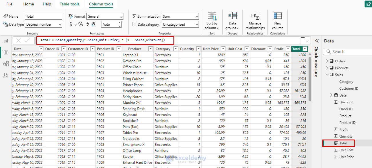
Create the Calculated Field:
- Total:
Total = Sales[Quantity]* Sales[Unit Price] * (1 - Sales[Discount])
This formula calculates the total sales amount.
Create the Following Key Measures:
- Total Sales:
Total Sales = SUM(Sales[Total])
- Total Profit:
Total Profit = SUM(Sales[Profit])
- Profit Margin:
Profit Margin = DIVIDE([Total Profit], [Total Sales], 0)
- Total Orders:
Total Orders = DISTINCTCOUNT(Sales[OrderID])
- Average Order Value:
Avg Order Value = DIVIDE([Total Sales], [Total Orders], 0)

Step 5: Create Basic Visualizations
You can select visualizations based on the story you want to tell. To create a visualization, select your data fields and drag them to the canvas or the Visualizations pane fields.
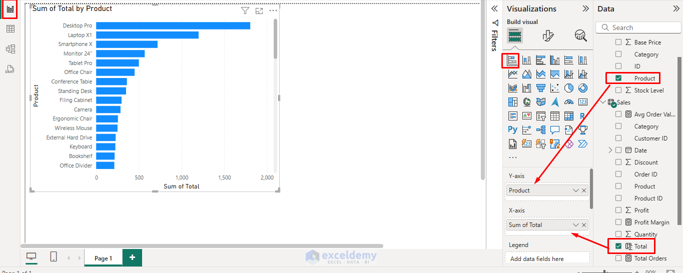
Bar Chart for Sales by Product
- Go to the Report view.
- Select Bar Chart from the Visualizations pane.
- Drag the Product name from Products to the Y-axis section.
- Drag Total from Sales to the X-axis section.
- This will create a bar chart showing the total sales amount by product.
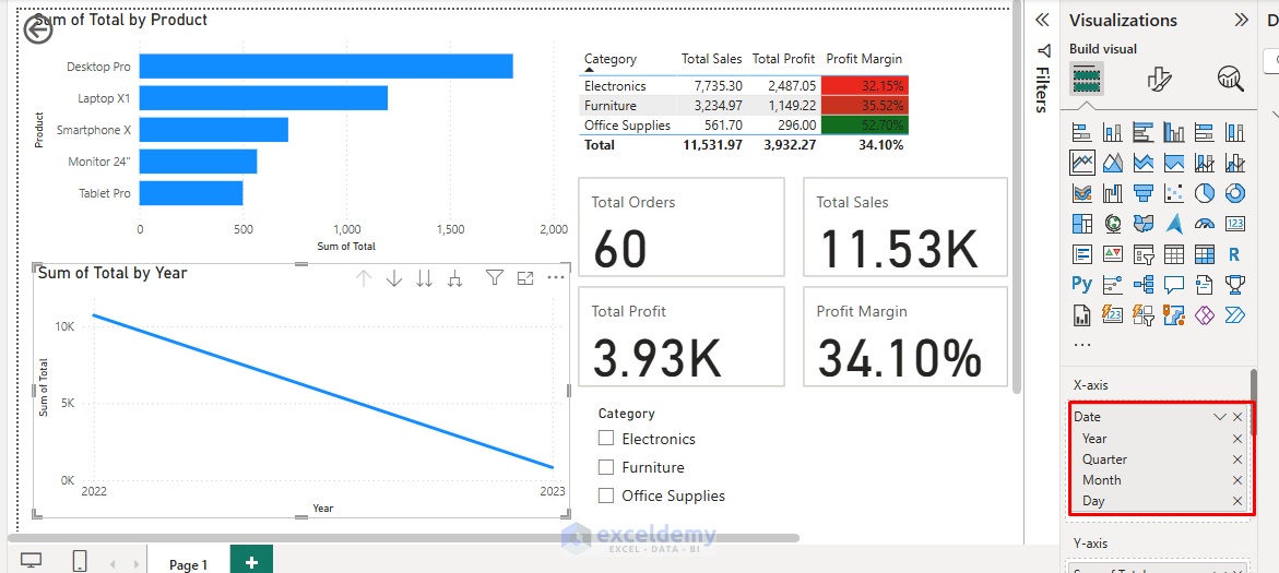
Line Chart for Sales Over Time
- Select Line Chart from the Visualizations pane.
- Drag SaleDate from Sales to the Y-axis section.
- Drag Total from Sales to the X-axis section.
- This will show sales trends over time.
Insert Table to Show Sales by Category
- Select Table from the Visualizations pane.
- Columns: Category.
- Values: Total Sales, Total Profit, Profit Margin.
- Apply conditional formatting to highlight high and low performers.
- Right-click Profit Margin >> select Conditional formatting >> select Background color.

- Either choose Minimum and Maximum, or you can set rules based on values, like:
- Green for profit margins > 30%
- Yellow for profit margins between 15-30%
- Red for profit margins < 15%
- Select Formatting and click OK.

Insert KPI Cards for Key Metrics
- Select Cards from the Visualizations pane.
- Drag key metrics into the Data field.
- Total Orders
- Total Sales
- Total Profit
- Profit Margin
- Avg Order Value

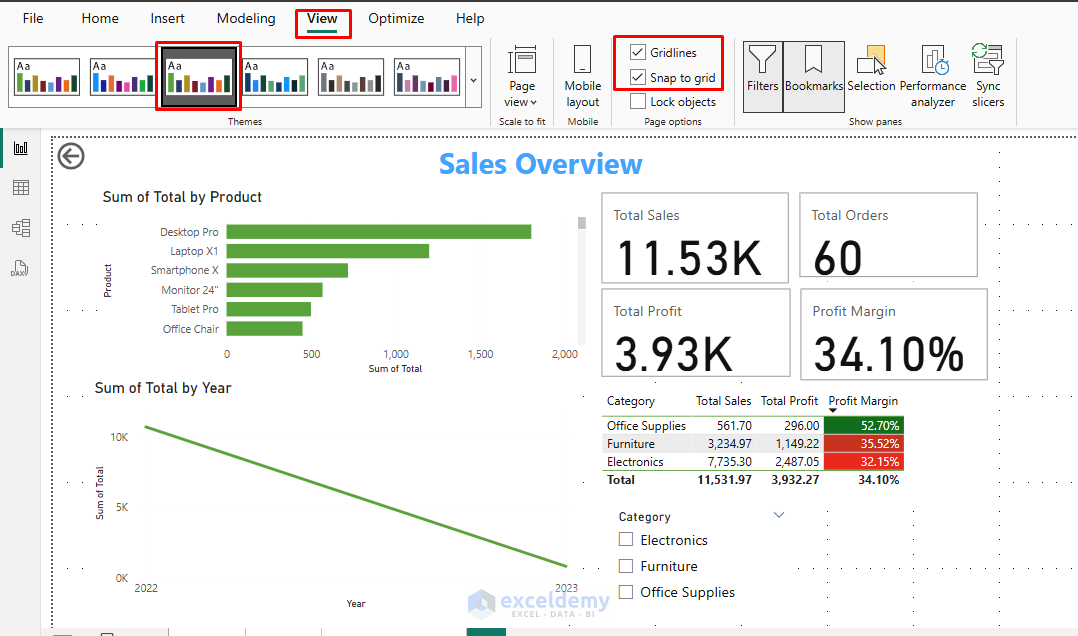
Customize Visualizations
Use the Format pane to customize your visualizations. You can adjust:
- Colors (e.g., change the color of bars in the bar chart).
- Labels (e.g., show data labels on the chart).
- Titles and legends (e.g., add a title to your chart or show a legend).

Step 6: Add Interactivity
Interactive features help users explore and filter data dynamically. Let’s add interactivity to our report using slicers, filters, and drill-through.
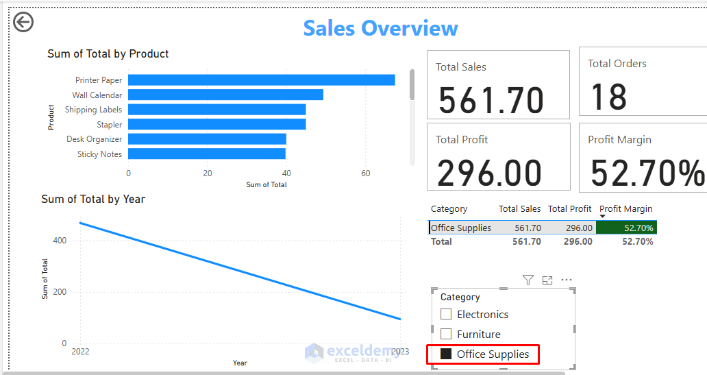
Insert Slicers
A Slicer allows users to filter data by selecting values.
- Select Slicer from the Visualizations pane.
- Drag Category from Products to the Field section of the slicer.
- This allows users to filter visualizations by product category (Electronics or Accessories).

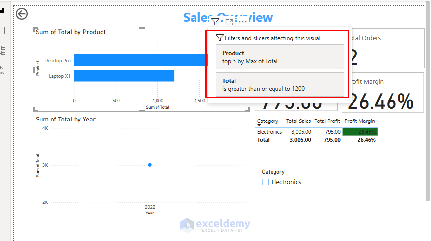
Apply Filters
Filters can be applied at the visualization level, page level, or report level.

- Filter on this visual: Apply filters to individual visualizations.
- Add a filter to show the top 5 products in the Bar chart.

- Filter on this page: Apply filters that affect all visuals on a page.
- Add a filter to show the products where the total is greater than or equal to 1200.

- Filter on all pages: Create filters that work across all pages.
Cross-Filtering and Highlighting
By default, when you select a product in the Bar Chart, it will filter the data in other visualizations such as the Line Chart and Slicer. This allows for cross-filtering between the visuals.
Customize this behavior:
- Select any visual on your dashboard.
- Go to Format tab >> select Edit interactions.
- For each related visual, choose:
- Filter: The visual will show only data related to the selection.
- Highlight: The visual will highlight related data while showing all data.
- None: The visual won’t respond to selections.

Drill Through and Drill-Down
Enable users to navigate from summary to detail views:
Create hierarchies for drill-down:
- Create a Date hierarchy:
- Year
- Quarter
- Month
- Day
- Create a Product hierarchy:
- Category
- Product
Enable drill-down on visuals:
- Add a Date hierarchy to your trend line chart.
- Enable the drill-down button in the visual’s header.
Create drill-through pages:
- Let’s see the detailed sales data for each Product.
- Create a new page and drag ProductID to the Drillthrough field well.
- Now, users can right-click on any data in the main report and drill through to view detailed sales data specific to that product.
- Select All.

- Select any particular product.

Interactivity is one of the key features of Power BI dashboards. This allows users to filter, drill down, and explore the data dynamically.
Step 7: Add Advanced Features
Bookmarks and Navigation
Create predefined views and navigation:
- Create different views for your dashboard (e.g., Sales Overview, Product Performance).
- Go to the View tab and click on Bookmarks.
- Click Add to save different views of the report.
- Name your bookmark (e.g., “Top Products View”).

- Add buttons or images and link them to the corresponding bookmark for easy navigation.
- Go to the Insert tab >> from Buttons >> select Choose button type.
- Format button appearance.
- Set Action to bookmark and select your saved bookmark.

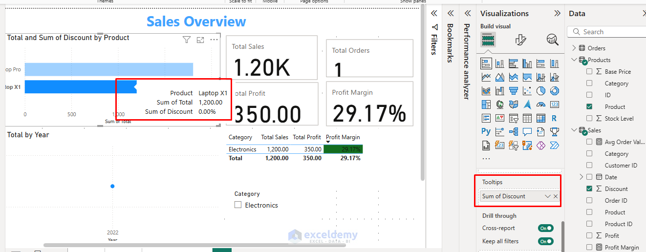
Tooltips
Apply the Tooltip to a Visual:
- Select the Bar chart.
- In Tooltips >> drag the Discount column.
- Hover the mouse over the bar to display the data points.
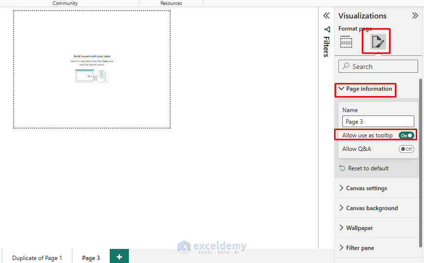
Create a Tooltip Page:
- Create a tooltip page by adding another report page.
- Set the page size to Tooltip under the Page Information pane.
- Add detailed visuals on the tooltip page to display additional information when hovering over data points.
Step 8: Design the Dashboard
- Arrange the visualizations on the canvas.
- Resize and align the visualizations to fit neatly on the screen.
- Add a Title and some Text Boxes for context (e.g., “Sales Overview” ).

Test Interactivity
Once your dashboard is complete, you can test the interactive behavior of all visualizations and calculations.
- Filter Top Product whose sales amount is greater than or equal to 1200.
- Select Category from Slicers.
Best Practices
Layout and Organization:
- Grid Layout: Align visuals in a grid pattern for cleaner organization.
- Z-Pattern: Arrange content following the natural eye movement pattern (top-left to bottom-right).
- Group Related Visuals: Use similar colors or borders to indicate related information.
Color and Typography:
- Consistent Color Scheme: Use your brand colors or a cohesive palette.
- Color Purpose: Use color to highlight important information, not just for decoration.
- Readable Fonts: Choose clean, simple fonts at appropriate sizes.
Dashboard:

Step 9: Publish and Share
- Once your dashboard is ready, save your Power BI Desktop file (.pbix)
- Go to the Home tab >> click Publish.
- Choose the workspace where you want to publish the report.
- Share the dashboard with others by providing a link or embedding it in a website.
Conclusion
Designing effective interactive visualizations and dashboards in Power BI requires a blend of technical skill, design sensibility, and business understanding. By following the principles and techniques outlined in this article, you can transform raw data into interactive, insightful dashboards that drive better decision-making across your organization. The most effective dashboards balance comprehensive information with clarity and ease of use, allowing users at all levels to derive valuable insights from your data.
Get FREE Advanced Excel Exercises with Solutions!
