
Image by Editor
Power BI’s visuals and layout matter just as much as your data. A clean, attractive design improves readability, user engagement, and overall professionalism. Power BI offers extensive customization options to create professional, branded reports that effectively communicate your data insights.
In this tutorial, we’ll show how to customize the look and feel of reports in Power BI, covering key techniques like themes, formatting, layout tips, and more.
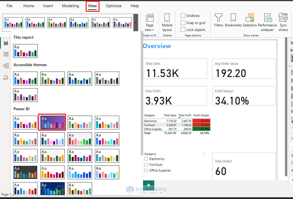
1. Apply a Theme
A theme is a quick way to set colors, fonts, and backgrounds consistently across the entire report.
Apply a Theme:
- Go to the Home tab.
- Click on Themes.
- Choose a built-in theme like “Default”, “Bloom”, “Classic”, etc.
- Or click Browse for themes to upload a custom JSON theme file.
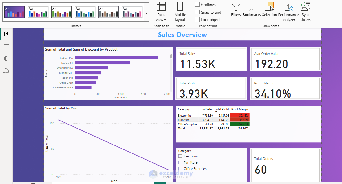
Output:
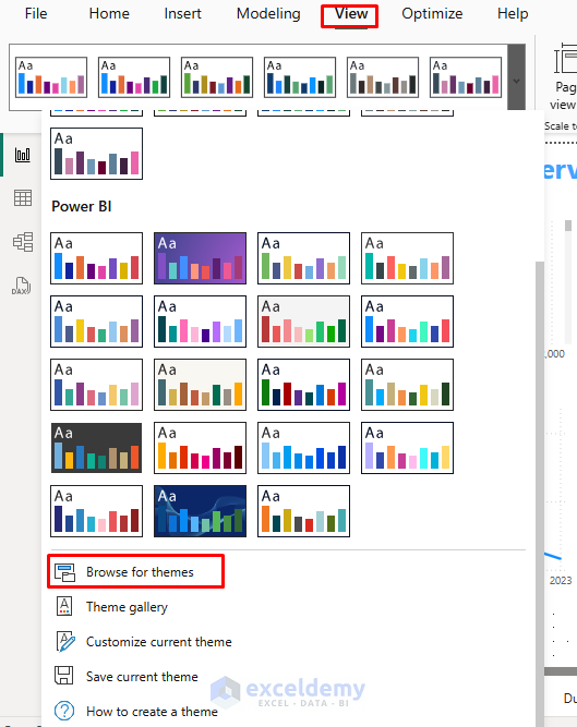
Creating Custom Themes:
- Go to the View tab >> select Themes >> select Customize current theme.
- Adjust colors, fonts, and visual styles.
- Save your theme for future use.
- Go to the View tab >> select Themes >> select Save theme.
You can also create a JSON theme file for more advanced customization:
- Go to the View tab >> click on Themes dropdown.
- Select Browse for themes
- Locate and select your saved .json file.
{
  "name": "MyCompanyTheme",
  "dataColors": ["#118DFF", "#12239E", "#E66C37", "#6B007B", "#E044A7"],
  "background": "#FFFFFF",
  "foreground": "#252423",
  "tableAccent": "#118DFF"
}
- Click Open.
Power BI will apply your custom theme to the report. If there are any errors in your JSON file, Power BI will display an error message.
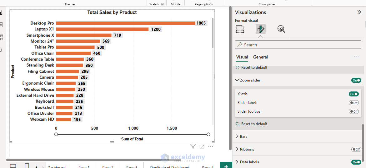
2. Format Visuals
Each visual (chart, table, map, etc.) in Power BI can be deeply customized.
Common Visual Formatting Options:
- Title: Turn it on/off, set text, font, background color, and alignment.
- Legend: Customize position, font size, color, and title.
- Data colors: Set specific colors for categories.
- Background and Borders: Add visual background colors, transparency, and borders.
- Data labels: Choose font, size, position, and color for labels inside visuals.
- Cards/KPIs: Change indicator settings, font sizes.
- Maps: Modify map styles, bubble sizes, and color saturation.
- Tables/Matrices: Customize gridlines, column widths, and conditional formatting.
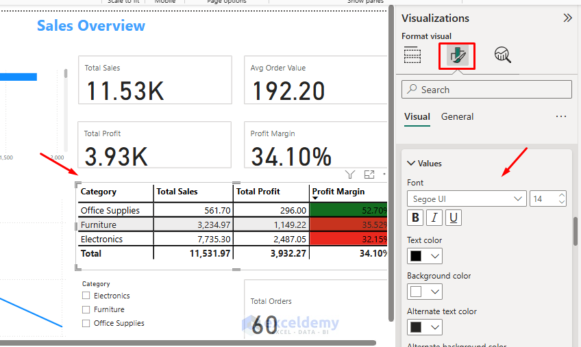
- Charts: Adjust data colors, axis properties, and data labels. Add Zoom slider to view the chart data.
3. Set Backgrounds and Wallpapers
Adding a background image or color gives your report a polished look.
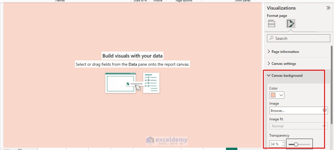
Page Background:
- Open your report in Power BI Desktop.
- Click on an empty area on the report page (not on a visual/chart — click on blank white space).
- On the right-side pane, under Visualization>> click the Format icon.
- Set a background color.
- Add an image (e.g., a light pattern or subtle texture).
- Control transparency.
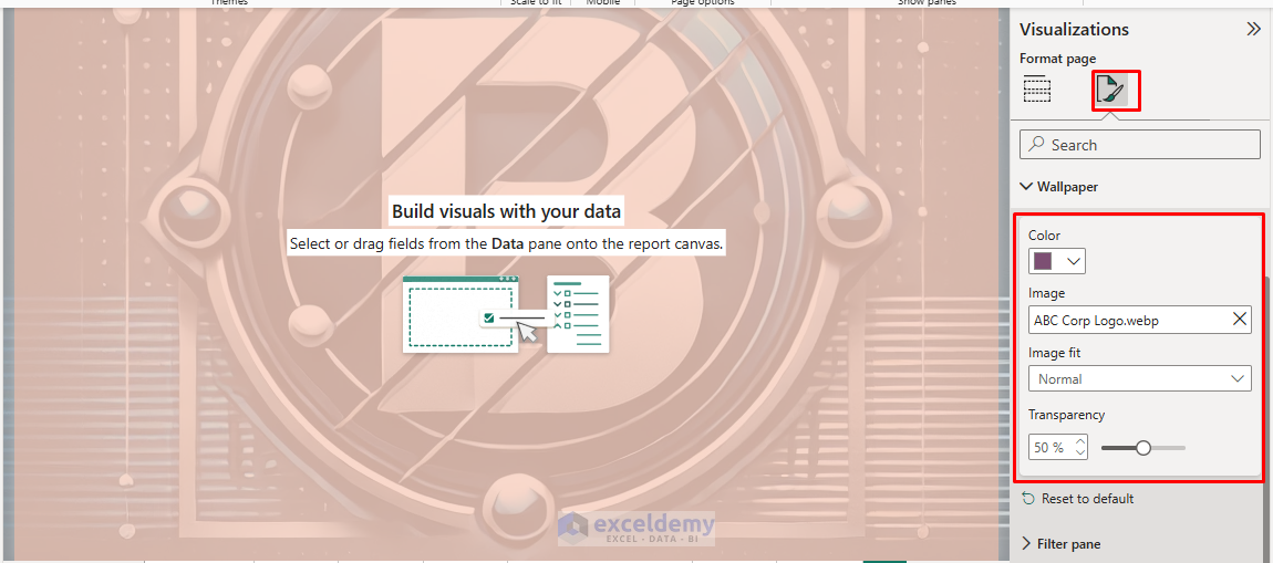
Wallpaper:
- Click the Format icon >> select Wallpaper.
- Add brand Image as wallpaper.
- This covers the entire canvas beyond the actual report page.
- You can create a branded frame for your visuals.
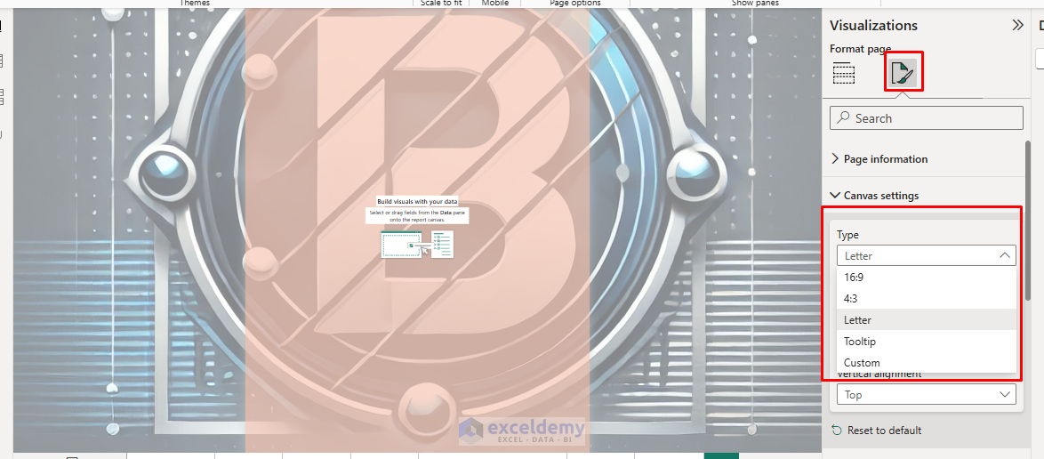
Set Up the Canvas:
- Click the Format icon >> select Canvas settings.
- Adjust page size and view settings.
- Choose from presets like “Letter,” “16:9,” or create custom dimensions.
Pro Tip: Use subtle backgrounds to avoid distracting from the visuals.
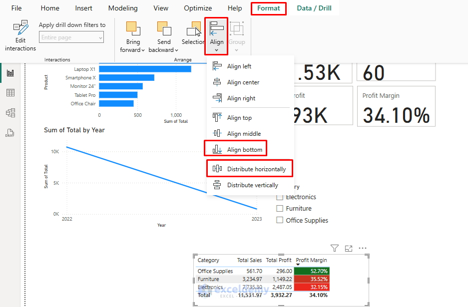
4. Page Layout and Alignment
Good alignment creates a clean and professional layout.
Align Objects:
- Select multiple visuals by holding Ctrl and clicking.
- Go to the Format tab >> select Align:
- Align Left, Center, Right, Top, Middle, Bottom.
- Distribute Horizontally or Vertically.
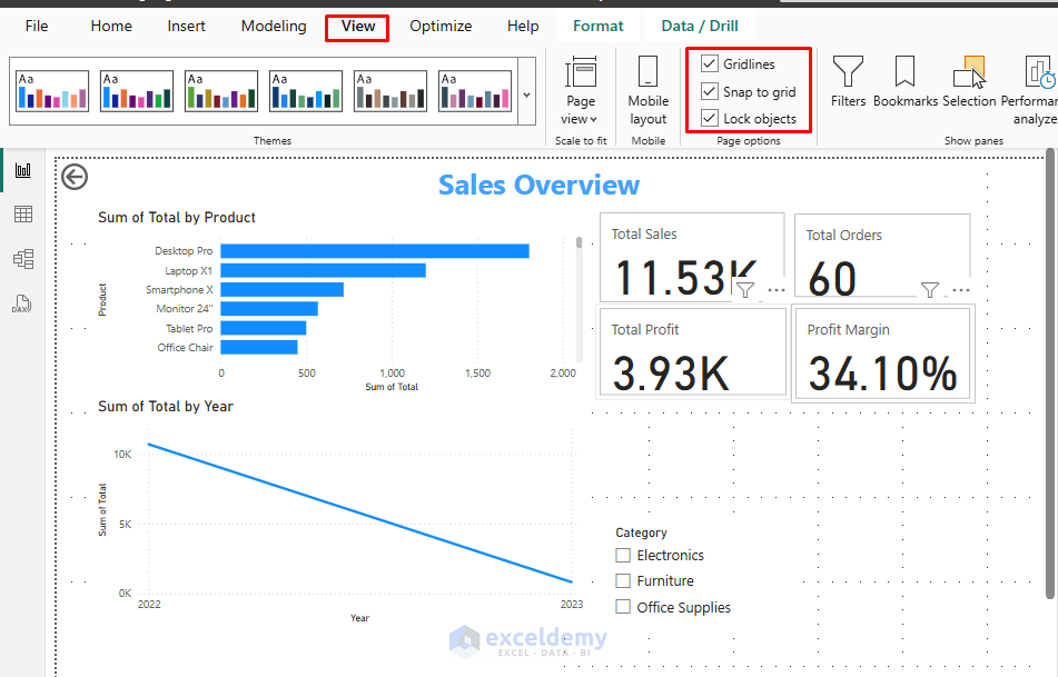
Use the Grid and Snap-to-Grid
To enable Gridlines;
- Go to the View tab >> select Gridlines.
Turn on Snap-to-grid;
- Go to the View tab >> select Snap to grid.
To Lock objects;
- Go to the View tab >> select Lock objects.
5. Use Consistent Fonts and Text Styles
Consistency in fonts improves readability.
Adjust Fonts:
- Go into each visual’s Format >> select Title / Data labels / Legend.
- Set a common font type (e.g., Segoe UI, Arial).
- Standardize font size across visuals (e.g., Titles at 14 pt, Data labels at 10 pt).
Note: Power BI themes can define default fonts across the report if you prefer automatic consistency.
6. Add Buttons and Navigation
Interactive buttons make reports feel more like apps.
Add Button:
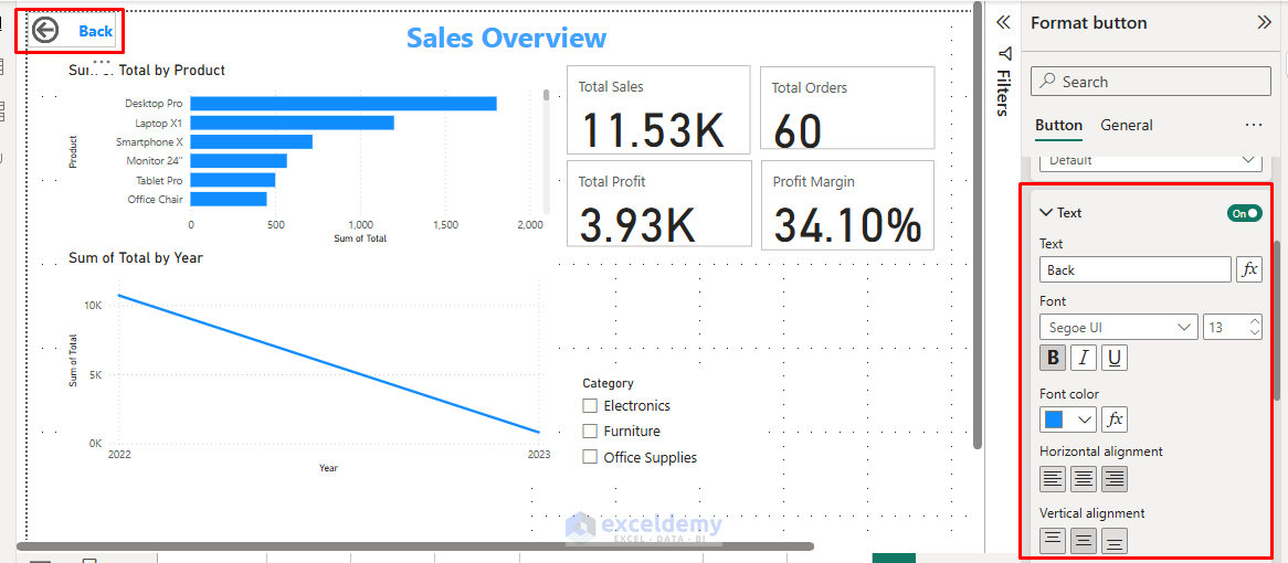
- Go to the Insert tab >> select Buttons >> choose button type.
- Customize:
- Icon (Home, Back, Next, etc.).
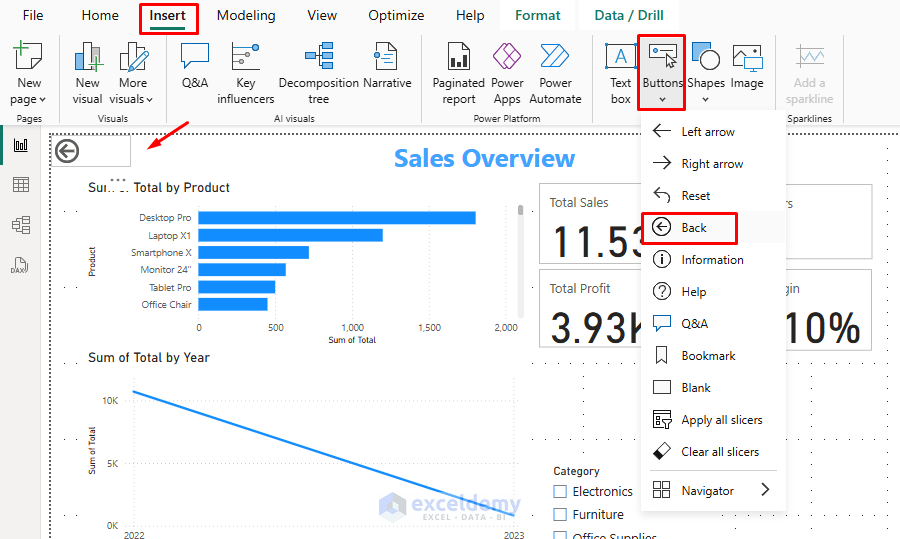
-
- Fill color, Outline, Shadow.
- Hover effect: Color change or border glow.
- Assign an Action (e.g., Navigate to a different page).
Idea: Create a navigation panel using “Back”, “Next”, and “Home” buttons for a better user experience.
7. Use Bookmarks and Selections
Bookmarks allow you to create custom views or states of your report page.
- Arrange visuals as you want them to appear.
- Go to the View tab >> select the Bookmarks pane.
- Click Add to save the view.
- Combine bookmarks with buttons for interactive storytelling.
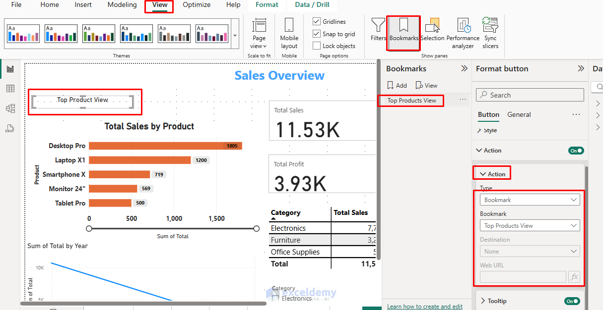
Example: You can create a “View Sales by Region” bookmark and a “View Sales by Product” bookmark, toggled via buttons.
Best Practices for Report Aesthetics
- White Space: Don’t clutter the page; leave space around visuals.
- Color Palette: Use a limited, cohesive color scheme (3–5 main colors).
- Clear Labels: Always label axes, legends, and titles.
- Accessibility: Use high-contrast colors for text and important elements.
- Visual Hierarchy: Make key insights larger or more prominently placed.
- Consistency: Use the same formatting across similar visuals.
- Accessibility: Ensure sufficient contrast and readable font sizes.
- Purpose-driven Design: Let your data story guide your design choices.
Conclusion
By using these customization techniques, you can transform standard Power BI reports into professionally designed dashboards that effectively communicate your data insights. It will improve usability, accessibility, and user engagement. Thoughtful design directs the viewer’s attention to key insights and creates a better overall user experience. Next time you build a report, take the time to customize its theme, fonts, colors, and layout. A few small design improvements can greatly affect how your data story is received.
Get FREE Advanced Excel Exercises with Solutions!
