
Image by Editor
Excel is more than just rows and columns. It’s a powerful platform for interactive dashboards, reports, and data analysis. If you’re stuck with static tables or lifeless charts, it’s time to elevate your spreadsheet game. If you’re sharing monthly sales data or preparing reports, interactive Excel files can help your audience engage, explore, and understand insights faster.
In this tutorial, we’ll show 5 ways to make your boring data interactive in Excel.
1. Use Drop-Down Lists for Dynamic Selection (Data Validation)
Drop-down lists are one of the easiest ways to make a spreadsheet interactive. They allow users to select a value from a predefined list, which can then drive formulas, charts, or data filtering in your report.
Steps:
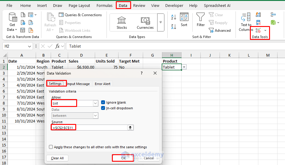
- Select the cell where you want the drop-down list (e.g., H2).
- Go to the Data tab >> from Data Tools >> select Data Validation.
- In the dialog box:
- Set Allow to List.
- In the Source field, input a list of values or type them manually.
=C2:C11
- Click OK.
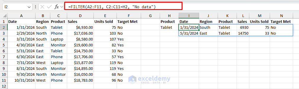
Allow users to pick a Product (e.g., Phone, Laptop) and use XLOOKUP or FILTER functions to pull and display matching Sales or Units Sold data dynamically.
Use the FILTER Function:
- In cell I2 (or any output cell), enter the following formula:
=FILTER(A2:F11, C2:C11=H2, "No data")
This formula filters the sales data based on the drop-down selection.
Example Use:
You can use this drop-down list as input to control which data appears in summary tables, charts, or KPI indicators. You can create a drop-down to select a specific region. Based on the selection, your sales dashboard updates the numbers and charts accordingly.
Pro tip:
Create cascading dropdowns by combining data validation with the INDIRECT function to make dependent selections (e.g., select Country, then see only cities from that country).
2. Add Slicers to Pivot Tables for Clickable Filtering
Slicers are visual buttons that make filtering Pivot Tables easy and intuitive. They’re especially useful when building dashboards that need to update multiple views at once. Slicers provide intuitive filtering controls that let users explore data without understanding Excel’s filter functions.
Steps:
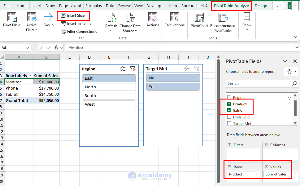
- Create a Pivot Table from your dataset.
- Click on any cell in the Pivot Table.
- Create your PivotTable summary.
- Drag fields like Product or Target Met to the rows and Sales to the values.
- Go to the PivotTable Analyze tab >> select Insert Slicer.
- Choose one or more fields to filter by (e.g., Category, Region, Date).
- Click OK.
- The slicers will appear as floating windows on your sheet.
Example:
Click on “East” in the Region slicer to filter the sales numbers by that region. Everything connected to that Pivot Table will update instantly, like your entire dashboard, including sales numbers, charts, and KPIs.
Pro tip:
Connect the same slicer to multiple PivotTables to create a cohesive dashboard where all visualizations filter simultaneously.
3. Insert Interactive Charts with Dynamic Named Ranges
Interactive charts allow your users to change the data being visualized through controls like scroll bars, drop-downs, or formulas. Dynamic named ranges allow charts to update automatically based on a changing input (like from a drop-down list or formula). This makes your charts flexible and user-driven.
Steps:
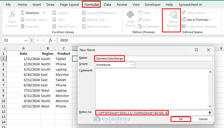
Name your data ranges using the OFFSET function:
- Go to the Formulas tab >> select Name Manager >> select New.
- Give it a name like DynamicSalesRange.
- Enter a formula like:
=OFFSET(Sheet1!$D$2,0,0,COUNTA(Sheet1!$D:$D)-1)
- This dynamically defines the Sales column (starting from D2).
- Click OK.
- Create a chart (e.g., Column Chart).
- Right-click on the chart >> choose Select Data >> select Edit Series.
- In the Series values, enter the named range:
=Sheet1!DynamicSalesRange
- Now link the data series to a formula or drop-down to allow selection of the Product.
Example:
Create a drop-down to select “Monitor”, “Tablet”, etc., and use FILTER() to generate a new column of sales for that product. Link that column to the chart so it updates when the selection changes.
Create Named Ranges from Filtered Data:
- Go to the Formulas tab >> select Name Manager >> select New.
- Name it SelectedDates.
=Sheet1!$L$2:INDEX(Sheet1!$L$2:$L$11, COUNTA(Sheet1!$L$2:$L$11))
- Name it SelectedSales.
=Sheet1!$L$2:INDEX(Sheet1!$L$2:$L$11, COUNTA(Sheet1!$L$2:$L$11))

These ranges expand or shrink based on the product selected from the drop-down.
Create the Dynamic Chart:
- Go to the Insert tab >> select Chart >> select Column chart.
- Right-click on the chart > Select Data.

- Add a new series:
- Name: “Sales”
- Values:
=Sheet1!SelectedSales
- Edit horizontal axis labels:
- Labels:
=Sheet1!SelectedDates
- Labels:
- Click OK.

Check Interactivity:
- Select Tablet from the Drop-down list.

- Select Monitor from the Drop-down list.

4. Use Conditional Formatting with Logical Formulas
Conditional formatting is not just for coloring cells, it’s a dynamic way to highlight data patterns or call attention to key values, depending on user interaction or formula logic. It can visually highlight trends, thresholds, and exceptions. It can be tied to user inputs like drop-downs or numeric thresholds.
Steps:
-
- Select your data (e.g., Sales column).
- Go to the Home tab >> from Conditional Formatting >> select New Rule.
- Choose Use a formula to determine which cells to format.
- Enter a formula to highlight high sales.
=D2>15000
- Choose a format (e.g., green fill or bold text) and apply.

Conditional formatting updates automatically whenever the underlying values change.
Example:
Highlight all departments where the average sales exceed the selected threshold. You can tie the threshold to a drop-down or input cell for added flexibility.
Pro tip:
Link your conditional formatting formulas to cells that users can change. For example, create input cells for “minimum” and “maximum” thresholds, then reference these cells in your conditional formatting formula. As users adjust these thresholds, the highlighting automatically updates, creating an interactive exploration tool.
5. Create a Dashboard Using Linked Controls
A dashboard is the ultimate interactive layout. It combines drop-downs, charts, formulas, and formatting into one view. A well-designed Excel dashboard gives users control over what they want to see without touching raw data.
Steps:
- Use Drop-Down lists to allow filtering by region, department, or time.
- Set up formulas (like IF, XLOOKUP, or FILTER) that update values and text based on the selected input.
- Add Pivot Tables and Insert Slicers for multi-dimensional filtering.
- Create Charts linked to your dynamic ranges or Pivot Tables.
- Format the layout using shapes, buttons, or grouped elements for clean navigation.

Example:
Build a company performance dashboard where selecting a department updates charts, KPIs, and even comments. Everything refreshes automatically without writing a single macro.
Pro tip:
Create a uniform color scheme based on your company colors and use consistent formatting for all interactive elements. This makes the dashboard both attractive and intuitive to use.
Bonus Tip: Enable Interactivity Across Workbooks with Power Query
For advanced users, Power Query can create connections between multiple data sources:
- Go to the Data tab >> select Get Data or From Other Sources.
- Import and transform your data.
- Create relationships between tables.
- Build interactive elements using connected data.
This approach lets you create dashboards that pull from multiple sources while keeping the original data separate and updatable.
Conclusion
Implementing these interactive techniques can make your boring data interactive. Excel offers various interactivity features that don’t require programming knowledge. By integrating drop-downs, slicers, conditional formatting, and dynamic charts, you can create engaging, user-friendly reports that allow your audience to explore the data themselves.
Get FREE Advanced Excel Exercises with Solutions!
