
If you’re an Excel power user who regularly uses pivot tables, VLOOKUP formulas, and complex calculations, you probably know how powerful it is for organizing, analyzing, and visualizing data. But as your datasets grow larger and your reporting needs become more complex, Excel can start to feel limited. This is where Power BI comes in. It’s not here to replace Excel; it’s here to supercharge it.
In this tutorial, we will explore 5 reasons why Power BI is the best thing that ever happened to Excel users.
1. Handle Massive Datasets with Ease
Excel has row limits and can become slow when working with large files. Formulas recalculate slowly, and sharing becomes a nightmare when your workbook is 50MB or larger.
Power BI, on the other hand, is built to handle millions of rows of data efficiently. Where Excel might crash or freeze, Power BI processes data lightning-fast using compression and optimized storage.
Real-World Example: Imagine you are working with 5 years of sales transactions containing 10 million rows. In Excel, this would be impossible or require splitting across multiple files. In Power BI, you can:
- Import all 10 million rows in minutes.
- Create interactive dashboards that respond instantly.
- Perform complex calculations across the entire dataset without lag.
- Share insights through the cloud without sending massive files.
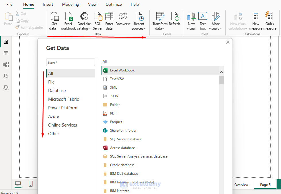
Connecting Data Sources: This is one of the reasons Power BI is considered a game-changer for Excel users; it can bring data together from nearly any source.
- Excel supports around 60–70 data connectors, depending on your Microsoft 365 or Office version.
- Power BI supports over 160 data connectors (and Microsoft keeps adding more).
2. DAX Gives Reusable Metrics (Avoid Cell-by-Cell Formulas)
Instead of writing a SUMIFS in 10 places, you can define a DAX measure once and use it everywhere, like cards, tables, and charts. Change it in one place; it updates across the report.
Steps:
- Go to the Table view >> select Table Tools >> select New measure.
Commonly Used Measures:
Total Sales = SUM(Orders[Revenue])

Total Cost = SUM(Orders[Cost])

Profit = [Total Sales] - [Total Cost]

Margin % = DIVIDE([Profit], [Total Sales])

Orders Count = DISTINCTCOUNT(Orders[OrderID])

Sales LY = CALCULATE([Total Sales], DATEADD('Date'[Date], -1, YEAR))

YOY % = DIVIDE([Total Sales] - [Sales LY], [Sales LY])

AOV = DIVIDE([Total Sales], [Orders Count])

Build a KPI Tile & Trend:
- Place Cards in the Report page.
- Total Sales, Profit, Margin %.
- Add a Line chart to show sales trends.
- Place ‘Date'[MonthNum] on the axis.
- Place ‘Total Sales’ and ‘Sales LY’ as values. Sort the axis by ‘MonthNum’ and show the month label using ‘Date'[Month]’.
Excel crossover: DAX is like a supercharged, model-aware SUMIFS that understands filters, time intelligence, and context.
3. Interactive Visualizations That Make Data Come Alive
Excel charts and PivotTables are great. You can create basic interactivity, but building truly dynamic, interconnected visualizations requires complex VBA programming that most users can’t manage.
However, Power BI enables you to create fully interactive dashboards that tell a compelling story. Every chart, graph, and table is interconnected, allowing users to explore data naturally through point-and-click interactions.
Interactive Features That Excel Users Love:
- Cross-filtering: Click on a product in one chart, and all other visuals automatically filter to show data for that product.
- Drill-down capabilities: Start with yearly data, then drill down to quarters, months, and individual days with simple clicks.
- Dynamic tooltips: Hover over data points to see detailed breakdowns without cluttering your main view.
- Slicers and filters: Create sophisticated filtering experiences that work across all visuals simultaneously.

Real-World Example: A dashboard showing sales by region lets you click on a specific region or city and instantly see trends, top products, and customer segments, with no need for multiple sheets.

4. Automated Data Refresh
Manually updating Excel reports every week or month can be time-consuming, involving copy-pasting new data, refreshing pivot tables, updating charts, and sending updated files to stakeholders. This process is time-consuming and error-prone.
On the other hand, Power BI allows you to schedule automatic data refreshes. You can set a schedule, and Power BI will automatically refresh your data, ensuring dashboards stay current without any manual intervention. Stakeholders will always see the latest information.
Schedule Implementation:
- Daily Sales Dashboard: Set up a connection to your sales database that refreshes every morning at 6 AM.
- Monthly Financial Reports: Configure automatic refresh on the first day of each month.
- Real-Time Monitoring: For critical metrics, set up near real-time refresh every 15 minutes.
- Send Notifications: You can send a notification to stakeholders or team members if any changes or updates occur.

Real-World Example: Your monthly sales dashboard can update itself every morning with fresh data from your company database.

Time Savings: What used to take 2-3 hours of manual work every week now happens automatically while you sleep.
5. Seamless Collaboration and Sharing
Sharing Excel files leads to version control nightmares. You end up with “Sales_Report_Final_v2_FINAL_revised.xlsx” scattered across email threads. Multiple people can’t work simultaneously, and consolidating changes becomes a headache.
Power BI doesn’t replace Excel; it complements it, and Microsoft designed them to work together. Power BI treats sharing as a core feature, not an afterthought. Your reports live in the cloud, accessible from anywhere, and always show the most current data.
Collaboration Features:
- Import your Excel reports and PivotTables into Power BI.
- Export Power BI datasets back into Excel for further analysis.
- Use DAX, which has a syntax similar to Excel formulas, to create custom measures.
- Stakeholders can leave feedback directly on visualizations.
- Full functionality on tablets and smartphones.
- Share reports in SharePoint, Teams, or your company intranet.
Real-World Example: You can take an Excel financial model, load the raw data into Power BI for advanced visualization, and then share the interactive results with your team.
Advanced Analytics Made Simple
Excel offers powerful formulas and basic statistical functions, but advanced analytics require complex array formulas, add-ins, or VBA coding. In contrast, Power BI offers modern features and analytics.
- Power BI’s Built-in Intelligence: Power BI includes advanced analytics capabilities that Excel users can leverage without learning new programming languages or statistical concepts.
- Key Influencers Analysis: Discover what factors drive your important metrics. For example, “What influences customer satisfaction scores?” Power BI will automatically identify and rank the most significant factors.
- Anomaly Detection: Set up automatic alerts when data points fall outside normal ranges. Perfect for monitoring sales performance, website traffic, or operational metrics.
- Natural Language Queries: Type questions in plain English like “Show me sales by region last quarter”, and Power BI generates appropriate visualizations automatically.
Conclusion
Using Power BI doesn’t mean forgetting Excel or that Excel is no longer relevant. Power BI and Excel complement each other. For Excel users, Power BI is like moving from a reliable bicycle to a high-speed electric bike. With its ability to handle large datasets, connect to multiple sources, create interactive dashboards, automate updates, and integrate seamlessly with Excel, Power BI truly is the best thing that ever happened to Excel users.
Get FREE Advanced Excel Exercises with Solutions!
