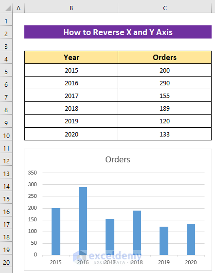
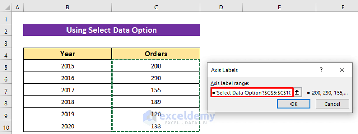
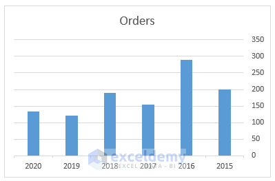
The dataset showcases the yearly orders of an online shop. In the chart, Excel keeps the first column horizontally and the second column vertically by default.
Method 1 – Using the Select Data Option to Reverse the X and the Y Axis in Excel
Steps:
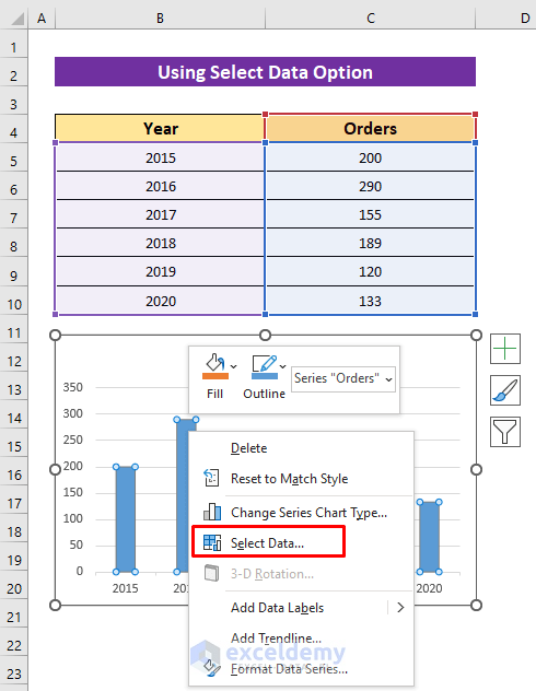
- Right-click the chart.
- Choose Select Data.
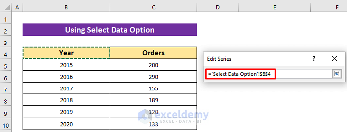
- Click Edit in Legend Entries.
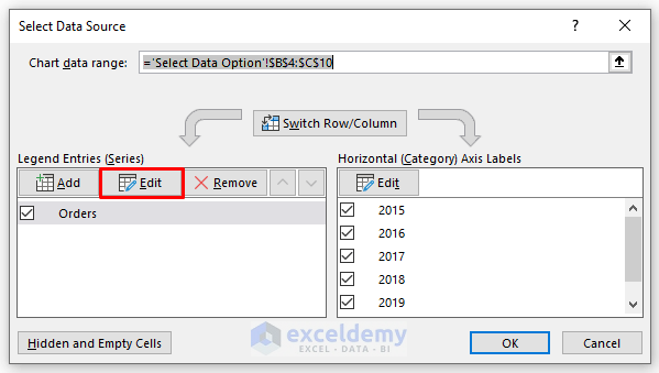
- Click the icon marked in the image.
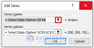
- Select the header of the first column and press ENTER.
- Click the icon marked in the image.
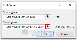
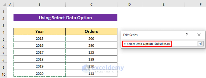
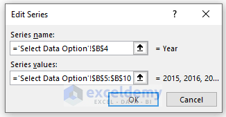
- Select the range of years and press ENTER.
- Click OK.
To change the horizontal axis:
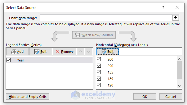
- Click Edit in Horizontal (Category) Axis Labels.
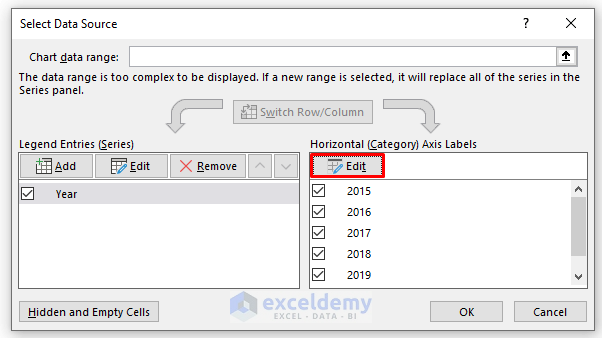
- Select the data range in the second column and press ENTER.
- Click OK.
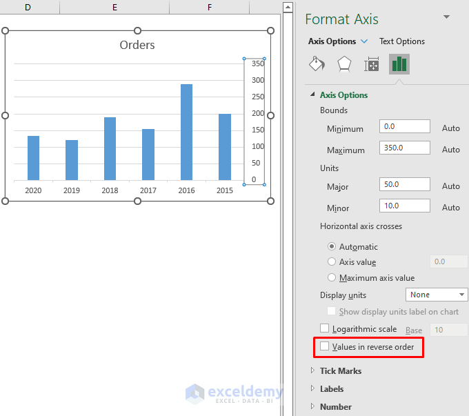
Method 2 – Using the Excel Format Axis Option to Reverse the X and the Y Axis
Steps:
- Double-click the axis you want to reverse.
- In Format Axis, click the X axis.
- Click Axis Options and check Categories in reverse order.
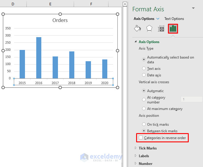
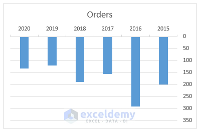
This is the output.
- To reverse the Y axis, double-click it and check Values in reverse order.
This is the output.
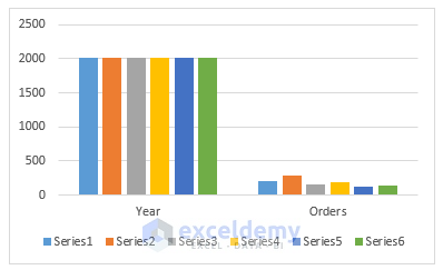
Method 3 – Applying the Switch Row/Column Command to Swap the X and the Y Axis
Steps:
- Select the chart by clicking it.
- Go to: Chart Design > Switch Row/ Column.
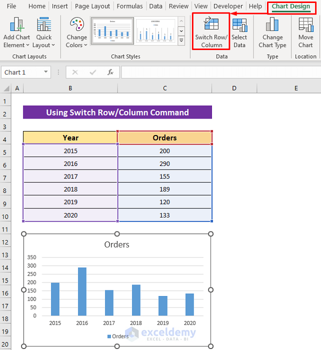
Both columns are displayed on one axis.
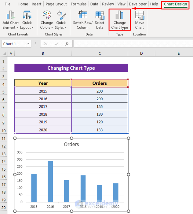
Method 4 – Changing the Chart Type to Reverse the X and the Y Axis
Steps:
- Click the chart.
- Select Change Chart Type in Chart Design.
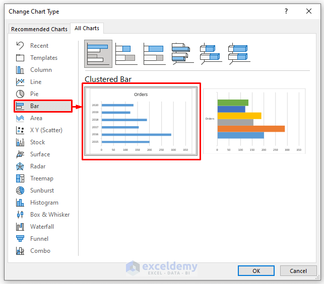
- In All Charts, click Bar.
- Choose a chart option. Here, the first one.
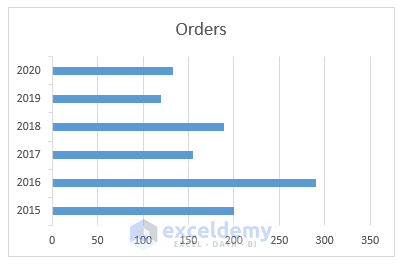
This is the output.
Read More: How to Reverse Axis Order in Excel
Download Practice Workbook
Download the free Excel workbook.
<< Go Back To Format Axis in Excel | Excel Chart Elements | Excel Charts | Learn Excel
Get FREE Advanced Excel Exercises with Solutions!
