Overview of a Logarithmic Scale
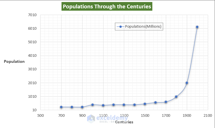
In the figure below, you can see that the population is increasing at a steeper rate from 1900-to 2000 in the world. The graph is more stretched vertically and makes it difficult to get insights.
We created a logarithmic scale version of the above graph below.
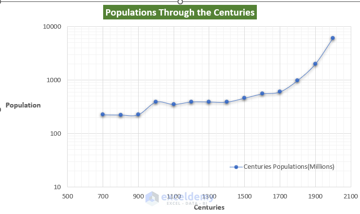
From the logarithmic graph, we can get a better overview of the lower values.
Read More: Excel Logarithmic Scale Start at 0
Fundamentals of a Log-Log Graph
We can plot a log-log graph using Excel quite easily by tweaking some axis format options. In the log-log graph, both of the axes are on a logarithmic scale. This graph demonstrates whether the variables are in a constant power relationship, just like the equation Y = mX^n. Here the X is in the power of n relation with the Y. If we have created a dataset from this equation and plotted the data in logarithmic scale, then the line should be straight.
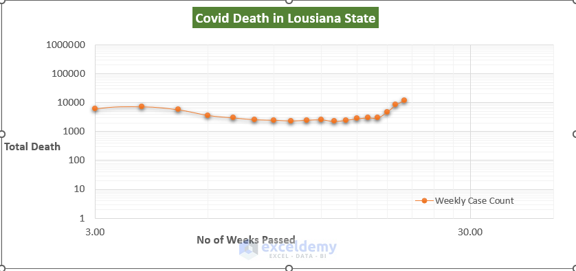
Example 1 – Plotting a Log-Log Graph of Weekly Covid-19 Cases in Louisiana in Excel
Steps
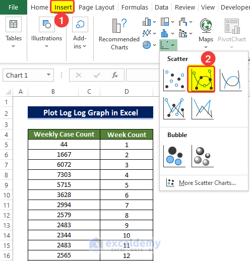
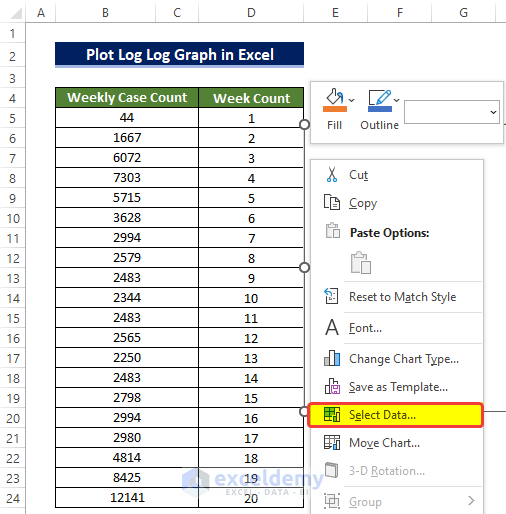
- Prepare the dataset. We collected the covid death data online in Louisiana.
- From the Insert tab, go to the Charts group and click on the Scatter Chart command.
- You’ll get a new empty chart.
- Right-click on the chart and, from the context menu, select the Select data command.
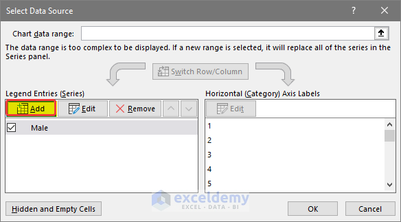
- You’ll get a new window named Select Data Source. Click on the Add command icon.

- Select the range of cells that will be taken as data for the X-axis and the Y-axis.
- To put the title, select the cell address that holds the cell name at this moment.
- In the second range box, select the range of cells D5:D24.
- In the third range box, enter the range of cells B5:B24.
- Click OK.

- After selecting the address, the Scattered chart will form. The chart will be difficult to read and there will be no format on the axis with no axis option title.
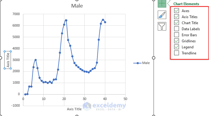
- Click on the Chart Elements icon on the corner of the chart, then tick the necessary boxes like Axis Title, Chart Title, and Legends
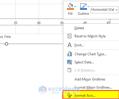
- To create the logarithmic graph, click on the Horizontal Axis labels and then right-click.
- Click on Format Axis.
- From the Format Axis side panel, tick the Logarithmic scale box under the Axis Options.
- Set Vertical Axis crosses to Automatic.

- Repeat the process of turning the logarithmic scale box for the vertical axis.
- This will turn the chart into a logarithmic graph. After some modifications, the log-log graph will look like the one below.
Read More: How to Plot Log Scale in Excel
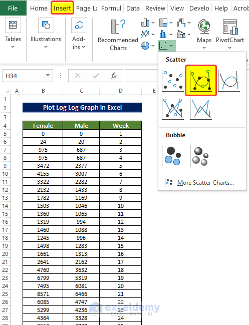
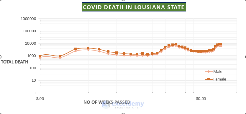
Example 2 – Plotting a Log-Log Graph of Male and Female Casualties from Covid-19
Steps
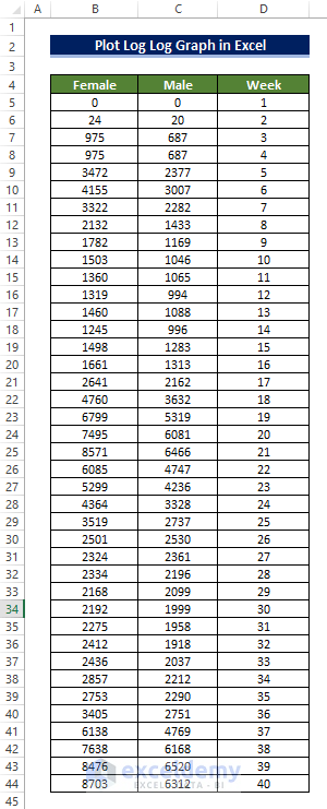
- Prepare the dataset. We collected the Covid death data for both males and females in Louisiana.
- From the Insert tab, go to the Charts group and click on the Scatter Chart command.
- You’ll get a new blank chart.
- Right-click on the chart and select the Select data command.

- You’ll get a window named Select Data Source. Click on the Add command icon.
- Select the range of cells that will be taken as data for the X-axis and the Y-axis.
- Select the cell address that holds the cell name.
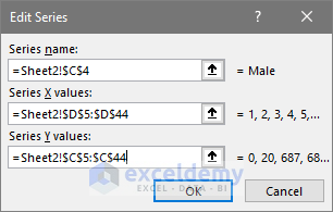
- In the second range box, select the range of cells D5:D44.
- In the third range box, enter the range of cells C5:C44.
- Click OK.
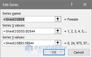
- Similarly, select the female column data into the chart.
- In the second range box, select the range of cells D5:D44.
- In the third range box, enter the range of cells B5:B44 and then click OK.
- The scatter chart will form. The chart will be difficult to read and there will be no format in the axis with no axis title.
- We need to enable the Logarithmic scale in the Format axis option.
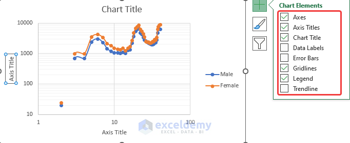
- Click on the Chart Elements icon on the corner of the chart, then tick the necessary boxes like Axis Title, Chart Title, and Legends.
- To create the logarithmic graph, click on the Horizontal Axis labels and then right-click.
- Click on Format Axis.
- A new side panel will open. From the Format Axis side panel, tick the Logarithmic scale box under the Axis Options.
- Set Vertical Axis crosses to Automatic.
- The log-log graph will somewhat look like this with a few modifications.
Read More: How to Log Transform Data in Excel
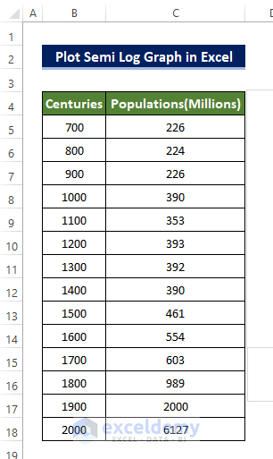
How to Plot a Semi-Log Graph in Excel
A semi logarithmic graph has only one logarithmic scale applied on one axis, usually applied to the vertical axis.
Steps
- Prepare the dataset. We collected the Population of the Earth between 700 AD to 2000 AD. We can also see that the population increases at almost an exponential rate.
- From the Insert tab, go to the Charts group and then click on the Scatter Chart command.

- You’ll get a new empty chart.
- Right-click on the chart and select the Select data command.

- You’ll get a new window named Select Data Source. Click on the Add command icon.
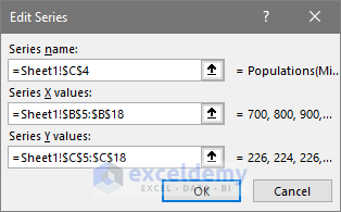
- Select the range of cells that will be taken as data for the X-axis and the Y-axis.
- To put the title, select the cell address that holds the cell name at this moment.
- In the second range box, select the range of cells D5:D44.
- In the third range box, enter the range of cells C5:C44, then click OK.
- After selecting the address, the Scatter chart will form. The chart will be difficult to read and there will be no format on the axis.
- Click on the Chart Elements icon on the corner of the chart, then tick the necessary boxes like Axis Title, Chart Title, and Legends.
- Click on the Vertical Axis labels and right-click.
- Click on Format Axis.
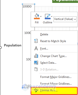
- From the Format Axis side panel, tick the Logarithmic scale box under the Axis Options.
- Set Vertical Axis crosses to Automatic.
- The semi-logarithmic graph will look like the one below after minor formatting changes.
Read More: How to Do Inverse Log in Excel
Download the Practice Workbook
Related Articles
- How to Calculate Log in Excel
- How to Calculate Log Base 2 in Excel
- How to Calculate Natural Logarithm in Excel
- How to Take Log of Negative Numbers in Excel
- How to Calculate Antilog in Excel
- How to Calculate Logarithmic Growth in Excel
<< Go Back to Excel LOG Function | Excel Functions | Learn Excel
Get FREE Advanced Excel Exercises with Solutions!
