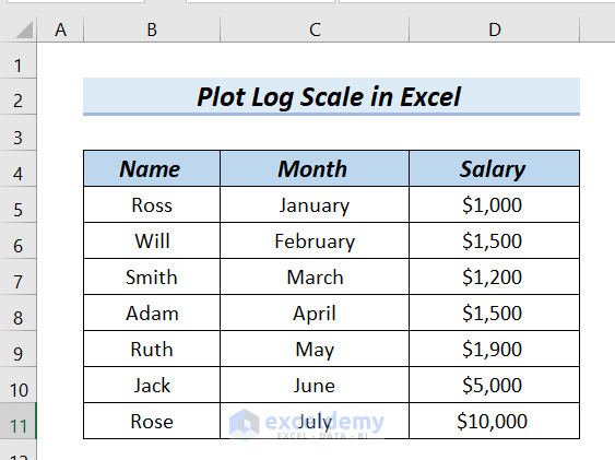
The following table contains the Name, Month, and Salary columns. We want to plot a log scale in Excel for this table.
Method 1 – Using the Format Axis Option to Plot Semi-Log Graph in Excel
Steps:
- Select the entire Month and Salary columns.
- Go to the Insert tab >> select Recommended Chart.
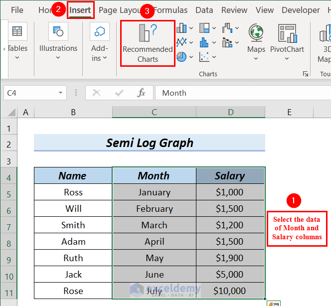
An Insert Chart dialog box will appear.
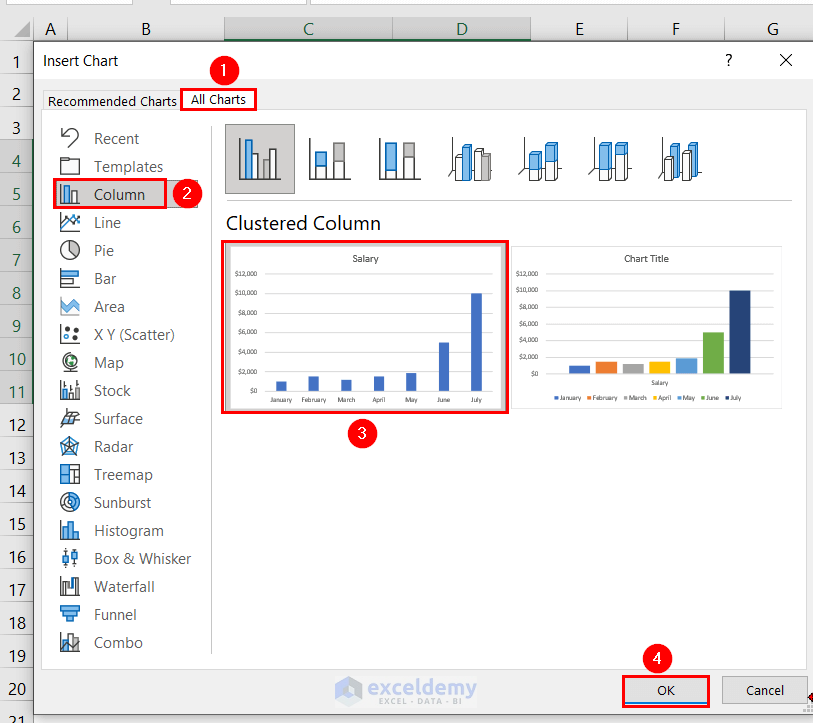
- Select All Chart >> Select Column.
- Select the chart according to your choices; here, we selected the red color marked box chart.
- Click OK.
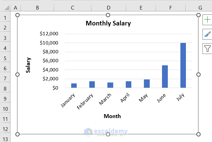
We can see our inserted chart in the following picture. Later, we changed the Chart Title and Axis Title.
Wwe will plot the log scale in this chart.
- Select the data from the Salary axis >> we will right-click.
- Select Format Axis from the Context Menu.
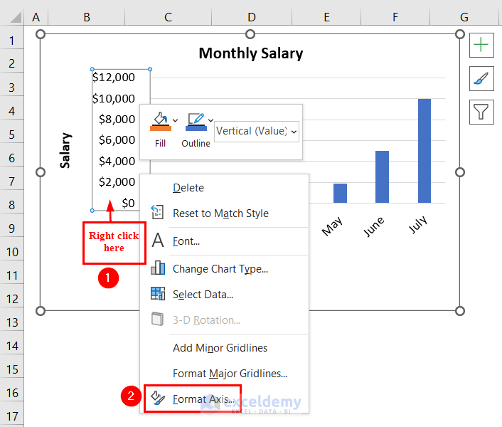
A Format Axis dialog box appears at the right end of the Excel sheet.
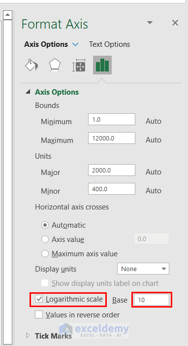
- Mark the Logarithmic scale.
Here, we keep the Base as 10. You can change the Base according to your needs.
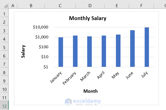
We can see the semi-log graph in Excel.
Read More: How to Plot Log Log Graph in Excel
Similar Readings
Method 2 – Plotting a Log Scale on Both Axis in Excel
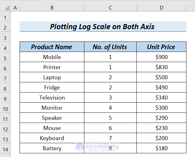
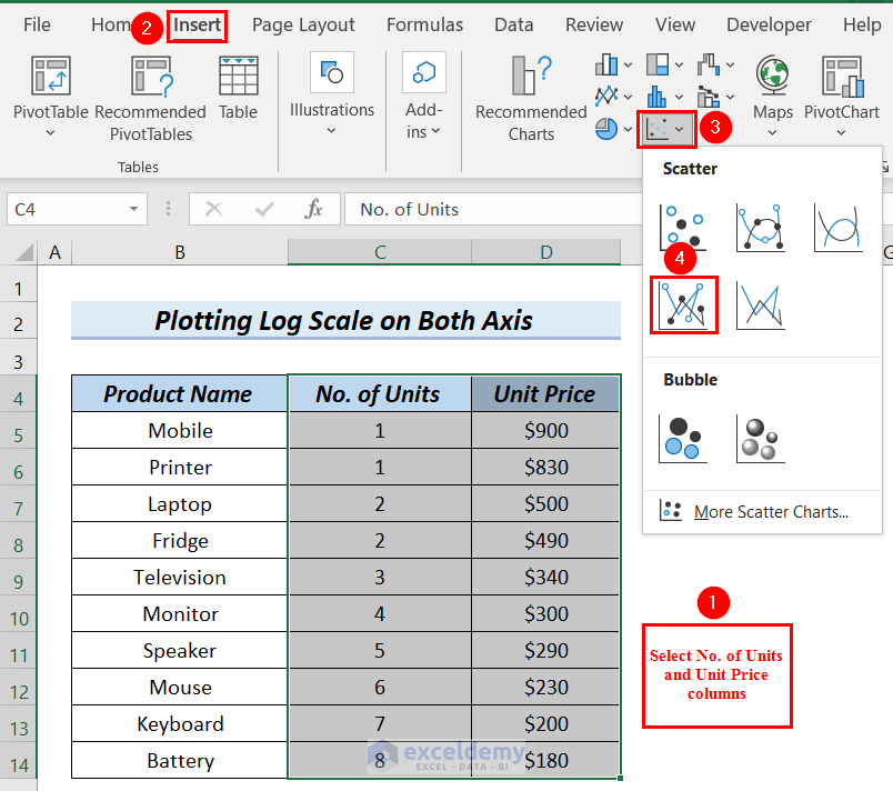
In the following table, we will use the data from No. of Units and Unit Price columns to insert a Scatter with Straight Lines and Markers graph. After that, we will plot the log scale on both axes using the Format Axis option.
 Steps:
- Select the entire No. of Units and Unit Price columns.
- Go to the Insert tab >> select Insert Scatter (X, Y) or Bubble Chart.
- Select Scatter with Straight Lines and Markers graph.
We will see the Scatter with Straight Lines and Markers graph. Change the Chart Title and Axis Title.
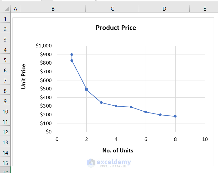
Plot the log scale on both axes of the graph.
- Select the data from the Unit Price axis >> we will right-click.
- Select Format Axis from the Context Menu.
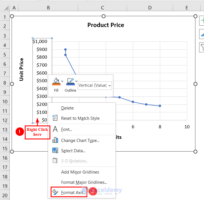
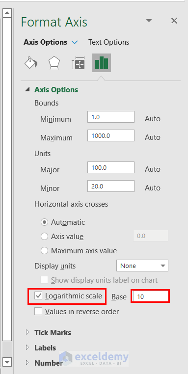
A Format Axis dialog box appears at the right end of the Excel sheet.
- Mark the Logarithmic scale.
Here, we keep the Base as 10. You can change the Base according to your needs.

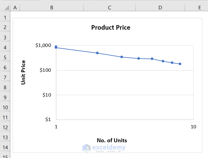
We can see the graph, which has a logarithmic scale on one axis.
Plot the log scale on the No. of Units axis.
- Select the data from the No. of Units axis >> we will right-click.
- Select Format Axis from the Context Menu.
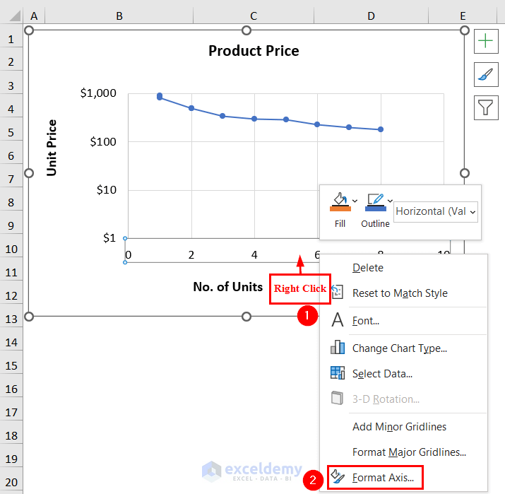
A Format Axis dialog box appears at the right end of the Excel sheet.
- Mark the Logarithmic scale.
Here, we keep the Base as 10. You can change the Base according to your needs.
We can see the graph, which has a log scale on both axes.
Read More: Excel Logarithmic Scale Start at 0
Things to Remember
- To plot the log scale on both axes, we must choose an Insert Scatter (X, Y) or Bubble Chart.
Download the Practice Workbook
Related Articles
- How to Calculate Log Base 2 in Excel
- How to Calculate Natural Logarithm in Excel
- How to Take Log of Negative Numbers in Excel
- How to Calculate Logarithmic Growth in Excel
- How to Log Transform Data in Excel
<< Go Back to Excel LOG Function | Excel Functions | Learn Excel
Get FREE Advanced Excel Exercises with Solutions!
