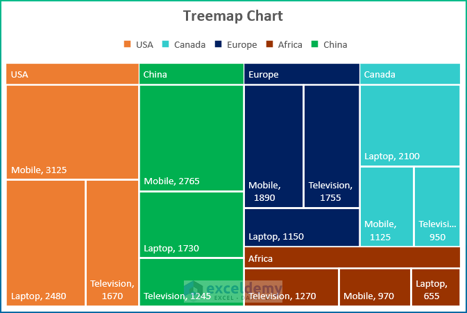
What Is a Treemap Chart?
The Treemap in Excel is a common type of chart that provides a hierarchical representation of the data. Usually, this type of chart uses rectangular boxes, which serve as branches to represent data within groups. Moreover, this type of chart is very useful for comparing products and depicting the best-selling ones, and the relationship that exists between the data is actually a one-to-many relationship. Generally, a Treemap consists of 3 major sections.
Plot Area: This is the portion where we generate the visual representation of the data. However, each rectangle has a label marking the name of the group.
Chart Title: Here, you can give a descriptive name to the chart and place it in a suitable location.
Legend: Generally, this section denotes the color of each data category to make it easy to compare them.
How to Create a Treemap Chart to Show Values in Excel: Step-by-Step Procedure
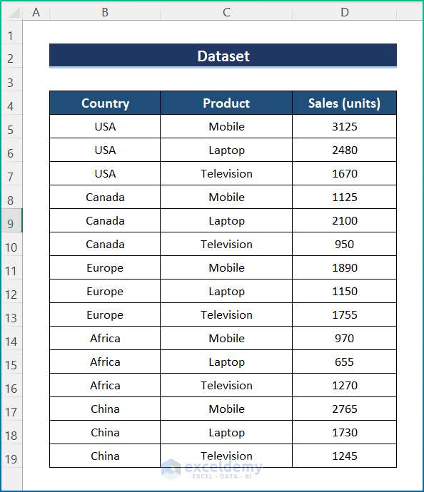
Step 1 – Create the Dataset
We’re keeping all the cells in general format. We have 3 sample columns, which are Country, Product, and Sales (units). However, you can vary the number of columns later on if that is needed.
Step 2 – Insert a Treemap Chart
- Select the dataset.
- Go to the Insert tab and select Insert Treemap Chart.
- Click on Treemap Chart.
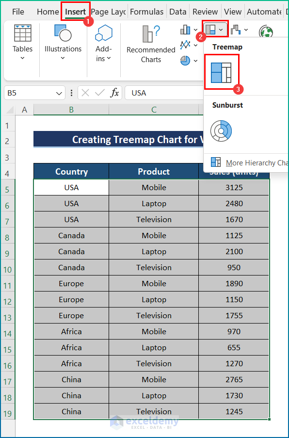
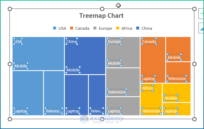
- You will get the Treemap Chart.
Read More: How to Change Treemap Order in Excel
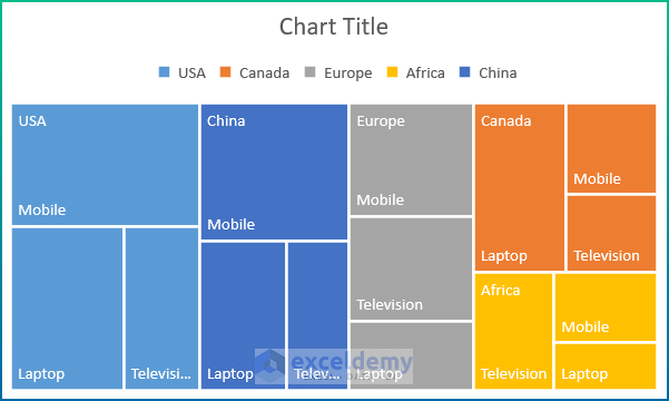
Step 3 – Modifications and Final Output
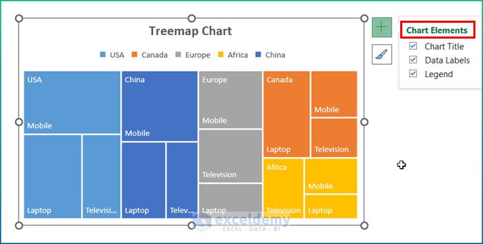
- You can add a Chart Title, Data Labels, and Legend from Chart Elements.
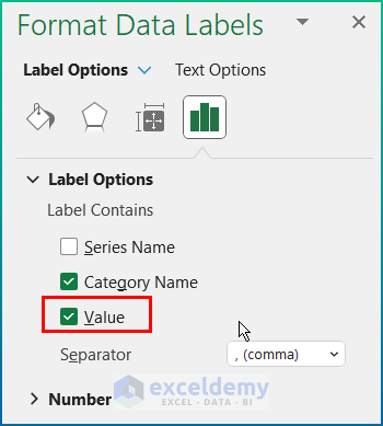
- Select Data Labels and press Ctrl + 1 to open the Format Data Labels pane.
- Check the Category Name and Value options.
- You will get the Treemap Chart as in the image below.
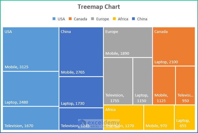
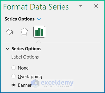
- You can add a Banner from the Format Data Series.
- After making some coloring changes, the chart will look better.

Read More: How to Add and Format Data Labels in Excel Treemap
Things to Remember
- To find the Treemap Chart option, you have to select the dataset, go to the Insert tab and select the Recommended Chart.
- You can choose any type of data with sub-divisions in order to draw the chart.
- Data labeling and chart titles are essential in this chart. Otherwise, the chart can be misleading sometimes.
- You can format the chart as you wish by going to the Chart Design option.
- Legends in the chart must be put in a way that helps to understand the data.
Download the Practice Workbook
Related Article
<< Go Back to Treemap Chart Excel | Excel Charts | Learn Excel

