In this article, you will learn how to create Heatmap in Excel. Here, we will explain static and dynamic heat maps, we will also learn about geographic heat maps.
Heat maps are commonly used in various fields, including geography, data analysis, statistics, finance, and user experience design. Geographic heat maps are useful for understanding spatial patterns and distributions of various phenomena, such as crime rates, disease outbreaks, customer locations, or environmental factors.
Download Practice Workbook
You can download the practice workbook from here.
What Is Heatmap?
A heat map is a visual depiction of data that employs colors to illustrate values in a two-dimensional or geographic area. It serves as a valuable instrument for examining and presenting patterns, concentrations, and fluctuations in data. In a heat map, each data point is represented by a color that corresponds to its value. The colors typically range from cool or light shades (such as blue or green) to warm or dark shades (such as red or orange). The intensity of the color reflects the magnitude of the data value at a specific position.
How to Create Heat Map in Excel
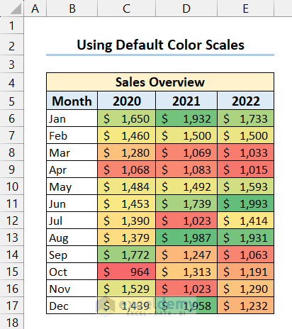
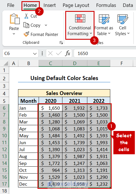
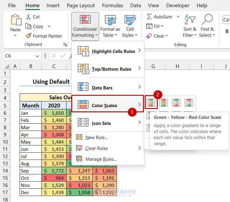
1. Create Heat Map with Default Color Scale
- Select the dataset >> go to the Home tab >> select Conditional Formatting.
- Select Color Scales >> select the color scale you like.
- Finally, you will see that you have got your desired heat map.
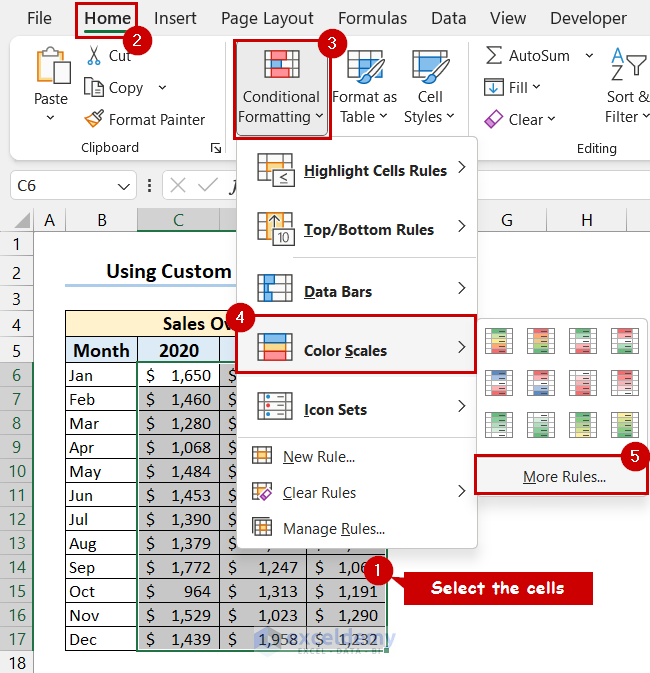
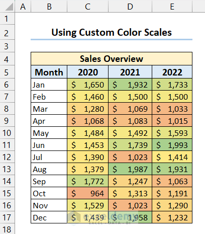
2. Generate Heat Map with Custom Color Scale
- Select dataset >> go to the Home >> select Conditional Formatting >> select Color Scales >> select More Rules.
- New Formatting Rule dialog box will appear.
- Select Format all cells based on their values >> select 3-Color Scale as Format Style >>select color for Minimum and Maximum value >> select OK.
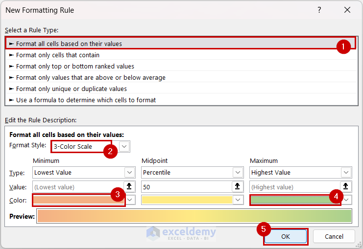
- Finally, you will get the heat map with your selected color scale.
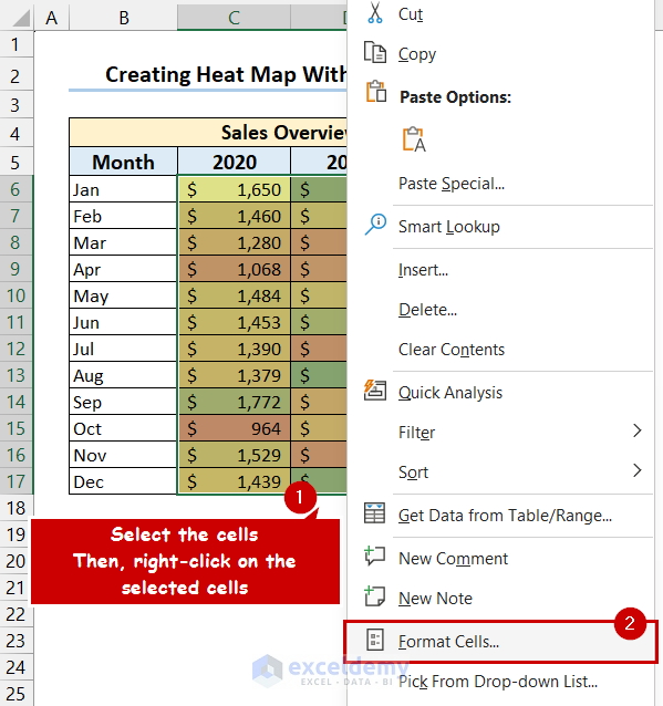
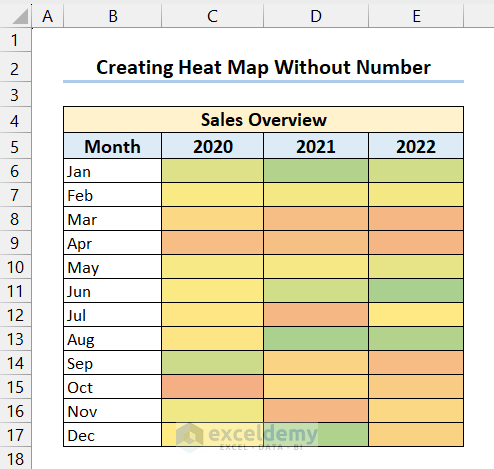
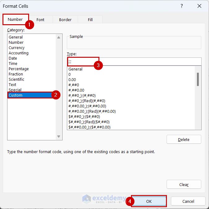
3. Create Heat Map Without Numbers in Excel
- Create a heat map following the previous method >> select the dataset >> right-click on the selected cells >> select Format Cells.
- Format Cells dialog box will appear >> select Custom >> write the custom format >> select OK.
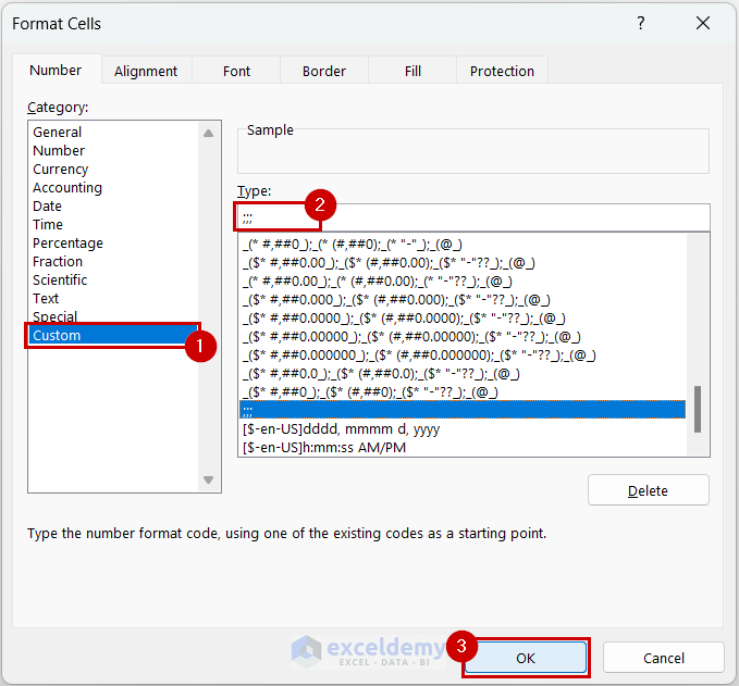
- Finally, you will get the heat map without numbers.
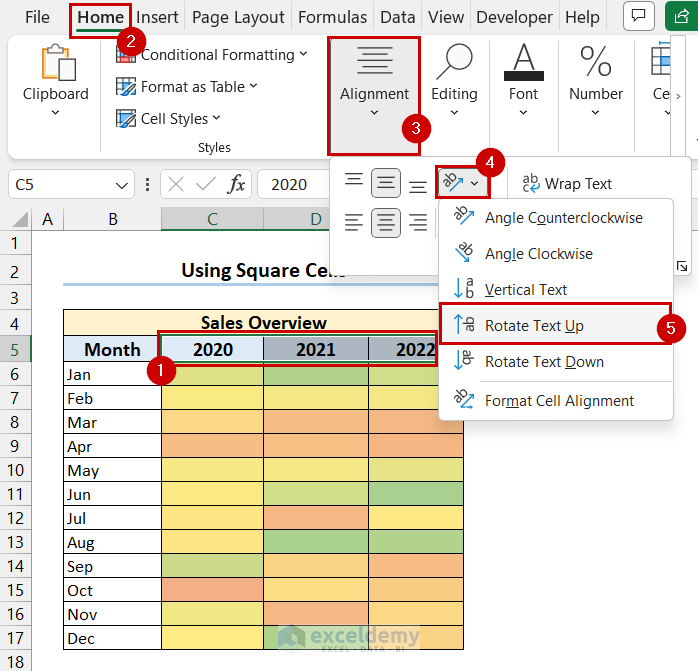
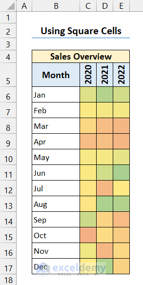
4. Make a Heat Map with Square Cells
- Insert a heat map following the previous method >> select the headers >> go to the Home tab >> select Alignment >> select Orientation >> select Rotate Text Up.
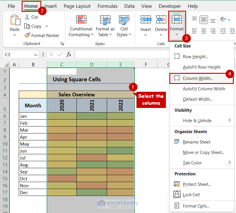
- Select the columns of the heat map >> go to the Home tab >> select Format >> select Column Width.
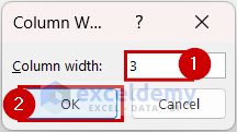
- Change the Column width to 3 >> select OK.
- Select the rows or the heat map >> go to the Home tab >> select Cells group >> select Format >> select Row Height.
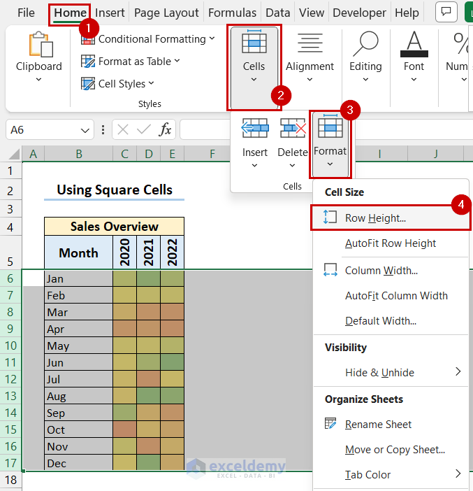
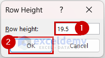
- Change the Row height to 19.5 >> select OK.
- Finally, you will get your heta map with square cells.
Read More: How to Make a Heatmap in Excel
How to Create a Dynamic Heat Map in Excel
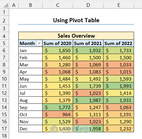
1. Create Dynamic Heat Map with Pivot Table
- Select the data from the Pivot Table >> go to the Home tab >> select Conditional Formatting >> select Color Scales >> select More Rules.
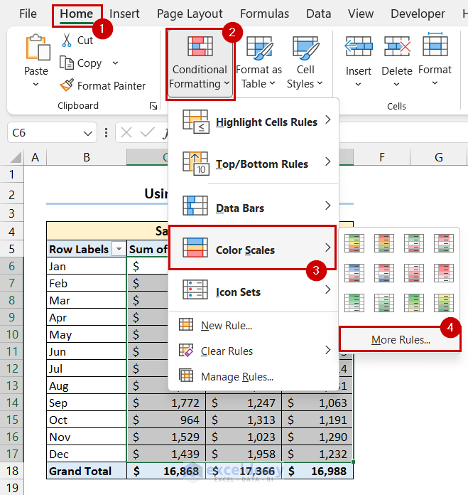
- Select the 3rd option from Apply Rule To >> select Format all cells based on their value.
- Then, select 3-Color Scale >> select colors for Minimum and Maximum value >> select OK.
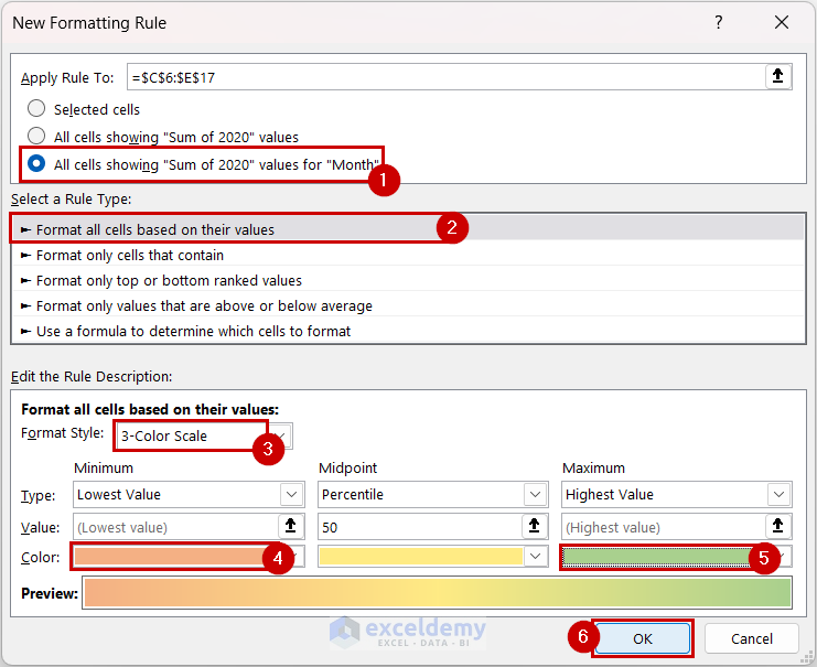
- Finally, you will get your dynamic heat map.
- If you add new data to the pivot table it will be included in the heat map automatically.
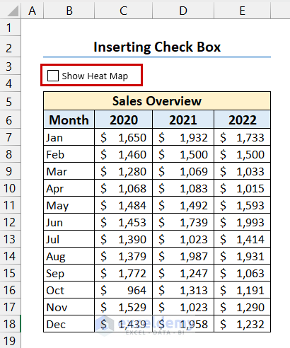
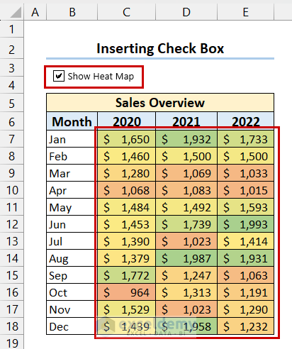
2. Generate Dynamic Heat Map with Check Box
- Go to the Developer tab >> select Insert >> select Check Box from Form Control.
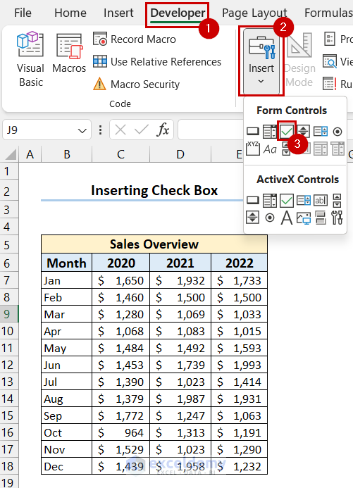
- Click and drag your mouse cursor where you want the Check Box.
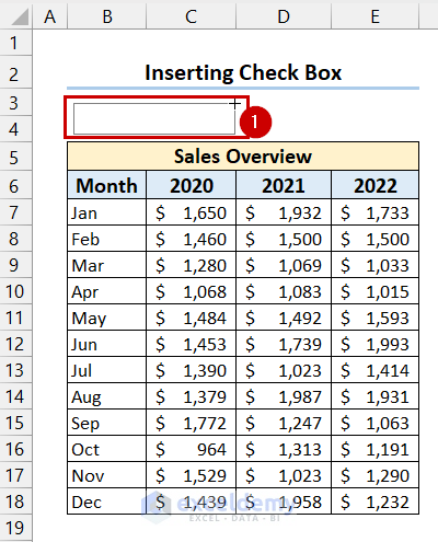
- You can see that I have inserted the Check Box and changed the text.
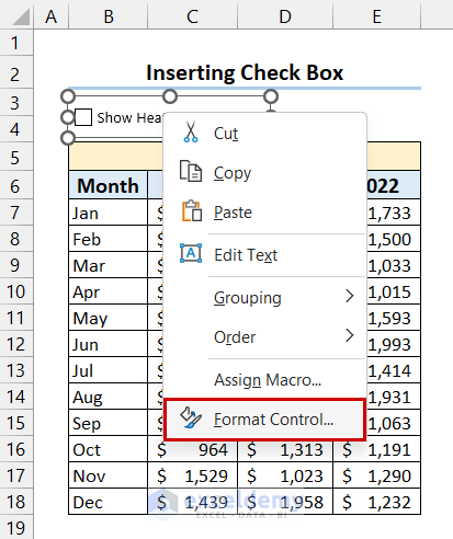
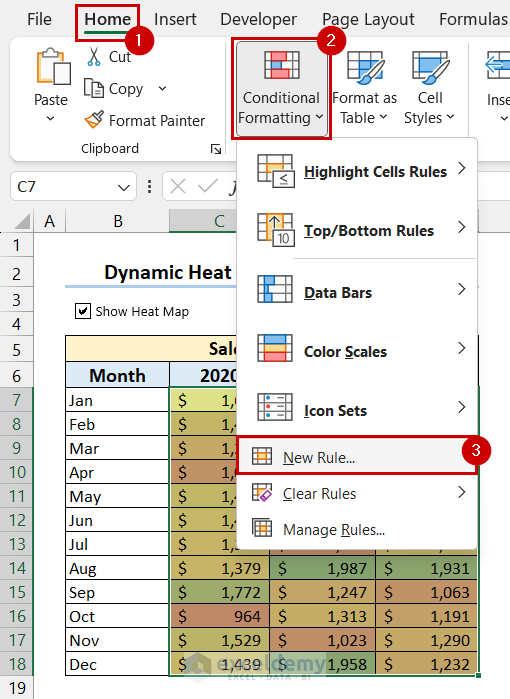
- Right-click on the Check Box and select Format Control.
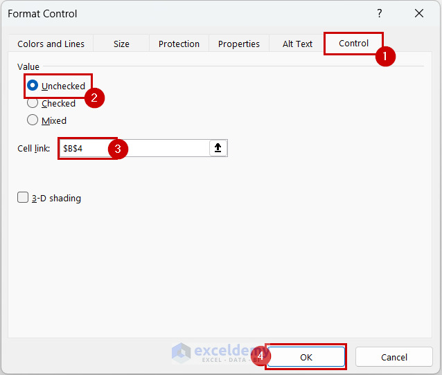
- Format Control dialog box will appear >> select Control tab >> select Unchecked >> select a cell for Cell Link >> select OK.
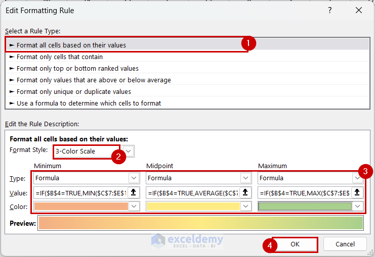
- Open the Edit Formatting Rule dialog box for the dataset like the previous methods >> select format cells based on their values >> select 3-Color Scale as Format Style.
- For Minimum select Formula as Type >> write the following formula as Value.
=IF($B$4=TRUE,MIN(C7:E18),FALSE)- For Midpoint select Formula as Type >> write the following formula as Value.
=IF($B$4=TRUE,AVERAGE(C7:E18),FALSE)- For Maximum select Formula as Type >> write the following formula as Value.
=IF($B$4=TRUE,MAX($C$7:$E$18),FALSE)- Select colors for Minimum, Midpoint, and Maximum >> select OK.
- Now, if you check the Check Box you will be able to see the heat map.
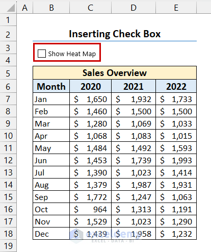
- If you uncheck the Check Box the heat map will disappear.
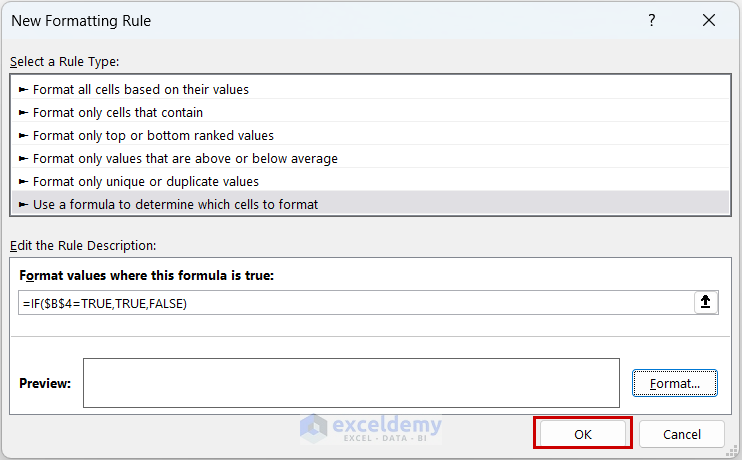
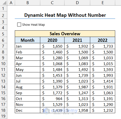
3. Make Dynamic Heat Map Without Numbers
- Select the dynamic heat map with Check Box >> go to the Home tab >> select Conditional Formatting >> select New Rule.
- New Formatting Rule dialog box will appear.
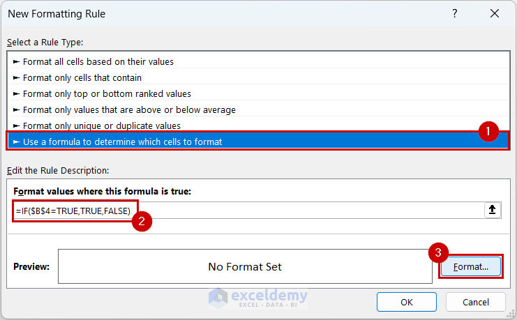
- Select Use a formula to determine which cells to format >> write the following formula.
=IF($B$4=TRUE,TRUE,FALSE)- Select Format.
- Format Cells dialog box will appear >> go to Number tab >> select Custom >> then write “;;;” as format Type >> select OK.
- Select OK.
- Finally, you will be able to see the heat map without numbers if you check the Check Box.
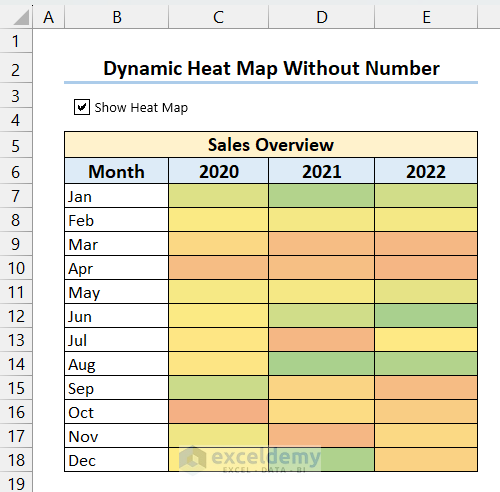
- If you uncheck the Check Box the heat map will disappear and you will get the dataset.
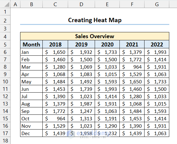
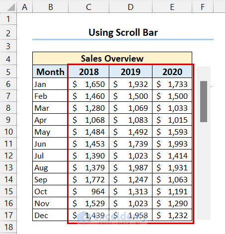
4. Use Scroll Bar in Heat Map in Excel
- We will use the following dataset for this example. Here, we will use the Scroll bar to show sales data for 3 years at a time.
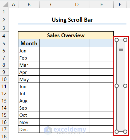
- Go to the Developer tab >> select Insert >> select Scroll Bar from Form Control.
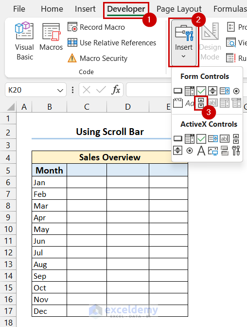
- Insert the Scroll Bar at your desired position.
- Right-click on the Scroll Bar >> select Format Control.
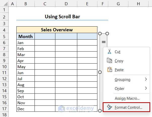
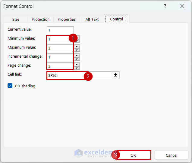
- In the Format Control dialog box, go to the Control tab.
- Select Minimum value, Maximum value, Incremental change, Page change >> select a cell for Cell link >> select OK.
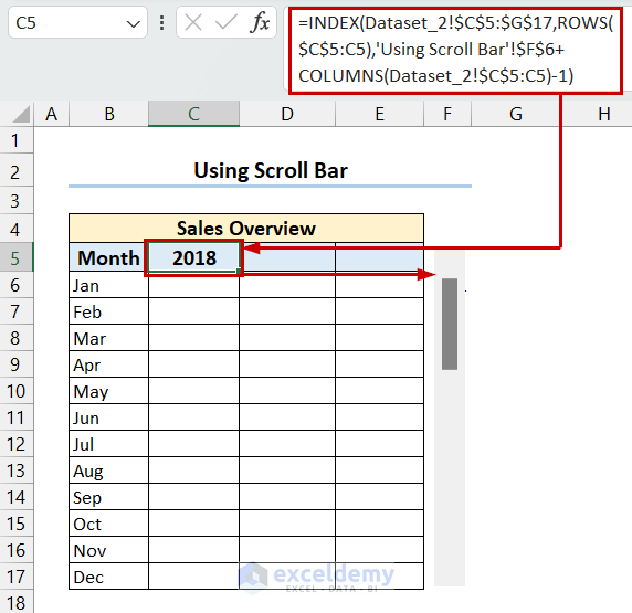
- Select the first cell of the heat map >> write the following formula.
=INDEX(Dataset_2!$C$5:$G$17,ROWS($C$5:C5),'Using Scroll Bar'!$F$6+COLUMNS(Dataset_2!$C$5:C5)-1)- Press Enter >> drag the Fill Handle to the right to copy the formula.
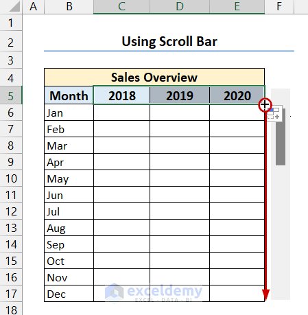
- Then right-click and drag the Fill Handle down to copy the formula to the other cells.
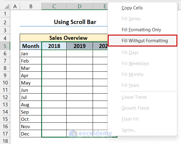
- Select Fill without Formatting.
- Finally, we have got the data from the dataset.
- Now, insert a heat map following the previous methods.
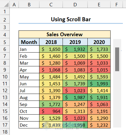
- Now you can get a heat map for different years by simply clicking the scroll bar.

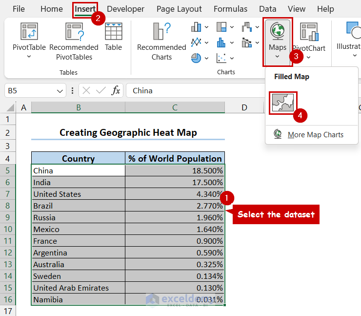
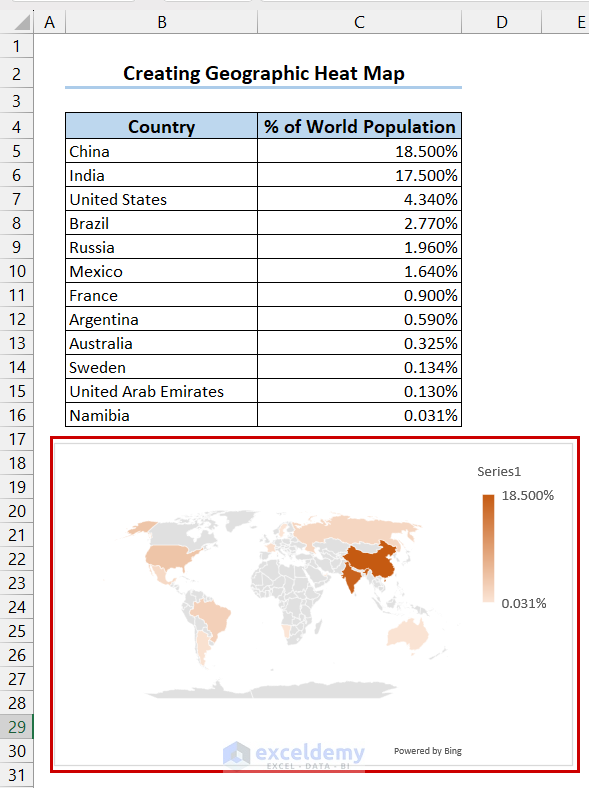
How to Create Geographic Heat Map in Excel
- Select the dataset >> go to the Insert tab >> select Maps >> select Filled Map.
- Finally, we have inserted the geographic heat map and changed the color.
Read More: How to Make Geographic Heat Map in Excel
Frequently Asked Questions
1. What is a heatmap used for?
A heat map is used for different types of data analysis, statistics, finance, and user experience design.
2. Is heatmap in Excel a chart?
A heat map is a two-dimensional chart where values are shown as color for better visualization.
3. Is heatmap in Excel used for numerical data?
A heat map shows the relationships between different values. It accepts only numerical values.
Heatmap in Excel: Knowledge Hub
Conclusion
In the end, we can say that this article covers how to create different types of heatmap in Excel. Here, we explained static, dynamic, and geographic heat maps. We hope this article was helpful to you. If you have any questions or queries, please let us know in the comment section below.
<< Go Back to Data Visualisation in Excel | Learn Excel

