This is the sample dataset. The Y-axis value is placed on the left.
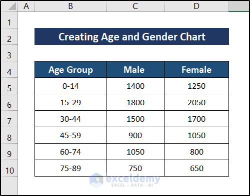
Example 1 – Using a Stacked Bar Chart Without Gaps in Between
Steps:
- Select C11 and enter the following formula,
=SUM(C5:C10)
- Press Enter.
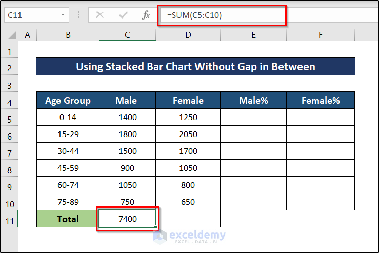
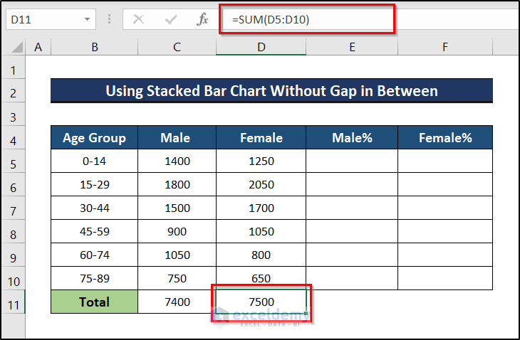
- For the Female group. selecl D11 and enter the following formula.
=SUM(D5:D10)
- Press Enter.
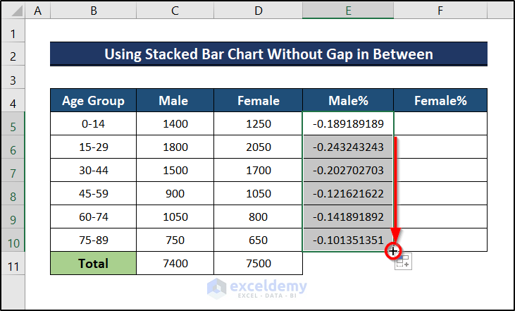
- Select E5 and enter the following formula,
=-(C5/$C$11)
- Press Enter.
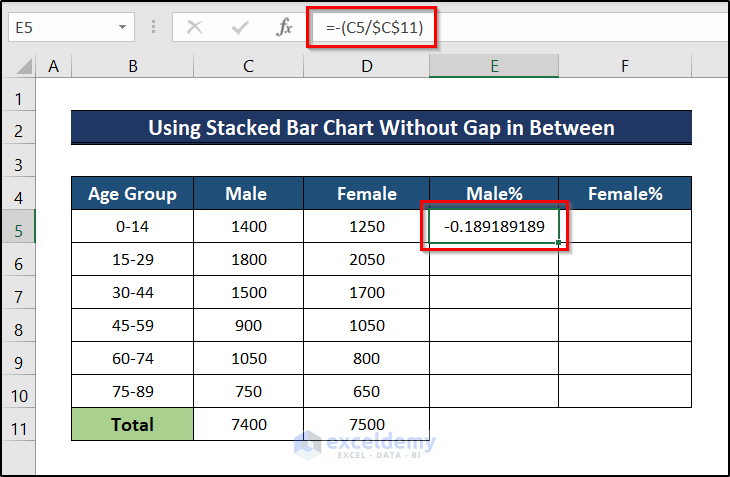
The formula has a minus sign to place the data to the left of the chart.
- The percentage of males belonging to that age group will be displayed.
- Drag down the Fill Handle to AutoFill the rest of the cells.
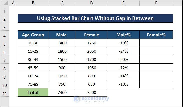
- Go to the Home tab.
- In Number, select the %.
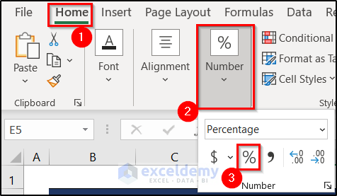
- Data will be presented in percentage.
- Click F5 and enter the formula below.
=D5/$D$11
- Press Enter.
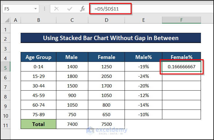
- The proportion of females in that age group will be displayed.
- Drag down the Fill Handle to AutoFill the rest of the cells.
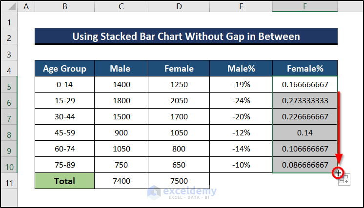
- Convert the proportion of females into a percentage following the same steps indicated for males.
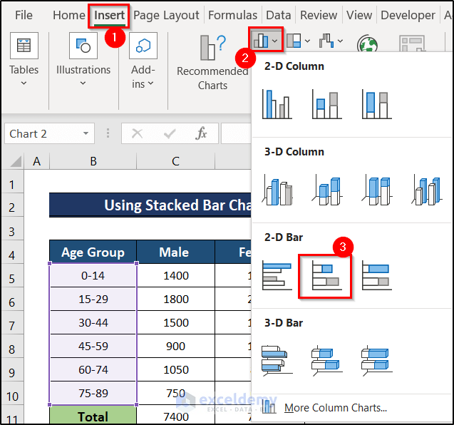
- Select the Age Group, Male%, and Female% columns.
- Go to the Insert tab.
- Choose Insert Column or Bar Chart.
- Select Stacked Bar Chart.
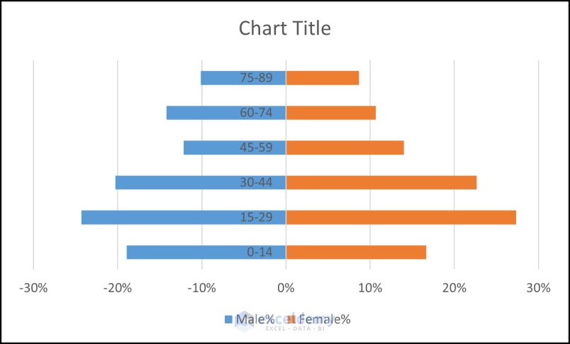
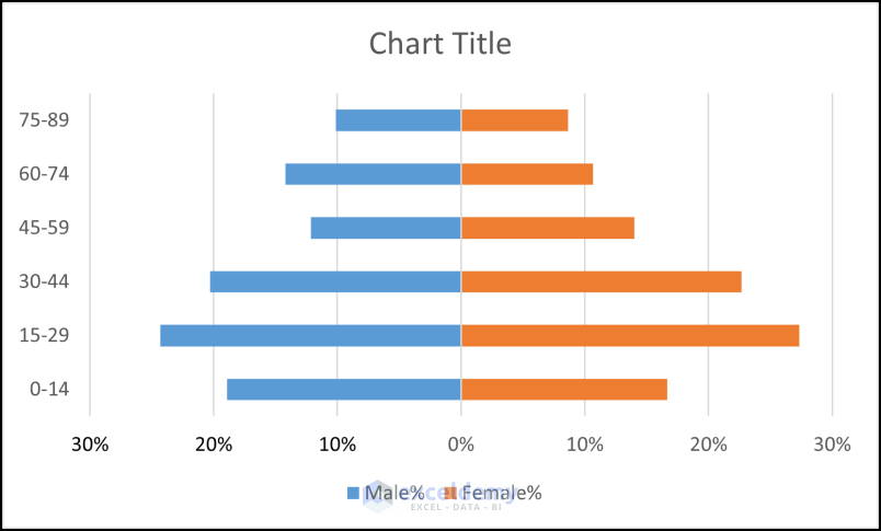
- This is the output.
- Select the labels on the graph.
- Choose Series Options.
- Select Labels.
- In Label Position, select Low.
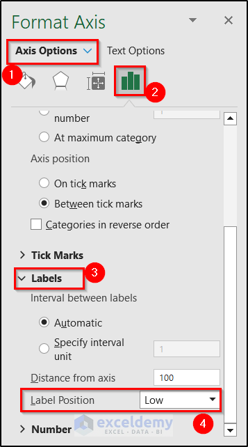
- Data labels will be placed on the left.

- Double-click the X-axis label.
- Go to Axis Options.
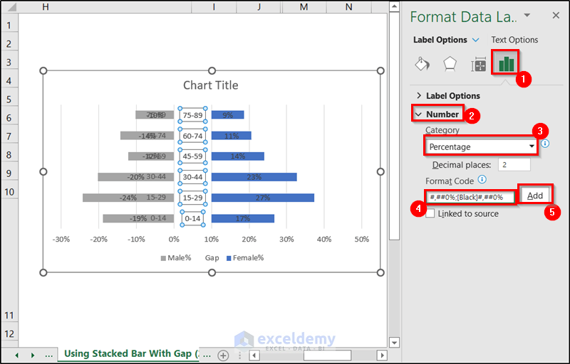
- Click Number.
- Enter the following code.
#,##0%;[Black]#,##0%
- Click Add.
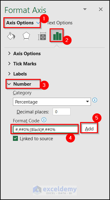
- All negative values in the X-axis will be removed.
- Click the bars in the Female group.
- Select the plus sign.
- Check Data Labels.
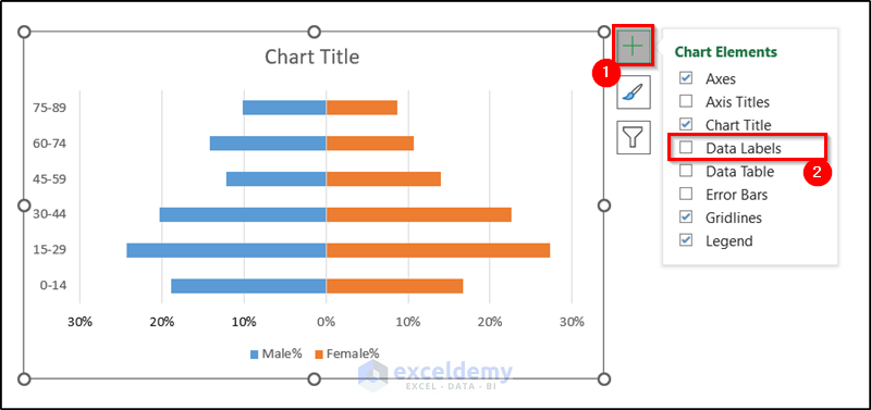
- Labels will be displayed.
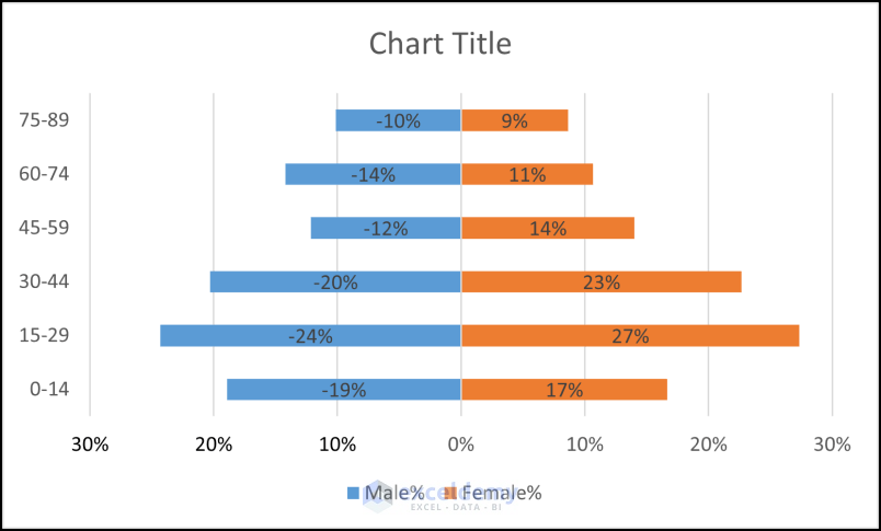
- Select Data labels.
- Go to the Label Options tab.
- in Label Position, check Inside End.
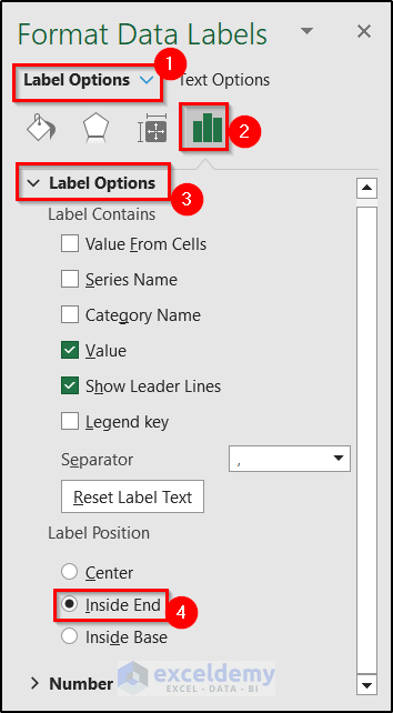
- Labels will be repositioned on the right of the graph.
- Repeat the process for the Male% column.
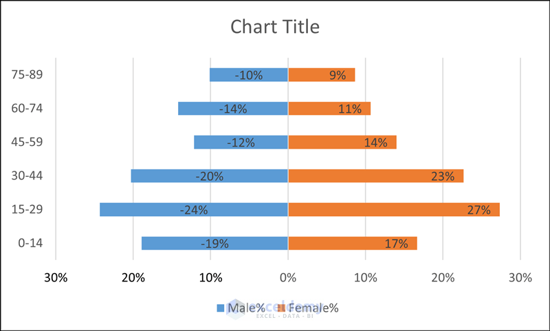
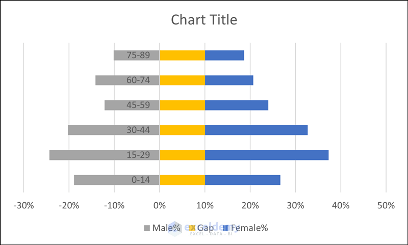
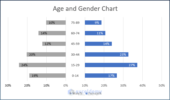
- This is the final age and gender distribution chart.
Example 2 – Using a Stacked Bar Chart with Gaps in Between to Create an Age and Gender Chart in Excel
The Y-axis value will be set in the center. A new column (Gap) is inserted to create a gap between the two groups.
Steps:
- Select the entire data.
- Go to the Insert tab.
- Click Insert Column or Bar Chart.
- Select Stacked Bar.
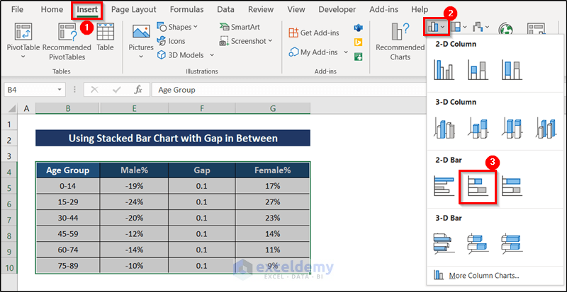
- A graph with a gap between the main data will be displayed.
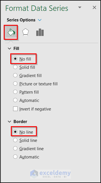
- Select the Gap data.
- Go to Series Options.
- In Fill, select No Fill.
- In Border, select No Line.
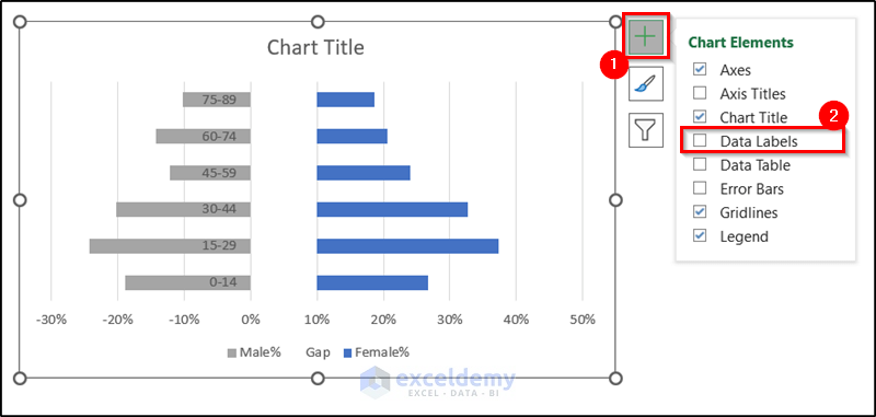
- Select the data in the gap and click the plus sign on the right.
- Check Data Labels.
- 0.1 will be displayed in each level (the value of each cell in the Gap column).
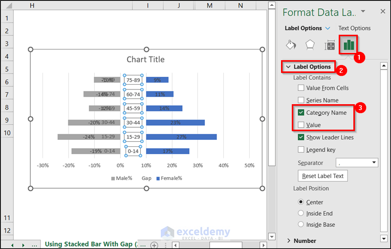
- To change it, go to the Label Options tab.
- Uncheck Value.
- Check Category Name.
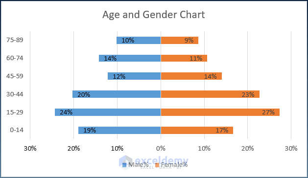
- The Y-axis value will be in the center.
- Select the Male% data labels and delete them.
- Select the X-axis values.
- Go to Axis Options.
- Choose Number.
- Enter the following code.
#,##0%;[Black]#,##0%
- Click Add.
- The X-axis will showcase no negative value.
- Follow the steps in Example 1 to add labels.
- The age and gender chart with Y-axis values in the middle will be displayed.
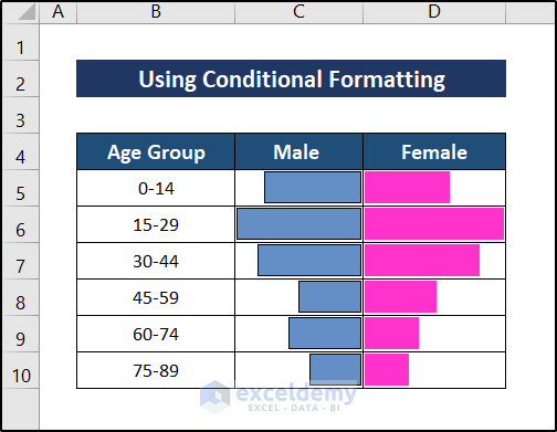
Example 3 – Using Conditional Formatting to Create an Age and Gender Chart in Excel
Steps:
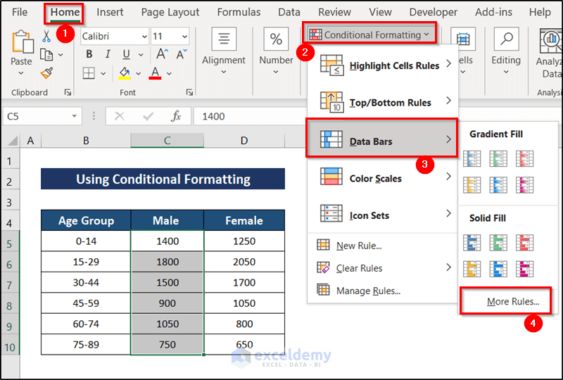
- Select the male column (C5:C10).
- Go to the Home tab.
- In Styles, select Conditional Formatting.
- Choose Data Bars.
- Select More Rules.
- In the New Formatting Rule window, select Format all cells based on their values.
- In Edit, check Show Bar Only.
- Select the Bar Direction as Right-to-Left. Choose a color and a solid border.
- In Bar Appearance, choose a color.
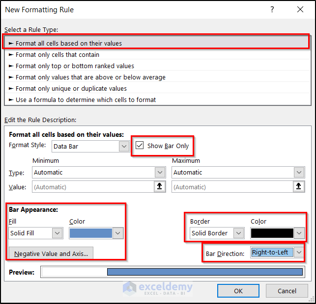
- Click OK.
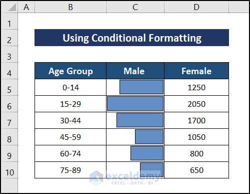
- Follow the same procedure for the Female column.
- The age and gender chart will be displayed.
Download Practice Workbook
Download the workbook here.
Related Articles
- How to Calculate Population Mean in Excel
- How to Make a Population Pyramid in Excel
- How to Make a Population Pyramid in Excel
- How to Calculate Population Growth Rate in Excel
- How to Analyze Demographic Data in Excel
- How to Make Age Pyramid in Excel
- Population Projection Formula in Excel
<< Go Back to Excel Demographic Data | Excel for Statistics | Learn Excel
Get FREE Advanced Excel Exercises with Solutions!
