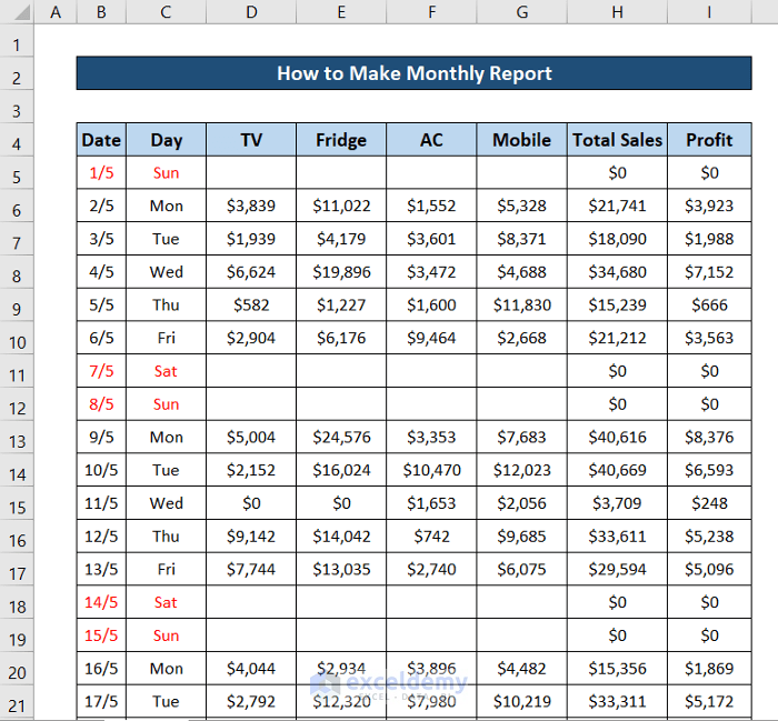
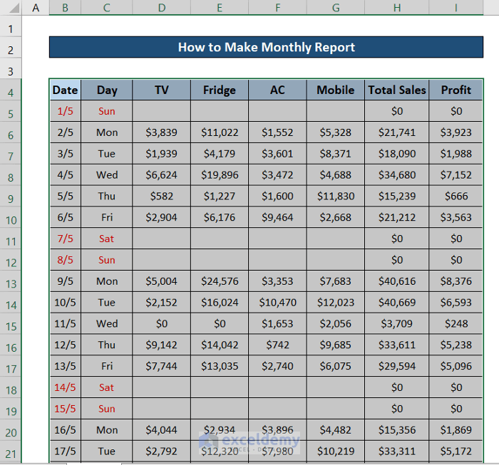
Step 1: Import Your Dataset
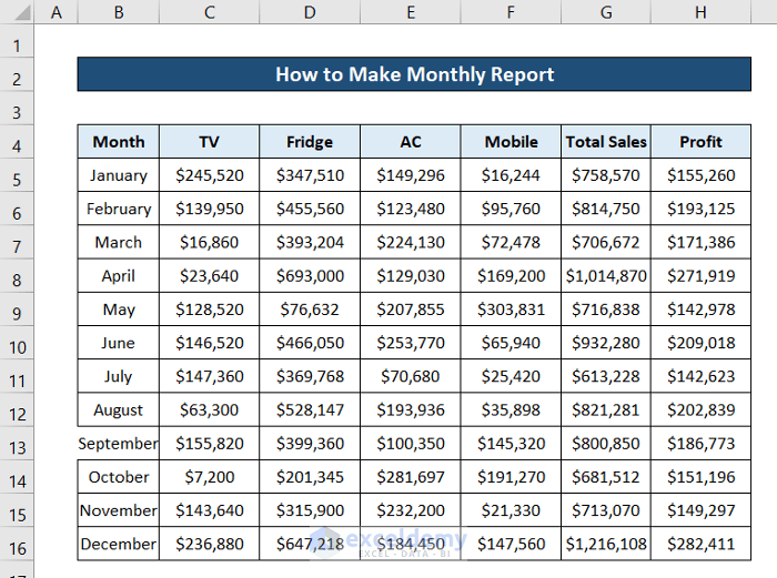
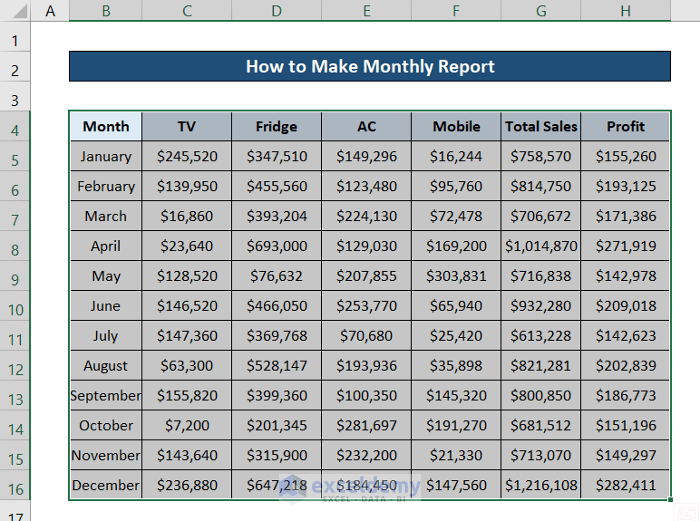
This is the sample dataset.
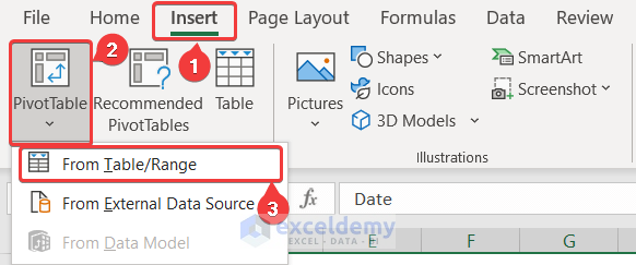
Step 2: Create Pivot Tables from the Dataset
- Select a cell in the dataset and press Ctrl+A.
- Go to the Insert tab on the ribbon.
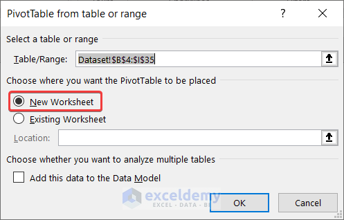
- In Tables, select PivotTable and choose From Table/Range.
- Select New Worksheet.
- Click OK.
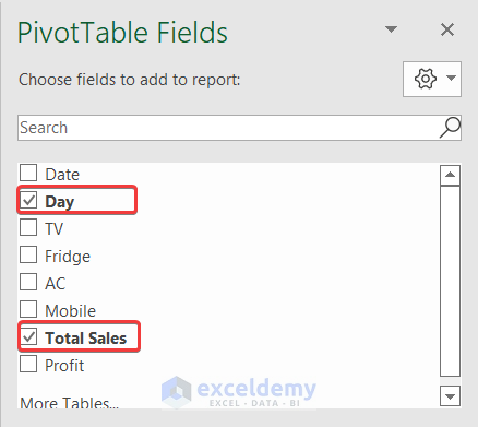
- Go to the new sheet and select Day and Total Sales from the PivotTable Fields.
- The pivot table with the column headers will be displayed.
Step 3: Insert a Daily Report Chart
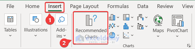
- Select a cell in the pivot table.
- Go to the Insert tab on the ribbon.
- In Charts, select Recommended Charts.
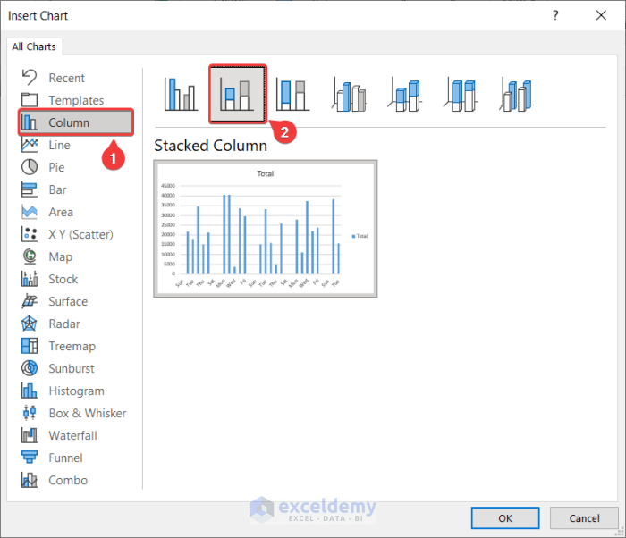
- In Insert Chart, select Column and the type of column chart you want. Here, Stacked Column.
- Click OK.
- A column chart will be created.
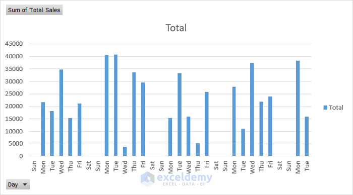
- You can modify the chart style by selecting it and using the plus and the brush icons on the right.
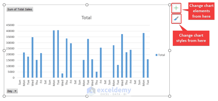
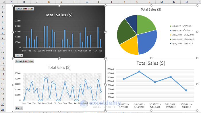
- This is the output (Style 8 was selected and the legend was removed).
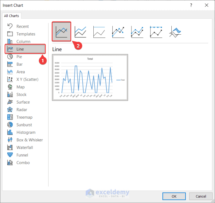
In Insert Chart, choose a line plot.
- Select a cell in the pivot table.
- Go to the Insert tab and select Recommended Charts from the Charts group.
- In the Insert Chart dialog box, select Line.
- Choose a type of line chart.
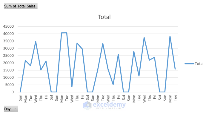
- Click OK. The line chart will be displayed.
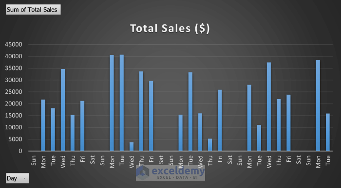
- You can change chart elements and styles, by selecting the chart and using the plus and the brush icons.
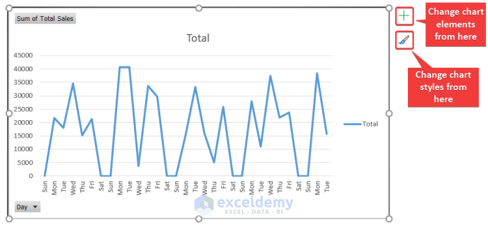
- This is the output (chart styles were changed and the legend was removed).
Read More: How to Make Daily Sales Report in Excel
Step 4: Insert a Weekly Report Chart
- Use the pivot chart in step 2 or create a new pivot table.
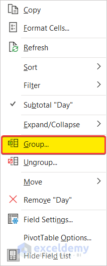
- Right-click one of the cells in the days’ column.
- Select Group.
- In Grouping, select Days and unselect Months.
- In Number of Days, select 7.
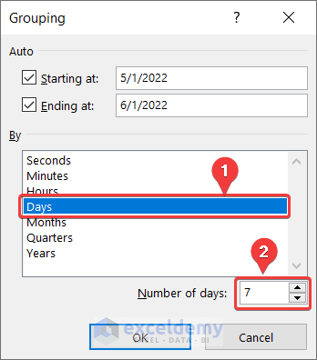
- Click OK.
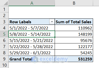
- This is the output.
- Select one of the cells in the pivot table and go to the Insert tab.
- In Charts, choose Recommended Charts.
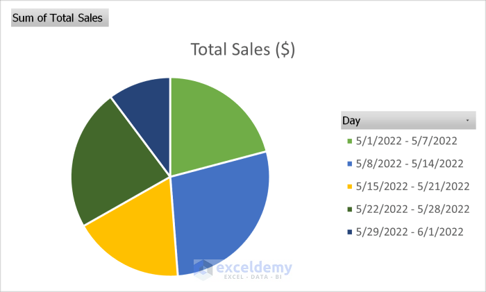
- In the Insert Chart dialog box, select Pie and a type of pie chart.
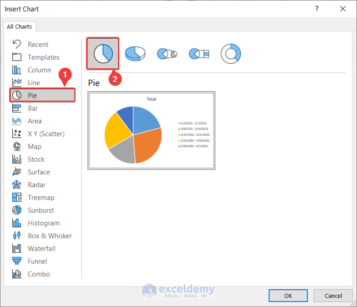
- Click OK.
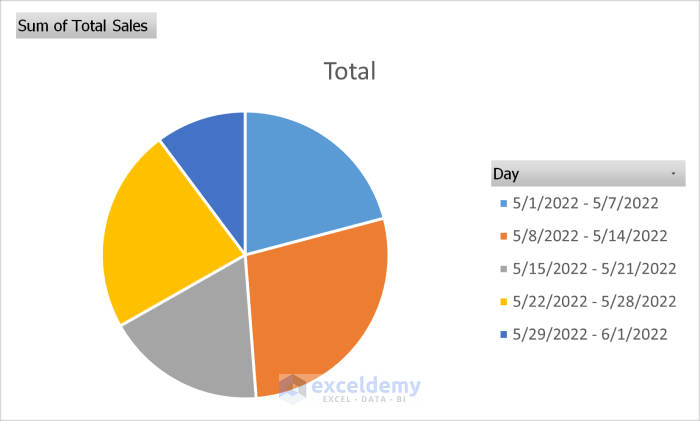
- A pie chart will be displayed.
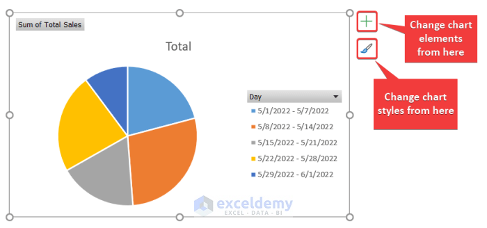
- You can change chart elements and styles, by selecting the chart and using the plus and the brush icons.
- This is the output (the color palette was changed).
To create a line plot:
- Select a cell in the pivot table.
- Go to the Insert tab and in Charts, select Recommended Charts.
- In the Insert Chart dialog box, select Line and choose a style.
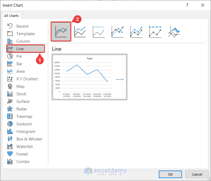
- Click OK.
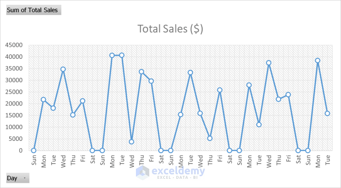
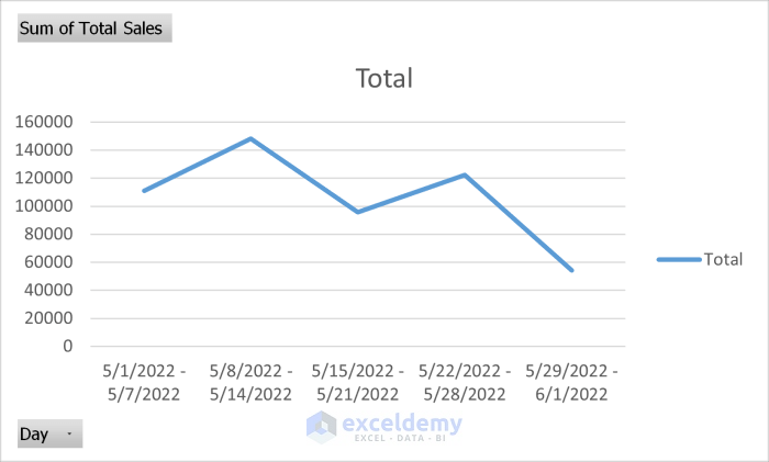
This is the line plot.
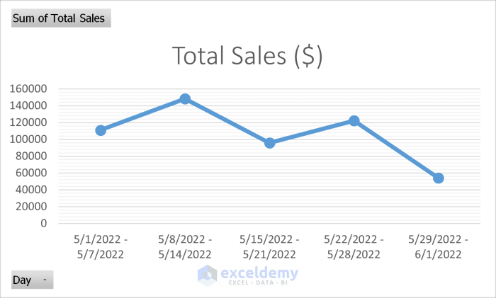
- This is the output (style was changed and the legend removed).
Step 5: Generate a Final Report
Daily or weekly reports can be copied to a new sheet to create a monthly report.
Read More: How to Make Sales Report in Excel
How to Make a Report for Consecutive Months in a Year in Excel
Step 1: Import Your Dataset
In the following dataset data is tracked and recorded by months.
Step 2: Create a Pivot Table
Convert your dataset into an Excel pivot table:
- Select the dataset.
- Go to the Insert tab.
- In Tables, select PivotTable.
- Choose From Table/Range.
- Select New Worksheet and click OK.
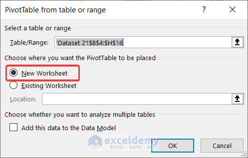
- A new worksheet will be created.
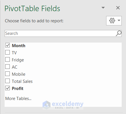
- Go to the sheet and in PivotTable Fields select Month and Profit.
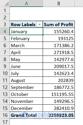
- A pivot table will be displayed.
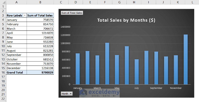
Step 3: Insert a Chart from a Dataset
- Select a cell in the pivot table.
- Go to the Insert tab.
- In Charts, select Recommended Charts.
- In the Insert Chart dialog box, select Column on the left.
- Choose a type of column chart.
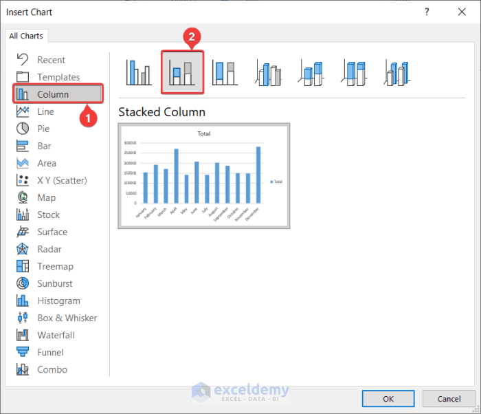
- Click OK.
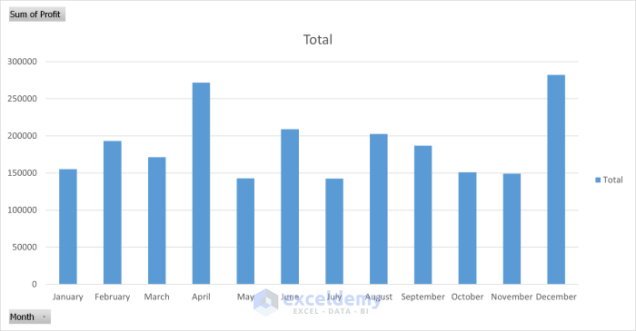
A column chart will be created.
Step 4: Generate a Final Report
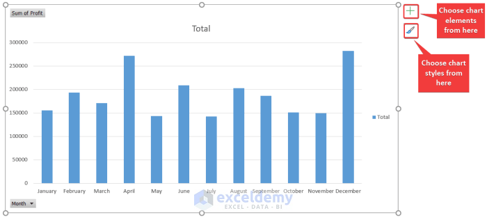
- You can modify the chart style by selecting it and using the plus and the brush icons on the right.
- This is the output.
Download Practice Workbook
Download the practice workbook.
Related Articles
- How to Create an Expense Report in Excel
- How to Create an Income and Expense Report in Excel
- How to Make Production Report in Excel
- How to Make Daily Production Report in Excel
- How to Make a Monthly Expense Report in Excel
<< Go Back to Report in Excel | Learn Excel
Get FREE Advanced Excel Exercises with Solutions!
