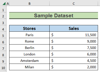
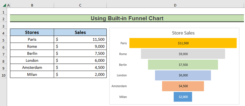
We have the sales number of different stores of a product arranged in descending order. We will use this data to create the pipeline chart.
Method 1 – Using the Built-in Funnel Chart
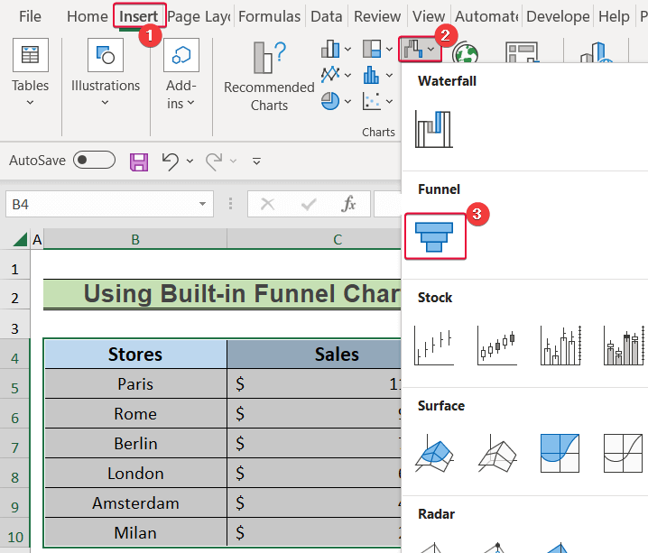
In the newer versions of Excel (Excel 2019 or later), users can draw a pipeline chart from the built-in Funnel chart.
Steps:
- Select the data in the B4:C10 range.
- From the Insert tab, go to the Charts group and click on Insert Waterfall, Funnel, Stock, Surface, or Radar Chart.
- Select the Funnel chart from the available options.
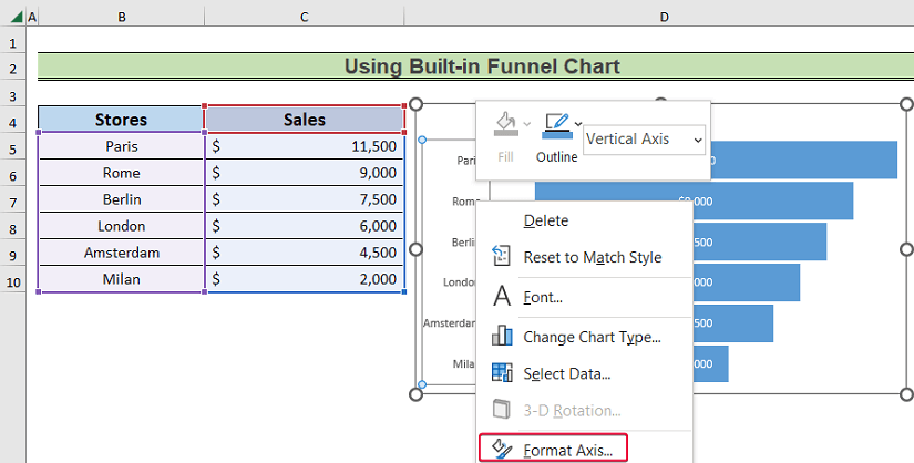
- Right-click on the vertical axis.
- Choose Format Axis from the available options.
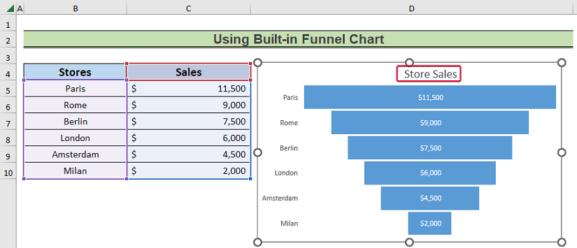
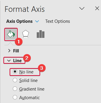
- Go to the Fill & Line section in the Format Axis panel.
- Click on Line.
- Select No line from the drop-down.

- Change the chart title.
- Double-click on one of the chart shapes.
- Go to the Home tab.
- Change the fill color of the shape.
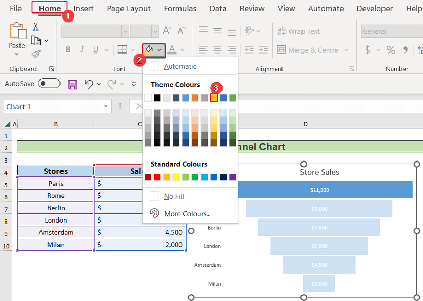
- Repeat for the rest of the shapes.
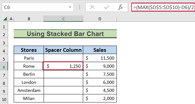
Method 2 – Using a Stacked Bar Chart
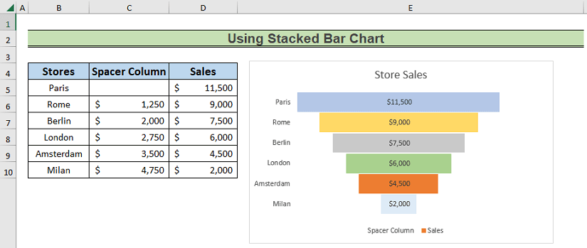
We will create a spacer column which will allow us to give the Stacked Bar chart a pipeline or funnel shape.
Steps:
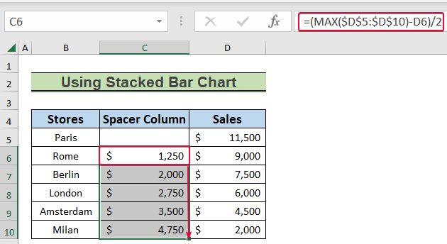
- Click on the C6 cell and enter the following:
=(MAX($D$5:$D$10)-D6)/2- Hit Enter.
- Autofill down the column.
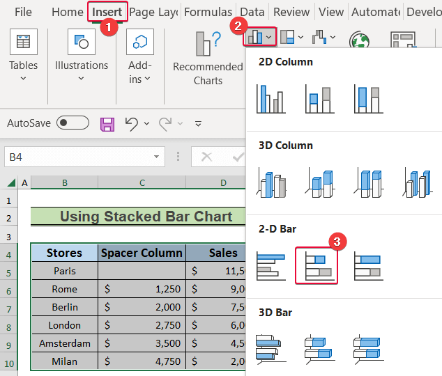
- Choose the values in the B4:D10 range.
- Go to the Insert tab.
- Choose a 2-D Bar from the Insert Column or Bar Chart option.
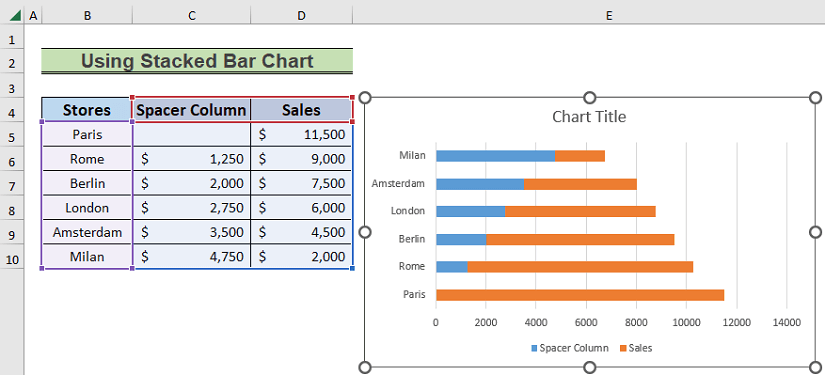
- You’ll get the basic graph.
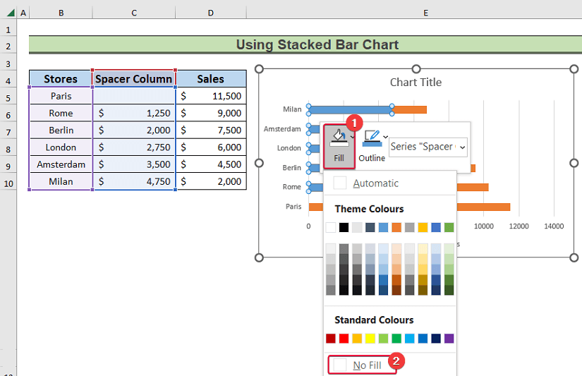
- Right-click on the spacer column data series.
- Choose Fill.
- Set the fill color to No Fill.
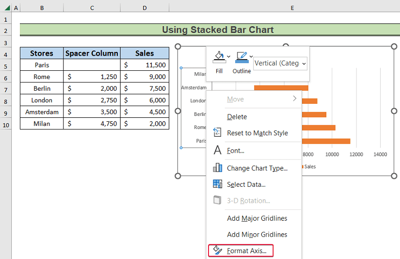
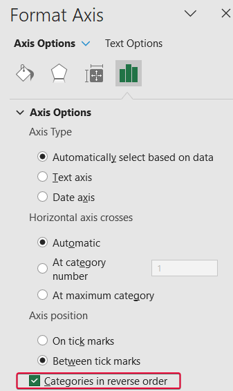
- Select the vertical axis and right-click.
- Choose Format Axis.
- From the Axis Options, choose Categories in reverse order.
- The chart will turn upside down and resemble the shape of a funnel.
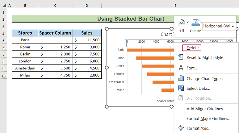
- Right-click on the horizontal axis and click on Delete from the available options.
- Right-click on the Sales data series and select Format Data Series from the available options.
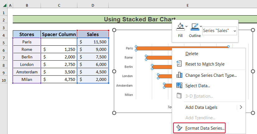
- Go to the Series Options.
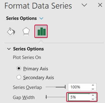
- Set the Gap Width to 5%.
- Right-click on the vertical axis and choose Format Axis.
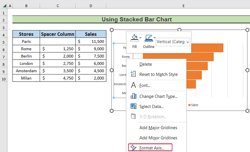
- Choose No Line under the Line option of the Fill & Line section.
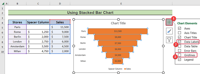
- Click on the plus sign to the top-right corner of the chart.
- Mark the Data Labels option and unmark the Gridlines box.
- Change the color of the fill of the shapes according to the previous method.
Download the Practice Workbook
Related Article
<< Go Back to Excel Sales Pipeline Templates | Excel Sales Templates | Excel Templates
Get FREE Advanced Excel Exercises with Solutions!
