Charts are powerful visual tools in Excel that transform complex datasets into clear, concise visual representations. Visually appealing and insightful charts in Excel can transform your data from overwhelming spreadsheets into actionable insights.
In this tutorial, we’ll show how to master Excel charts by discussing everything from chart basics to building dynamic dashboards that update automatically as your data evolves.
Choosing the Right Chart Type
Understanding chart types is essential for accurately visualizing data. Here are common Excel chart types and ideal use-cases:
- Column Charts: Comparing categories and values.
- Categories on X-axis, values on Y-axis.
- Use clustered columns for multiple data series.
- Use stacked columns to show part-to-whole relationships.
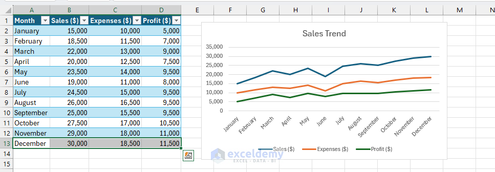
- Line Charts: Displaying trends over time.
- Use markers for small datasets.
- Remove markers for large datasets to reduce clutter.
- Add trendlines to highlight patterns.
- Use multiple lines to compare trends.
- Pie Charts: Showing proportional data distribution. Showing parts of a whole (limit to 5-7 slices).
- Use data labels showing percentages.
- Consider donut charts for a modern look.
- Avoid 3D effects that distort perception.
- Scatter (XY) Charts: Revealing relationships between variables.
- Add trendlines to identify correlations.
- Use different colors for data categories.
- Size bubbles based on the third variable (bubble chart).
- Perfect for statistical analysis.
- Combo Charts: Combining multiple chart types in one visualization.
- Create an initial chart with primary data.
- Right-click the secondary data series.
- Select “Change Series Chart Type”.
- Choose a different chart type for the secondary axis if needed.
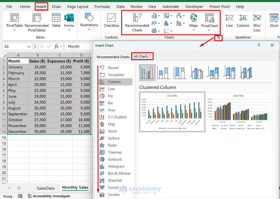
Creating Basic Charts
Let’s create your first chart.
Select Data:
- Ensure data is organized in columns or rows.
- Highlight the data range including headers.
Insert a Chart:
- Go to the Insert tab >> from Charts group >> select your preferred chart.
- Excel will automatically generate a basic chart.
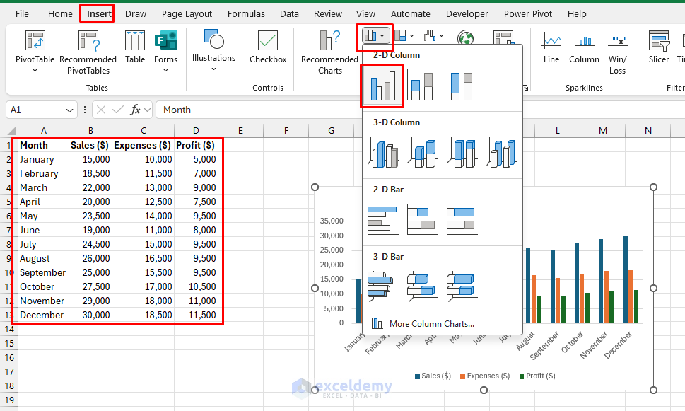
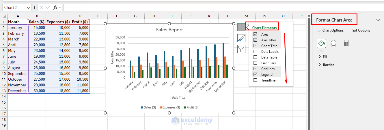
Chart Elements: Every Excel chart consists of key components:
- Chart Area: The entire chart container.
- Plot Area: Where data is displayed.
- Data Series: The actual data being plotted.
- Axes: Horizontal (X) and Vertical (Y) reference lines.
- Legend: Explains what each data series represents.
- Chart Title: Describes the chart’s purpose.
Customizing Excel Charts
Excel allows extensive customization to align charts with your specific needs.
Key customization options:
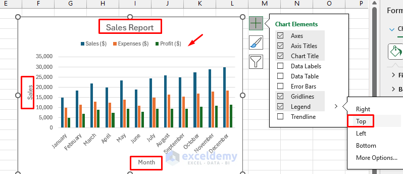
- Chart Titles & Axis Titles:
- Click on chart >> select Chart Elements (+) >> check Chart Title and Axis Titles.
- Legend Adjustment:
- Click Chart Elements (+) >> check Legend >> select Position accordingly.
- Data Labels:
- Click Chart Elements (+) >> select Data Labels >> choose placement.
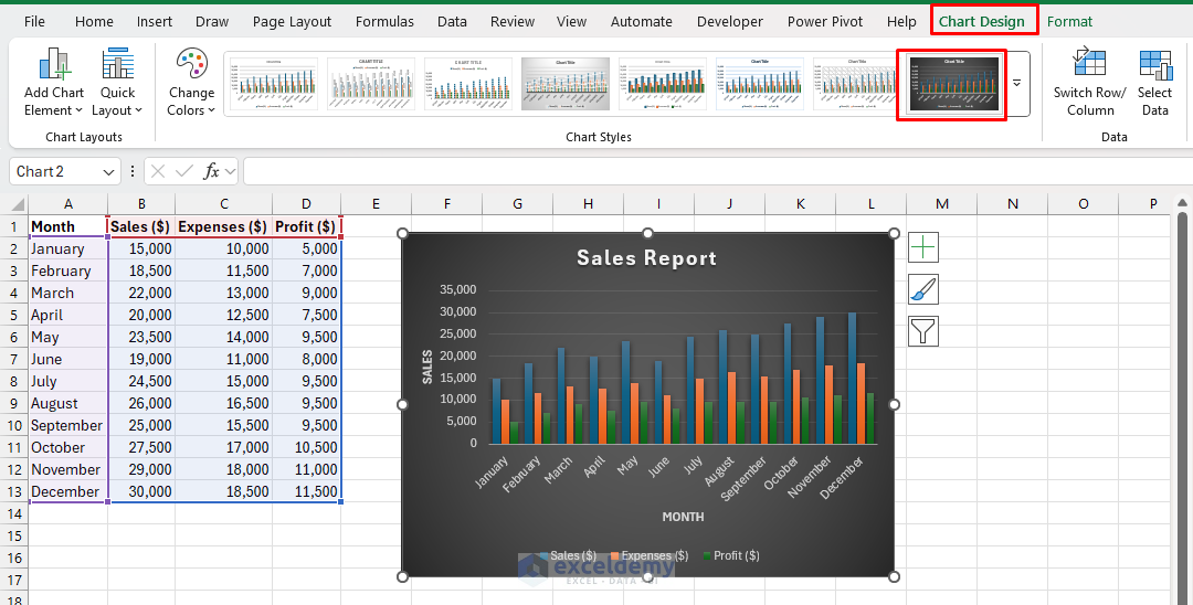
- Colors & Styles:
- Go to the Chart Design tab >> from Chart Styles select predefined themes.
Advanced Chart Techniques
Dynamic Chart Ranges
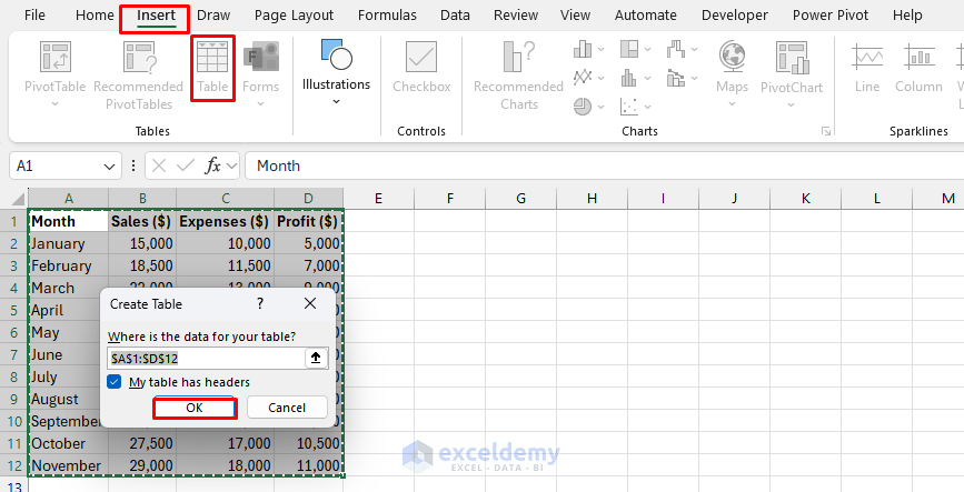
Using Excel Tables:
- Select the data (including headers).
- Go to the Insert tab >> select Table.
- Check “My table has headers” is checked.
- Now your data is formatted as an Excel Table, automatically expandable.
- Create a chart from table data.
- The chart automatically expands when new data is added to the table.
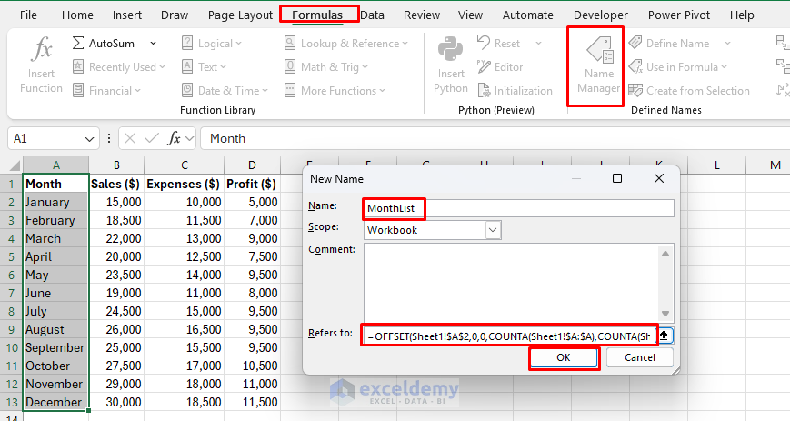
Named Ranges with OFFSET:
- Go to Formulas tab >> select Name Manager >> select New.
- Name: Chart_Dates.
- In Refers to: Insert the following formula.
- Click OK.
=OFFSET(Sheet1!$A$2,0,0,COUNTA(Sheet1!$A:$A),COUNTA(Sheet1!$1:$1))
This formula creates a dynamic range that grows with your data.
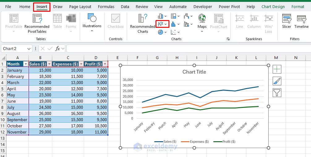
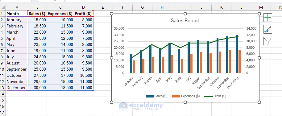
Creating Combo Charts
You can use Combo Charts to illustrate two data types with different scales clearly.
- Select the data range.
- Go to the Insert >> select Combo Chart >> select appropriate types (e.g., Column + Line).
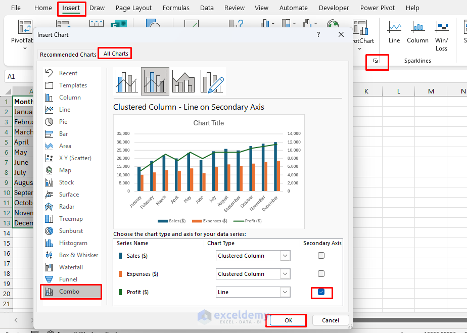
- You will get a combo chart with a secondary axis.
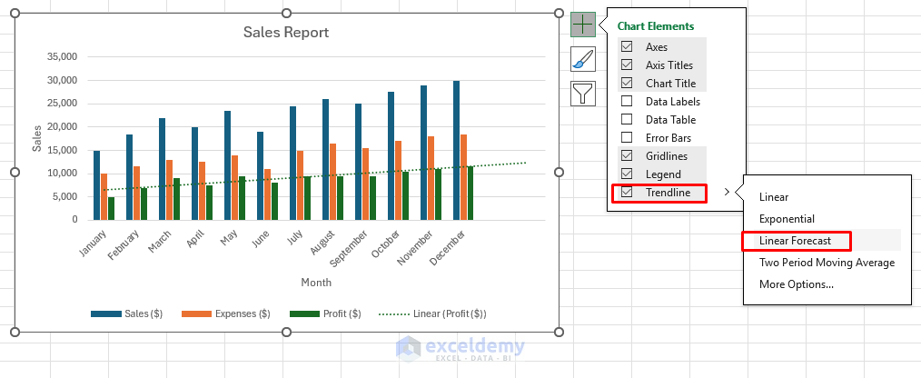
Adding Trendlines
Trendlines reveal underlying trends or forecasts. Excel offers multiple trendlines; choose the best to suit your data.
- Click the data series.
- Right-click >> select Add Trendline >> choose Linear Forecast.
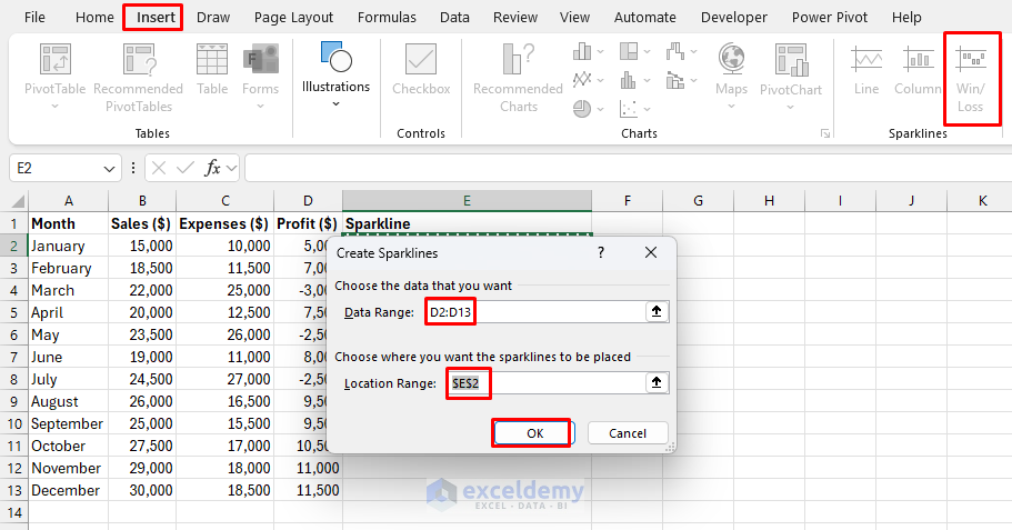
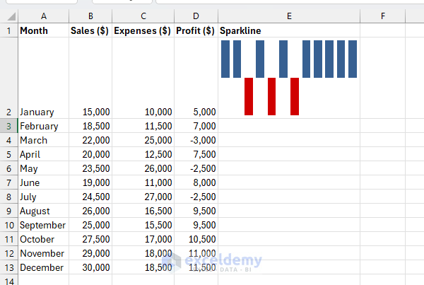
Inserting Sparklines
Sparklines are tiny charts in a cell that give you a quick visual representation of data trends. It is perfect for summarizing trends. Miniature charts are placed within a single Excel cell.
- Go to the Insert tab >> choose Sparklines (line, column, win/loss).
- In the Data Range: box,
- Enter the range for Profit values D2:D13.
- In the Location Range: box,
- Enter where you want the Sparkline to appear.
- For a single summary Sparkline, enter E2.
- Click OK.
- Sparkling will appear on the selected location, showing the overall trend for Profit throughout the year.
Creating Interactive Dynamic Dashboards
Dynamic dashboards display updated data with interactive controls.
Step 1: Data Preparation
- Organize data in structured tables for ease of updating.
Step 2: Pivot Charts
- Select the data range.
- Go to the Insert tab >> select PivotChart.
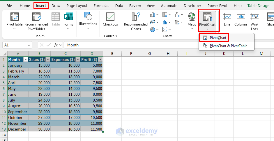
- Configure your pivot fields (rows, columns, values).
- Drag the Month to the Axis.
- Drag Sales and Profit to Values.
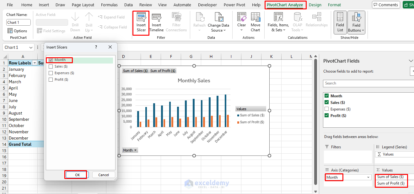
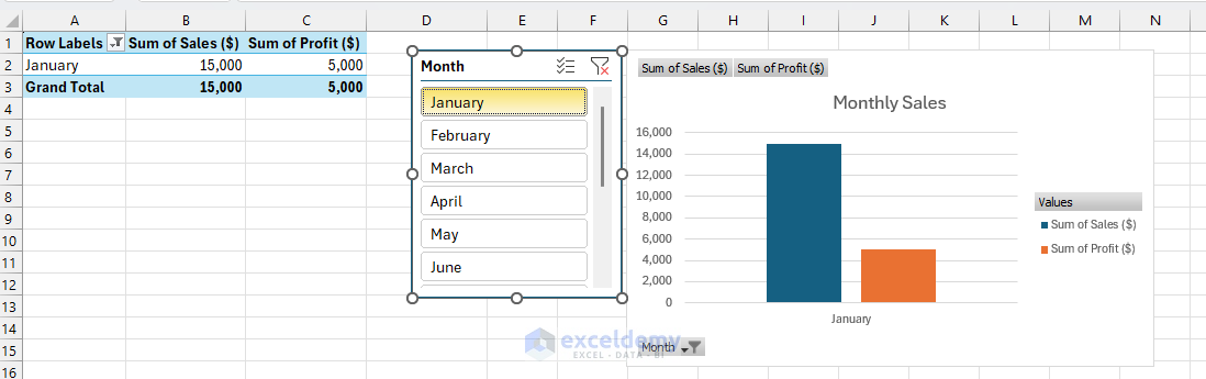
Step 3: Adding Slicers
- Select PivotChart.
- Go to the PivotChart Analyze tab >> select Insert Slicer.
- Choose filters (e.g., Month).
Step 4: Incorporate Drop-down/Form Controls
Data Validation for Interactive Charts:
- Set up the Data Validation dropdown.
- Link the dropdown selection to the chart data source.
- Use the FILTER/INDIRECT function to switch between datasets.
- Create multiple chart views from a single control.
Insert Form Controls:
- Go to Developer tab >> select Insert >> choose Form Controls (e.g., Scroll Bars, Option Buttons).
- Link to the cell containing the selection.
- Use FILTER/INDEX/MATCH formulas to update chart data.
=FILTER(Sheet1!$A$2:$D$13,Sheet1!$A$2:$A$13=INDEX(Sheet1!$A$2:$A$13,Sheet1!$O$2),"No Data")

Creating a Sales Dashboard:
- Use slicers to filter by month.
- Use Pivot Charts to update automatically upon slicer selection.
- Use form controls to provide interactive navigation.
Best Practices & Tips
- Keep charts simple and readable.
- Use consistent color schemes for clarity.
- Group related charts logically.
- Include clear titles and labels.
- Avoid overcrowding the dashboard; leave space for readability.
Conclusion
Mastering Excel charts and dynamic dashboards helps you to present your data effectively. Visually appealing data enables informed decision-making. By progressing from basic charts to advanced dynamic dashboards, you gain a powerful toolkit to enhance decision-making and boost productivity. Begin practicing these concepts, and you’ll soon turn raw Excel data into insightful, actionable visual stories.
Get FREE Advanced Excel Exercises with Solutions!
