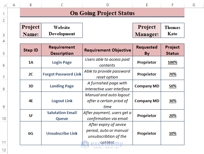
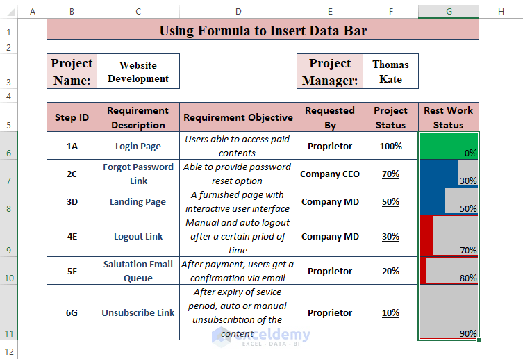
We have a dataset that depicts the ongoing project status in percentage. We want conditional formatting data bars in different colors.
Apply Conditional Formatting Data Bars with Different Colors: 3 Easy Ways
For different colored data bars, the typical insertion of the Conditional Formatting Data Bar won’t work. The typical Data Bar allows users to choose only one shade of color. To display data bars in different or multiple colors, users need to use formulas and functions. The coloring typically indicates the percentages, such as green indicates >= 75%, blue between >= 50% and < 70%, and red >=0% and < 50%.
Method 1 – Using Formulas for Conditional Formatting with Data Bars in Different Colors
Steps:
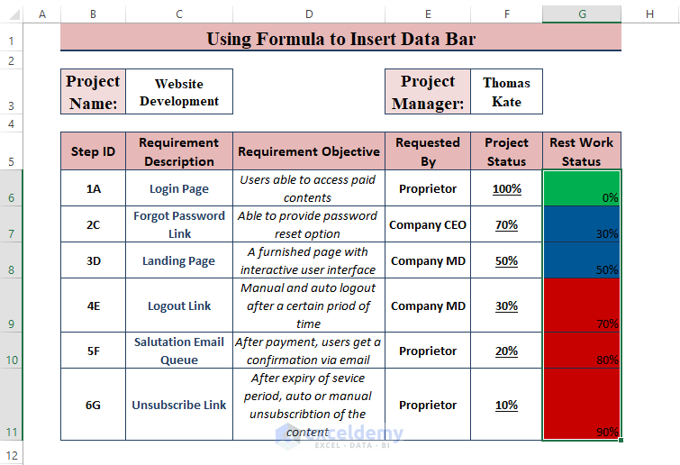
- Find the remainders of work percentages with the following formula in cell G6, then drag the Fill Handle.
=1-F6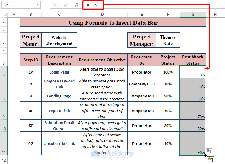
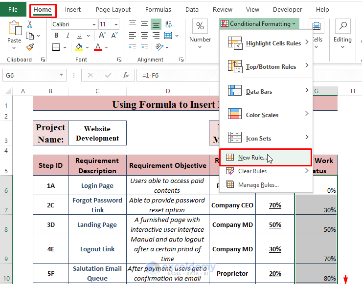
- Select the new range.
- Go to Home and Conditional Formatting, then choose New Rule.
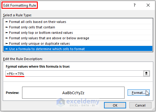
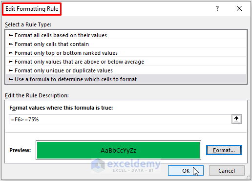
- The Edit Formatting Rule window appears.
- Choose the Use a formula to determine which cell to format rule under Select a rule type.
- Use the following formula under Edit the Rule Description.
=F6>=75%- Click on Format.
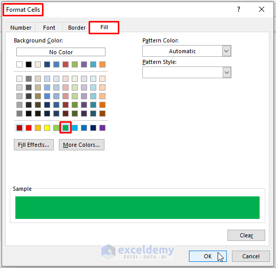
- The Format Cells window appears.
- Click on Fill.
- Choose the desired Fill color (i.e., green for >=75%).
- Click on OK.
- Excel returns to the Edit Formatting Rule window.
- Click on OK.
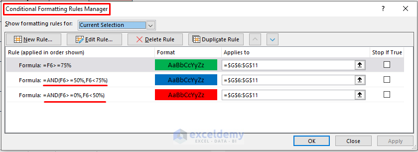
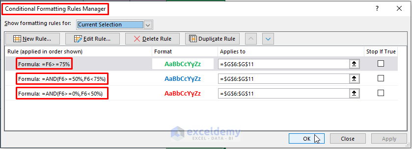
- Add a New Conditional Formatting Rule for another 2 formulas. Replace each formula with the below formulas under Edit the Rule Description and use a different fill color.
=AND(F6>=50%,F6<75%)=AND(F6>=0%,F6<50%)- Here’s an overview of the Rules Manager.
- Here’s the result.
- Select the formatted range.
- Go to Conditional Formatting and New Rule. Select the options as depicted in the image below and click OK.
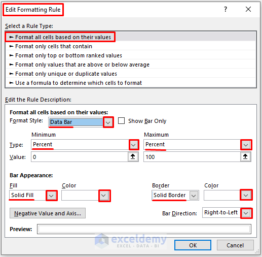
- Applying the Data Bar Format Style displays values as colored data bars.
Read More: Conditional Formatting with Data Bars Based on Another Cell in Excel
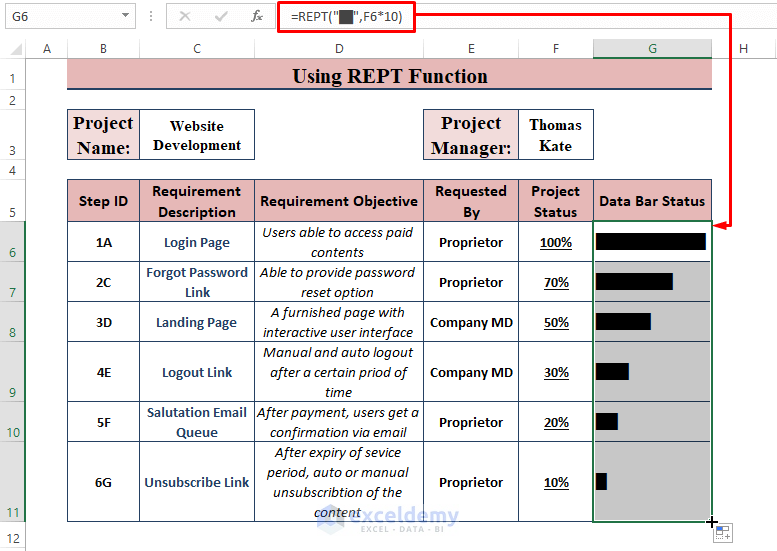
Method 2 – Using the REPT Function to Display Different Colors Data Bars
Steps:
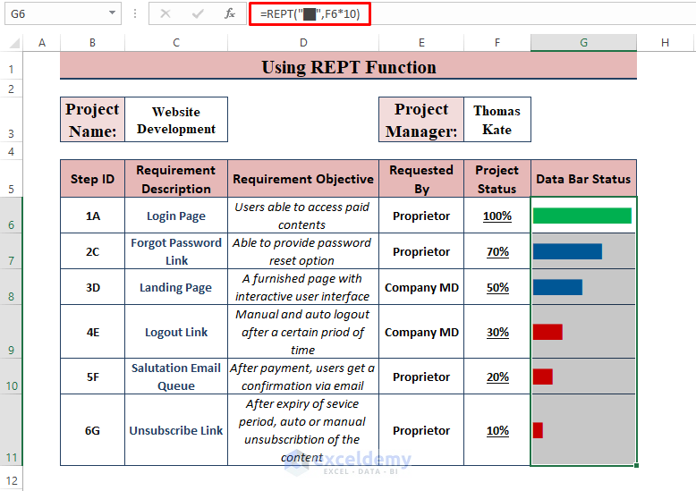
- Insert the following formula into G6, then AutoFill the column.
=REPT("█",F6*10)The formula repeats the solid black block based on the value in the F cell.
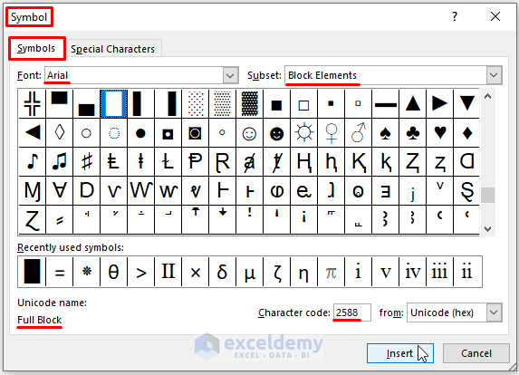
If you want to insert the symbol manually, go to Insert > Symbols (in the Symbols section). Choose Arial as Font, and Block Elements as Subset. Find a Full Block.
- Use the formulas outlined in Method 1 to change the cell formatting. This time, change the Font color rather than the Fill color.
- Return to the worksheet and you’ll see all the cells have colored data bars.
Method 3 – Displaying the Deviation from the Average in Data Bars with Different Colors
Steps:
- Use the following formula in cells in the G column to find the deviation values from the average.
=F6-AVERAGE($F$6:$F$11)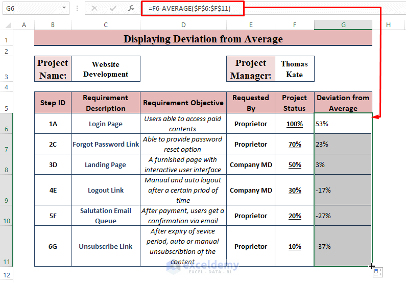
- Select the new range.
- Go to Home and Conditional Formatting, then choose Data Bars.
- Select Light Blue Data Bar (in the Solid Fill section).
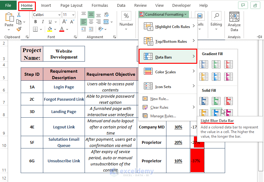
- Excel inserts the data bars in different colors, displaying the existing contrasting values as depicted in the following picture.
Download the Excel Workbook
Related Articles
- How to Add Data Bars in Excel
- How to Add Solid Fill Data Bars in Excel
- How to Use Data Bars with Percentage in Excel
- How to Define Maximum Data Bars Value in Excel
- [Fixed]: Conditional Formatting in Data Bar Percentage Not Working in Excel
<< Go Back to Data Bars | Conditional Formatting | Learn Excel
Get FREE Advanced Excel Exercises with Solutions!

Have a look at this. I made it for Excel 2010 but it still works for me with Office365.
https://digimac.wordpress.com/2014/06/29/multicoloured-data-bars-in-excel/
Hello David M,
Thanks for sharing the link! It’s great to hear that the solution for Excel 2010 works well in Office 365 too. It’s always helpful to find methods that can be applied across different versions of Excel. I’ll check out the detailed steps you’ve provided. You can also explore more ways to use conditional formatting with different color schemes in Excel on ExcelDemy’s site.
Regards
ExcelDemy