Latest Posts From Nasir Muhammad Munim

Step 1 - Choosing an XML File The XML file code attached in the below image will be used. The structure is needed to create an XML mapping. ...
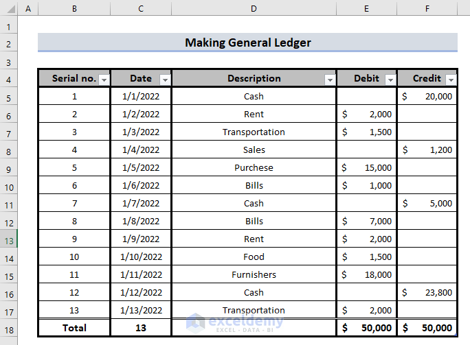
Step 1 - Input Fields and Choose the Range Select data to input into the General Ledger. A typical ledger has 5 fields: Serial no., Date, Description, ...
Method 1 - Using the Context Menu to Exit Full Screen Steps: Right-click anywhere in the workbook. Select Close Full Screen. Method 2 - ...

We will consider this example below. Here, the dataset contains the number of different products sold over three days and their Product IDs. Method ...

Method 1 – Using the Simple Formula Steps: Select the cell where we will keep the updated value. In our case, cell E5. The entire column called New ...
Method 1 - Using Excel Built-in Option to Remove the Automatic Page Break Steps: Open the worksheet and then go to Files in the top left corner. ...

While working on Excel, we encounter different views like Normal View, Print Preview, Page Break Preview, Custom View, etc. In this article, we will be ...

In this Excel tutorial, we will demonstrate how to hide and unhide the status bar. Reasons for hiding or unhiding the status bar in Excel mostly depend on ...
Method 1 - Creating Column Headers by Freezing a Row Steps: Click the View tab. Choose the frame right inside the row and column to create ...

We often face trouble while changing alignment according to our needs in Excel. If you are facing the same, this tutorial will show you 5 different methods to ...

This guide will use the following dataset: Step 1: Build a Formula to Convert From Numbers to Words The following formula is huge but it give you ...

A Trendline is a popular way to make predictions in Excel. Often, we need to find the Trendline equation to see the slope and the constant. Excel has a feature ...

Excel is often used to make charts and graphs that show how data looks. We often put labels on charts to help us understand them better. Also we try to put the ...

This is the sample dataset. This is the corresponding pie chart: Method 1 - Exploding a Pie Chart Using the Mouse Cursor ...

Column Charts can be used to show how data changes over time or to show comparisons between things. In Column Charts, the categories are usually lined up along ...
See Our Reviews at


Dear KAREN CAYANAS,
Thanks for reaching out to us with your problem.
This problem occurs when you do not have enough view area on the monitor. While there is no particular fix to your problem, if you want to keep the cell styles in the Ribbon, you may consider removing some unnecessary groups from the Home tab.
To do so follow these steps:
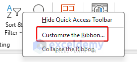
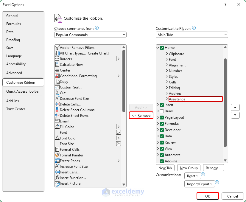
1. Right-click on the empty area of the Ribbon.
2. Select “Customize the Ribbon“.
3. From the Home tab dropdown, select and remove unnecessary groups one by one.
4. Click on OK to finish the process.
After removing the groups, cell styles will be visible without the “Cell Styles” drop-down if there is enough room in the Ribbon.
Regards,
Exceldemy
Hi Arthur,
Thank you for finding out about this issue. We have updated the VBA code to avoid the “Sub or Function Not Defined” error. Please try again with this new code and let us know if this problem still exists or not.
Regards,
Team Exceldemy
Dear AVI,
We can assure you that if you followed the steps correctly, everything should be fine with the tutorial. Moreover, both of these formulas are single-cell output formula. So, the procedure for the array formula implementation or pressing CTRL+SHIFT+ENTER is not required here.
If you want to take all the data to find out the standard deviation without conditions or avoid taking the false as 0, you should have a look at our article How to Calculate Average and Standard Deviation in Excel.
Regards,
Exceldemy
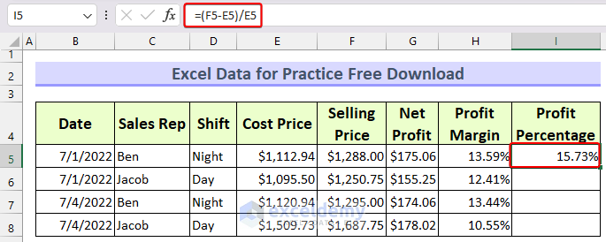
Dear Fardeen,
The profit margin is the percentage you get from the selling price. The formula for profit margin is: (Selling Price-Cost Price)/Selling Price or, Net Profit/Selling Price
The profit margin is calculated in the worksheet with the formula: =(F5-E5)/F5
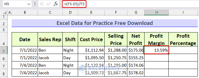
On the other hand, the profit percentage is calculated based on the Cost Price. The formula for profit percentage is: (Selling Price-Cost Price)/Cost Price or, Net Profit/Cost Price
The profit percentage is calculated in the worksheet with the formula: =(F5-E5)/E5
Regards
Exceldemy