Method 1 – Use Trendline Feature to Extrapolate a Graph in Excel
1.1 Extrapolate Linear Graph by Trendline Feature
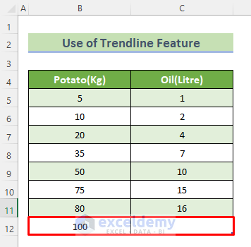
Extrapolate a Linear graph in Excel, let us assume we want to find out how much oil is needed for 100 kg of potatoes.
To find that out, we should follow the following steps.
Steps:
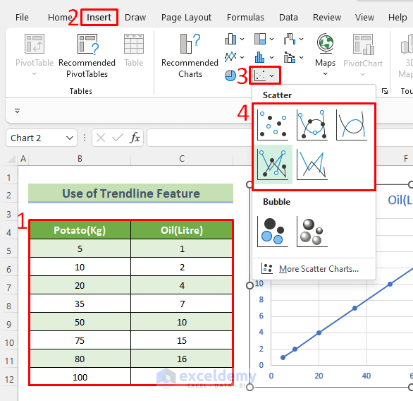
- Choose the range of data (B4:C12).
- Go to the ribbon and click on the Insert tab.
- Click on the Scatter chart in the chart area (you can pick up the Line chart too).
- Click on the (+) sign beside the chart and open Chart Elements.
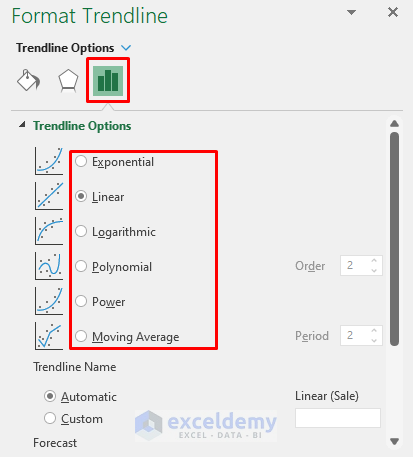
- Enable the Trendline feature to predict the expected data from the graph. If you double-click on the graph’s trend line, you can open the Format Trendline panel and make your own changes.
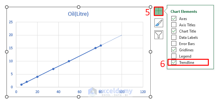
We can see that 100 kg of potatoes will need almost 20 liters of oil. We can make this prediction even more accurate by adding more ranges.
1.2 Extrapolate Non-Linear Graph by Trendline Feature
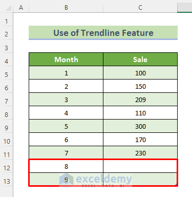
Extrapolating a graph of Non-Linear data in excel, let us assume we want to find out the sales for the 8th and 9th months from previous data.
Steps:
- Use the given data to make a Scatter plot by following the steps above for Linear Data.
- Press on the (+) sign beside the chart and open Chart Elements.
- Selecting Trendline, we can have a Linear Trendline. Choosing the arrow beside, you can have multiple trendline options like Exponential, Moving Average, Logarithmic.
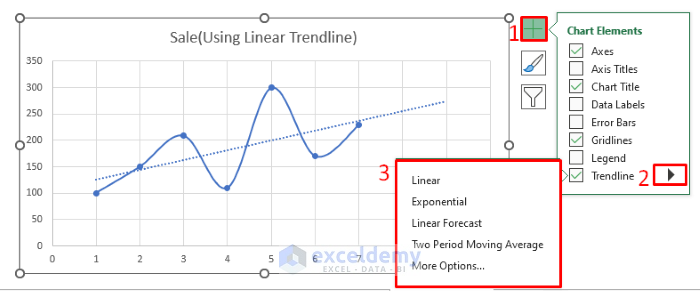
- Clicking More Options, we can have more types of trendlines and options to edit the trendline.
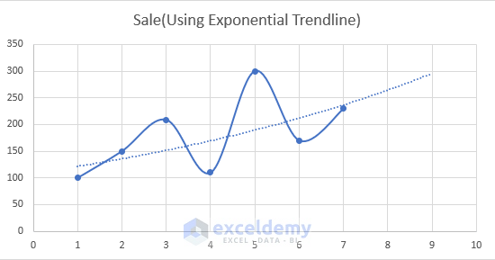
An example of an Exponential Trendline.
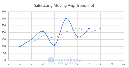
Moving Average Trendline in the below image. See Moving Average trendline is closer to our real graph.
Method 2 – Extrapolate Graph in Worksheets
Steps:
- Select the entire data range (B4:C11).
- Go to the Data tab in the ribbon and select the Forecast Sheet option.
- A dialog box will appear. Find the Forecast End option and set it to the expected value. The expected value is 50.
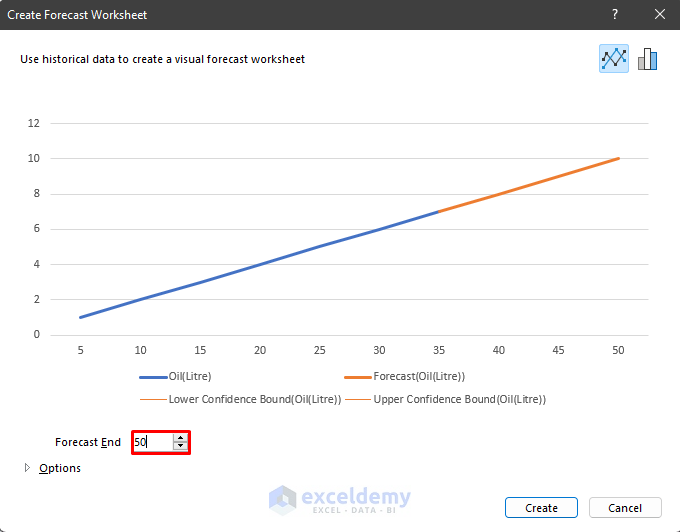
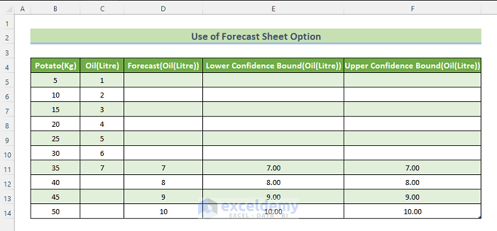
- Create button will create a new sheet with a table that has all the data up to 50 kg, along with an Upper and Lower Confidence Bound.
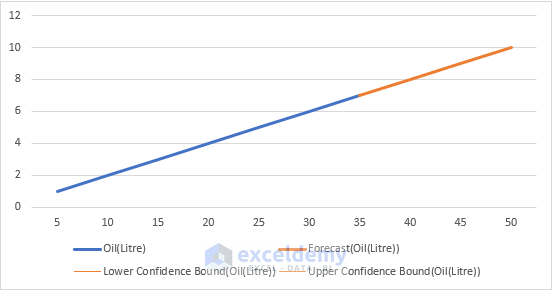
Create a linear graph with a trendline in it.
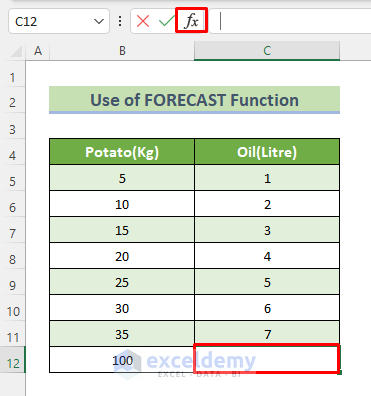
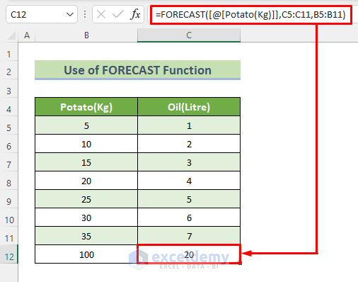
Data Extrapolation with FORECAST Function
Steps:
- Select the empty cell we want to forecast. Click on the function button in the formula bar.
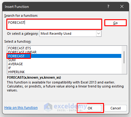
- A dialog box will appear. Search for the FORECAST function and select FORECAST from the results and click OK.
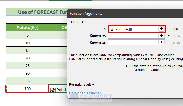
- A dialog box will appear. In this box, for X, select the cell that corresponding cell’s value we need to find out. The cell carries 100.
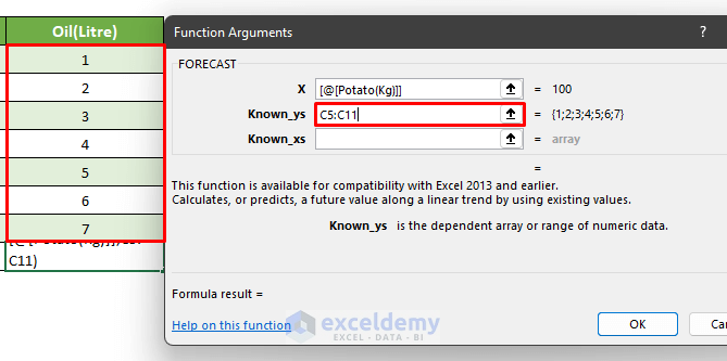
- For known_ys, select all the cells containing known oil amounts.
- For known_xs, select all the cells containing known potato amounts. Press OK.
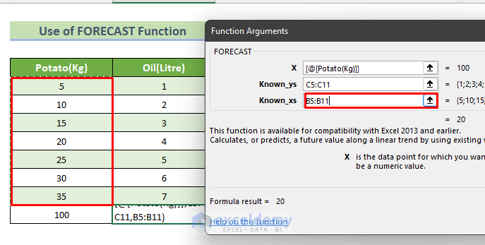
- We will have the forecasted value in the empty cell.
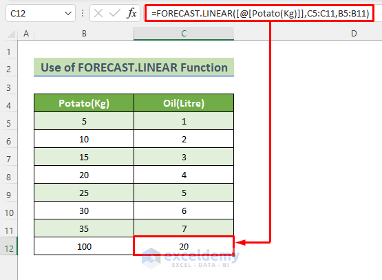
2. Use FORECAST.LINEAR Function
The FORECAST.LINEAR function is the same as the FORECAST function. Each and every step is similar as well. Here is an example of this method.
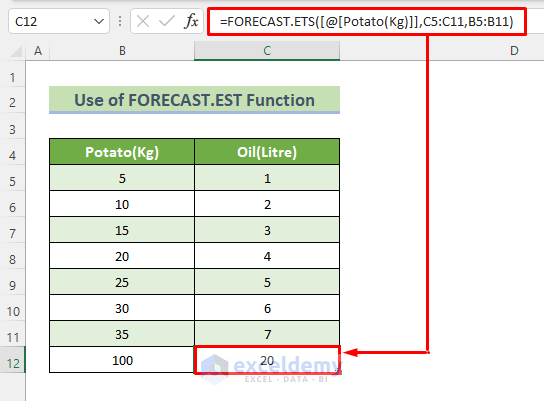
3. Apply FORECAST.EST Function
There is a seasonal pattern that needs a certain function to be able to predict the future. Use the FORECAST.EST function. This is the previous example with FORECAST.EST function:
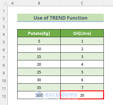
Extrapolate Data with Excel TREND Function
Excel also has a function called the TREND function that can be used to extrapolate data without making graphs. Using linear regression, this statistical function will figure out what the next trend will be based on what we already know. Here is the previous example of the FORECAST function with the TREND function.
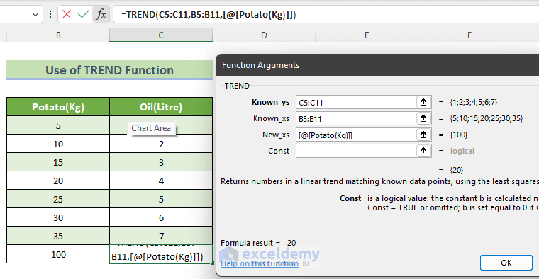
This is the output of using the TREND function.
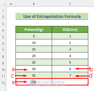
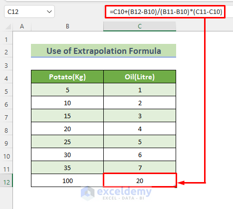
Use Extrapolation Formula to Extrapolate Data
We will put the Extrapolation Formula in the formula bar after selecting the desired cell. The extrapolation formula is:
Y(x) = b+ (x-a)*(d-b)/(c-a)
Here is an example of this method:
Apply this equation to the empty cell, we will get the extrapolated value like the picture below.
Things to Remember
- TREND and FORECAST functions might look like the same thing, but the difference is that the FORECAST function only works as a regular formula that returns one value. On the other hand, the TREND function is an array formula to figure out how many y values go with how many x values.
- Forecast Sheet only works when you have a constant difference between known values.
- Extrapolation isn’t very reliable because we can’t be sure that the trend of the data will continue beyond the range of our data. Also, there is no way to see if our prediction is right or not. But if our original data is consistent, we can use extrapolation to get a better idea.
Download Practice Workbook
You can download the practice workbook here.
Related Articles
- How to Fill a Series Based on Extrapolation in Excel
- How to Perform Linear Extrapolation in Excel
- How to Extrapolate Trendline in Excel
<< Go Back to Excel Extrapolation | Excel for Statistics | Learn Excel
Get FREE Advanced Excel Exercises with Solutions!
