What is an Animated Bar Chart Race?
A bar chart race is an effective graphic format to demonstrate a significant change in information over time, by displaying time series data in an animated bar chart. It presents statistics in a new, intriguing, and coherent manner.
How to Create Animated Bar Chart Race in Excel: Step-by-Step Procedure
This article will walk through the 4 stages required to create a dynamic bar chart race in Excel. First we will construct a dataset, then we will plot the data into a bar chart, and finally we will create a Macro using VBA code and assign it to a button to initiate the animation of the chart.
Step 1 – Set up Data Model
The dataset we will use shows monthly sales for the years 2020 and 2021, and has three columns titled Month, Sales(2020), and Sales(2021).
- Select the C4:D16 range.
- Press Ctrl+C.
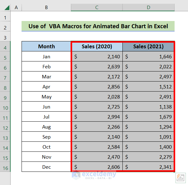
- Select the E4:F16 range.
- Press Ctrl+V.
Our model now looks like below.

Step 2 – Generate the Chart Data
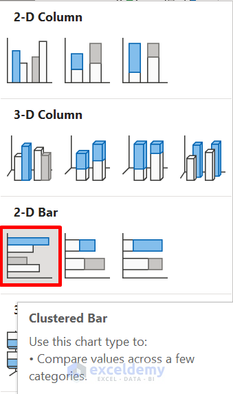
We still need another two columns to plot the data into the bar chart. We will copy both Sales columns and paste them beside the dataset to be more specific. Then we’ll plot a graph utilizing the columns created in the previous step. We’ll use a Clustered Bar Chart.
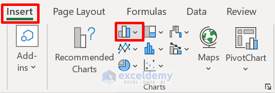
- Navigate to the Insert tab.
- Click on the Insert Column or Bar Chart icon from the Charts group.
- Click on the Clustered Bar icon from the 2-D Bar section.
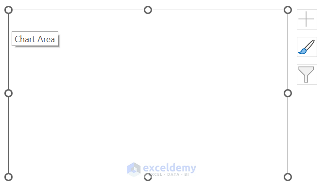
An Empty chart will appear like the one below.
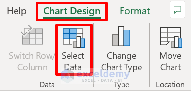
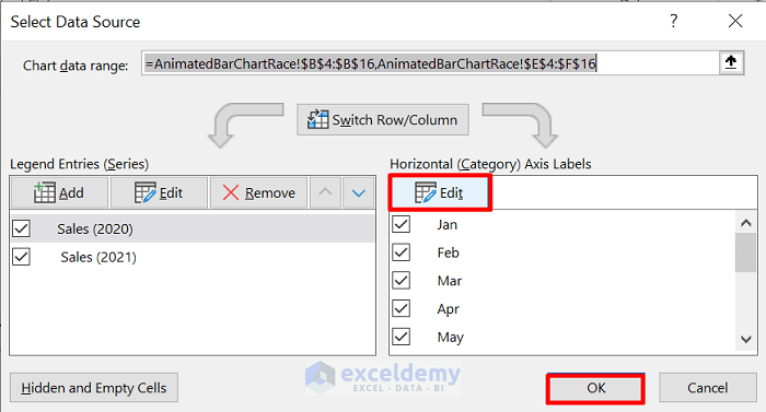
- Click anywhere on the chart, and go to the Chart Design tab, followed by Select Data.
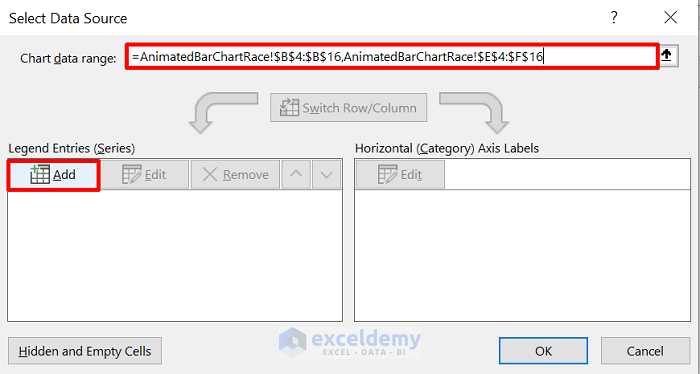
The Select Data Source window will open.
- Enter the Sheet Name followed by an Exclamation mark, then the range.
It is essential to use commas between several ranges.
- Click the Add icon in the Legend Entries section.
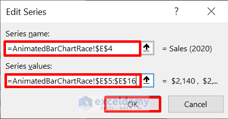
The Edit Series window opens,
- Enter the Series name and Series range for column E using the proper syntax described above
- Click OK.
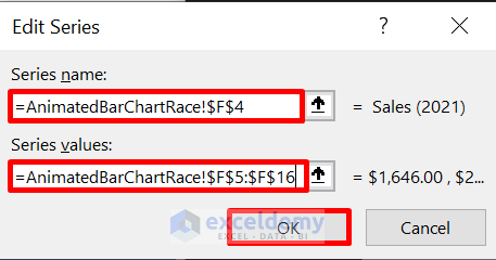
- Repeat the process for column F, then click OK.
- Go to the Select Data Source window.
- Choose Edit from the Horizontal Axis Labels.
- Click OK.
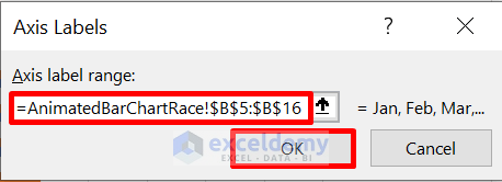
The Axis Labels window opens.
- Enter the range for column B in the box and click OK.
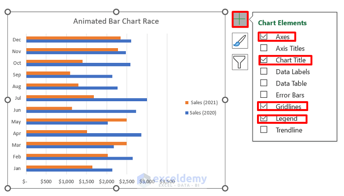
The chart will fetch data from the data model.
- Click on the Plus icon and check Axes, Chart Title, Gridlines, and Legend for this demo.
Read More: How to Create Animated Charts in Excel
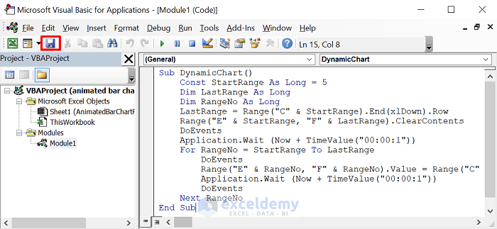
Step 3 – Build a Macro for Animated Bar Chart Race
Now we will write some VBA code to display the data in an animation. We will declare a procedure labeled DynamicChart, which will fetch data for the chart from the C and D columns while maintaining a delay, and paste it into the E and F columns.
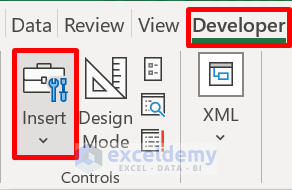
- Navigate to the Developer tab.
- Click on Visual Basic.
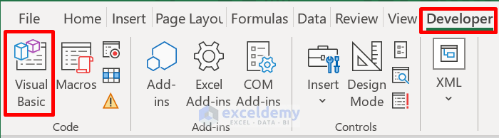
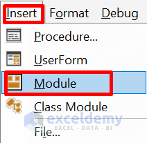
- Choose Insert, followed by Module.
- Enter the following code in the Module box.
Sub DynamicChart()
    Const StartRange As Long = 5
    Dim LastRange As Long
    Dim RangeNo As Long
    LastRange = Range("C" & StartRange).End(xlDown).Row
    Range("E" & StartRange, "F" & LastRange).ClearContents
    DoEvents
    Application.Wait (Now + TimeValue("00:00:1"))
    For RangeNo = StartRange To LastRange
        DoEvents
        Range("E" & RangeNo, "F" & RangeNo).Value = Range("C" & RangeNo, "D" & RangeNo).Value
        Application.Wait (Now + TimeValue("00:00:1"))
        DoEvents
    Next RangeNo
End Sub- Click the Save icon.
Step 4 – Generate a Button to Assign the Macro
Lastly, to make this application more user-friendly, we’ll build a START button and assign the previously built macro to it.
- Go to the Developer tab, followed by Insert.
- Draw a rectangle button in the space between the data model and the chart.
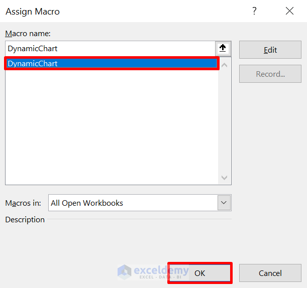
The Assign Macro window will appear.
- Choose the macro, in this case DynamicChart, and click OK.
- Select the button and rename it. In this case, to START.
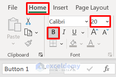
- Highlight the text and go to the Home tab.
- Select Bold from the Font group, and set the size to 20.
The button will look like below.
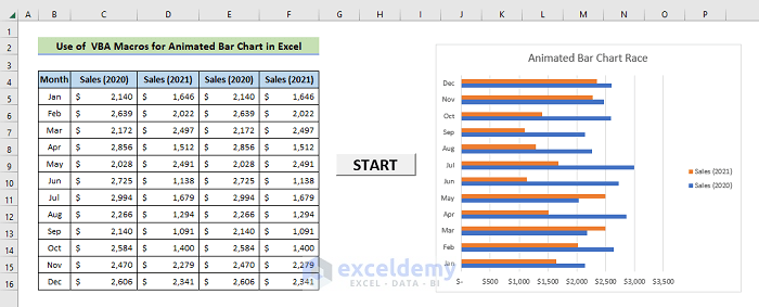
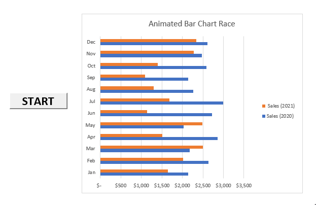
- Click the START button, and the intended output will appear as below.
Read More: How to Animate Text in Excel
Download Practice Workbook


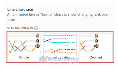
This article was realy great and I apprecite it a lot. But I have a question: is it possible to do this with lines instead of bars?
Thanks a lot.
Another question. I hav seen other types of race charts (bar and lines, but horizontally. Thru the time. I saw that in Flourish. Can this be done in Excel?
I guess it is needed to switch the axis, but else should be done?
Thanks a lot.
Hello Roge,
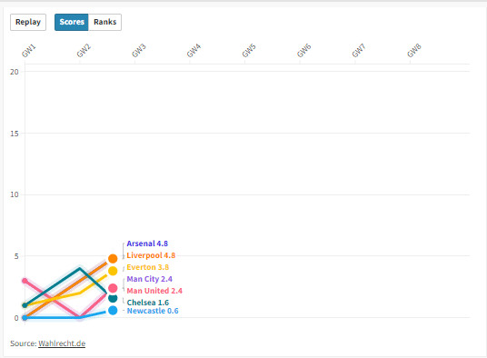
Thanks for your feedback! I understand you want to create a line chart race horizontally. Yes, it is possible to do so using Excel’s built-in animation features, VBA, or Flourish Studio. Though, I would recommend using Flourish Studio because it is so much easier.
To create a line chart race horizontally with Excel data and Flourish Studio, follow these steps:
1. Login into Flourish Studio.
2. Create a new project. Scroll down and select any template.
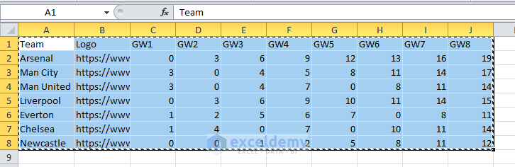
3. Line up your Excel data and copy.
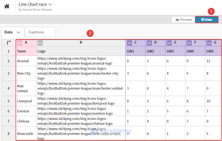
4. Go to the site again. Click Data and feed your Excel data by pasting.
5. Now, you can preview your data and modify it according to your requirements.
6. Finally, click on Export & Publish.
If you still need to implement this in Excel, post your problem at our Exceldemy Forum with sample data. Our team will reach out to you as soon as possible.
Regards,
Yousuf Khan Shovon