Method 1 – Generating Moving Average in Excel Chart
Select data.
Click Insert tabs>Charts ribbon.
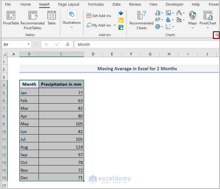
Click Recommended Charts or any chart option
See the following figure.
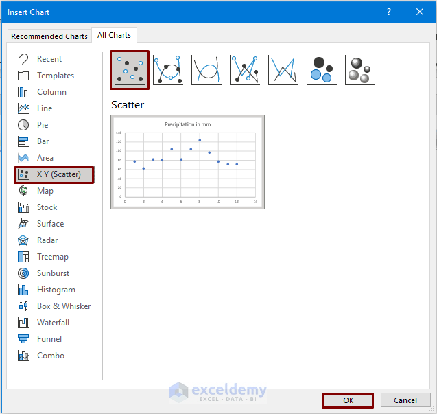
We chose the Scatter chart option, but you can pick another depending on your purpose.
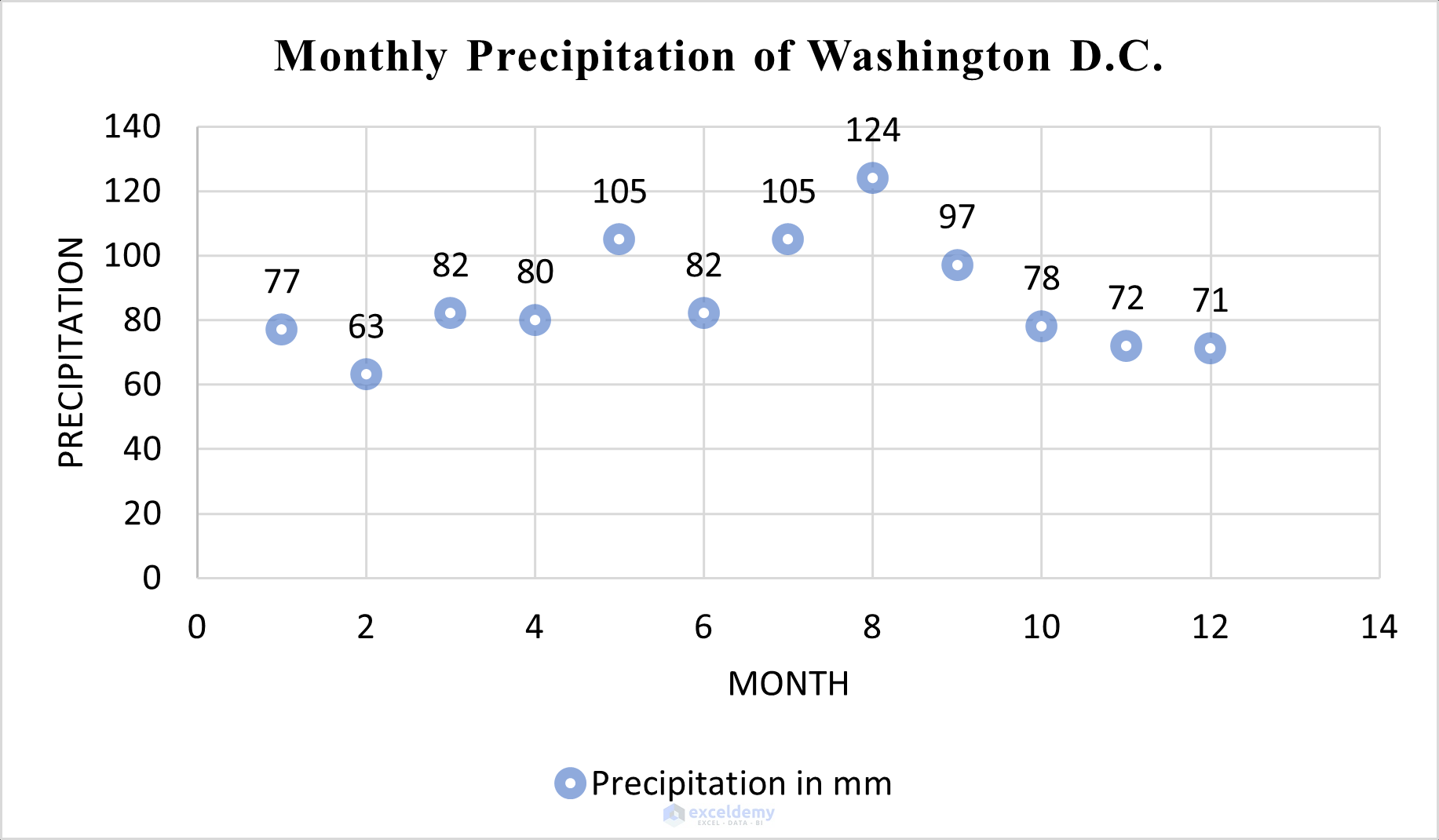
A chart is created like this.
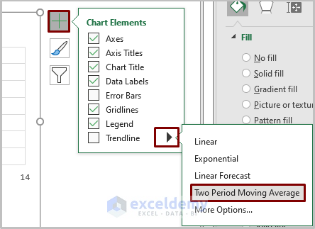
Follow the steps to create a moving average line.
Click the Plus (+) icon in the upper-right corner of the chart.
Move the cursor to the right arrow of the Trendline element.
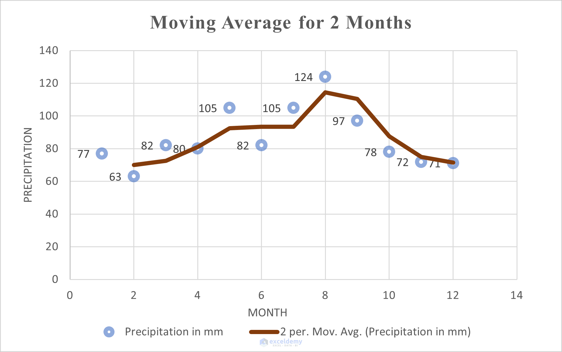
Choose the Two Period Moving Average option.
See the following moving average line for 2 months.
Using a formula, you can generate a simple moving average line in the chart without the calculation process.
Method 2 – Producing Simple Moving Average in Excel Chart
2.1. Simple Moving Average for 3-months
Pick More options from the Trendline element by moving your cursor on the element.
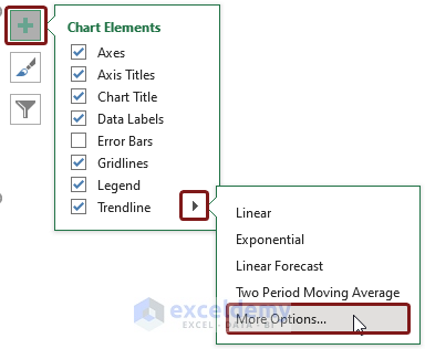
See a Format Trendline toolbar on the right side of Excel.
Click Trendline Options.
Choose the Moving Average option.
Fix the period to 3.
You can click the 2-month moving average line to discover the above Format Trendline toolbar in the same place. Set the period to 3.
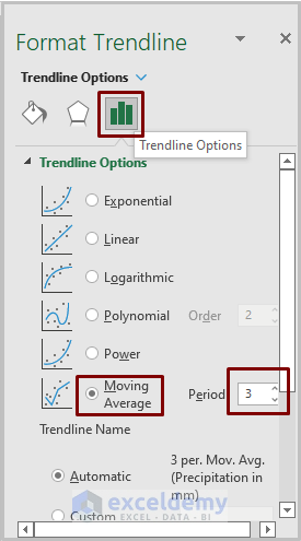
You’ll see the following output.
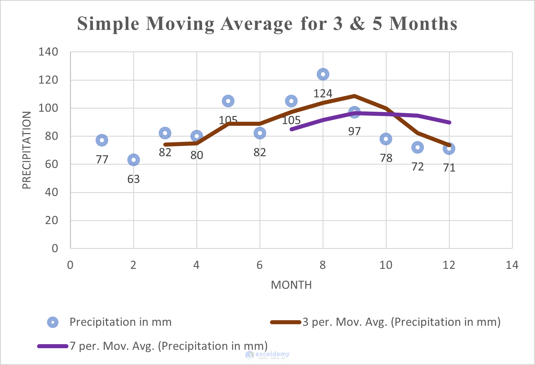
2.2. Adding a Second Simple Moving Average Line in Excel Chart
Add a second simple moving average line and follow the same process. Choose the period to 5.
The output will look like this.
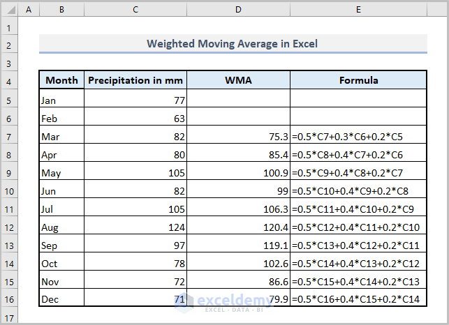
Method 3 – Calculating Weighted Moving Average in Excel Chart
The formula is:
=0.5*C7+0.3*C6+0.2*C5
C7 represents precipitation in March, C6 represents precipitation in February, and C5 represents precipitation in January.
If you select “Month”, “Precipitation in mm”, and “WMA” fields, and insert a line chart.
The output will be as follows.
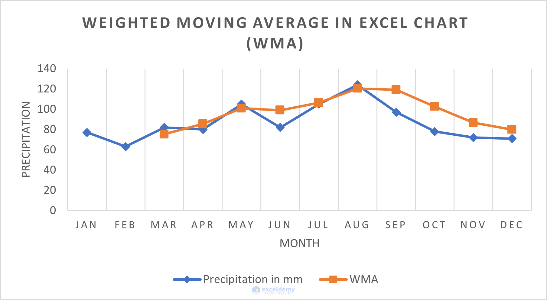
The above picture reveals that the weightage moving average provides a smoother moving average line than a simple moving average line.
Method 4 – Creating Exponential Moving Average in Excel Chart
St=α.Yt-1+(1- α)St-1
Formula Explanation:
Yt-1 means actual observation is made in the t-1th period.
St-1 refers to the simple moving average (SMA) in the t-1th period.
α (Alpha) denotes the smoothing factor calculated using the formula below.
α=2/(N+1)
N is the value of the period.
We mention that if the value of α is higher, the line will be less smooth.
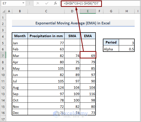
Input the following formula in Excel.
=$H$6*C6+(1-$H$6)*D7
Formula Breakdown:
H6 is the value of α where $ (dollar sign) is used as it is fixed.
C6 is the precipitation of February (actual observation).
D7 is the simple moving average for 3-months.
If you select the precipitation, SMA, and EMA fields and insert the line chart, you’ll see the following output.
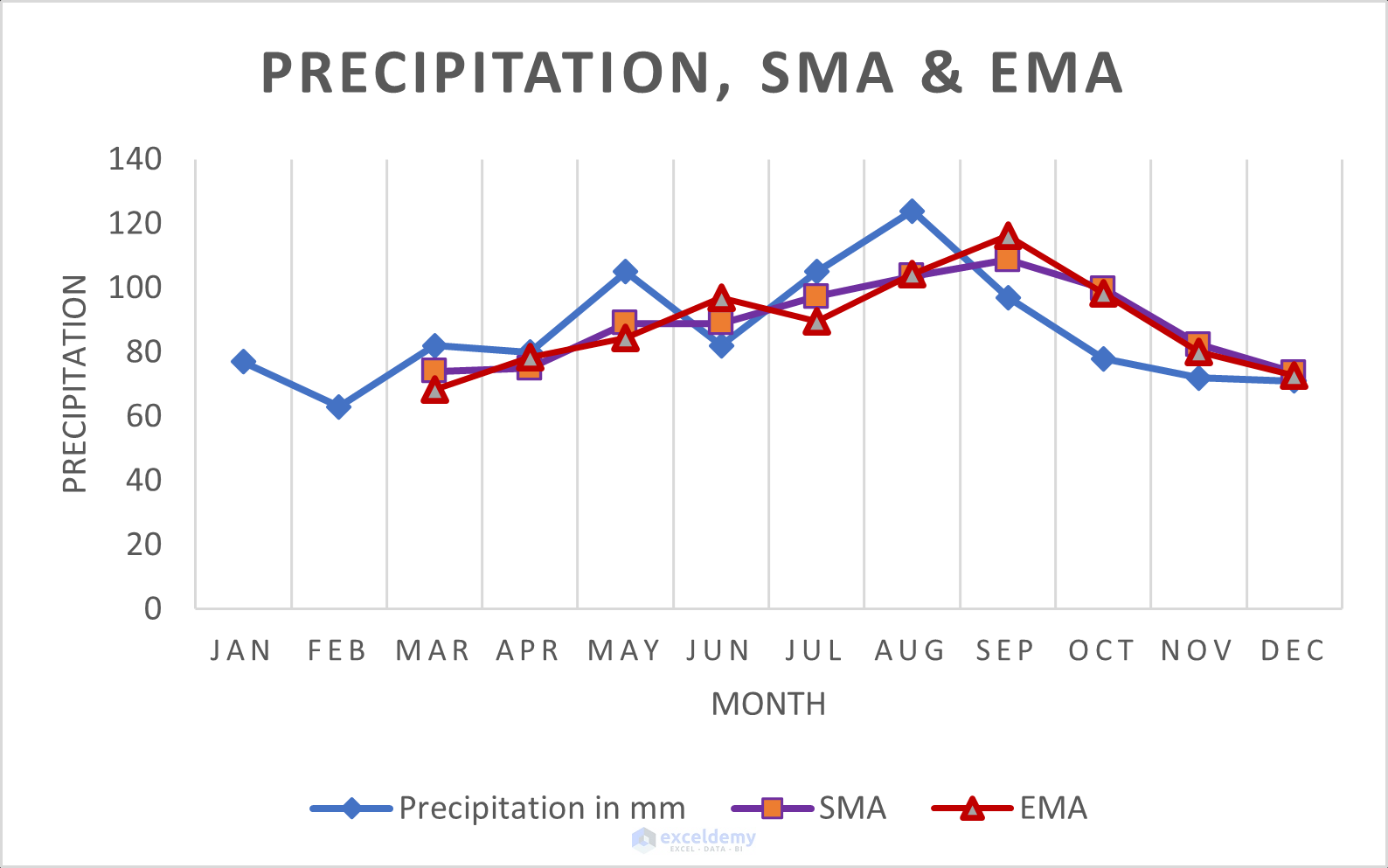
The weighted moving average (WMA) line is smoother than the exponential moving average (EMA) line. If the α is lower, the EMA line will be smoother.
Things to Remember
1. Be careful when selecting the cell for getting output as the period is related to this. For example, if you want to calculate a simple moving average line for 3 months, you have to blank above two cells.
2. Weighted moving averages (WMA) and exponential moving averages (EMA) can be used for forecasting.
Download Practice Workbook
Related Articles
- Calculate Moving Average for Dynamic Range in Excel
- How to Calculate Centered Moving Average in Excel
- How to Calculate 7 Day Moving Average in Excel
- How to Calculate Running Average in Excel
<< Go Back to Moving Average | Calculate Average in Excel | How to Calculate in Excel | Learn Excel
Get FREE Advanced Excel Exercises with Solutions!
