
Image by Editor
Data science doesn’t always require specialized programming languages or complex tools. By using Microsoft Excel’s right tools and techniques, you can execute a full data science workflow. It can handle many data science tasks with surprising power.
In this article, we will show how to create a complete data science workflow in Excel.
Consider a Sales & Marketing dataset that represents a company’s monthly performance across products and regions.
Import Your Data
Open a new Excel workbook and import your dataset. You can import data from various sources using the Get Data option in Excel.
Importing Data from Different Sources:
From CSV/Text Files:
- Go to the Data tab >> click Get Data >> click From File >> select From Text/CSV.
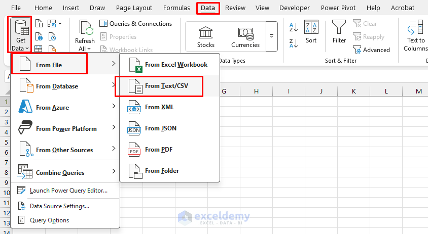
- Browse your data file.
- Select your file and click Import.

- In the preview window, verify data looks.
- Click Load or Transform Data to open Power Query Editor.

Power Query offers easier data cleaning and automation.
From the Web:
- Go to the Data tab >> select Get Data >> select From Web.
- Enter the URL of the web page containing your data.
- The Navigator will display available tables; select the one you want.
- Click Load to import the data.
From a Database:
- Go to Data tab >> select Get Data >> select From Database >> choose your database type.
- Enter server credentials and connection information.
- Select tables or write a custom query.
- Click Load to import the data.
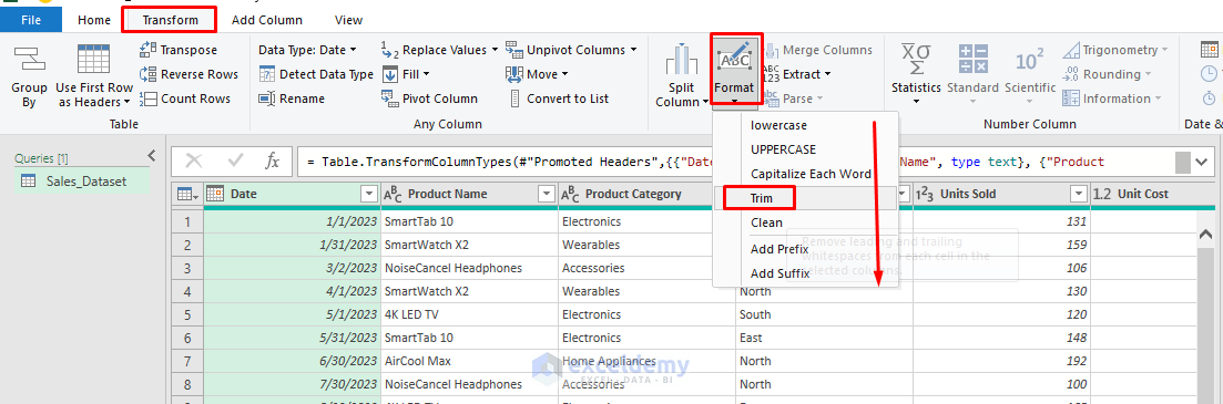
Data Cleaning and Transformation
Power Query Editor offers built-in features for data transformation and data cleaning.
Trim Text:
- Select columns.
- Go to the Transform tab >> select Format >> select Trim.
Check Data Types:
- Go to the Home tab >> select Data Type.
- Or, click on the column Header icon to change the data type.
- Date: Date
- Product Name, Category, Region: Text
- Units Sold, Unit Cost, Marketing Spend, Total Sales, Net Profit: Whole Number or Decimal

Remove Rows:
- Remove Duplicates:
- Select all columns.
- Go to the Home tab >> select Remove Rows >> select Remove Duplicates.
- Remove Blank Rows:
- Select all columns.
- Go to the Home tab >> select Remove Rows >> select Remove Blank Rows.
- Remove Errors:
- Select all columns.
- Go to the Home tab >> select Remove Rows >> select Remove Errors.

- Click Close & Load to bring the clean data into Excel.

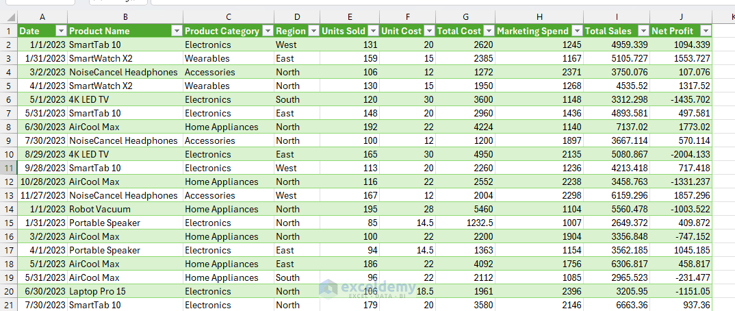
Dataset:
Exploratory Data Analysis (EDA)
Start by exploring key metrics using PivotTables and descriptive statistics.
Descriptive Statistics
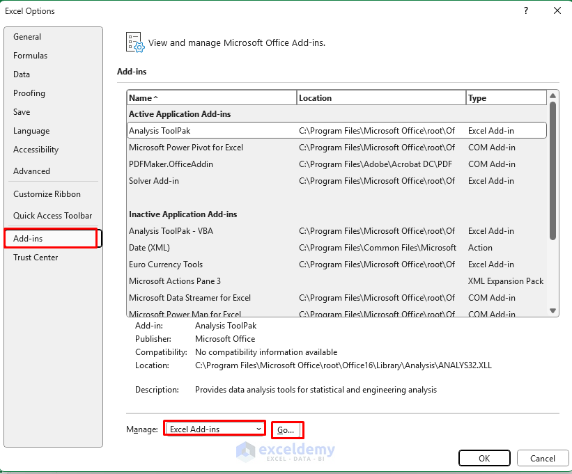
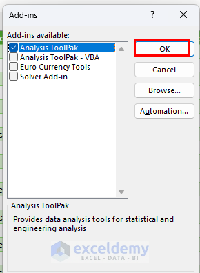
Enable the Analysis ToolPak:
- Go to the File tab >> select Options.
- In the Excel Options box;
- Select Add-ins >> select Excel Add-ins in the Manage box >> click Go.
-
- Select Analysis ToolPak >> click OK.
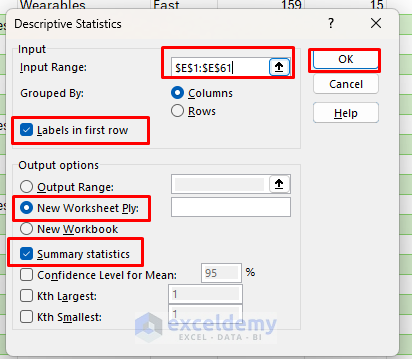
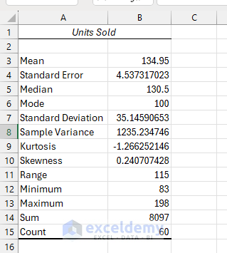
Summary Statistics of Units Sold:
- Go to the Data tab >> select Data Analysis >> choose Descriptive Statistics.
- Click OK.

- In the Descriptive Statistics box;
- Input Range: Select Units Sold (e.g., E1:E61).
- Select Labels in first row.
- Output: Select New Worksheet ply.
- Check the Summary statistics.
- Click OK.
Output:
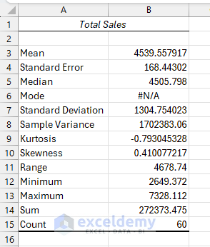
Summary Statistics of Total Sales:
- Follow the previous steps.
- Insert Input Range: Total Sales (e.g., I1:I61).
Create PivotTables
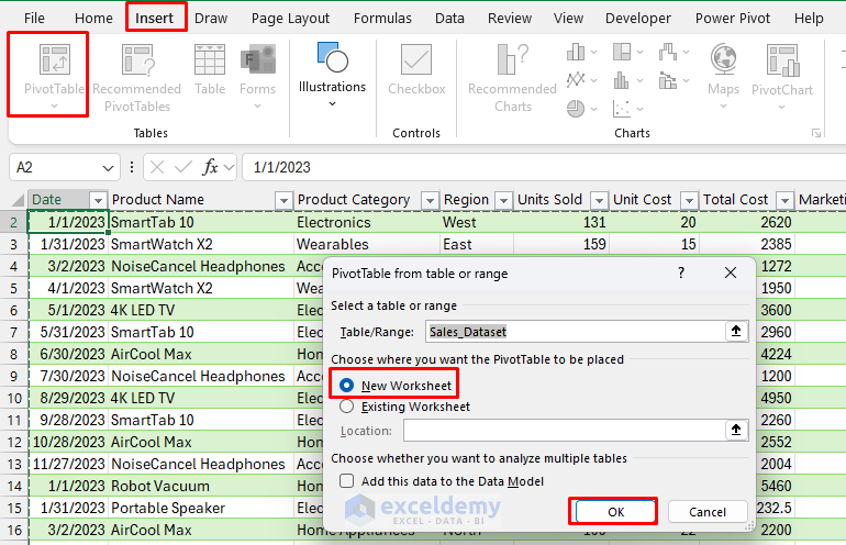
Let’s create a pivot table to analyze the sales dataset:
- Select the data range.
- Go to the Insert tab >> select PivotTable.
Sales by Product Category Analysis:
- Create a PivotTable.
- In the PivotTable Field list;
- Drag Product Category to the Rows field.
- Drag Total Sales to the Values field.

- Go to the PivotTable Analyze tab >> select PivotChart.
- Select the Pie chart.

Sales Trends Over Time:
- Create another PivotTable.
- In the PivotTable Field list;
- Drag Date to Rows field. Keep only the Month.
- Drag Total Sales to the Values field.
- Create a Line chart to visualize the monthly sales trend.

Regional Analysis:
- Create a PivotTable.
- In the PivotTable Field list;
- Drag the Region to the Row field.
- Drag Total Cost to the Values field.
- Drag Total Sales to the Values field.
- Drag Net Profit to the Values field.
- Create a Column chart to visualize.

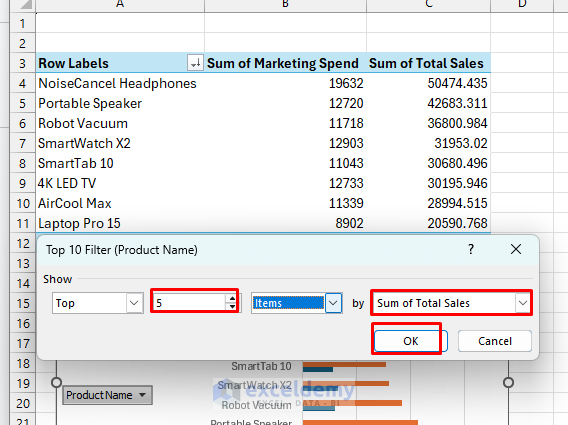
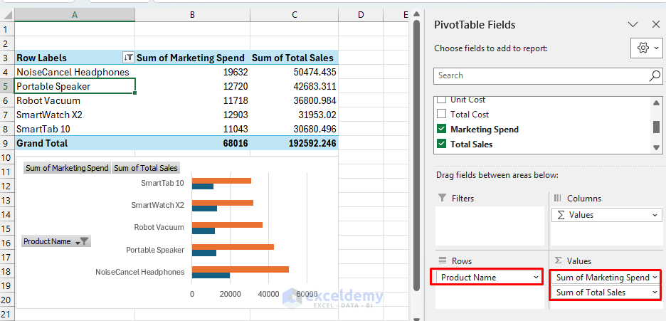
Product Performance:
- Create a PivotTable
- In the PivotTable Field list;
- Drag Product Name to the Rows field.
- Drag Total Sales to the Values field.
- Sort by Total Sales descending to identify the top products.

- Show the top 5 products using Value Filters.
Output:
Interactivity
Insert Slicers:
- Select PivotTable.
- Go to the PivotTable Analyze tab >> click Insert Slicer >> select Product Name.
Insert Timeline:
- Select PivotTable.
- Go to the PivotTable Analyze tab >> click Insert Timeline >> select Date.

Verify Interactivity:

Simple Modeling (Linear Regression)
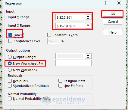
Let’s model Total Sales as a function of Marketing Spend.
- Go to Data tab >> select Data Analysis.
- Choose Regression >>click OK.
- In the Regression box;
- Input Y Range: Select the Total Sales column (e.g., I1:I61).
- Input X Range: Select Marketing Spend column (e.g., H1:H61).
- Check the Labels if you selected the headers (H1, I1).
- Output Range: Select New Worksheet Ply.
- Click OK.
Interpret the Output:
- R Square: Explains variance. Higher = better fit.
- You can predict revenue in a new column using:
=Intercept + Coefficient * [Marketing Spend]
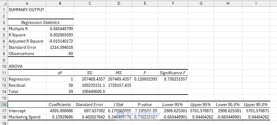
- R Square = 0.0021
- Marketing Spend explains only 0.21% of the variation in Total Sales: a very weak relationship.
- P-value for Marketing Spend = 0.7302
- Not statistically significant (p > 0.05). Changes in marketing spend don’t meaningfully impact sales.
- Intercept = 4305.10
- This is the baseline sales when Marketing Spend is zero.
Coefficient Interpretation:
| Predictor | Coefficient | Meaning |
| Intercept | 4305.10 | When Marketing Spend is 0, the predicted Total Sales is $4305. |
| Marketing Spend | 0.1393 | For each additional $1 spent on marketing, Total Sales increase by $0.14, on average. |
Regression Equation:
Total Sales = 4305.10 + 0.1393 × Marketing Spend
The regression analysis shows that Marketing Spend has no statistically significant impact on Total Sales based on the dataset. Although the coefficient suggests a small positive relationship (every $1 spent increases sales by $0.14), the very high p-value (0.73) and low R-squared (0.002) indicate that this effect is weak and likely due to chance.
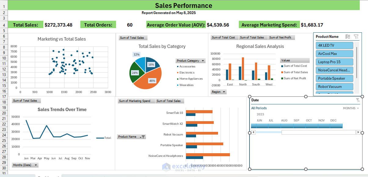
Insight Communication: Dashboard
Let’s create a dashboard sheet using created PivotTables, charts, and KPIs.
- Add Title and Date section:
- Add your company logo (if available).
- Add dashboard title “Sales Performance”.
Add dynamic date:
="Report Generated on "&TEXT(TODAY(),"mmmm d, yyyy")
- Add Summary Metrics Section:
- Insert KPI Cards.
- Total Sales:
=SUM(Sales_Dataset[Total Sales])
-
- Average Marketing Spend:
=AVERAGE(Sales_Dataset[Marketing Spend])
-
- Total Orders:
=COUNTA(Sales_Dataset[Unit Sold])
-
- Average Order Value:
=SUM(Sales_Dataset[Total Sales]) / COUNTA(Sales_Dataset[Total Sales])
-
- Pull values from your Summary Statistics sheet.
- Add Visualization Sections:
- Copy marketing vs sales scatter plot.
- Copy your monthly sales trend chart.
- Copy your product category pie chart.
- Copy your regional sales bar chart.
- Copy your product performance column chart.
- Adjust size and position for optimal layout.
- Connect Charts to Slicers and Timeline:
- Right-click on the Slicers and Timeline >> select Report Connections.
- Select all the PivotTables >> click OK.
- Format and Finalize Dashboard:
- Apply a consistent color scheme.
- Add borders and backgrounds to sections.
- Ensure all charts have clear titles.
- Add data labels where appropriate.
Conclusion
Excel is an incredibly powerful tool for data analysis. By using advanced features and options, you can create the entire data science workflow. By combining Power Query, descriptive tools, modeling capabilities, and dashboard features, Excel transforms from a simple spreadsheet tool into a practical data science platform. Though specialized data science tools offer more advanced capabilities, Excel provides an accessible starting point for many data science workflows.
Get FREE Advanced Excel Exercises with Solutions!
