Download Practice Workbook
Method 1 – Using Moving Average Method for Forecasting Data Analysis in Excel
1.1 Using Data Analysis Command
We will use the following dataset to demonstrate how time series analysis and forecasting are done using the moving average method.
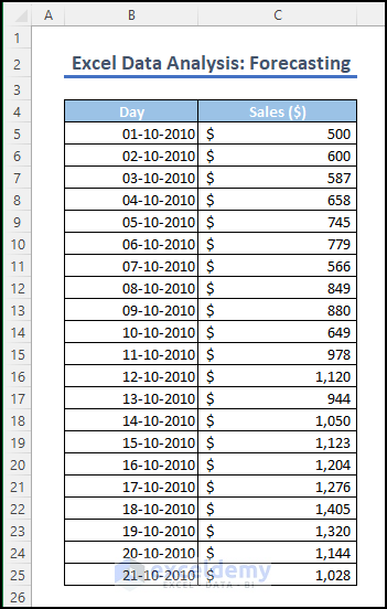
Assume that a retail company has collected sales data from 1-10-2010 to 21-10-2021. They are interested in forecasting the sales value for the next day. To accomplish this, we can utilize time series analysis techniques in Excel.
To smooth out daily sales changes over a week, we’ll add a new column called Average and calculate the average of seven consecutive days. We’ll repeat this process by shifting the 7-day window each time to create a series of averages.
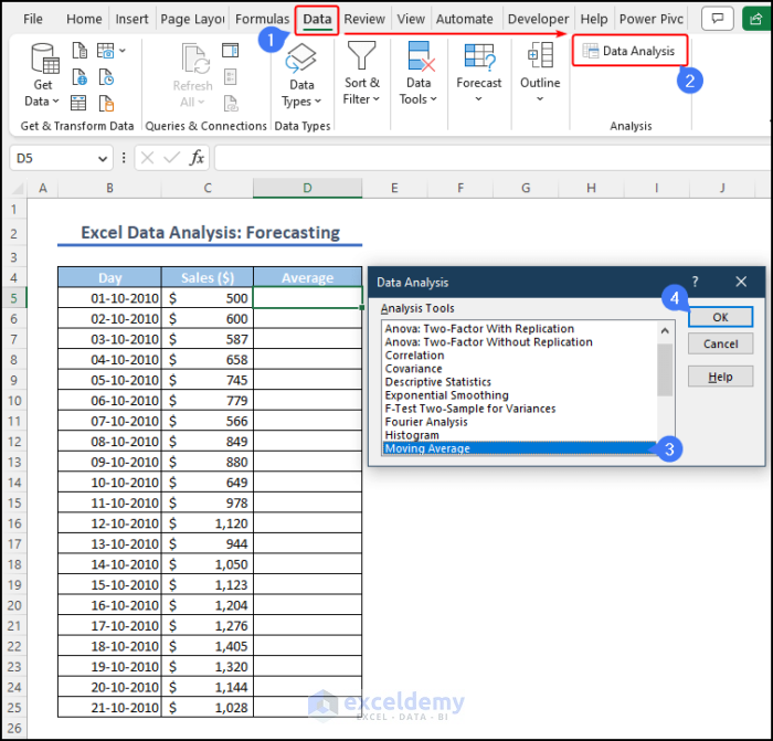
In Excel, there are two ways we can use the moving average method. The first approach is the following.
- Go to the Data tab and select Data Analysis from the Analysis This action will open a new window displaying a range of available data analysis techniques. Locate and choose the Moving Average option from the list, click OK to proceed.
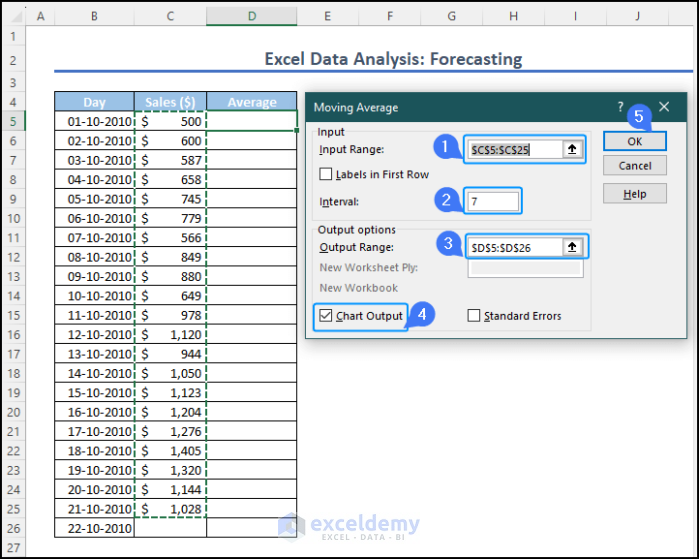
- From the Moving Average window, specify the input range, which in this case is the sales column ($C$5:$C$25). Since we are calculating the average of 7 days, set the interval to 7.
- Define the output range as $D$5:$D$26. If you want to visualize the results in a chart, check the chart output Once you have made these selections, click OK to generate the moving average.
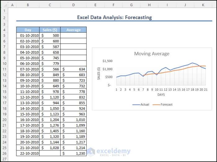
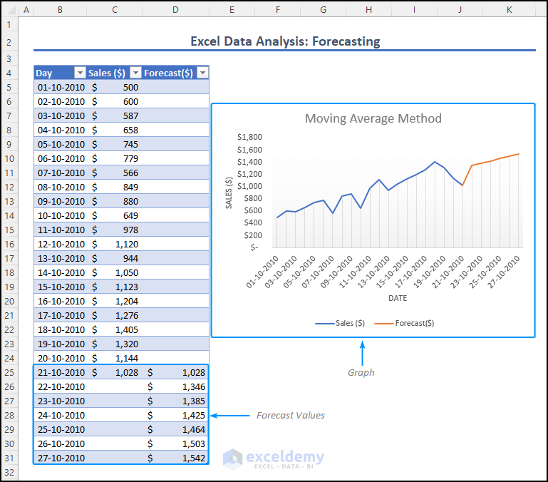
Excel will calculate the averages in the specified output range, which in this case is the Average column ($D$5:$D$26). Excel will generate a chart that displays the moving average curve and the forecasted values.
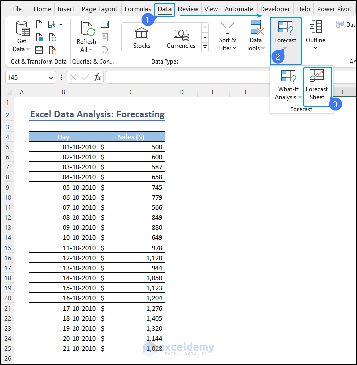
1.2 Using Forecast Sheet Command
- Go to the Data tab and select the drop-down menu of the Forecast option.
- Choose the Forecast Sheet option to proceed.

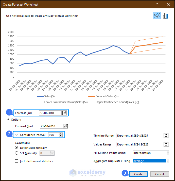
- In the Create Forecast Worksheet window, select the forecast end For example, in this case, it is 27-10-2010.
- You have the option to check the confidence level, which shows the upper and lower confidence values.
- Click Create to generate the forecast.
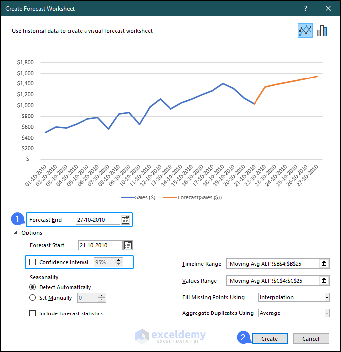
- We will obtain the forecasted values for the next seven days, from 21-10-2010 to 27-10-2010 in the forecast The graph will display the distribution of the data, providing a visual representation of the forecasted values.
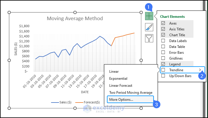
- After selecting the chart, you will notice three options at the top right corner. Click on Chart Elements represented by a plus sign. From the list, choose Trendline. A menu will appear with various trendline options. Select More Options.
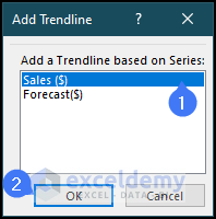
- A window named Add Trendline will appear. Choose the Sales ($) option and click OK.
- On the right side of Excel, you will see a new option named Trendline Format. This option allows you to customize and format the trendline according to your preferences.
- To select the moving average option, click on the Moving Average Enter the value 7 in the box beside the Period option. This indicates that we are calculating the average of 7 days.
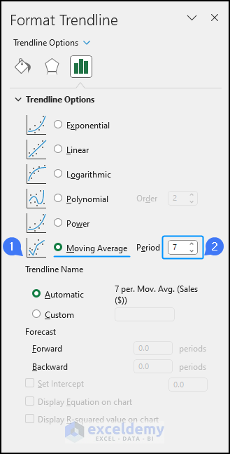
- You will notice changes in the graph. A new trendline will be added, representing the moving average of the sales data.
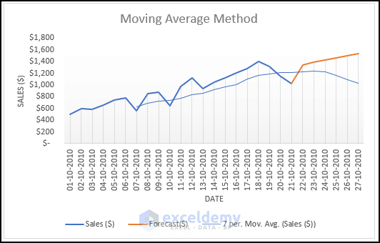
This trendline will also forecast future values based on the previous average data, providing insights into potential trends.
Method 2 – Applying FORECAST.ETS Function for Forecasting Data Analysis in Excel
Excel offers another method for forecasting called Exponential Smoothing. It involves smoothing past data trends and considering seasonality patterns and confidence intervals.
- Go to the Data tab, select the drop-down menu from the Forecast option and choose Forecast Sheet.
- In the Create Forecast Worksheet window, specify the forecast end date (e.g., 27-10-2010). You can check the confidence level to view the upper and lower confidence values.
- Click Create to generate the forecast.
- The resulting dataset will include three additional columns. The first column will display the forecasted sales values. If you click on the columns, you can see that the values are calculated using the FORECAST.ETS function. The second column will show the lower confidence bound and the third column will display the upper confidence bound.
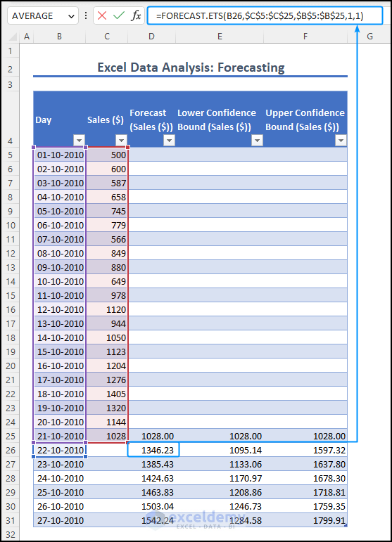
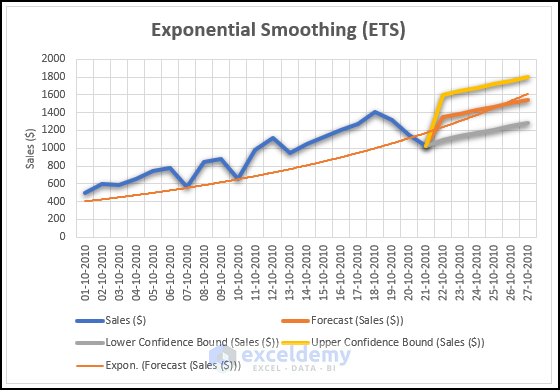
The generated graph will display the forecasted sales values, including the upper and lower bounds. It will also feature an exponential trendline to visualize the overall trend.
You can use exponential smoothing (ETS) to forecast values based on any given data.
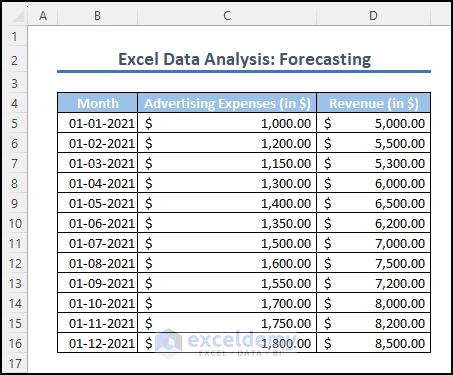
Method 3 – Using Regression Analysis for Forecasting Data Analysis in Excel
There are also two ways we can do regression analysis in Excel. We will be using the following dataset below to demonstrate both approaches.
Consider that a company wants to forecast its monthly revenue based on its advertising expenses. The company believes that there is a relationship between the amount spent on advertising and the resulting revenue. By analyzing historical data, the company aims to build a regression model to predict future revenue based on advertising expenses.
- Go to the Data tab and select Data Analysis from the Analysis Choose Regression from the list and click OK.
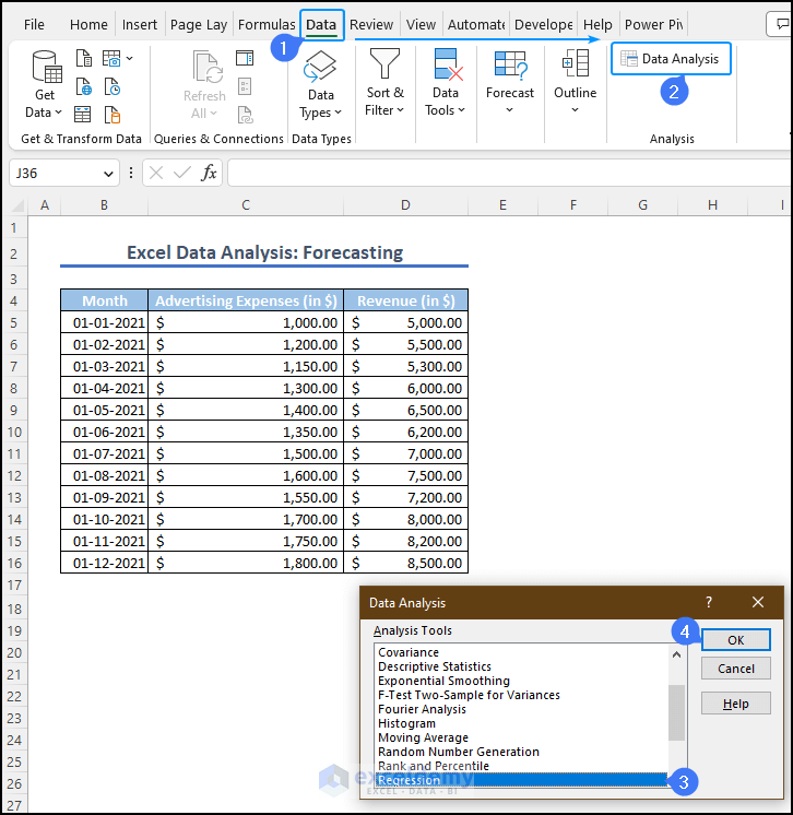
- This will open the Regression Select the input Y range, which represents the revenue column and the input X range, which represents the advertising expense column.
- Check the confidence level option to include confidence intervals. Specify the output range, like cell B18, where the regression results will be displayed.
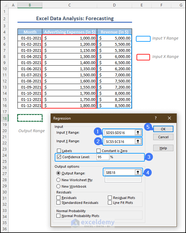
Note: In this regression analysis, the dependent variable is the Revenue (Y), and the independent variable is the Advertising expense (X).
- You will find the output summary below the data table in cell B18.
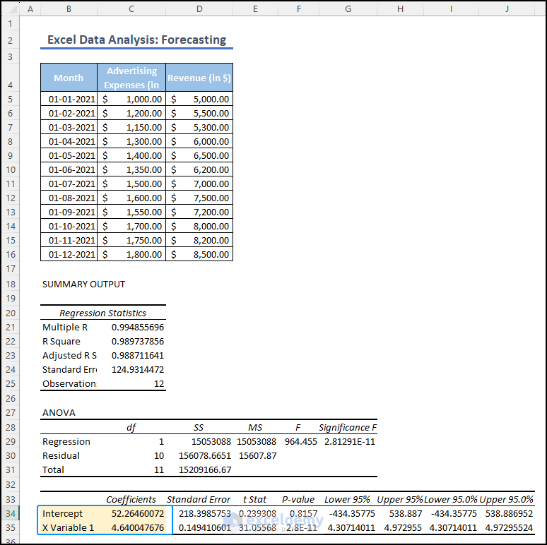
- To forecast the revenue for a given advertising expense, we will use the linear equation (y = mx + c). The intercept value represents the constant term (C) and the coefficient of the independent variable 1 (X) represents the slope (m) in the equation.
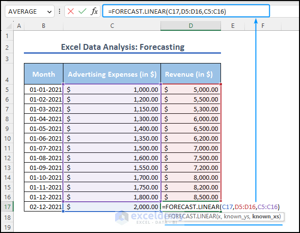
- In cell H5, we will use the following formula to forecast the revenue based on an advertising expense of $2000.
=(G5*H9)+H10
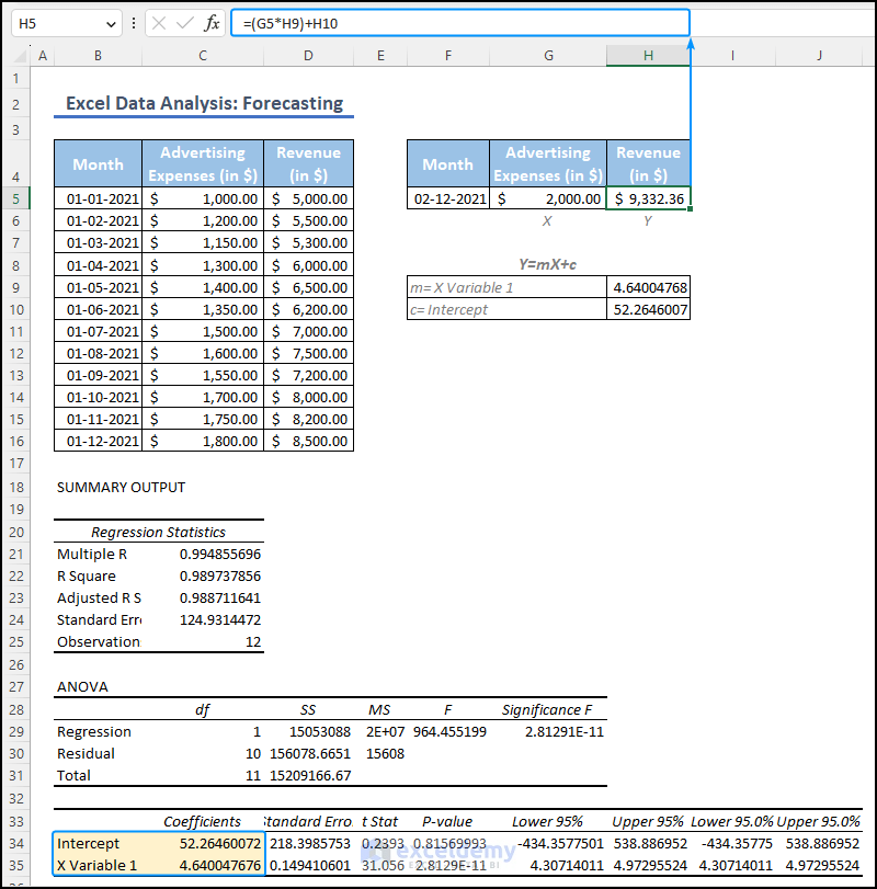
Formula Breakdown
- G5 represents the value of X which is $2000, multiplied by H9 which contains the value of slope (m) for the linear equation.
- C or the constant represented by H10 is added to the product of the advertising expense and the slope.
The equation calculates the forecasted revenue as $9332.36 when the advertising expense is $2000. This enables you to forecast the revenue for any given advertising expense.
The second method involves using FORECAST.LINEAR function to forecast revenue based on regression analysis. This function is available in Excel 2016 and later versions, while earlier versions used the FORECAST function.
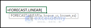
We can demonstrate this process using the same dataset. Consider that our objective is to predict the revenue when the advertising expense is $2000. Enter the following formula in cell D17.
=FORECAST.LINEAR(C17,D5:D16,C5:C16)
Formula Breakdown
- C17 is the known x-value, which represents the advertising cost of $2000.
- The range of the dependent variable (known_ys) is D5:D16 i.e. the Revenue Column.
- The known xs-values range is C5:C16 which represents the Advertising Expense Column.
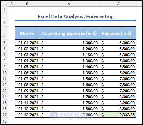
The FORECAST.LINEAR function will return the forecasted revenue value of $9332.36. The value is the same as in the earlier approach.
This function simplifies the regression analysis and forecasting process, allowing for quick and easy predictions based on known independent and dependent values.
How to Customize Options While Forecasting
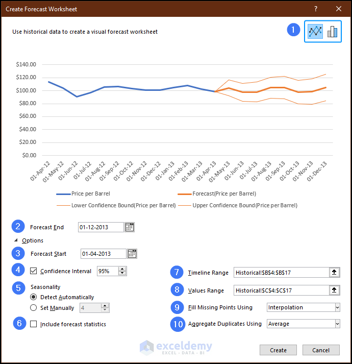
In the top right corner, there are options for choosing either a line chart or a column chart.
You can change the Forecast End date, as this is the output you are looking for.
Choose the starting point on the timeline for the forecast by selecting the Forecast Start date. This allows you to focus on specific periods and compare the forecasted series with actual data.
Toggle the display of the Confidence Interval, which shows the range where future data points are expected to fall with 95% confidence.
Determine the length of the seasonal pattern in your data through the Seasonality option. Excel can automatically detect this pattern, or you can set it manually.
If you check the included forecast statistic, the opt will display additional statistical information on the forecast, including smoothing coefficients (Alpha, Beta, Gamma) and error metrics (MASE, SMAPE, MAE, RMSE).
Specify the range that contains the timeline values in the Timeline Range, ensuring it matches the Values Range.
Define the range that contains the actual values, which should be identical to the Timeline Range
You can also decide what to do if there is any missing value. Choose between Interpolation, where missing points are filled based on neighboring values, or Zeroes, where missing points are represented as zeros.
Aggregate duplicates Using the option determines how Excel handles multiple values with the same timeline value, like calculating the average or using other methods like Median or Count.
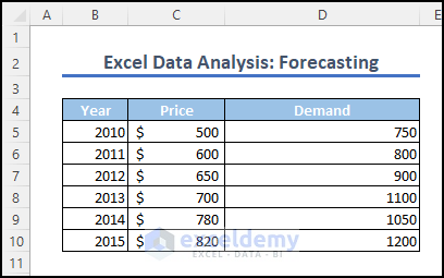
How to Demand Forecast in Excel
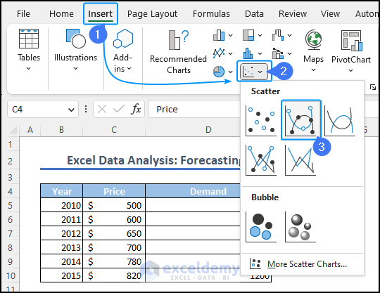
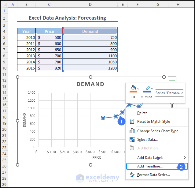
We have a sample dataset below representing the price and demand of a commodity from 2010 to 2015. Our goal is to forecast the demand for the commodity in 2017 when the price is $900.
Select the dataset. Go to the Insert menu and go to Charts. From the drop-down menu of scatter chart options, select the second one.
This action will generate a chart, visually representing the data. Right-click on the data line and select Add Trendline from the menu.
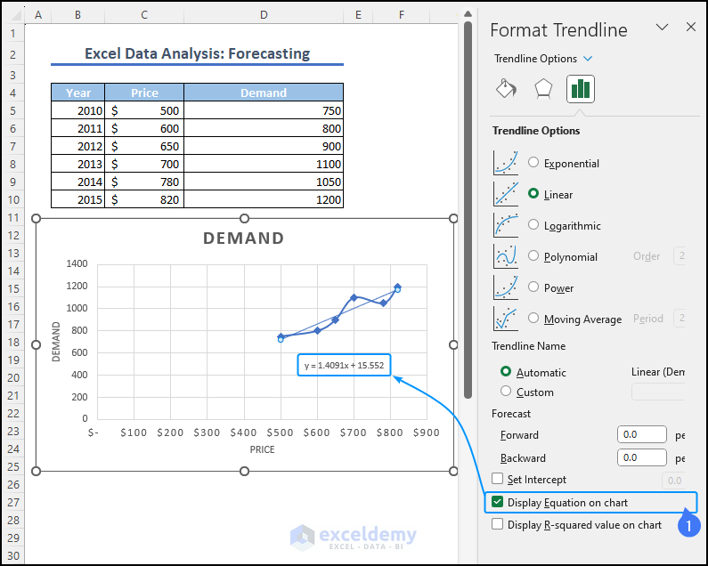
In the Format Trendline menu, mark the checkbox named display equation on chart. It will reveal the equation inside the curve.
In cell D13, enter the following equation, replacing ‘x‘ with the cell reference of C13 (which contains the value $900) to forecast the demand against the price.
=1.4091*(C13)+15.552
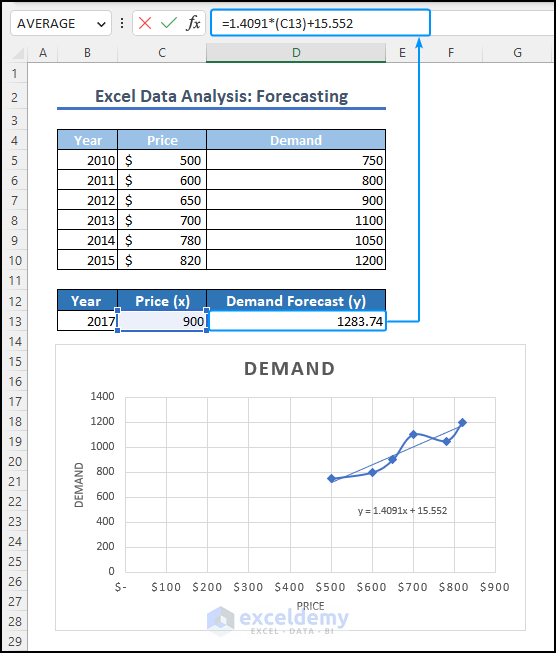
It will return the demand value of 1283.74.
By utilizing the FORECAST.LINEAR function, we can conveniently forecast the demand for the commodity. In cell D13, you can enter the following formula to obtain the result.
=FORECAST.LINEAR(C13,D5:D10,C5:C10)
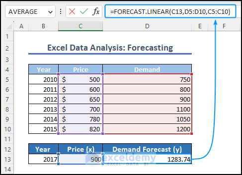
Formula Breakdown
- C13 represents the known price which is $900.
- D5:D10 is the range of the known demand values from the dataset.
- 5:C10 is the range of the known price values from the dataset, which is used as the independent variable.
The output of the formula, which is 1283.74, represents the forecasted demand for the given price of $900.
How to Forecast Sales in Excel Based on Historical Data
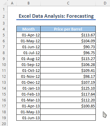
Given the sample dataset below of monthly crude oil prices per barrel, we aim to forecast the sales value for the months of May and June.
When the dataset exhibits a linear trend, whether it is increasing or decreasing, we can utilize the Fill Handle tool to generate a swift forecast.
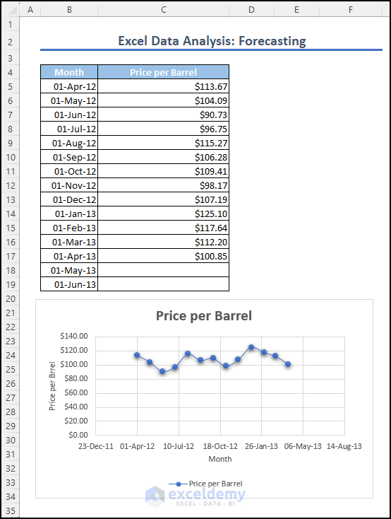
Select the range of cells containing the prices (C5:C17), hover over the bottom right corner of the last cell (C17), and drag the fill handle tool to extend the forecast until the desired cells (C19 in this case).
By applying the Fill Handle tool, we can forecast the price per barrel for the months of May and June as $112.57 and $113.29.
Frequently Asked Questions
- Is Excel good for forecasting?
Yes, Excel is a powerful tool for forecasting. It offers different types of functions, such as FORECAST, FORECAST.ETS, and FORECAST.ETS.CONFINT. It can also help users visually present the data in charts, which also helps to make accurate predictions based on historical data.
- What are forecasting tools?
For precise forecasting, Excel offers specialized functions, graphs, charts, and coding algorithms. They are normally known as forecasting tools for Excel.
- What are some popular forecasting techniques used in Excel?
Excel offers a range of forecasting techniques, including moving averages, exponential smoothing, regression analysis, and time series analysis. These methods analyze data patterns and relationships to accurately predict future outcomes.
- Which chart is best for forecasting?
Line charts and scatter plots are popular choices for forecasting in Excel. These chart types effectively illustrate the trends and patterns in data over time for accurate forecasting. Combination charts with trendlines are also helpful for showcasing historical data and identifying trends simultaneously.
- What is the difference between Trend and Forecast in Excel?
In Excel, the trend helps identify the underlying behavior or trendline in the data, allowing for a better understanding of its overall direction.
On the other hand, the forecast utilizes the trend to estimate and project future values or outcomes.
Get FREE Advanced Excel Exercises with Solutions!

why Get FREE Advanced Excel Exercises with Solutions is not working
Hello Bhabani,
Please fill out this form properly to get the FREE Advanced Excel Exercises with Solutions
I received the exercise sheet via email after filling out the form.
Regards
ExcelDemy